
Since September 2025, the TTC CEO’s Report has included a new presentation of various performance stats both to improve clarity, and to allow a deeper dive into each mode – subway, bus, streetcar – than was done in past reports.
This article presents the new pages for surface modes side-by-side, followed by the subway versions which differ because of the operating environment and infrastructure.
It would be heartwarming to see a revised set of data, but my gut feeling is that the new format adds little to older reports than pulling together many stats for each mode in one place. The actual content still leaves a lot to be desired.
To be fair to the TTC, there is a project underway to review and improve the KPIs [Key Performance Indicators] used to monitor the system, but this is not yet reflected in the reported data.
A pervasive problem with TTC’s self-monitoring is that many statistics are averages over long time periods, locations and routes. There is no sense of local variability or “hot spots” deserving of attention. Use of averages hides the problems, and prevents exception monitoring to show whether improvement happens where it is really needed.
Other metrics allow management to present a rosy picture when this does not match what riders actually see and politicians responsible for transit hear about in regular complaints.
Some metrics are demonstrably invented out of thin air. I have already written about how, until September 2025, bus reliability stats were artificially capped making eBuses appear much more competitive than they actually are. These stats should be restated for previous years to show actual trends, not fairy tales about bus reliability.
Short turns are under-reported by an order of magnitude, and the percentage of short trips is much higher than the numbers reported by management.
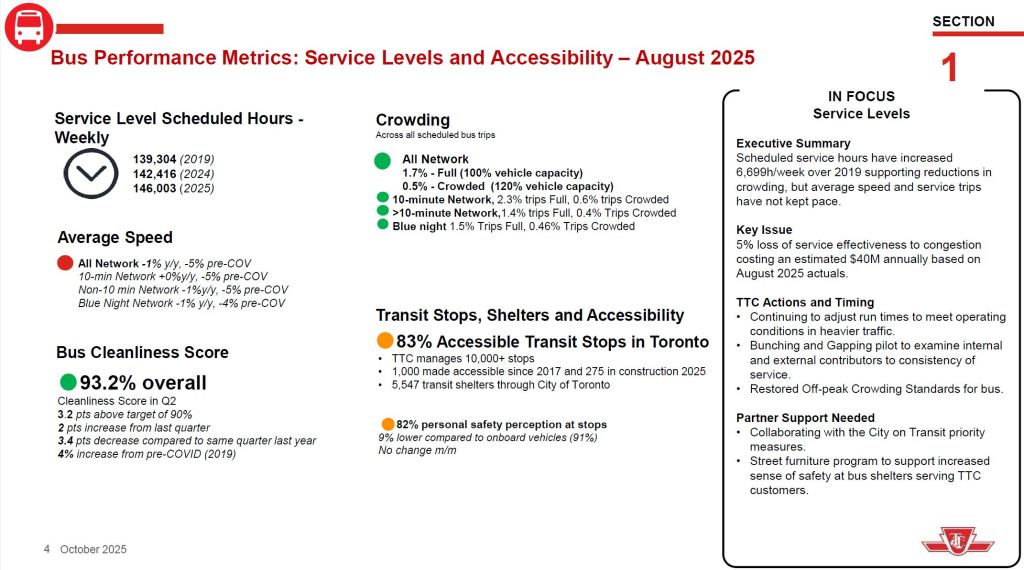
Crowding is reported on the basis of “full” or “crowded” status, but these are not defined, nor is there any recognition that the approved Service Standard for off-peak is different than for peak vehicles. What might be considered only “crowded” in the peak would be well beyond the off-peak standard.
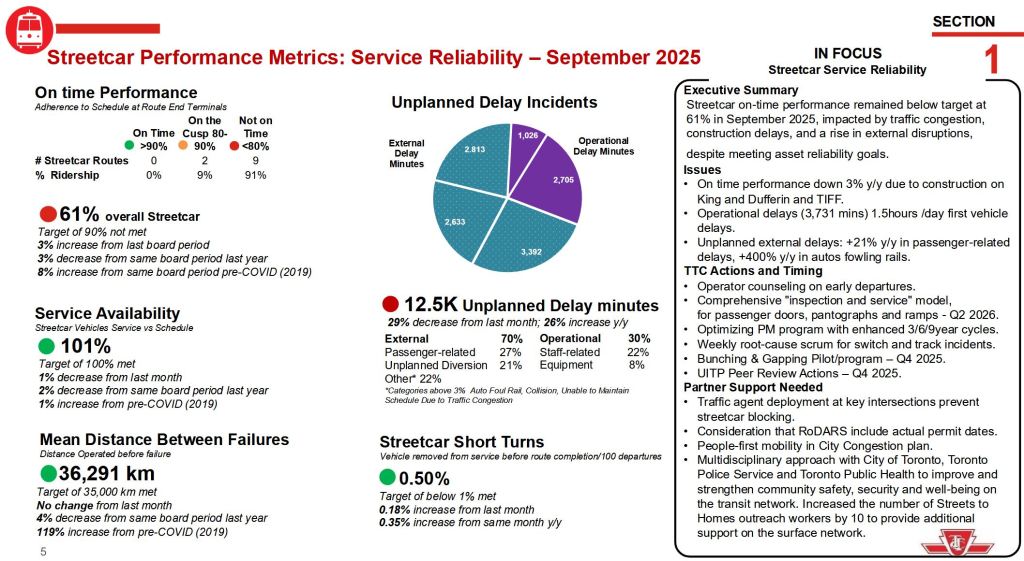
Recently, the average speed of streetcars was misrepresented as being strongly affected by autos blocking the tracks when, in fact, the lion’s share of these incidents were the result of the winter snowstorm and the ineffectual clearing of roadways by the City of Toronto. Traffic obstacles for streetcars (and in some cases for buses) remains a problem, but misrepresentation of stats will only undermine calls for better transit priority.
Fleet availability is reported relative to scheduled service, but without any discussion of factors that could limit how much service the TTC attempts to operate. This includes operator shortages through budget limits. A basic metric for transit fleets is the “spare ratio”, the number of spare vehicles above and beyond regular service requirements. Some spares exist for routine maintenance, some for ad hoc service, but some are simply sitting with nothing to do because there is no budget for them nor for the operators needed to better utilize the available fleet.
A related question is the degree to which a high spare ratio reduces the effect of vehicle failures because the pool available for scheduled service is so high. A high number of spares represents both a capital cost (procurement and yard capacity) and an operating cost (routine maintenance). Does the high number of spares represent real availability for better service, or are these the duds left on the sideline except for extreme emergencies? How large is the truly available fleet for each mode?
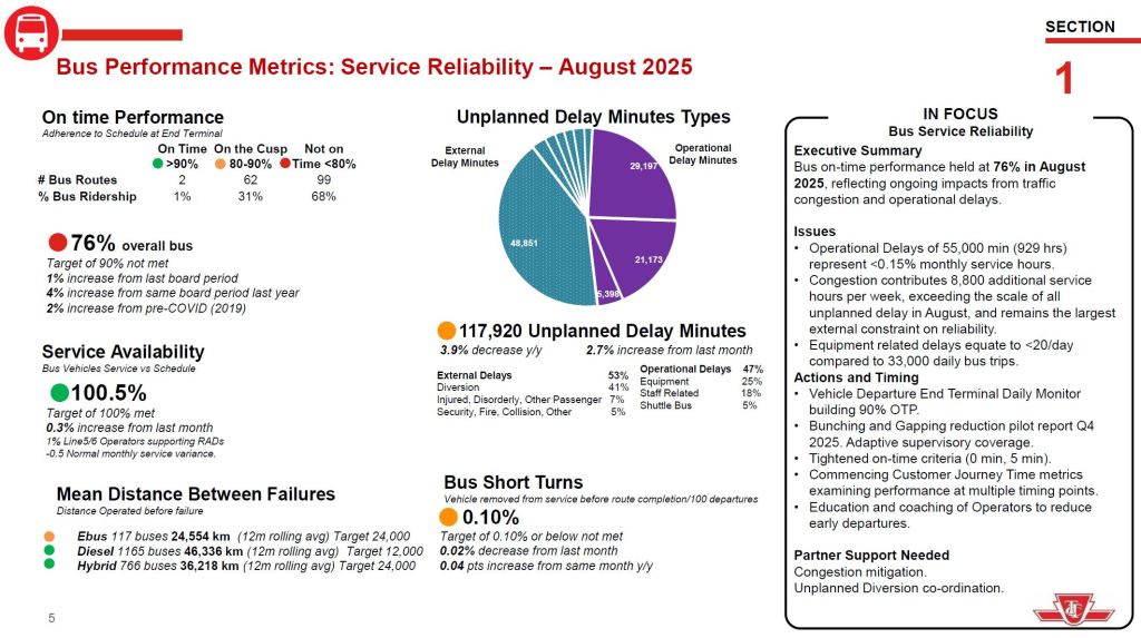
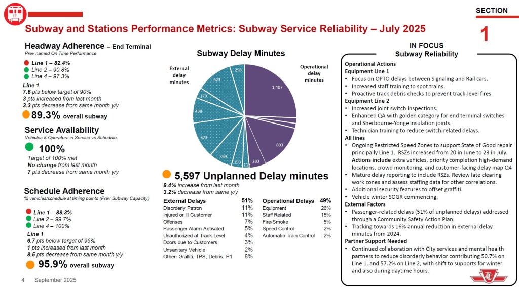
“On time performance” is a misleading term on several counts.
- The metric has historically only applied to terminal departures, not to overall route behaviour.
- A separate headway metric is now coming into use, and it is much more generous for the divergence of actual from scheduled service than the on-time metric in most cases.
- Service Standards define metrics for early arrivals and for missed trips, but these are not reported.
- Delay logs report the length of a service blockage/diversion, but give no indication of the number of vehicles or riders affected.
With the continued reporting of ridership levels today compared to pre-pandemic times, what is missed is a comparison of service levels. Leaving aside the bunching & gapping issue, service on most streetcar routes is less frequent, sometimes dramatically so, than it was in early 2020 and before. The wider headways are compounded by bunching problems which accentuate the relative infrequency of scheduled service. Decades ago, we saw how 501 Queen lost a substantial portion of its ridership when longer ALRVs replaced CLRVs on comparably wider headways. How much of the current ridership loss is due to much less attractive service as opposed to some inherent weakness in demand?
A comparison of pre- and post-pandemic service levels is at the end of this article.
The remainder of this article reviews the charts in detail.
Service Reliability
“On-time performance” for surface routes is defined in the Service Standards using a window of 1 minute early to 5 minutes late, or “+1/-5” for short. Recently, this was changed for reporting purposes, but not in the Standards, to “+0/-5”. There are two fundamental problems here.
- Stats are reported on an all-day basis. Many routes, particularly the streetcars, have the same or similar service levels of 8-10 minutes all day. Most trips are not operated in the peak periods which account for a minority of total service. However, there is no distinction in the reporting of when the out-of-standard trips occur.
- Allowance of five minutes late departure on a typical 10 minute headway means that a 15 minute gap is acceptable. Proportionately the gap is even wider for more frequent services so that a 5 minute service could have a 10 minute gap and be “on time”.
Recent route analyses published here show how badly the actual service varies from the scheduled level, and how this variance is much worse during certain operating periods. None of the TTC metrics reveals this problem.
Service availability is reported against the scheduled service, not against fleet capacity. Achieving 100% of scheduled service is no achievement if that service is designed to fit within a budget that leaves buses and streetcars sitting in the garage. Also, there is no reporting of trips cancelled due to a shortage of operators, although these do show up in the delay logs for those who know where to look.
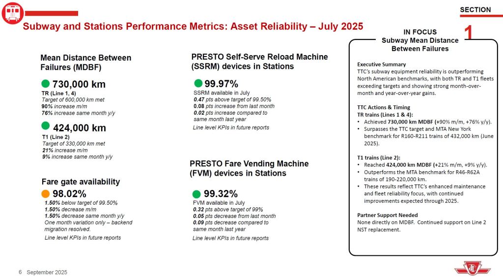
Mean Distance Between Failures have only recently been reported for some modes without an artificial cap on the value. September bus data show that eBuses are the least reliable of the three modes, but this was not visible in past CEO reports, nor have historical figures been restated to correct this problem. Other possible metrics are:
- Mean Time Between Failures which is meaningful for some types of failures that are independent of distance travelled,
- Mean Time to Repair indicating the complexity of failures and the effect on vehicle availability, and
- Mean Cost to Repair indicating whether some failures drive disproportionately high costs.
The TTC is studying changes to the metrics it reports for fleet reliability.
The delay stats are reported both as minutes of delay and number of delays. This information gives no indication of the severity of a delay in terms of numbers of vehicles and passengers affected. An important change in the surface delay logs is that there is now a much more fine-grained set of codes for delays beginning in 2025. This makes comparisons with past years’ data tricky because many types of incident were lumped into generic descriptions.
Short turns are reported as under 1% of trips, a value which I have previously reported is well below the actual stats. There is no reporting of missed trips (which produce the same effect at terminals as short turns, but also affect the entire route) due to lack of a vehicle or operator. Some of this information appears in delay logs, and is also easily found in vehicle tracking data as shown in route-level reviews on this site.
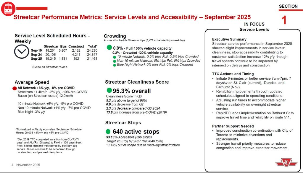
Service Levels
Scheduled service hours can be misleading because the clock runs whether a vehicle is moving or not. Over the years, and beginning pre-covid, scheduled times have increased to provide more driving time in response to traffic conditions, to provide more generous recovery time at terminals, and to reduce the need for short turns. This causes the number of kilometres operated per vehicle hour to decline, but even that statistics must be treated with care.
If terminal times are lengthened, this does not change the scheduled speed of the trip, only the provision for recovery after particularly bad ones. It is important to express operating speeds relative to scheduled travel time, not to total round trip time including recoveries. Comparisons of pre- and post-covid service levels are at the end of this article.
The reported crowding stats suggest that very few trips are overcrowded. This is misleading because:
- There is no distinction between peak and off peak service which have different standards for “over crowding”.
- The majority of trips occur outside of the peak period because there are many more off-peak hours, and many TTC routes have good off-peak service.
- It is unclear if this statistic applies to one-way trips or to round trips. Routes with strongly directional demand will always be uncrowded on counter-peak trips.
The “In Focus” section claims that off-peak crowding standards have been restored for buses, but there is no demonstration of the effect with granular data presentation. What is needed are “heat maps” showing crowded areas at a route level and by time-of-day. Dis-aggregating the statistics will reveal much more than system-wide averages.
Problems of project co-ordination with the City have led to diversions which last longer than actually required because of changes to City-led project timelines. For example, work on Queen west of Broadview might get underway by mid-November when diversions to support it were scheduled beginning on Thanksgiving weekend in October. Similar delays affected the King/Dufferin project.
Customer Metrics
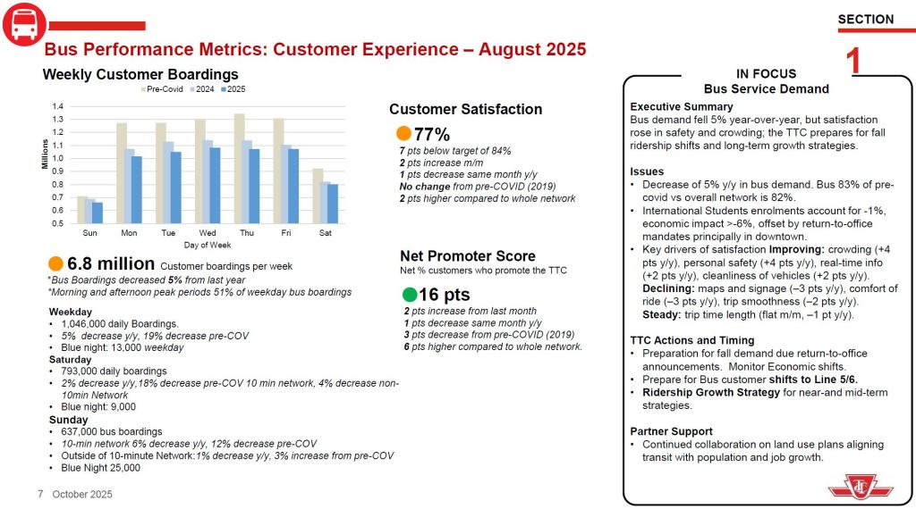
The tables of boardings by type of day are interesting and warrant comparison. A few points deserve a more detailed review:
- Are changes year/year different for various routes, and what are the common factors?
- What is the service level difference on routes with high, little or no ridership loss?
- What periods are covered by these stats, and do they reflect recent return-to-work trends?
| Metric | Bus | Streetcar |
|---|---|---|
| Weekday Daily Boardings | 1,046,000 | 220,000 |
| Year/Year Change | -5% | -6% |
| Current/PreCovid Change | -19% | -33% |
| Blue Night Boardings | 13,000 | |
| Saturday Boardings | 793,000 | 221,000 |
| Year/Year Change | -2% | +6% |
| Current/PreCovid Change | -18% on 10-minute net -4% on other routes | -10% |
| Blue Night Boardings | 9,000 | |
| Sunday Boardings | 637,000 | 170,000 |
| Year/Year Change | -6% on 10-minute net -1% on other routes | No change |
| Current/PreCovid Change | -12% on 10-minute net +3% on other routes | -8% |
| Blue Night | 25,000 |
Subway
The subway stats are similar to the surface modes, but with some key differences:
- Service reliability at terminals is measured by headway adherence, not “on-time” performance.
- Schedule adherence at time points is measured by count of trains (effectively giving the line’s capacity). This too is not an “on-time” metric.
- Delays are reported only as minutes, not as minutes and incident counts.
- MDBF number are much higher for subway trains than for surface vehicles for a few reasons:
- Subway lines run faster, and so more mileage accumulates between time-dependent failures.
- A failure that could take a streetcar or bus out of service can affect only part of a train, and it can continue in service without recording a service outage, the basis for a “failure” charged to the MDBF stats.
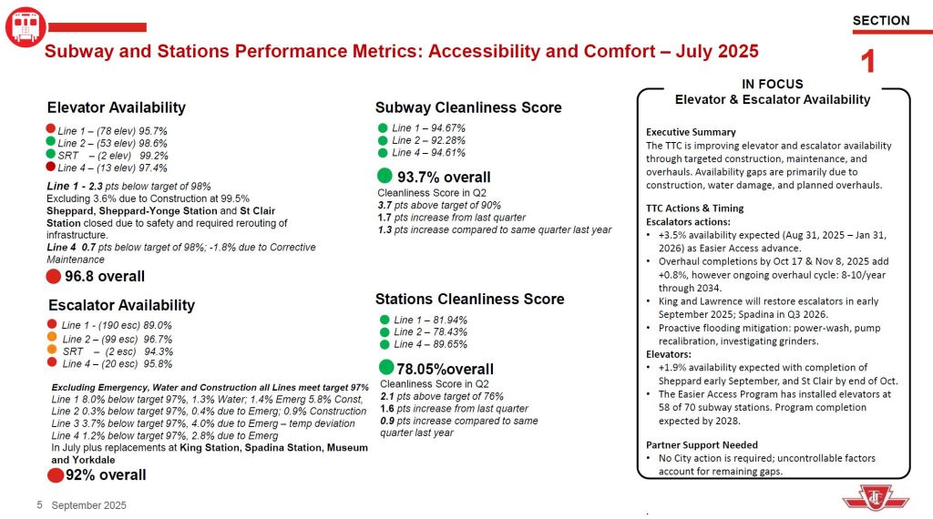
- Availability of escalators and elevators has no equivalent on surface routes. An issue in reporting these is to distinguish between scheduled outages for maintenance and major overhauls, versus in service failures.
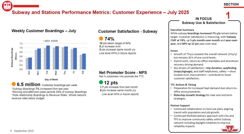
- Subway boardings are up across all days including weekends, and there is a variation through the week. Note that the comparison is with 2024, not with pre-covid levels.
Pre- and Post-Covid Streetcar Service Levels
In the analysis of ridership changes since early 2020, the TTC cites commuting patterns, notably work-from-home, and other factors to explain the drop in demand. However, some responsibility lies with service quality. Most streetcar routes today operate at wider headways (the scheduled gap in time between cars) than before the covid-era cutbacks. There is a similar situation on many bus routes, but this analysis concentrates on streetcars.
An important change concurrent with the pandemic was the shift to larger streetcars and, eventually, to wider headways. The capacity of service operated in most cases today is lower than it was before. One might argue a chicken-and-egg situation where lost ridership drove service cuts, but the converse issue is the lack of aggressive service improvements now that economic recovery is underway. This is a budget problem for the TTC who, even with a large fleet of new streetcars, cannot afford to run better service.
There is a plan to build back to a 6 minute headway across the streetcar network, and this began on 512 St. Clair in October 2025 with 505 Dundas and 511 Bathurst to follow in November.
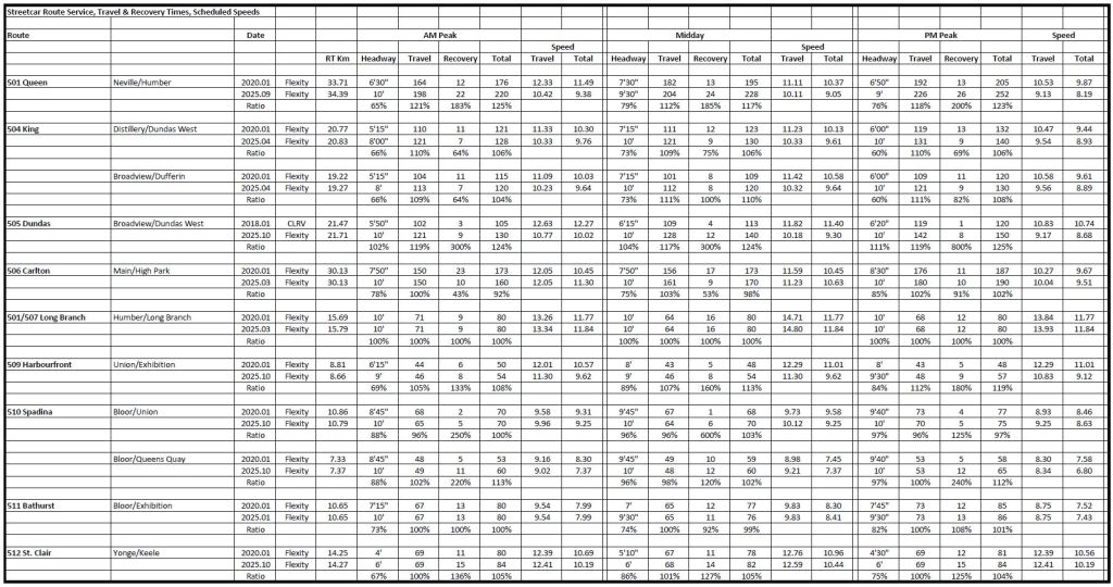
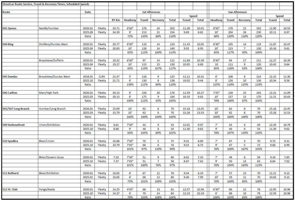
The table below compares service levels on streetcar routes pre-covid to service operated today. The reference dates are primarily January 2020 versus October 2025. Direct comparisons are tricky mainly because of construction projects, and in some cases I have chosen alternate dates for an apples-to-apples view.
On one route, 505 Dundas, there is no 2019-20 comparator because buses were serving the line. I have shown early 2018 schedule values when CLRVs were still operating.
There are five time periods shown: AM Peak, Midday and PM Peak for weekday service, and afternoon service on weekends. Within each section, the columns are:
- RT Km: The round trip distance for the route. Note that many values in 2025 cited by the TTC are slightly different from the earlier schedules.
- Headway: Frequency of service
- Travel: Scheduled round trip driving time
- Recovery: Scheduled round trip terminal recovery time
- Total: Sum of travel and recovery times
- Travel Speed: Calculated speed based on route length and travel time
- Total Speed: Calculated speed based on route length and travel+recovery time
The Ratio line shows the relative changes as percentages. Note that almost all travel and recovery times are up, and the capacity (the inverse of headway, equivalent to cars/hour) is down, sometimes quite substantially.
The 505 Dundas headway ratios are adjusted for the larger Flexity capacity compared to CLRVs. Cars arrive less often, but the theoretical route capacity is up. Service Standard crowding figures are used for peak and off-peak adjustments as required.
By far the largest travel time changes are on 501 Queen reflecting the extra time allocated for the Ontario Line diversion downtown.
Weekday services today range from 60-100% of pre-covid levels with most well below the 100% line.
PDF version of this table: 202510_PreVPostCovidComparison
My apologies to readers for a dense table, but there is a lot of information, and the overall pattern is important. Service is nowhere near pre-pandemic levels, and it is impossible to believe that ridership recovery is unrelated to service levels, especially with the compounding effects of bunching and gapping on wider scheduled headways.
Later this year I will publish an update to my full tables comparing pre- and post- service levels across the system, allowing for changes due to lines 5 and 6.

So have you received the service memo for starting next week now that TTC posted the November service changes?
Steve: Just posted the article. Spreadsheet to follow over the weekend.
LikeLike
I wonder if the quantity of “excess” spare buses – ones that are not supported by the operating budget – might now be equivalent to the storage capacity of one TTC garage?
LikeLike