
In recent discussions of the Bathurst and Dufferin transit priority schemes, a major issue is the degree to which various parts of the routes contribute to slower operation by time-of-day and direction. In this article and two to follow, I will review the actual behaviour of these routes to provide both a basis for discussion of expanding the priority schemes, and as a “before” reference for comparison after they are implemented.
Reviews by time-of-day are useful not just to spot peak period issues, but also as a reference for what might be achieved. At the beginning and end of service hours on most routes, there is no traffic congestion and lighter passenger demand reduces stop service time. Bettering travel times from those periods would be challenging.
Travel times are affected by many factors including:
- Interference from other traffic on the road, and the degree of congestion for traffic generally.
- Absence of signal priority and “priority” signals that do not adequately reflect actual operating conditions.
- Stop service time including both the penalty for stopping, starting and rejoining the traffic flow; and passenger boarding times which depend on the volume of riders and crowding conditions.
- The proportion of riders with large objects such as bicycles, baby carriages, shopping carts, luggage, scooters and wheelchairs. This affects not just boarding times, but also the ability of passengers to move within vehicles, particularly buses.
- Slow driving speeds induced by a desire to avoid running early when scheduled times exceed what is actually needed.
- Posted speed limits.
- Weather conditions.
Express services have fewer stops and therefore lose less time on that account, but this is only one of many possible factors.
A further consideration is that for the transit vehicle, we generally talk about point-to-point times, but for a rider, “travel” includes access time to and from stops at their origin and destination. Removing stops might speed up buses, but at the cost of longer access time. This is a balancing act depending on local geography, the location of signalized intersections and major trip generators.
Travel Times and Ridership
The relationship between travel times and demand is not exact, and depends on various factors:
- A substantial reduction in a long trip is more noticeable than a small reduction.
- For short trips, an improvement in scheduled service and reliability will improve wait times possibly by more than the saving for in-vehicle time. This is compounded by riders experiencing wait time as longer than in vehicle travel time.
- Comfort is important for longer trips where standing in a packed bus is no fun. For short trips the inability to board is a disincentive to ride. Speed is only one measure of attractiveness.
- If service is changed, or stops are removed, in parallel with the reduction in travel time, it is not clear which factor influenced ridership the most.
The origin and quantity of any new riders can vary and will depend greatly on both the latent demand and the perceived improvement for travellers. Would-be riders who now drive require a substantial inducement to change modes especially if their trip would involve multiple routes of which only one was improved. Some riders may shift from nearby routes as happened with the King Street corridor, but this is very specific to local routes and riding patterns, and it does not represent net new transit users.
Any analysis is complicated by the events of 2020-25 and a major shift in overall travel including the stronger recovery of off-peak as compared to peak period demand. If transit priority only yields its greatest benefit in the peak, a large part of the travel market sees little change.
The TTC projects substantial ridership increases on Jane, Dufferin and Bathurst through the proposed transit priority schemes, and this implies both a major improvement in perceived service quality and a latent demand for better transit. However, they do not explain how they reach this conclusion nor the methodology behind their claims, nor the amount of extra service, if any, that will be fielded in anticipation of growth.
Looking at the Whole Route
The Council debate concerned only the section of 7 Bathurst and 29/929 Dufferin south of Eglinton, and of 511 Bathurst from Bloor to Fleet. An inordinate amount of time was spent on a short section of Bathurst south of Dupont. For both corridors, much work was done by local Councillors, their communities and Transportation Services to fine tune the design. This should have occurred earlier in the process.
The larger question, however, is not just the installation of transit priority over a portion of these corridors, but the routes overall and the service they provide. The TTC loves to point to external factors like traffic congestion as their rationale for irregular service, but they do not manage the service they already have as I have shown in numerous articles. Moreover, the standard on which they base reports of “reliability” is very generous for routes that only run every 10 minutes allowing a deviation between 5 and 15 minutes in vehicle spacing.
If one were to say “make it tighter”, I expect the first response would be “oh, we cannot possibly do that” even though the same standards set a tighter deviation for more frequent routes. If it is possible to manage to a six minute window on a 6 minute service, it should be possible to manage to this on a 10 minute service. TTC Service Standards excuse poor service rather than demanding excellence.
The main part of this article presents speed profiles showing details over 7 Bathurst by hour. Within these, one can see locations where transit vehicles have slow operation over extended distances, notably on approaches to intersections. These are key sites for any focus on speeding up transit service.
As a reference, the travel times over each segment, broken down by hour, are also included to show the variation over the day, and the degree of variation (standard deviation of values).
There are many charts, but only a sampling is included inline here. PDFs with full day sets are linked for those who are interested.
I will cover 29/929 Dufferin and 511 Bathurst Streetcar in Parts II and III.
7 Bathurst Bus
Bloor to Eglinton
Travel Times
These two charts show how the travel times between Barton (north of Bathurst Station) and Eglinton vary over the day for each week in June 2025. Note that week 5 contains only Monday, June 30 and has lower times because it is effectively part of a holiday weekend. There is a much more pronounced PM peak northbound compared to a small AM peak (and almost no PM peak) southbound.
Note that some of the standard deviations reach as high as 5 minutes indicating a fairly wide spread in travel time values.


Travel Speeds
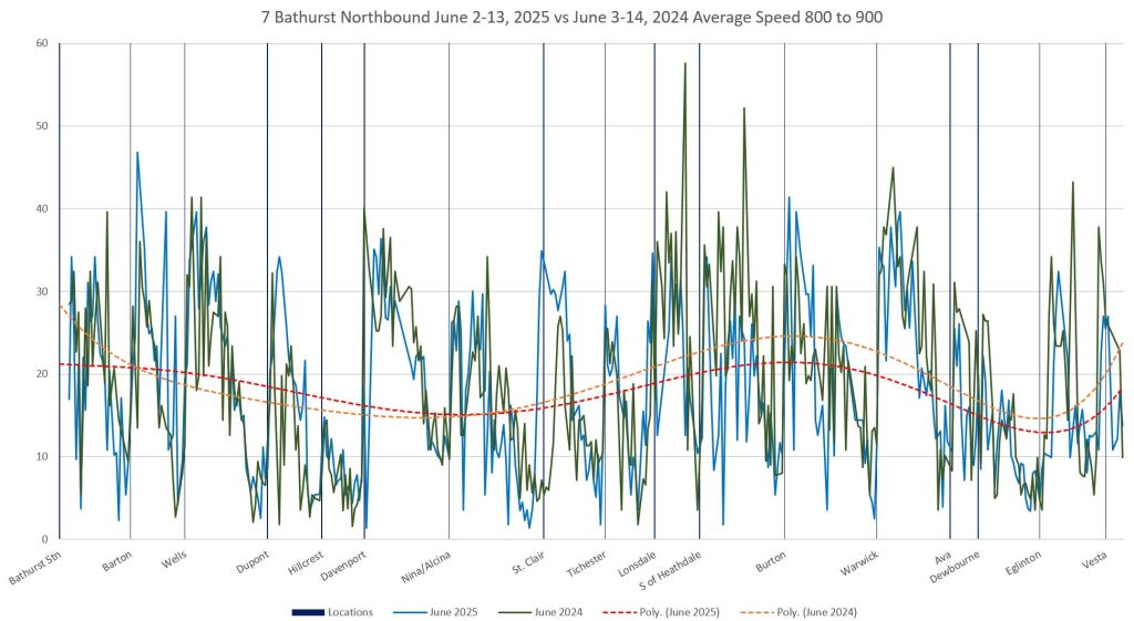
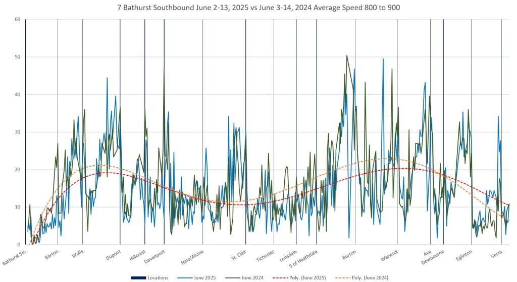
The first pair of charts below show the average vehicle speeds between Bloor and Eglinton both ways for the 10 weekdays from June 2-13, 2025, and by comparison for the ten weekdays June 3-14, 2024. In most cases there is little difference.
The red (2025) and orange (2024) trend lines lie close together for the most part, but they move considerably in later charts below as conditions vary through the day.
Both charts show the south end on the left (Bathurst Station) and the north end on the right (Eglinton). The decline in speed as buses approach stops can be seen as a drop in the averages from left to right northbound, and from right to left southbound.
In the 6-7am charts, traffic conditions are probably as good as can be expected, although even then some areas show a delay approaching an intersection that is worse than other parts of the route (e.g. southbound to St. Clair, and to a lesser extent northbound).


The 8-9am hour shows an overall decline in speed compared to 6-7am notably approaching Dupont and Davenport northbound, and in the entire section from Burton Road southbound. The notches in the southbound speed chart at stops are deeper in the 8-9am data probably because of longer stop service time and greater demand.
The drop in southbound speeds approaching Eglinton shows that congestion extends north of the intersection because the tight notch visible in the 6-7am data above is flattened out by 8-9am. There are delays on the approach to Eglinton through much of the day both ways.
By noon, the speed trendlines have shifted upward in some portions of the route, but the effect of congestion south of Dupont, Davenport and St. Clair northbound is evident.


For 7 Bathurst, I have included hourly charts through the PM peak to show how travel times evolve. An important consideration is that some parking/stopping restrictions kick in at 4pm. This is late relative to the buildup of traffic, and some other neighbourhoods have seen the 4-6pm restrictions extended to 3-7pm (or some variation on this).
By 3-4pm, the trend line lies roughly at 10km/h northbound from Wells to St. Clair. Southbound there is little change from the noon data.


Between 4-5pm, there is a slight improvement in the Dupont-Davenport area northbound, but a decline south of Eglinton. Southbound speeds do not change much.


The 5-6pm data continue the same patterns seen in the previous hour.


By 8-9pm, speeds have improved overall, but they are still below the 6-7am values northbound.


To get a sense of how these values evolve over the day, open the full-day PDF (linked below) and step hour by hour though the data. This gives the effect of flip chart animation, and you can focus on specific segments to see how the values change with time (or not).
Eglinton to Wilson
Travel Times
In the segment from Eglinton to Wilson there are notable travel time peaks in both the AM and PM, particularly the latter.


Travel Speeds
As with the Bloor-Eglinton segment above, the first charts below show travel speeds between 6-7am giving a likely “best case” for the route as it now exists. The notches in the values correspond to stops, and they are all quite sharp indicating little congestion on the approach. A notable exception is southbound to Lawrence.
The trendlines for 2024 and 2025 data are close together showing that conditions on the route are similar year-over-year.
In the 6-7am hour, the trend lines lie in the 20-25km/hr range with some segments showing speedier operation.


By the 8-9am hour, the trendlines for average speeds have dropped considerably from two hours earlier. Note in particular the extended slow area approaching Eglinton and Lawrence southbound.
The area around Lawrence shows generally slower speeds throughout the day.


Speeds improve in some sections by noon, but not all, notably northbound from south of Lawrence to Wilson. However, there is little sign of extended slow areas approaching stops that could be caused by local congestion as opposed to a general slowdown in traffic speed.


In the 5-6pm hour, northbound travel times are again lower. Southbound times decline, but not by as much.


In the 8-9pm period, travel speeds rise again and there is no sign of congestion on approach to intersections. The area around Lawrence remains a slow portion of the route.


Wilson to Steeles
Travel Times
As seen further south, there is a pronounced rise in travel times northbound in the PM peak. The southbound peaks are lower.
Note that these charts have a maximum y-value of 35 km/hr while the others above have a 30 maximum. This was done to fit in the high PM peaks. This segment is longer than the two shown above (roughly 6km rather than 4km).


Travel Speeds
From Wilson to Steeles, average speeds tend to be higher than on the route further south with the trend lines touching the 30km/hr mark in some cases. Between Sheppard and Finch, there is an extended area of green space where Bathurst crosses the west Don Valley, and to a lesser extent north of Finch at the Hydro corridor.
Between 6-7am, average speeds northbound from Wilson to Sheppard are notably faster than southbound and the downward spikes corresponding to stops are not as deep. This suggests considerably shorter stop service times in the off-peak direction.
Sheppard and Finch are major stops both ways, and there is some congestion southbound to Finch even at this early hour.


By 8-9am, the trend lines for average speeds have dropped considerably.


Speeds from 12nn-1pm are higher than in the am peak, but not uniformly along the route. Finch southbound continues to show congestion on the approach.


In the 5-6pm hour, average speeds have dropped again for most of this section. There is a particularly slow operation northbound approaching Sheppard in 2025 data likely due to a construction project constraining peak road capacity.


By 8-9pm, speeds are back up again, but not generally to the level seen at 6-7am.


Full Chart Sets
- Northbound Bloor to Eglinton
- Southbound Eglinton to Bloor
- Northbound Eglinton to Wilson
- Southbound Wilson to Eglinton
- Northbound Wilson to Steeles
- Southbound Steeles to Wilson
Methodology
The raw tracking data provided by the TTC does not give a vehicle’s location at each instant, but rather at snapshots usually several times per minute. These contain GPS coordinates of a bus or streetcar which, for the purpose of analysis, I convert to a location on a linear version of the route (imagine the route as a piece of string stretched out into a straight line). The vehicle location is converted to a number along this line divided into 10m segments. Since a bus moves more than 10m between two observations and more time can pass than the 20s time scale used here, the intermediate values are interpolated assuming constant speed. In this format, the values produce the time and distance “string charts” familiar to readers on this site.
The same information can be used to assign a speed for each 10m segment for each vehicle. The sum of these speeds divided by the number of observations gives the average speed at that segment. The calculations are subdivided by hour of the day giving an average speed within each hour at the segment, and data are included from several weekdays (10 in the cases here) to get a large enough sample. (Routes operating every 10 minutes only produce 6 observations per hour on a single day assuming even headways, and disruptions can make this an even lower number.)
The average values produce the plots shown here with the horizontal axis representing the straight line version of the route. Vertical reference lines are added to show stop locations. These will not exactly align with locations of low average speed because they are usually positioned in the middle of the cross street, and stops are offset on either side.
An important point about the source data is that they give the detailed locations and times for vehicles rather than only the stop arrival/departure times. This shows the change in average speed along a route, and critically on areas near congested areas, rather than a generic change in stop-to-stop travel times.
