
Updated May 14, 2025 at 6pm: A section is added at the end of the article showing the time spent at both the Steeles and Bathurst Station terminals.
In Part I of this series, I reviewed headway reliability on 7 Bathurst during April 2025. This article turns to travel times along the route, an important issue relative to claims made for the potential benefit of reserved bus lanes.
See also:
- Service Analysis of 7 Bathurst Part I: Headways in April 2025
- RapidTO Dufferin and Bathurst Streets: Public Consultation May 2025
In Part III I will review historic data back to January 2024 to see how, if at all, conditions have evolved over the past 16 months.
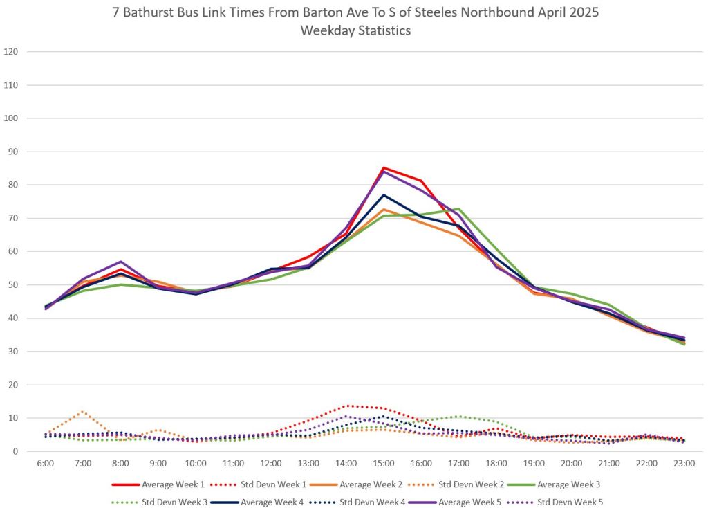
Travel Times Between Bloor and Steeles
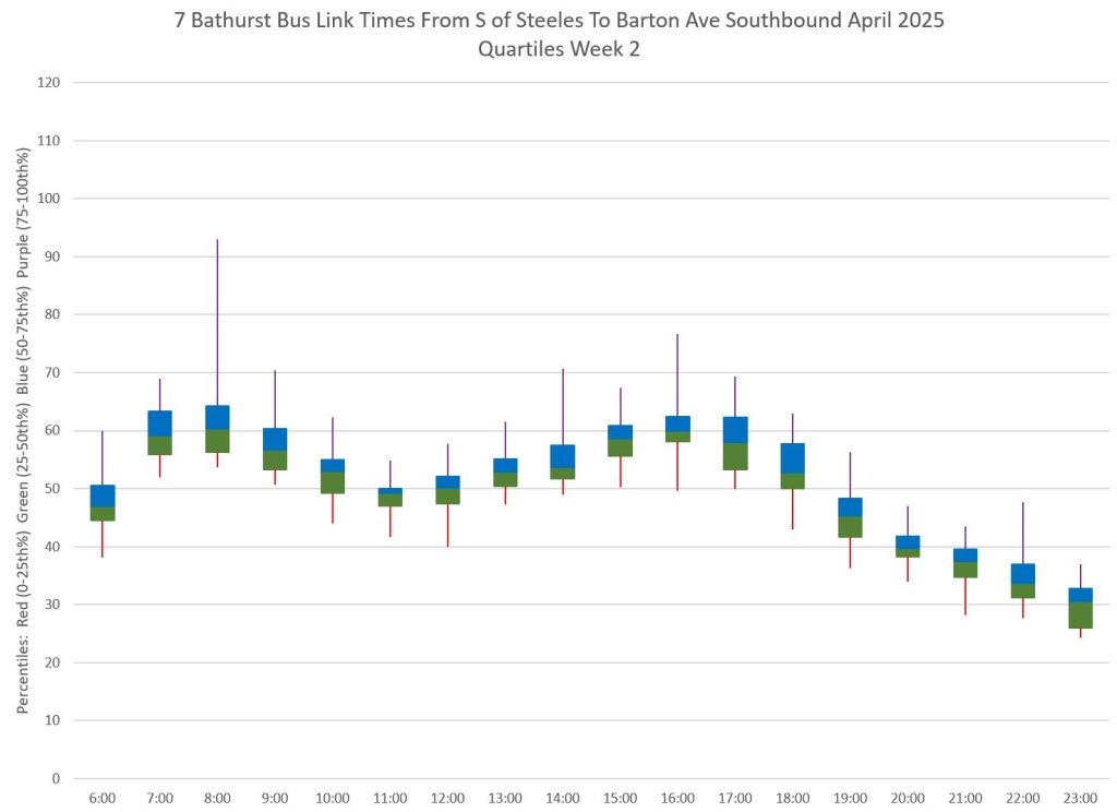
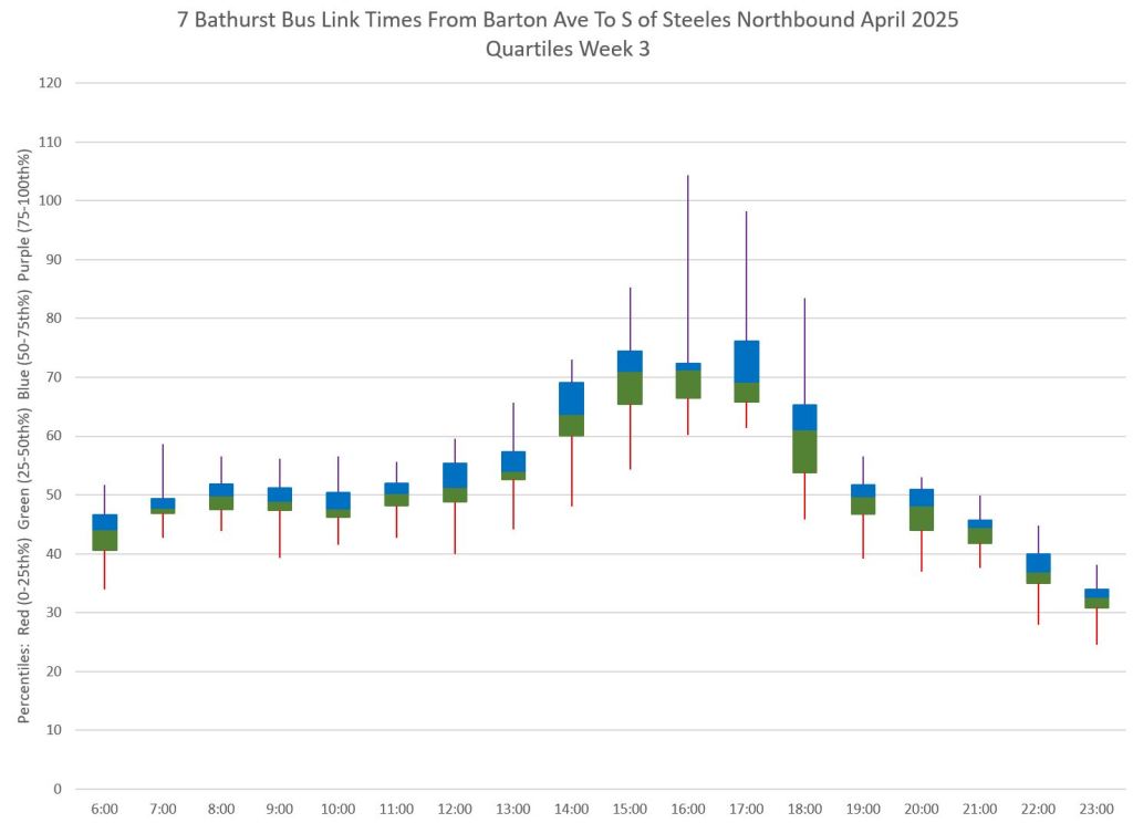
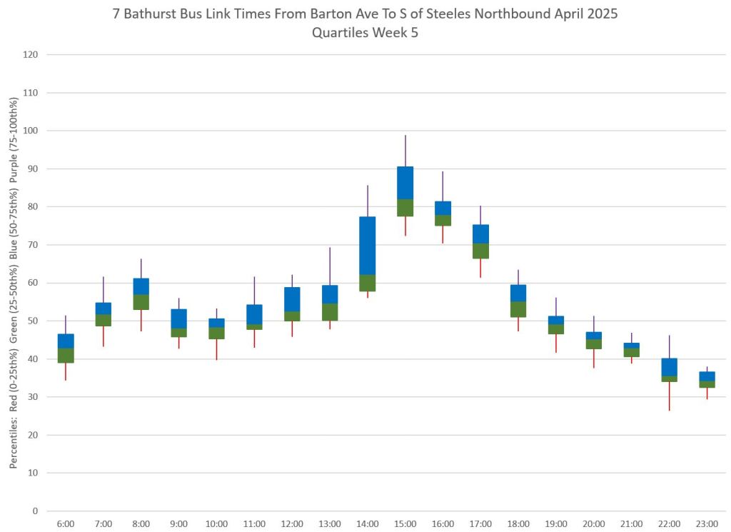
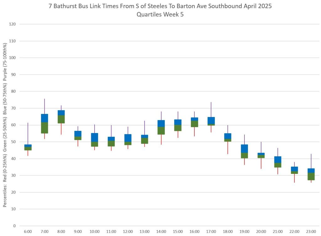
The charts below show travel times on weekdays over the full route subdivided by weeks of the month. The screenline at the south end is at Barton Street just north of Bathurst Station, and at the north end is just south of Steeles. These were chosen to eliminate any bus movements that were not actually starting new trips from the departure times at the terminals.
The left column shows data for northbound trips, and the right column for southbound. The first pair of charts shows the broad stats for each week with averages and standard deviations. The following pairs show quartiles for each week. Ideally the central blue-green blocks holding the second and third quartiles should be as compact as possible showing consistent travel times.
The shorter those blocks and the tails for the lower first (red) and upper fourth (mauve) quartiles should also be as short as possible. Some periods show a substantial range of travel times, notably northbound. Not only are northbound trips slower, they have a less predictable travel time and this affects the ability to stay “on time”, however that might be defined.


The question, then, is whether the variation over the day is general across the route, or confined to specific locations. The charts below examine each segment.
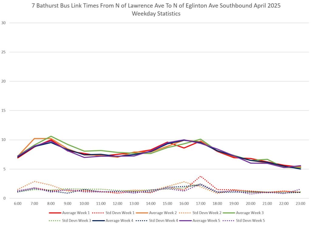
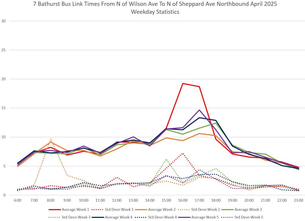
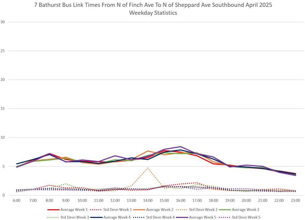
Travel Times By Route Segment
The screenlines for each route segment plotted here are the same locations as used in Part I for the headway plots. Part I measures the time between buses at a single screenline, while Part II measures the travel times between the screenlines.
As the overall travel time charts above showed, there is a much larger variation in the northbound compared to the southbound direction.
The charts below show that this is concentrated in certain segments: Barton to St. Clair, Lawrence to Wilson, and Wilson to Sheppard. Only the first of these lies within the bounds of the RapidTO proposal.


Travel Times in the Proposed RapidTO Segment
These charts show travel times between Barton and Eglinton. If we assume that times at the outer ends of these plots (6am to 7am, 11pm to midnight) are the best case values when both demand and road traffic are as light as we could hope for, this sets a lower bound on travel times and the potential saving against current values in all periods.
For northbound trips, the potential saving is at most 15 minutes during the PM peak hours, probably less given that some of the time difference is due to stop service in busier periods. For southbound trips, the potential saving is lower, at most 8 minutes, and then only during the height of the AM peak.


The following slides are taken from the Presentation Deck for the Bathurst RapidTO project.

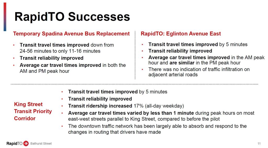

Information in these slides must be taken with several grains of salt.
Yes, 35,000 riders per day (2023 data) travel in the Bathurst corridor. Of these, 20,000 are on the 7 Bathurst Bus and the rest are on the 511 Bathurst Streetcar. There is some double counting of riders who transfer between the two routes, although this is a comparatively small proportion of the total based on personal observations of rider behaviour at Bathurst Station.
The scheduled speed of the 7 Bathurst Bus on weekdays varies from 12.9 km/hr (pm peak) to 23.3 km/hr (late evening). For the 511 Bathurst Streetcar, travel speeds vary from 8.8 km/hr (pm peak) to 12.3 km/hr (late evening). Clearly the buses are not as bogged in traffic during most periods as in the PM peak.

The claimed saving is up to 7 minutes per trip between Eglinton and St. Clair. This is close to best case expectations southbound and about half of the PM peak spike northbound.
It is not clear how the time saving will translate to reliability over the route considering that the RapidTO segment covers only about 30% of the total route length, and there are congestion points outside of this area.
The idea that ridership will grow by 23% is extremely optimistic because the percentage change in travel time over the route, as opposed to the RapidTO segment, is only about 10%. Moreover, if the TTC cannot fix headway reliability problems, riders will still encounter unpredictable waits for service. There is no examination of how the 18% gain in reliability will be achieved.
Even assuming the travel time saving is achieved, it will only apply to the peak period. The TTC is fond of pointing out that the benefit will flow to all periods, and that off-peak demand is rising. True, but the travel time saving will not be as great. Indeed, if it is only a few minutes each way, this will be barely enough to shave one bus from the off-peak service.
The slide listing RapidTO successes misleadingly includes the Spadina south red lane. This was a very different situation from other RapidTO proposals. The Spadina bus was shoehorned into an already badly congested area where Gardiner-bound traffic snarled the buses. It is no surprise that a reserved lane had a big effect, but this is not representative of other bus corridors. (This was also a case where the TTC badly underestimated the effect of attempting mixed traffic bus operation, and riders paid dearly until that oversight was fixed.)
On Eglinton East, part of the travel time saving was due to elimination of a few stops, although some of these were restored. It is not clear how much the stop eliminations on Bathurst contribute to expected travel time savings.
On King, the initial savings, particularly in reliability, were impressive, but these were totally lost in the post-covid recovery period coinciding with major construction downtown. Travel times on King skyrocketed thanks to lack of enforcement of the traffic rules. This affected not just service downtown, but on the outer ends of the route.
The TTC Board report on the subject foresees considerable new revenue from ridership growth as well as operational savings for this scheme. It is not clear whether, at least in the medium term, TTC will actually increase service rather than just clawing back buses because of slightly shortened travel times.
Terminal Times
A common sight at Bathurst Station is multiple buses laying over between trips. Considering that they are supposed to be 10 minutes apart, this represents a considerable portion of the total operating hours. A similar situation applies to the terminal loop at Steeles.
Some recovery time is essential to allow for day-to-day variations and for a relief break for the driver. On weekends when schedules are tighter, the amount of relief/layover time is lower, sometimes nil, but on weekdays, the substantial layovers should allow buses to depart regularly. This shows up in the wider scatter in headways from the terminals when recovery time is not sufficient.
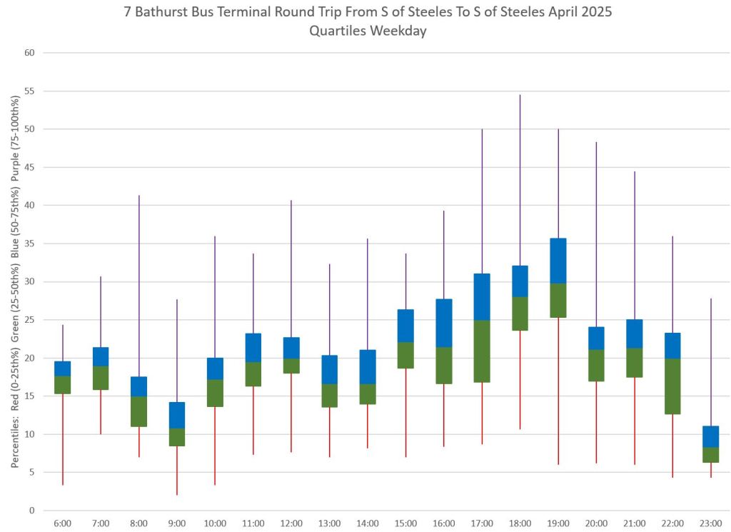
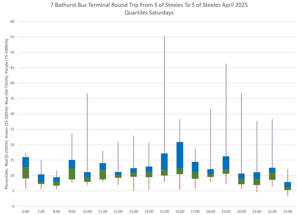
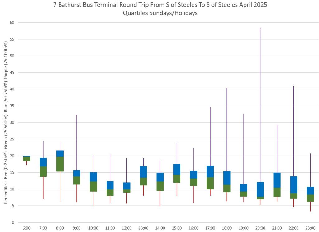
In the charts below, the left column holds charts for the southern terminal measured as the round trip from Barton Avenue to Bathurst Station and return. This means that some time included here is driving time, but it ensures that the times are true arrivals and departures. The right column shows times measured from south of Steeles Avenue at the point where the route divides to loop.
- The first pair of charts show the weekday data, by week, with average and standard deviation values.
- The second pair show the raw data for all weekdays. Note that some buses spend over half an hour at terminals, particularly at Steeles. A few buses turn around in a very brief time.
- The third pair show the weekday data summarized by quartile.
- The fourth and fifth pairs show the Saturday and Sunday/Holiday data by quartile. Note that the central blocks containing the 2nd and 3rd quartiles lie lower on the charts than for weekdays, and the blocks themselves are shorter indicating a more compact range of values. The tails for the 1st and 4th quartiles are also shorter than on weekdays. These charts illustrate how the weekend schedules provide less terminal time than on weekdays, and this leads to more disorganized service.


Steve –
It would be very helpful if you provided summaries in the emails instead of requiring people go to the links. Some days I want the details but some days just the basic picture, even just a cloudy picture.
Cheers.
Ben Barkow
LikeLike
You wrote 512 Bathurst a few times, instead of 511.
Steve: Fixed. Thanks for catching that.
LikeLike
A fellow reader asks you to “provide summaries in the emails instead of requiring people go to the links”. I think it is fair to say that virtually every route analysis you have ever published could be summarised by “The TTC fails to manage the route and the vehicles are generally not well spaced.”
Steve: I do not propose to do that. Most articles are written with an introduction followed by the “more” break. Sadly, yes, the analyses come to a similar conclusion far too often.
LikeLike