
A central part of any transit rider’s journey is the wait for a vehicle that may or may not show up when expected. Even with an app that tells you where the bus is, the news might not be good. Rather than being just around the corner, the bus might be several miles away, and heading in the wrong direction.
The only statistic the TTC publishes on service quality is an “on time” metric. This is measured only at terminals, and even there “on time” means that a bus departs within a six-minute window around the scheduled time. Performance is averaged over all time periods and routes to produce system-wide numbers, although there are occasional references to individual routes in the CEO’s Report.
Riders complain, Councillors complain, and they are fobbed off with on time stats that are meaningless to a rider’s experience.
The problem then becomes how to measure the extra time riders spend waiting for their bus, and to report this in a granular way for routes, locations and times.
This article presents a proposed method for generating an index of wait times as a ratio comparing actual times to scheduled values, and their effect on the rider experience. The data are presented hour-by-hour for major locations along a route to see how conditions change from place to place.
An important concept here is that when buses are unevenly spaced, more riders wait for the bus in the long gap and fewer benefit from buses bunched close together. The experience of those longer waits raises the ratio of the rider’s waiting experience to the theoretical scheduled value. The more erratic the service with gaps and bunching, the higher the ratio of rider wait time to scheduled time. This is compounded by comfort and delay problems from crowded buses, and is responsible for rider complaints that do not match the official TTC story.
There’s some math later to explain how the calculations are done for those who want to see how the wheels turn, so to speak.
Note that this is a work in progress for comment by readers with suggestions to fine tune the scheme.
Calculating the Wait Time Ratio
In the simplest of cases, buses arrive at the same interval, one after another, and this matches the scheduled service (there are no missing or extra buses). The real world does not look like that, and buses come at irregular intervals.
| Scheduled service | BUS…..BUS…..BUS…..BUS…..BUS…..BUS…..BUS…..BUS…..BUS…..BUS |
| Actual service | BUS..BUS……….BUS…BUS…….BUS…BUS……….BUS..BUS..BUS..BUS |
Assume that riders arrive at a stop at a constant rate, say one per minute. As each bus arrives “N” minutes apart, there will be “N” riders waiting to board. Each of them will have waited, on average, “N/2” minutes, some longer, some shorter.
| Total wait time for passengers | N times N/2, or N*N/2 |
| Average wait time | (Total time)/N or N/2 |
These values can be summed over a time period, but with even headways, the resulting average wait is always N/2 or half a headway.
Real service does not work like that. If there is a gap, the value of N goes up, but the total wait time goes up proportionately to N-squared. Similarly, bunched service is great for people who arrive just at the right time, but few benefit from that short interval. The result is that the sum of wait times for all of the buses in, say, an hour will be larger if the service is uneven that if it is regular. It is this difference that shows what riders actually experience.
Here is an example from 29 Dufferin on Tuesday, September 17, 2024 between 5 and 6 pm northbound at Bloor. I chose this interval to be “not too bad”, but there are better and worse examples. Note that in my tracking model, all times are rounded to 10 second intervals. The scheduled times are taken from the electronic version of the schedules (GTFS) for the northbound stop at Bloor. Actual times are measured at an east-west screenline in the middle of the Dufferin/Bloor intersection.
More riders wait longer for buses in wider gaps than for buses running close behind. A few of the headways are near the scheduled 8 minutes, but some are much shorter and others much longer. This causes the average wait time per rider to go up relative to the scheduled value of 4 minutes.
One point that should be noted is that if the scheduled headway is uneven (a not uncommon situation), then the base value for the scheduled average wait time will include this unevenness. Any variation in actual conditions will be on top of that.
| Scheduled Time | Scheduled Headway | Actual Time | Actual Headway |
|---|---|---|---|
| 4:53:09 | 4:53:10 | ||
| 5:01:09 | 8:00 | 5:01:50 | 8:20 |
| 5:09:09 | 8:00 | 5:08:30 | 6:40 |
| 5:17:09 | 8:00 | 5:11:50 | 3:20 |
| 5:25:09 | 8:00 | 5:20:10 | 8:20 |
| 5:33:09 | 8:00 | 5:35:20 | 15:10 |
| 5:41:09 | 8:00 | 5:43:40 | 8:20 |
| 5:49:09 | 8:00 | 5:47:10 | 3:30 |
| 5:57:09 | 8:00 | 5:57:10 | 10:00 |
Normalization of Time Intervals
In the example above, we were “lucky” in that the headways measured at Bloor between 5 and 6 pm were all within a common interval of 4:53 to 5:57. Things don’t always work out that way, and a problem arises in comparing average wait times if the scheduled and actual intervals don’t match. To correct for this, the calculated values for each “hour” are scaled from the first-last bus interval to 60 minutes. This also irons out problems with headways that lie across hourly boundaries.
This tactic also adjusts for cases where the “actual” data are consolidated from multiple days. If we take data for a one-hour band for one week, there are actually five hours (more or less) of actual data versus one hour of schedule data.
For the data above, here is the calculation of the wait time ratio. All values except the ratio are in minutes. Note the varying contribution of short and long gaps in service.
| Scheduled Headway | Rider Wait Time | Actual Headway | Rider Wait Time | |
|---|---|---|---|---|
| 8 | 32 | 8.33 | 34.72 | |
| 8 | 32 | 6.67 | 22.22 | |
| 8 | 32 | 3.33 | 5.55 | |
| 8 | 32 | 8.33 | 34.72 | |
| 8 | 32 | 15.17 | 115.01 | |
| 8 | 32 | 8.33 | 34.72 | |
| 8 | 32 | 3.50 | 6.13 | |
| 8 | 32 | 10.00 | 50.00 | |
| Total wait time | 256 | 303.08 | ||
| Riders (interval) | 64 | 63.67 | ||
| Wait/rider | 4 | 4.76 | ||
| Ratio | 1.19 |
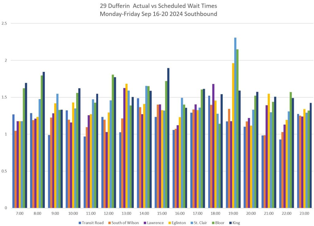
Sample Charts Showing Ratios for 29 Dufferin September 16-20, 2024
The charts below show the ratio of actual wait times, weighted to account for higher rider volumes in gaps to the expected times that are defined by the schedule.
The locations correspond to the screenlines used in my service analyses. For the scheduled equivalent, the nearest stop in the GTFS version of the schedule is used.
See also:
The top set of charts shows the values before they are normalized to correct for the length of each interval as explained earlier. The bottom set of charts shows the values normalized to 60-minute intervals.
Generally speaking, the ratio is relatively low at the trip origin and grows along the route. This reflects the growing dispersion of headway values as gaps get wider and bunched vehicles get closer together along their trips. The more gapped/bunched the service is, the greater the typical wait time relative to scheduled expectations.
Note that the southern screenline on the route here is at King which is not immediately at the terminal points of Dufferin and Princes’ Gates. At the north end, the screenline is close to Wilson Station.
A value of “1” indicates that the calculated actual wait times match the scheduled times. The higher the value, the more the service diverges from a reliable, scheduled operation. Note that this is not a measure of “on-timeness”, but of the degree to which service regularity and spacing, and by implication rider wait times, match scheduled values. This is a headway-based, not a schedule-based metric.
This is an essential difference from the TTC metric which is based on a schedule. The schedule can be used to calculate the ideal average wait time, but the actual service shows up when it gets there. As long as the spacing is reasonable, riders do not care.
For most northbound service at Bloor, the ratio of actual:scheduled to ranges from about 1.2 to 1.6 at Bloor (orange bars, lower left chart below). In other words, the typical wait for a 29 Dufferin bus ranges from 20% to 60% longer than the advertised value leaving Dufferin Station northbound. The situation is worse the farther north one goes as bunching becomes more of a problem. Similarly with southbound service, the ratio of actual to scheduled wait times grows along the route.
In almost all cases, the ratio between actual and scheduled is greater than 1.0 and can reach well over 1.5. Is there any wonder why riders complain of service that is much less reliable than management claims?
Incorporating this model into some sort of standard or target presents an important question: how much difference from the scheduled service and wait times is acceptable? I will not attempt to answer this here, and leave this for discussion.
Another important factor will be that performance data must be reported with enough granularity – time of day, location, relatively few days’ data per consolidated view – to be meaningful to riders without masking specifics in a too-general metric.


Accounting for Demand Levels
Finally, there is the issue that demand varies by time and location. The assumed one rider per minute at each stop obviously does not match the real world, but this fictitious rider allows us to calculate an index of service quality. If the value of the index at each time and location were applied to the demand, we would get a measure of the effect of irregular headways on the overall ridership weighted by times and places where demand is greatest.
However, one can equally argue that riders in off-peak periods deserve good service quality even if they are less numerous. This is part of making transit attractive on an overall basis.
This is a topic for another time. Meanwhile, dear readers, please let me know if this makes sense for inclusion in my regular assortment of service analyses.

In my younger days, I wondered about applying for to be a streetcar driver. However, I worried about what if I get a stomach ache, or vomiting, or worse a bout of diarrhea.
At least if you’re in a TTC meeting, you are still able to run to a washroom to escape the meeting for five minutes. On a bus, you may attempt to speed up a bit to get to a terminal or loop with washroom facilities. Hopefully in time.
The drivers should have time for those times built into their runs (pun included).
But not every day or trip.
Steve: When you get trips that are well over an hour one-way, every trip is essential. It’s also easier to schedule because otherwise you have to take into account when crew breaks occur, and built the relief breaks around them.
LikeLike
Agent based modelling takes the concept of adding wait time to the trip up to the way the consumer sees it. Follow a synthetic individual’s journey from A to B along a TTC route using the actual performance of the system. That would combine all the wait and travel times into a string that is specific for any given time. Do that across thousands of journeys (cuz AI does that) throughout the day and the TTC would see why certain journeys are just not worth using transit at all.
Steve: Yes, that is the next obvious step from here. I wanted to produce a metric that was at the route-time-location level both to show the importance of granularity, and the difference between how the TTC reports and the riders see service.
A further issue with a synthetic trip would be the combined effect of variations at each leg of the journey. The longer the trip, the more transfers, the wider the variation in the projected trip time.
A major problem with models is that the “agents” need realistic data on which to emulate trips. The official info from TTC is useless for this purpose because it does not reflect actual conditions along routes.
LikeLike
Beginning of the 12th paragraph – “Real service does NOT work like that.”
Steve: Thanks for catching that. There was a “not” there originally and somehow in editing I lost it.
LikeLike
Another way to do this might be to look at each “stop arrival” and whether the headway was bigger or less than scheduled. Then ignore all the less thans…but add up all the “excess time” for all stops divided by the number of stops. Perfect service would be 0…10 minute of excess over 10 stops would be 1, 100 over 10 would be 10…this would perhaps give a better picture of large gaps and their impact…ie every person is likely to see an average of 1 minute or 10 minutes of delay on a line no matter what stop they go to…you could then do the reverse with the less thans and see on average how often you might get lucky…
Just to add that this is really just wait time before getting on…another important metric would be wait time on the route, or on the journey…or for the whole trip (including wait time for getting on the system)…if you call a segment a bus going from stop A to B, where a and b are next to each other…then the question is how many of those segments happen in the scheduled time or not (then divide by vehicles and segments)…this might be more useful for service comparison….
Steve: For some time I wrestled with actual wait times, and there are problems with not knowing how many people are affected at each stop. If there were a gap that was five minutes wider than the scheduled headway, then the total extra time would be both a factor of demand and of how many stops there were. The demand numbers I don’t have, and the number of stops is arbitrary in the sense that we could eliminate stops and reduce the “extra time”, but with added access time due to wider spacing. It was only when I hit on the idea of a ratio between scheduled and actual service behaviour that I had a value that was independent of route geometry and demand level. As I said in the article, demand values, if available, could be applied to the ratio as a second step. Another goal was to produce a dimensionless index that allows route-to-route comparison of how much drift there is between scheduled and actual service.
On the question of stop spacing, there is a problem in knowing the typical trip lengths and how much the extra access time contributes. If someone were going 10km, the extra distance/time for access at either end might be relatively small, but there are a lot of short hop trips on many routes (especially since we encourage them with the two-hour transfer). Longer access times would add substantially, and that’s without considering the effect on people for whom the longer walk would make transit much less attractive.
LikeLike
Great article on a topic close to my heart. I have always struggled about how to explain this concept to lay people (non transport enthusiast who waits at the bus stop)…this article gives me hope.
LikeLike
Relating to the topic of advertised wait times, I’ve noticed that the Next Bus Info Screens at the stations are never correct (and probably never updated to real time). It boggles my mind that these screens can’t even display the correct information or the TTC purposely obfuscated the schedules; one is better off just using Google maps to find out the next bus via bus stops location as the data is live.
Addendum, not only the Next Bus screens but also the ETA display for the subways. Google maps actually displays more live information than the platform display.
LikeLike
Is it really necessary to give the numbers relative to the suggested interval? Because the difference between a 2 and 3 minute wait is small, but it shows up as an alarming 1.5 (or more because of passengers). But going from 10 to 15 minutes does start to get annoying and is also a 1.5. Can’t you just show the real average wait time (something like (sum waitTime^2) / (2 * sum waitTime) ) and then just compare that to a horizontal bar where the scheduled wait time is supposed to be (or maybe half the scheduled wait time since that’s the value you should ideally get if everything is on-time). Bleh. I suck at math. We need a queuing theory expert or something from the university to properly weigh in on the math.
Steve: It’s a bit more complicated. Most headways are in the 10 minute range with an average wait time of 5 minutes. Getting to 1.5 requires a 15 minute gap yielding an average wait of 7.5 minutes. However, because the effect is squared you have 15 passengers waiting an average of 7.5 minutes each, or 112.5 minutes of wait time. If the gap is only 10 minutes, there are 10 passengers waiting an average of 5 minutes or 50 minutes of wait time. Some of this will be offset by the short headways where service is bunched, but not completely.
For shorter headways, say 4 minutes scheduled, this represents 4 riders times 2 minutes or 8 minutes. If the headway widens to 6 minutes, you have 6 riders times 3 minutes or 18 minutes. Because of the square factor, the ratio goes up faster than the change in the headway.
As for a horizontal bar, that’s challenging because there are routes where the scheduled headway varies. The ratio then expresses the additional proportion of wait time beyond what might be expected based on the schedule.
I am more than happy to get input from someone with a more advanced mathematical and modelling background, but I have not heard from anyone yet. And, btw, although I don’t have a degree, my math skills have always been strong.
LikeLike
The squared value captures the total amount of time waited by all riders. But I’m not sure if that’s necessarily better than a weighted average wait time of riders. Obviously, the raw, average wait time is misleading, but an average that factors in the number of people waiting might be more intuitive. I used to like the square thing, but I’ve come around to thinking that it’s too mathy for normal people to understand, and that an average wait time, but one that’s calculated properly, might be more intuitive and easier for normals to understand. I’ll try to make a little web page describing a corrected average wait time for you to consider (but my math skills are completely shaky so it might be a little loose).
Steve: The square factor does provide the weighted time based on an assumed constant arrival of passengers, and in comparison with the wait time from scheduled service, this gives a ratio that can be applied to actual passenger volumes over the day so that, for example, peak times and directions will have a greater weight in the total.
The important thing is to distinguish between times, directions and locations because the actual service is not uniformly out of sync with the schedule over the entire route, nor is the demand profile uniform. Using a route-long and/or day-long average understates the effect at key points. I think explaining the square factor is easily done.
LikeLike
I made a little web page about the average wait time that I was thinking of.
While mathing, I ended up having to watch some math videos to refresh my math skills, and it turns out that the result I was looking for just falls out of basic calculus. So my write-up is sort of unnecessary. Apparently, if you know calculus, then that’s just the proper way to calculate the average. I was just doing averages wrong all this time. Bleh, math.
Steve: Your formula and mine are the same provided that you use an arrival rate of 1/minute. In this case both the base and height of the triangles in your diagram are the same length because “1 rider/minute” generates “headway” riders. The area of the triangle then becomes (headway*headway)/2. I then sum the wait times over an hour for both the actual service and the scheduled version, and the ratio indicates the inflation factor. It is, as you noted, independent of the arrival rate. We both went down the same road.
LikeLike
Hi Steve,
I read your discussion with Ming, and I wanted to offer some of my insight. What your ratio effectively does is gives (Actual Headway / Scheduled Headway)^2. This doesn’t change regardless of how many people arrive per minute, as long as it is constant. So your assumption can be relaxed to “uniform arrival.” Could be 1/minute or 10/minute.
What it also does is punish short headways more than long headways. e.g. a bus with 1 minute scheduled headway with 2 minute actual headway is treated the same as a bus with 30 minute scheduled headway with 1 hour actual headway. Although causing 1 person to wait an extra minute is pretty negligible compared to the latter situation.
I don’t really have a clever solution, but based on my own lived experience, what matters to me most is that the absolute wait time is small. I would care about how many people have to wait in excess of 5 minutes of their expected wait time. If you expected to wait 3 minutes but instead had to wait 5 minutes, it’s no big deal. But as soon as you have to wait 5 more minutes than your expected wait time (in this case, 8 minutes), then it starts getting annoying.
Actually, what would be interesting is if you plotted total extra wait time (more than expected) on the x-axis, and the percentage of riders on the y-axis. This would create a CDF. Maybe you can then differentiate this to get a PDF. You could get good summary statistics from this distribution?
Anyways, it was a super interesting blog post! Thank you for sharing. Maybe I will write my own.
Kenny
Steve: Through that whole process of trying to find a workable index, I realized that there is no one-size-fits-all answer, and especially that a different formula is needed for infrequent services where uniform arrival rates cannot be assumed. If a bus only arrives every 20 minutes, people are more likely to time their arrival at stops as opposed to arriving randomly. That said, on a system like the TTC, the vast majority of routes have “frequent” service, and certainly those routes have far more riders. However, route connections can foul up this assumption if transfer passengers arrive in clumps, and the meets are not co-ordinated.
I would argue that an extra few minutes is more significant on a frequent route with good demand because more riders will be affected especially from effects of bunching and crowding. If a two minute service arrives in clumps six minutes apart, loads on vehicles will vary greatly unless the multiple buses leap-frog to change which one is the “gap bus”. On a rail line this is impossible, of course. TTC practice discourages operators from doing this although it is an obvious operating tactic. Another important issue is whether all buses in a group have the same destination, and the effect of some buses skipping a stop because another vehicle is serving it.
For a few years now I have been trying without success to get the raw passenger count data from TTC. All they release is a simplistic index where most of the middle range includes the critical crossing of the seated to standing load line. If I had the actual counts, it would be easy to calculate extra wait time based on actual loads and bunching behaviour. The TTC’s foot dragging on this is extremely annoying to the point I wonder what they are hiding. Also, of course, on board riding counts do not measure riders waiting at stops and we cannot assume that the number of waiting riders drops back to zero every time a vehicle passes.
There is an arrogance in TTC planners that the tools and metrics they use are just fine, thanks, and I have had push-back when I try to helpfully suggest ways they could be improved. It feels like the typical defensive posture of an organizational attitude that “this is how we do things”.
BTW, the idea of creating an excess wait time index was floating around the TTC a decade ago, but nothing ever came of it. The impetus for this work vanished when Andy Byford left as CEO.
LikeLike