
This article continues a series of reviews of various routes in September 2024, and in particular the crowding conditions on buses.
The data for Wednesday, September 25 are reviewed in detail to show some of the factors that vanish in stats averaged at the level of a month.
Updated Nov. 4, 2024 at 6:45am: Charts have been added at the end of the article showing the combined local and express service on September 25, and comparing travel times over segments of the route.
General notes:
- Although the TTC Service Standards are based on the premise that vehicles leave terminals more-or-less “on time”, in practice there is a considerable variation that extends beyond the approved standard.
- Irregular vehicles spacing tends to grow along a route so that bunches and gaps become more accentuated. There does not appear to much attempt to regulate vehicle spacing enroute.
- Crowded buses are likely to appear after gaps in service, and loads on groups of buses are not evenly distributed. The average load measured over time might be within standards, but the load experienced by most riders is above that average.
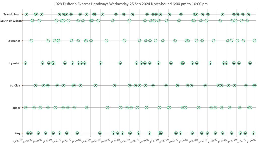
- Both the local and express services suffer from irregular vehicle spacing. The express buses make the journey between King and Wilson about five minutes faster than the locals.
- Severe traffic congestion northbound near Yorkdale in the afternoon affects both the local and express buses.
This is a rather long article with a lot of charts to illustrate how vehicle tracking data can be presented in many ways.
Scheduled Service
The scheduled service levels for the local and express branches on Dufferin are shown below. Note that the service design is for articulated buses in all periods.
There was no service to the loop at Exhibition eastern entrance in September.
Note that Saturday afternoon service is actually more frequent than on weekdays although the local:express balance is different.
| Period | Local Buses/Hour | Express Buses/Hour | Total Buses/Hour |
| Weekday midday and PM Peak | 7.5 | 7.5 | 15 |
| Saturday afternoon | 12 | 6 | 18 |

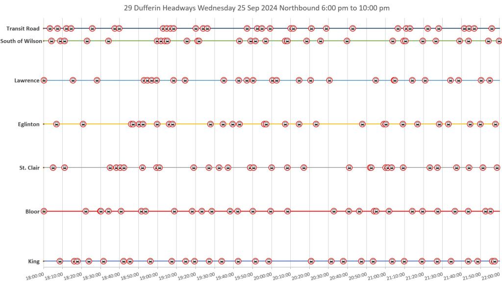
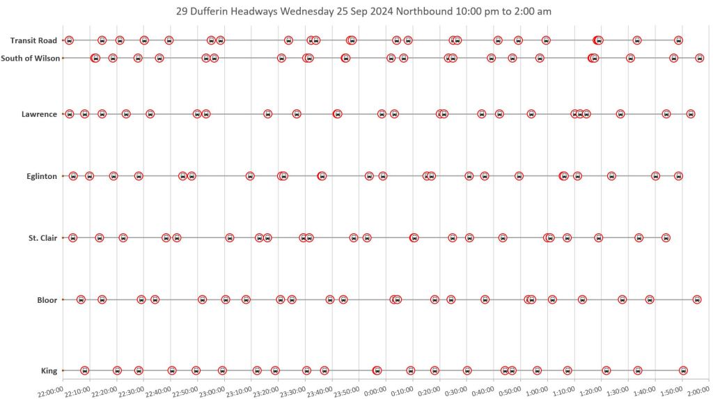
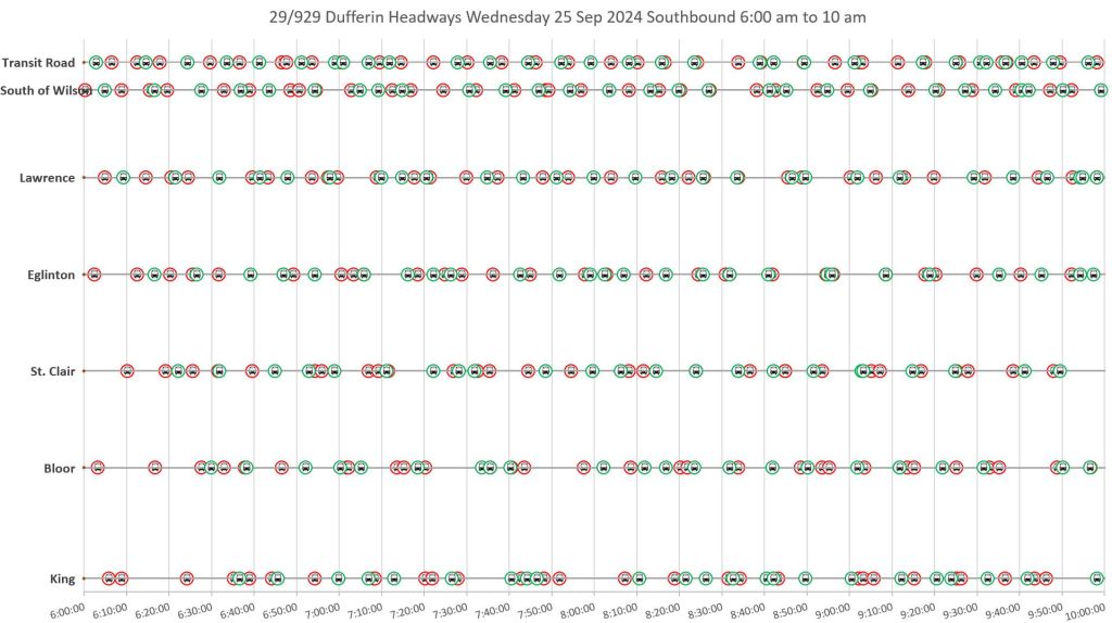
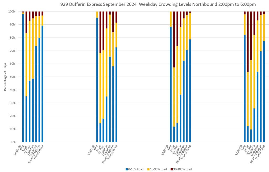
Service and Crowding on Wednesday, September 25, 2024
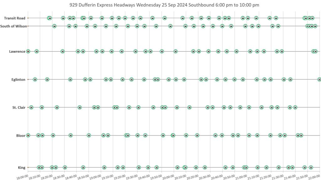
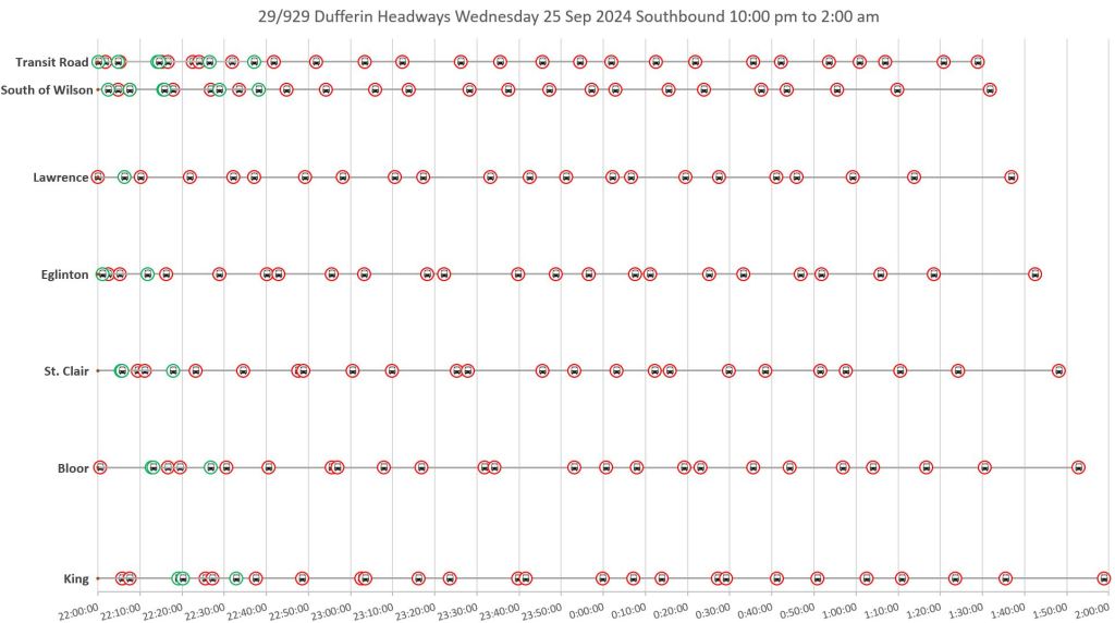
Wednesday was picked as a midweek day, the busiest in the week, and later in the month so that school-based demand is included. The charts below show the operation of the 29 Dufferin (left) and 929 Dufferin Express (right) buses through various periods in the day from 7am to 1am.
The colour and thickness of lines indicates the degree of crowding as measured by the on-board automatic passenger counters. Note that the percentages are relative to the size of articulated buses.
- Blue: 0-10% load
- Dark yellow: 10-90% load
- Dark red: 90-100% load
The yellow and red lines are thicker for emphasis, although this is generally visible if the charts are viewed full size by clicking on them. For a notoriously busy route, there is a lot of “blue” indicating light loads. This is partly due to irregular spacing and partly due to the distribution of demand. This begs the question of the accuracy of the data and whether the automatic passenger counters actually pick up all riders. This has important implications for service planning.
The spacing between the lines shows the gap (or not) between buses. In many case, crowded buses appear after gaps, but sometimes the route is just very busy even with regularly spaced service.
The slope of the lines indicates the vehicle speed. Slower buses and congestion show up as lines that are less vertical than most. This is notable southbound (down to the right) in the period just after the AM peak approaching Lawrence, and particularly northbound between Lawrence and Yorkdale in the PM peak. Stopped buses, notably at terminals, show up as horizontal lines.
This is a one-day sample, but it is typical for the route. The same data are presented in different ways in following charts.


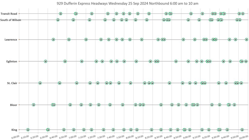
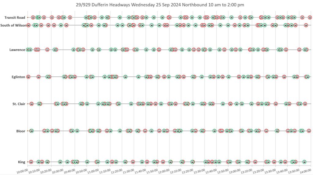
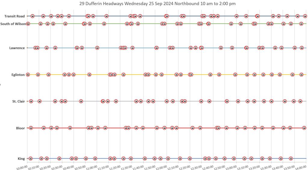
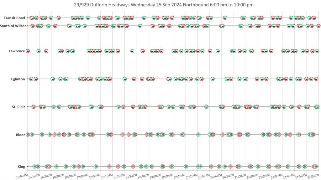
Vehicle spacing
From a rider’s point of view, the gaps between buses and the regularity of service are key factors. Wait time is felt more keenly by riders than on-board travel time, and yet much effort goes to schemes to move buses faster without necessarily improving their reliability. From the King Street project, we know that transit priority can bring more reliable service even if the change in travel time is relatively small on average. Dependability is key.
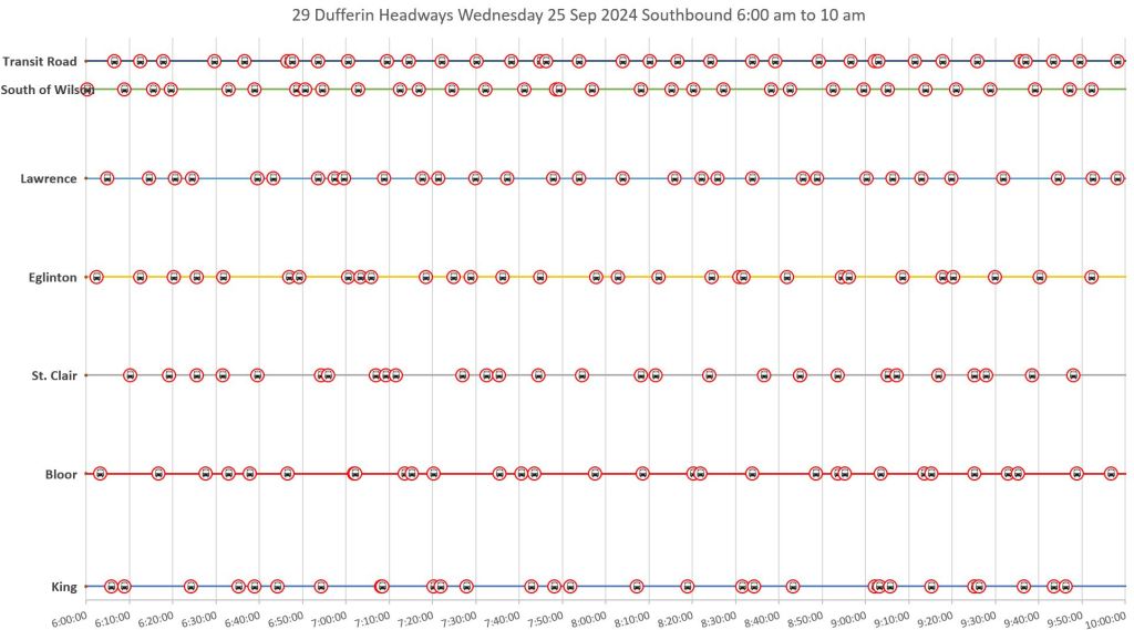
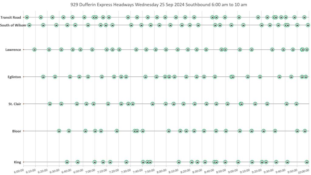
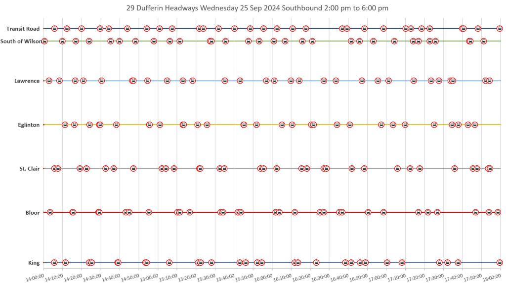
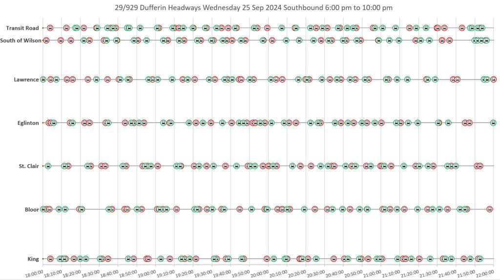
The charts below show the service at major points along the route. The icons show when buses crossed each point, equivalent to the intersection between the diagonal vehicle lines in the charts above and the horizontal location lines. The same progression up to the right for northbound, and down to the right for southbound is visible, but with an emphasis on vehicle spacing.
The data are presented in three columns. On the left, both the local 29 Dufferin buses (red) and the express 929s (green) are plotted together, in effect merging the two columns of charts shown above. If a rider’s trip could use either bus (whichever shows up first), then the service pattern on the left is what they see. However, if their trip begins or ends at a local stop, then only the local buses are available to them, and their service appears in the middle column. Conversely, if they can use an express bus and are willing to wait for one, their service is shown in the right column.
TTC measures service quality (“on time performance”) only at terminals. For the northbound trips originating at the bottom of the charts, the spacing between buses is fairly regular during some parts of the day. However, this deteriorates along the route so that even a few kilometres north at Bloor Street, the service can be more bunched than it was at King. Groups of buses travel together over a considerable distance to the northern terminal at Wilson Station. (Transit Road is used as the screenline at Wilson to avoid confusion with buses looping around the terminal.)
The scheduled headway on both the local and express services is often the same, every 8 minutes (see summary above), but this does not mean that express and local buses leave terminals alternately every four minutes. Even if they did, the expresses would overtake the locals giving an irregular pattern even if service were perfectly on time.
Northbound


Southbound
The pattern for southbound service is similar to what is shown above for northbound. Buses might leave the terminal (top of the charts) on a regular spacing, but it does not take long for bunching to set in and the service experienced over much of the route can be considerably less regular than at Wilson Station.


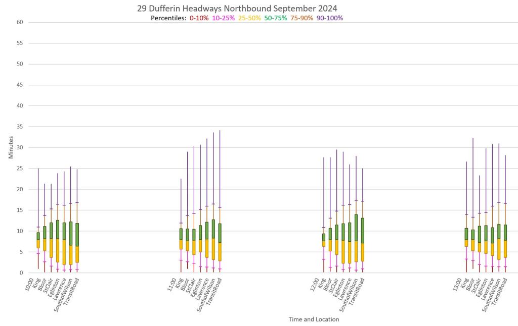
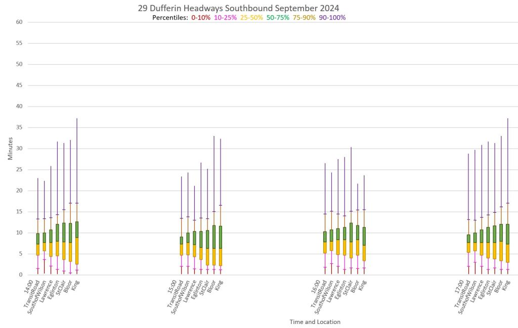
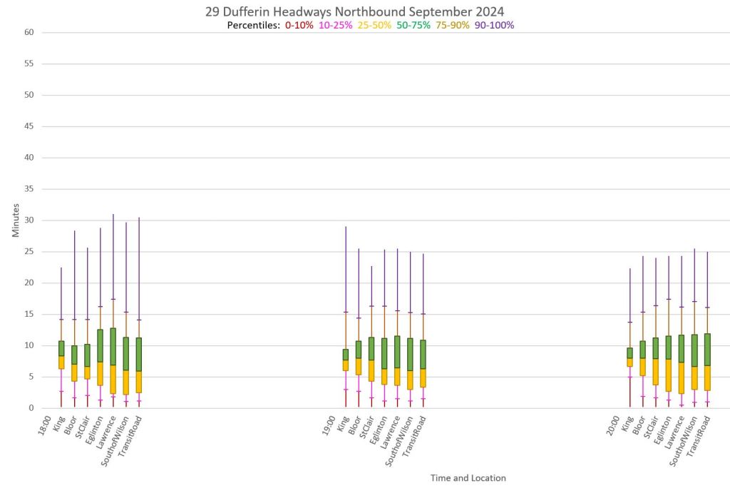
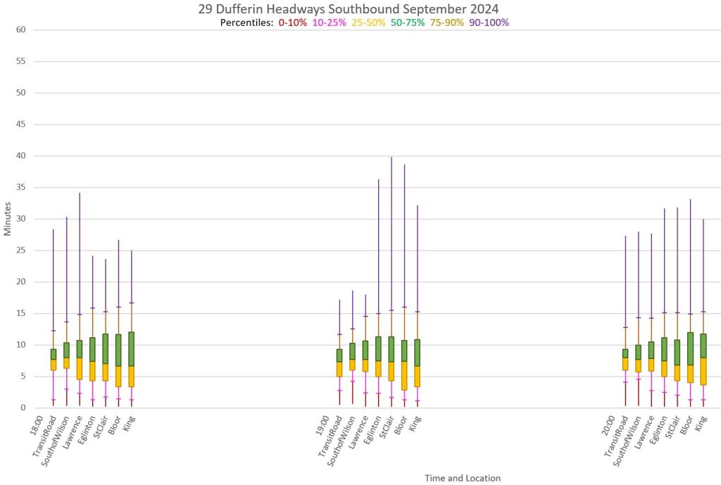
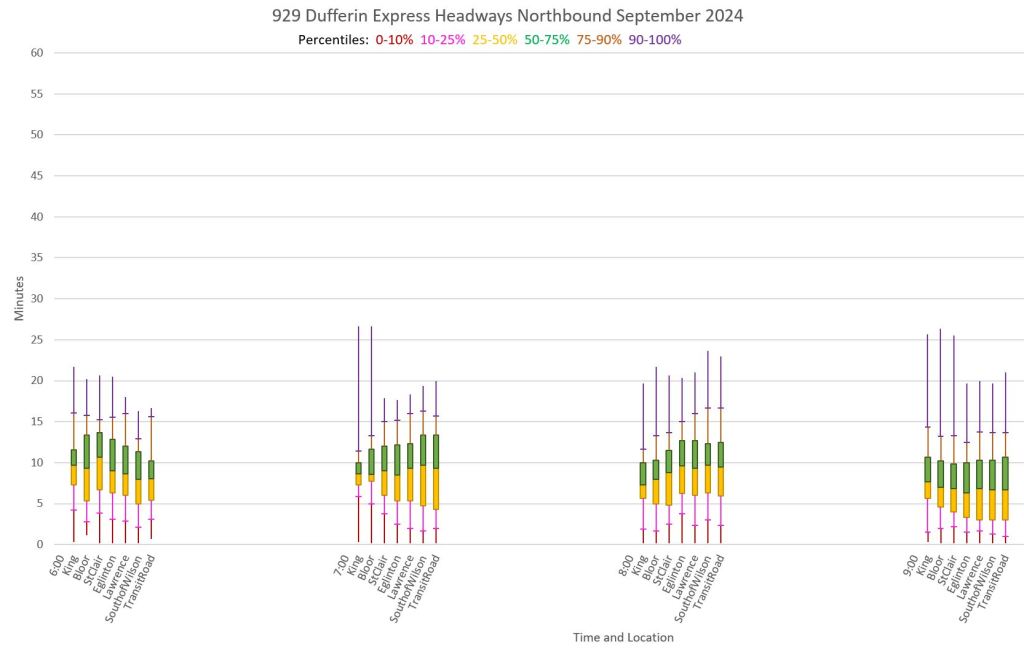
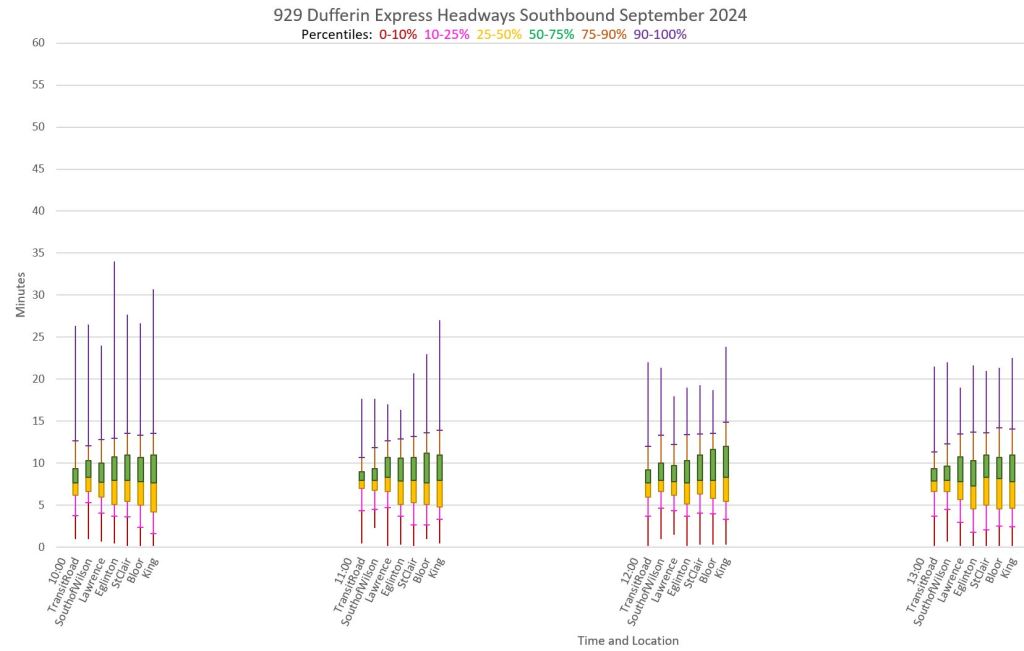
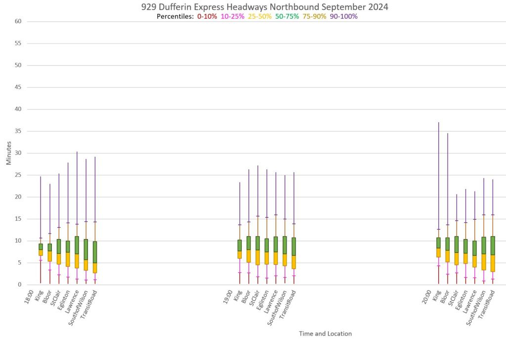
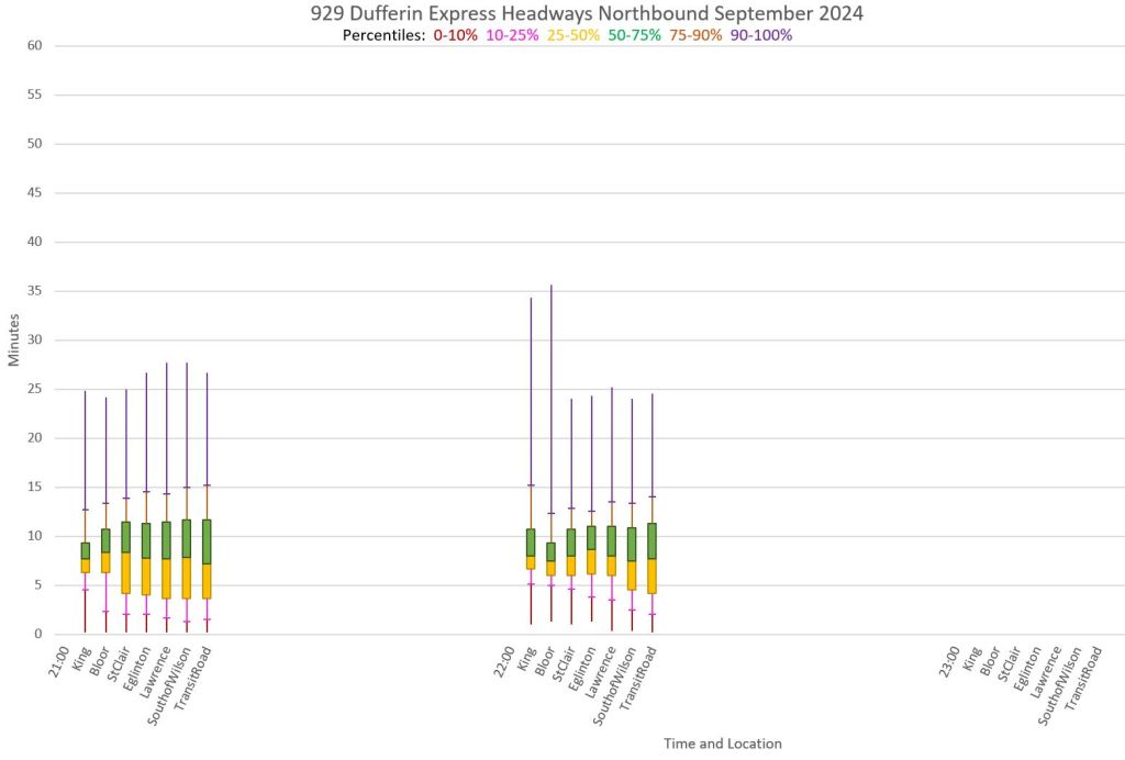
Monthly Headway Summaries
Another way to look at the data on vehicle spacing consolidates information from all weekdays and summarizes it by time-of-day, location, and headway in minutes. The charts below show northbound (left) and southbound (right) service with each group of columns representing one hour, and the individual columns showing the data for one location. (The first charts include only 29 Dufferin local service, and the second set include the 929 Express.)
The middle yellow and green blocks hold the 2nd and 3rd quartiles of values while the “tails” above and below show the 4th and 1st quartiles respectively (with subdivisions for the outer deciles). These show the probability that a rider will encounter a gap of a specific width at the time and location. Half of the actual arrival times lie within the central bands, and the other half above or below it.
Ideally, one would want the central bands to be wide and the tails to be short. This would indicate that even though half of the service was above or below the central range, the divergence was not large. However, the upper tails on these charts reach well into the 20-40 minute range. On the good side, the small bar dividing the 75-90th percentile range from the 90-100th percentile is usually near the bottom of the range indicating that the very wide gaps are rarer, but not unknown.
Putting it another way, the span between the lower bar at the 10th percentile and the upper bar at the 90th encompasses 80% of the service. Only rarely is this anywhere near close to the TTC’s 6-minute variation to “on time” in the standards.
In some cases, the band widens along the route as more vehicles pull close together and corresponding gaps emerge. The upper decile, representing 10% of all trips, routinely lies in the 15-25 minute range. A rider making five daily trips is likely to encounter at least one of these gaps in their weekly travels.
Note that the chance of seeing a short or a long headway will not be evenly distributed among riders. Many will accumulate at a stop during a long gap, while few or none during a short one. Assuming that riders arrive at stops evenly spaced in time (unlike the buses), few will actually experience the short gaps even though they might make up 10% or more of service. Those short gaps represent lost use of capacity, and most riders will see full, not empty, buses. There is a huge difference between service quality presented as average loads and headways with actual conditions on the route.
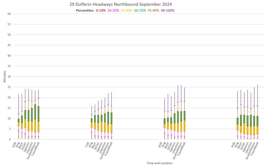
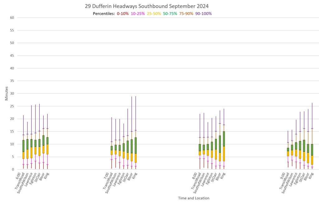


Express Service


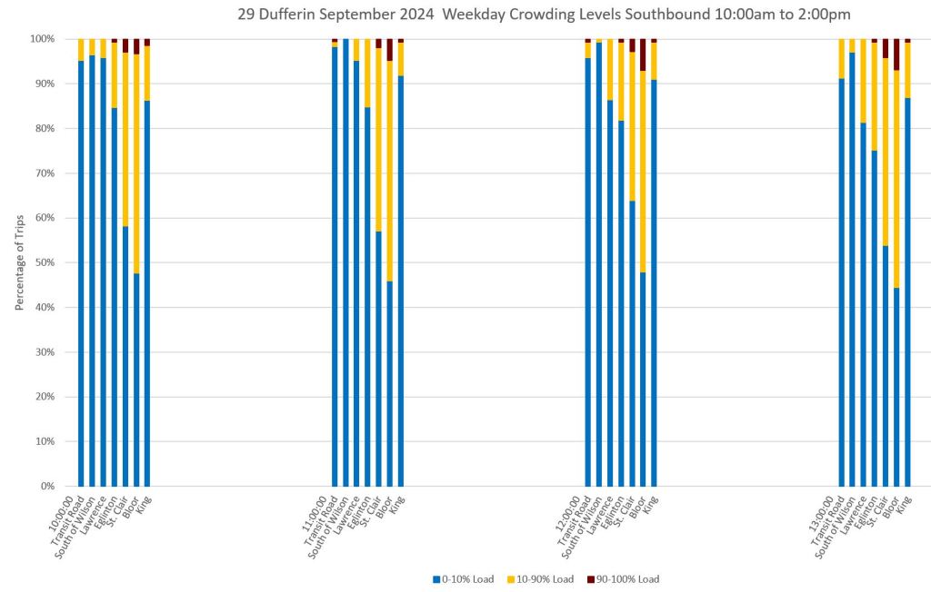
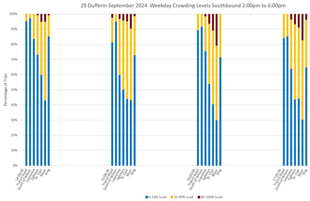
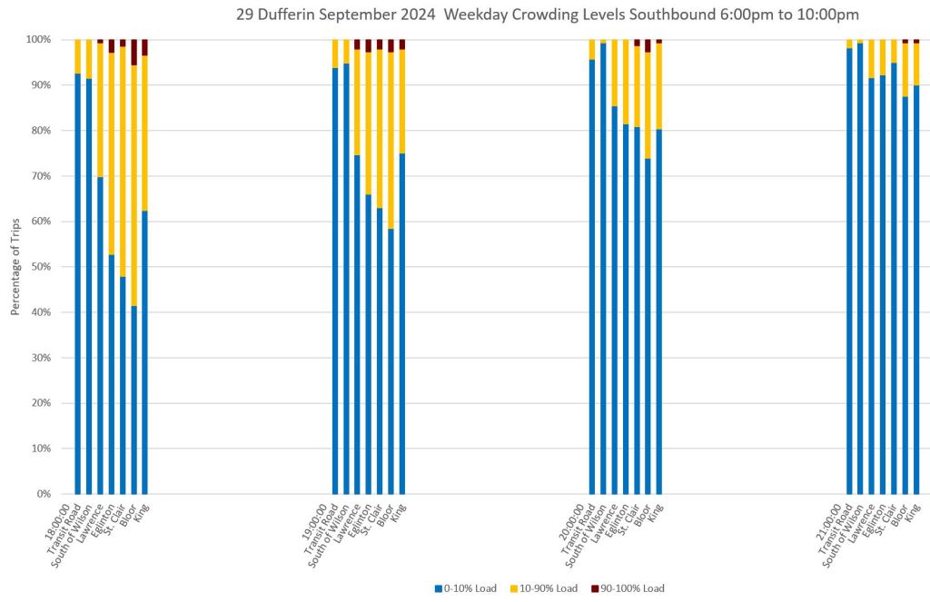
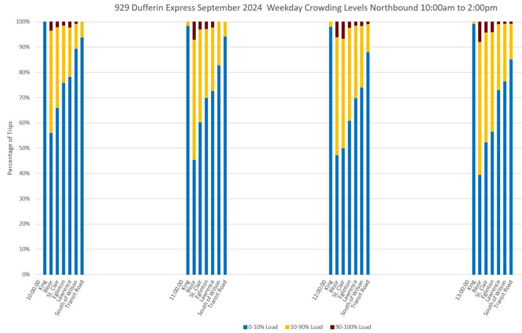
Monthly Crowding Summaries
Just as the headway data can be plotted by time and location, so can the crowding levels. The charts below show the distribution, in percentage, of buses crossing each screenline by time of day and direction. The columns are organized in the same manner as the headway charts above, but to show the contribution of each crowding status (using the TTC’s breakdown) to the total service.
When the blue section of a column is high, then a large proportion of buses are running with few passengers. When the yellow and dark red sections push down into the columns, medium to heavy loads prevail.
Although the number of crowded buses might be a small portion of the total, they have more passengers on them. (I hope to get a more fine-grained breakdown of crowding levels from the TTC so that the yellow 10-90% band can be subdivided at least into seated and standing load ranges.)
The presence of crowded buses outside of the peak period shows how the Service Standard, which call for at worst light standing loads outside of the peak, are not met thanks to pandemic era cuts that have not yet been restored.
Local Service


Express Service
Here are the corresponding charts for the 929 Express service. Note that a greater proportion of express buses are crowded in some periods than the local service above.


Month on a Page Charts
Long-time readers will recognize the chart formats below. I have included them to show yet another presentation, and the one which I used in articles over several years. Each chart has its own strengths and weaknesses. I have included only the 29 Dufferin local data to illustrate how it behaves, but the 929 Express data are similar.
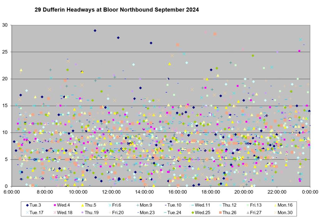
Raw Headway Data
The charts below show all of the headway data (at least the points below 30 minutes) for the 29 Dufferin service northbound at Bloor (left) and southbound at Lawrence (right). These points were chosen to be away from the terminals and at locations of heavy demand on the route.
There is no intent of “analysis” at this level beyond observing that this is not what we would expect from well-regulated, evenly spaced service within a narrow band of “on time” performance.

Another view of the same data is to show the distribution of values in quartiles by hour. Those central blocks of green and blue correspond to the central yellow and green blocks in the monthly headway summaries above. The differences are that the charts below are for only one location, and there is no subdivision of the extremities below the 10th and above the 90th percentile.


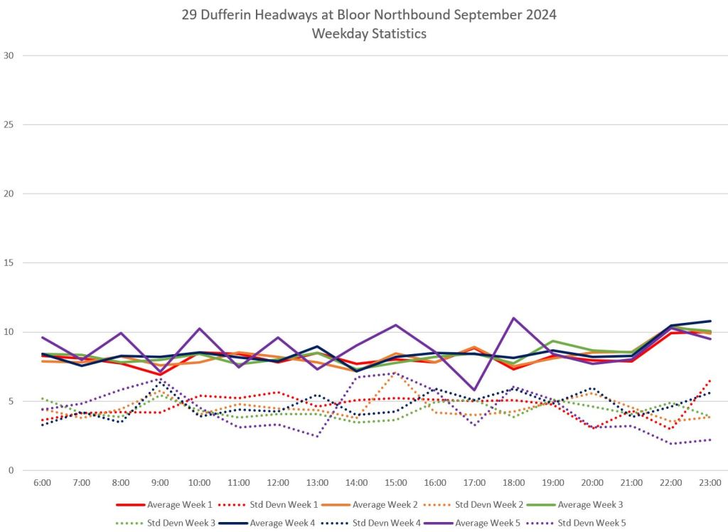
The same data are presented below as averages and standard deviations. The latter show the the degree of scatter of values around the average. Those averages sit at roughly the 8 minute mark which is the scheduled headway on 29 Dufferin for most of the day. However, the SD values are in the 4-6 minute range indicating that about two-thirds of the data lies 8-12 minutes either side of the average. For regular service, it is impossible to achieve an SD of zero because transit service does not run precisely on time, but a lower value would indicate less variation in gaps that riders see.
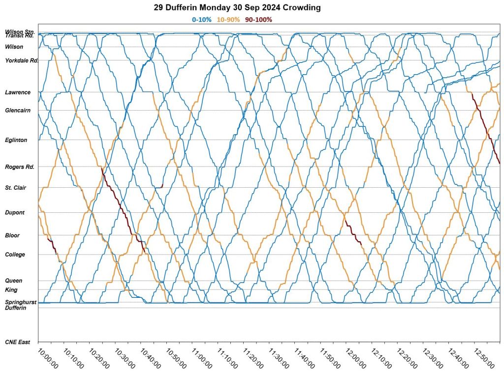
Note that “week 5” here (purple) contains only one day, Monday, September 30, and this was a particularly bad day with severe congestion from noon onward at the north end of the route. Values for the other weeks contain at least four days (“week 1” contains Labour Day which is not included). Despite the wide range of headways shown on the charts above, the average values below lie close to the 8 minute schedule headway. This could erroneously be interpreted to mean that the service was behaving well, when in fact all that this tells us is that all of the scheduled buses showed up, not whether they were well-spaced.

Weekends are not much better. The charts below show the raw data points for all Saturdays and Sundays (Labour Day is included as a “Sunday”) with trend lines interpolated through each day’s data. As on weekdays, the spread of values is much wider than one would hope for with reliable service.

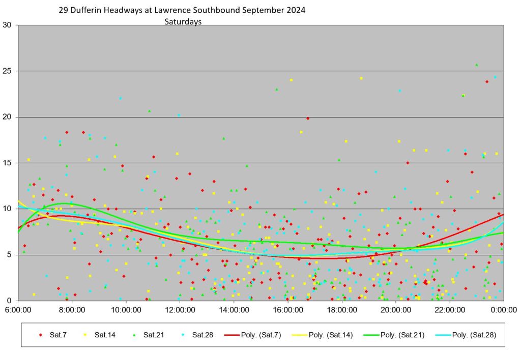

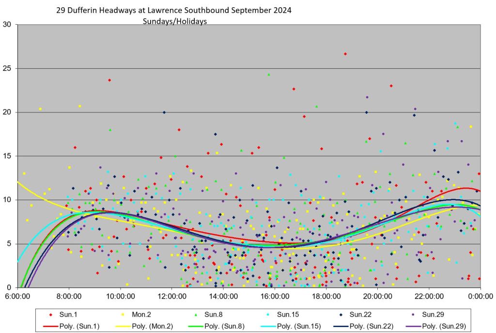
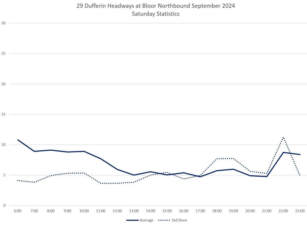
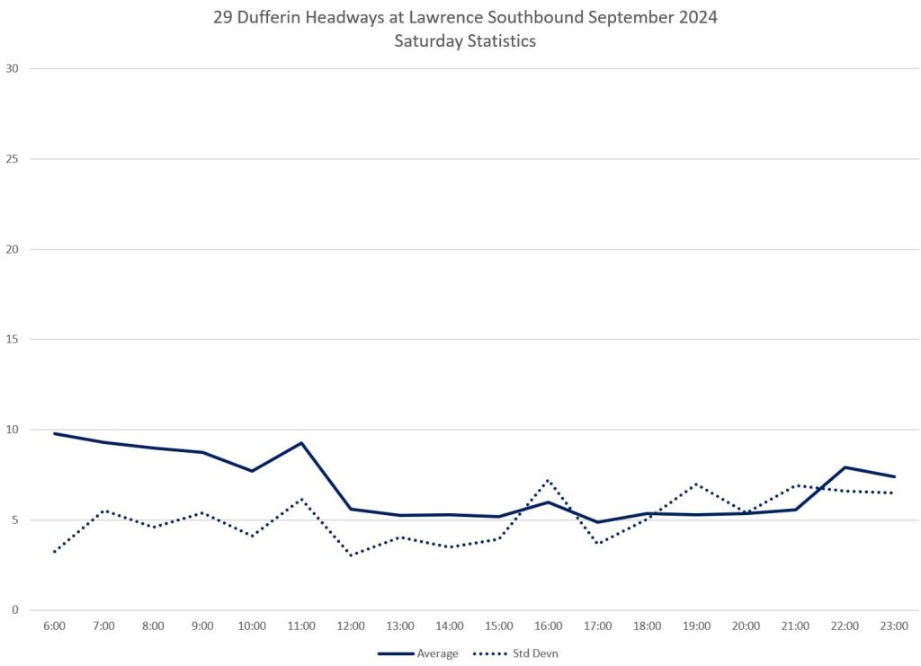
The stats corresponding to these data are shown below. Note that the standard deviation values typically lie close to the averages indicating a severe mix of gaps and bunching.


Travel Times
Travel times between King and Wilson vary over the course of the day, although within most hours they lie in a band about ten minutes wide. There is a striking exception in the northbound data with a prominent rise in travel times between 3 and 5pm, except on September 30th when this peak fell at midday. There is little sign of a peak in southbound travel times.
In the stats chart (lower left) the peak for Week 5 is particularly high because it has only one day’s data without other, less disrupted days, to pull the average down.


This is entirely due to congestion between Lawrence and Wilson at Yorkdale. Here are the stats for that section. There is almost no change in travel times and low values for standard deviations southbound, while the northbound service shows much more variation.
Any “transit priority” scheme for Dufferin that does not address the Yorkdale problem will miss a significant issue on the route.


To illustrate the severity of the problem on September 30, here are the operating charts showing severe congestion from noon onward at the north end of the route. Also visible on this chart is some short-turning through the afternoon in an attempt to regulate service.


Local vs Express
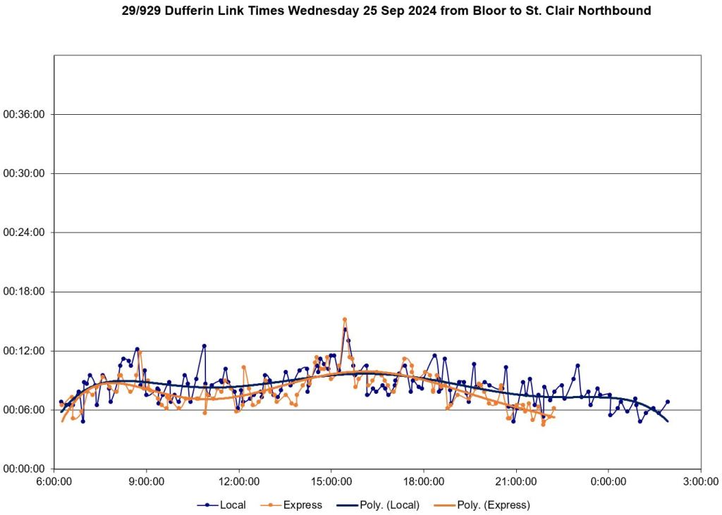
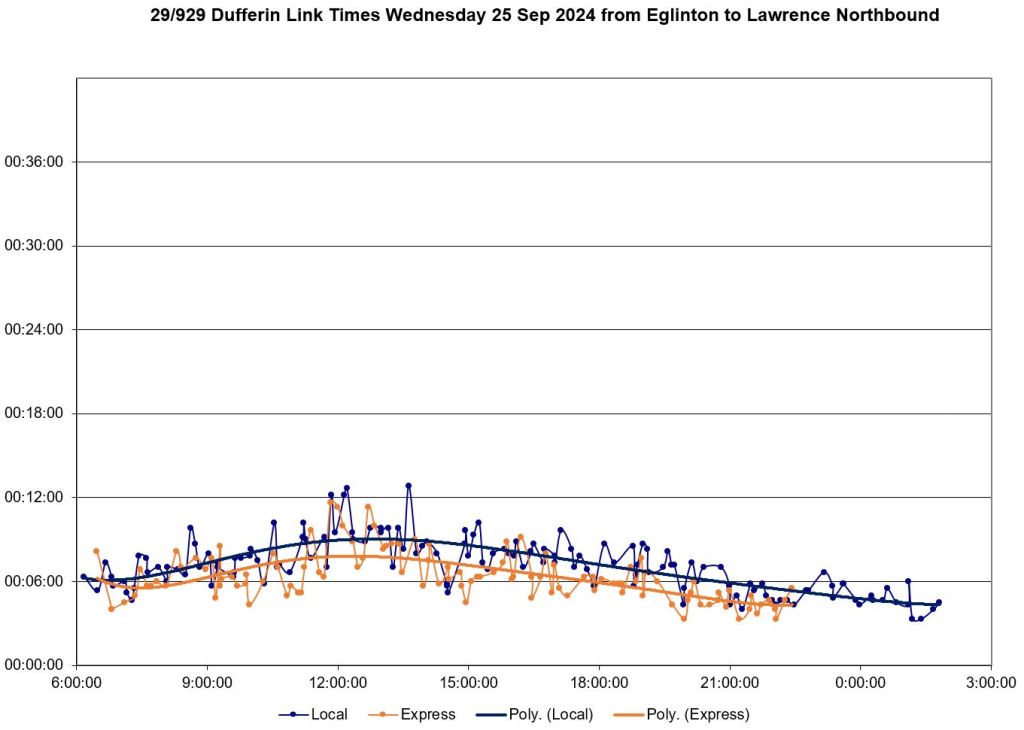
The charts below compare travel times between King and Wilson for the local and express services. There is a roughly five minute difference over the full route.


Updated Nov. 4, 2024 at 6:45am
The charts below show the local and express services on September 25 combined on a single set of charts. Local service is in blue while express is in orange. (I have avoided red/green due to accessibility issues.)
This shows both the uneven spacing of the two services, as well as the degree to which express buses pass locals. I have changed the page layout from letter to legal aspect ratio to give the lines more elbow room.


The charts below compare travel times over route segments for local and express services. The difference in travel time is not consistent over the route, or over time. Northbound trips are on the left, southbound on the right.


If buses (and streetcars) have GPS, do they “talk” to each other? Does run #12 inform the driver that they are closing in to run #11? Does run #12 inform the driver that run #13 and run #14 are 1 and 1 1/2 minutes behind and “appear” to be closing in?
Steve: Yes, sort of, although positional information is based on scheduled times rather than headway management. Also, it’s useless for diversions because the system does not know where cars are supposed to be relative to each other.
Of course, it would help if the GPS tells Toronto Transportation Services to hold the green until run #12 passes the next traffic signal. However, public transit seems to have a lower priority than single-occupant empty private pick-up trucks, of course.
Steve: This is in the works, but I often see references to giving transit priority only when vehicles are late. As I have discussed here many times, “late” is a fictional concept especially for frequent route. Traffic signals should give transit priority all of the time, especially for turns that are routinely used for diversions and short turns, not just for scheduled moves.
Unless Doug Ford’s SUV is approaching the cross traffic and Transportation Service MUST make sure he gets clearance of every else (sarcastic).
LikeLike
I take this route regularly, especially in the non-bike-friendly seasons. These charts mirror my experience. AM rush-hour SB service near Rogers is usually pretty regular until you get to peak school commute time. PM NB service at Bloor is a gong show throughout the rush hour. Your 2024-09-25 PM data a bit before 6pm, showing a 20-min gap in NB service at Bloor followed by four buses arriving within about nine minutes, is typical.
It’s been like this since time immemorial. Nothing ever changes and no-one at the TTC seems to care.
Steve: A point I didn’t mention is that the buses on the 25th seemed to be getting reasonable layover times at Dufferin Loop. The problem is not a too-tight schedule, but that they leave in packs.
LikeLike
The new vehicle spacing charts. A nice feature I didn’t appreciate when you rolled them out: because the 10-minute vertical gridlines mirror the “frequent service” criterion, they make it easy to see times when that criterion isn’t being met.
On this route, those charts also point out places where the combined service is fairly regular, but there are large gaps in local service that are filled by multiple express buses. That’s a frustrating feeling if you need a local bus and all you’re seeing is expresses. On a route like this where the express is identical to the local, just with fewer stops, couldn’t buses be dispatched at the terminals on whatever branch needs to go next, rather than being tied to either the local or express? The travel time express vs local is different, but not that different. (And if local vs. express departures are being that actively monitored and managed, then so are departure times in general.)
Not to add to the lengthy list of charts that you’ve already prepared, but in cases with express and local service, it might be interesting to see a Marey diagram with local (red) and express (green) service combined to see the interaction and level of benefit (if any). You mentioned the 929 is maybe 5 minutes faster end to end than the 29. That’s a nice cumulative benefit if you’re traveling a long distance, and I enjoy that on my regular route, but that’s with skipping many stops along the way. In another recent article you talk about the TTC considering stop removal with one of the rationale being faster travel times. A 5-minute travel time savings over 11 km (say 25 seconds per km) gives an indication of how many stops would need to be removed to achieve a meaningful travel time reduction.
Steve: I have added combined local/express operating charts for September 25 as well as charts showing how travel times over route segments compare for the two services. I agree that the express vs local comparison illustrates what is, or is not, available as a saving from stop elimination. In a future article I will pursue this on other routes.
LikeLike
Is it even worth having Route 929 if only 5 minutes is saved between Wilson and King? Los Angeles Metro used to have a lot of corridors with local and express/rapid routes overlaid and got rid of almost all of them because there was so little time savings on the express and almost everybody just got on the first bus that appeared. Would service be better overall if you maybe took out a few local stops and operated Route 29 only every 2-3 minutes?
Steve: I think this is a route-specific discussion, and plan to look at a selection of such routes in a future article. As for stop removals, it depends on what is meant by “a few” and where this would occur. It is clear from the charts of travel times by route segment that the locals and expresses travel at the same speed for parts of the route. There will also be an issue of how express buses will pass locals if a transit lane is implemented.
LikeLike
I wait at a stop that services only the 29 and the amount of times the 29 South bound bus skips my stop because a) it arrives earlier than the 929 so therefore the bus gets crowded b) the 29 bus between 8-9 comes every 20 min or so.
I use the TTC ride app and I notice that if the 29 arrives at 8:05, there’s no bus for another 20 min and then after it comes every 10-15 minutes. The smaller stops that only have 29 bus stops are SOL every time and it’s absolutely frustrating.
LikeLiked by 1 person
A net savings of 30 sec per km for the 929 suggests that the bottlenecks to speed on this route don’t have to do with the number of stops. That said, that number may also be biased by crowding (e.g., when the 29 gets so full that it operates as a de-facto express bus — which I see sometimes, though it is more of a phenomenon on the 63 it seems).
LikeLike