
First off, an apology to regular readers for the lack of posts in the past week or so. I have been working on new ways to present service reliability data together with information on bus crowding. This is now possible because the TTC includes crowding info in the data I receive from them.
Updated October 21, 2024 at 7:45am:
- The scheduled service levels for 35/935 Jane have been added.
- Charts showing the distribution of weekday headways by hour and location have been added.
TTC service metrics suffer from a lack of detail, and an inability to see what is happening to “my bus” or “my streetcar” as opposed to average service conditions over many hours, weeks and vehicles. Statistics purport to show that average loads and service lie within so-called Service Standards (about which more later) while riders wait glumly for buses that arrive in packs and have little room on board.
In past articles, I have presented charts showing the behaviour of many routes, but there are limitations of how many charts I can publish. With the advantage that I can review all of the data, patterns are more evident than might be the case with only excerpts.
One important pattern is the spacing of vehicles along a route. TTC standards assume that if service is “on time” (itself a rather loose concept) at terminals, the rest of the line will look after itself. Flatly, this is not true, but it is an assumption that lets managers collect gold stars they do not deserve.
Even on days when there is no adverse weather, traffic or special events, tracking data show that a reasonably spaced service might leave a terminal, but can degenerate into pairs (or worse) along the line. Instead of a steady “tick .. tick .. tick” of service promised by the schedule, riders experience “tick …… tick tick ….. tick .. tick ………. tick tick tick” like a drunken clock. All of the promised buses might eventually arrive, but unevenly. Of course, riders in the real world know that even at terminals, departures can be uneven, and this worsens across a route.
This contributes to crowding because the buses in wide gaps tend to have more riders, and the problem compounds as stop service times for these buses rise.
Although the TTC has released vehicle tracking data since 2007, crowding data are much more recent. Initially they showed up in the real-time data feed used by various apps, and now in the archival data I receive each month. This allows analysis of the relationship between vehicle spacing and crowding, as well as a better view of when and where routes are heavily used.
Buses have automatic passenger counters with infrared beams at doorways to keep track of entries and exits. Work to install them on the streetcar fleet is still in progress, and crowding data for streetcars is not yet available.
This article looks at bus tracking data showing crowding levels. This is a preliminary view of 35 Jane to show and explain the new chart formats. In future articles, I will dive into this and other routes in more detail.
If you have suggestions to improve these charts, please leave a comment.
Scheduled Service
The table below shows the scheduled level of service, travel and recovery times, vehicle assignments and scheduled speed for routes 35 Jane and 35 Jane Express.

Service and Crowding Charts
The charts below are based on the same data, but with different colour schemes.
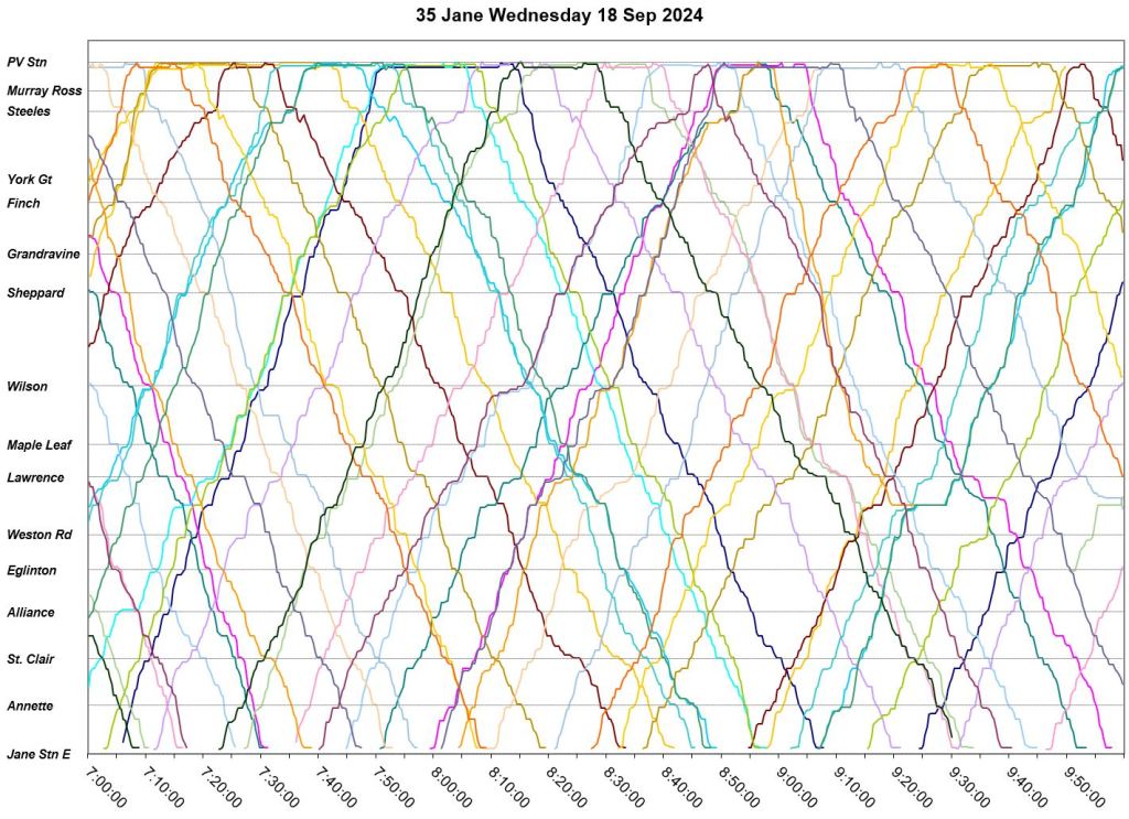
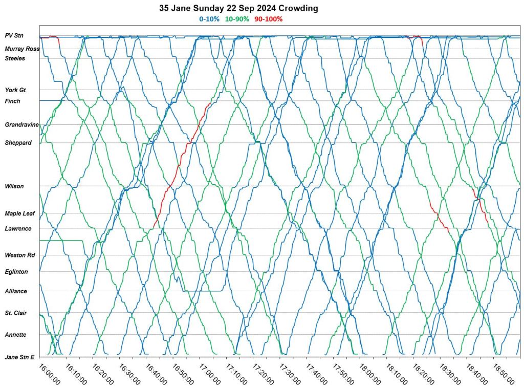
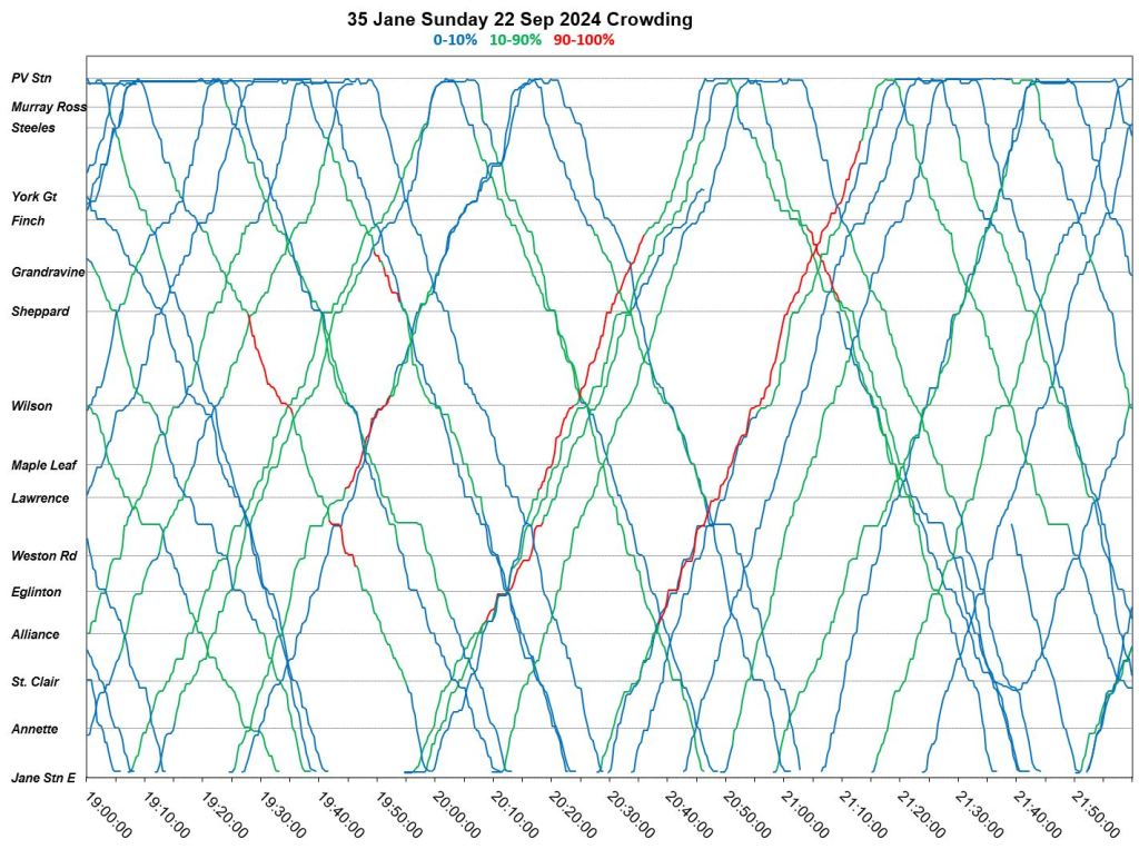
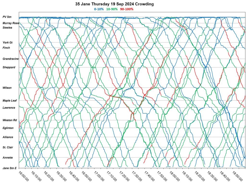
On the left is the type of chart readers here will recognize. It is based on a 19th century technique for drawing railway timetables, and has been used in the industry for a very long time. Each line represents one vehicle and the route is laid out from south to north from the bottom to the top of the image. Colours are randomly assigned to each bus.
Northbound trips are diagonals up to the right, southbound down to the right. The slope of the line is proportional to the vehicle speed. Horizontal lines show stops long enough to appear in successive snapshots of the vehicle locations.
On the right, the lines are colour coded based on the crowding index for each bus. These levels are set by the TTC, the chart colours by me. The percentages are relative to the vehicle’s peak service capacity.
- 0-10% load
- 10-90% load
- 90-100% load
An immediate problem is the large middle section which overlaps the line between a seated and standing load, an important distinction in the service standards where off-peak loads, on average, are supposedly based on seated capacity, or seated plus a small increment.
In any event, the red sections show immediately when and where vehicles are heavily loaded. In the chart below right, we can see that many 35 Jane buses have heavy loads southbound to Jane Station in the AM peak, and that this condition begins generally around Sheppard Ave. Some bunching is evident, but few locations where congestion slows the progress of buses.
In this case, many of the red lines show buses that are fairly well-spaced, and so the crowding is not the result of disorganized service.
Notes:
- The southern terminus of 35 Jane is at Old Mill Station during construction at its “home” station, Jane. The portion of the trip west of Jane Station is not shown in the charts.
- Wednesday, September 18 was chosen here as a mid-week day a few weeks after the resumption of the school year to show representative conditions. The weather was seasonably warm with no precipitation.
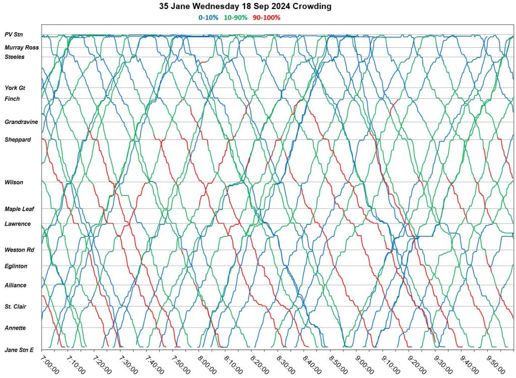
As the day goes on, the situation changes.
10am to 1pm:
- Note that there are data missing for about 10 minutes just after 10 am.
- Most vehicles show light to moderate loads.
- Some bunching is evident northbound although returning headways southbound are more reliable.
- The horizontal lines south of Jane & Lawrence are layovers for crew changes. (35 Jane operates from Mount Dennis division.)
1pm to 4pm:
- Crowded vehicles show up mainly in the central part of the route after 1pm.
- Bunching is more common than earlier in the day and vehicles leave the terminus, particularly Pioneer Village Station in groups later in the afternoon.
4pm to 7pm:
- A delay south of St. Clair just after 4pm held a few vehicles, but they were joined by a pack of five (!) buses to create a northbound parade. This group is only slightly broken up for the return trip southbound. The parade is followed by another northbound gap at about 4:40 and a second cluster of buses shortly later.
- There is some crowding, but not on most vehicles over the route.
- The only visible short turn is one bus turning back north from St. Clair just before 5:20pm.
7pm to 10pm
- The early evening service is largely uncrowded although bunching still occurs.
- There are three short turns southbound at St. Clair that, to varying degrees, achieve the purpose of filling a northbound gap.


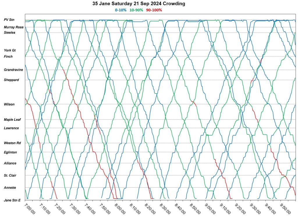
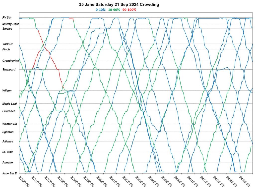
Saturday, September 21
Saturday September 21 has much less crowding than Wednesday the 18th, but noticeably more ragged service with severe bunching and wide gaps that persist late into the evening.
While there is some evidence of service management, several of the bus bunches stay together from one trip to the next with large gaps echoing back and forth on the route.


Sunday, September 22
Sunday, September 22 has less crowding than Saturday, although this is a notable problem northbound early in the day. Bunching worsens as the day goes on, especially in the early evening.


Full Chart Sets
Weekdays, September 16-20
The charts below show how service can differ from day to day. These show the PM peak period for weekdays from September 16-20. The degree of crowding and the locations of delays are not the same in all cases.
- Congestion northbound to Wilson is evident on most days, but is least on Monday.
- Congestion southbound between Wilson and Lawrence is minor early in the week, but much worse on Thursday and Friday.
- The degree of crowding varies from day-to-day.


Charts of Bus Bunching
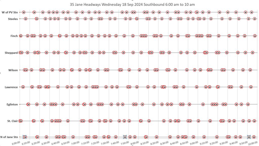
The charts below are drawn from the same data as the vehicle tracking illustrated above, but points representing buses are shown only at major cross-streets. Each circle with a small bus icon represents a bus crossing each screenline, and the spacing between the icons shows the headway (time between vehicles).
Northbound
Service northbound is not perfect to begin with, but the midday chart from 10am-2pm shows how bunches form and worsen along the route. Note that the change from fairly regular spacing at Jane Station becomes bunched a short distance north.
In many cases, buses leave Jane Station quite close to each other, and bunching worsens from there northward.


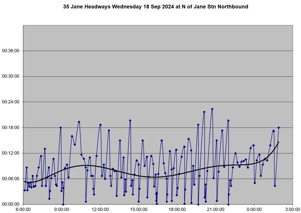
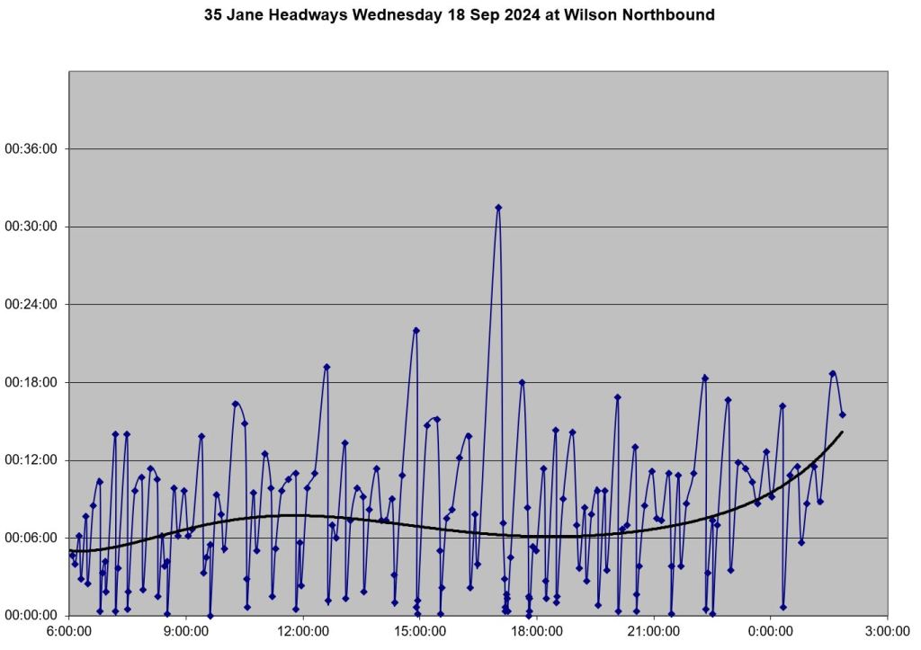
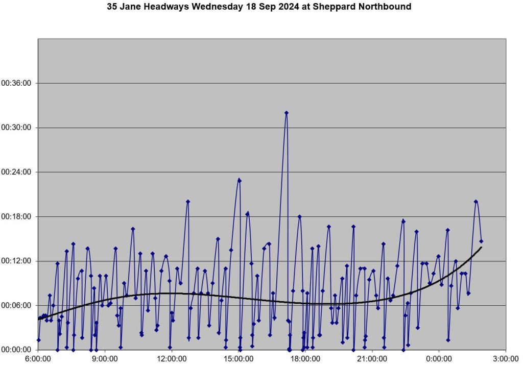
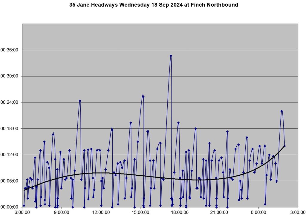
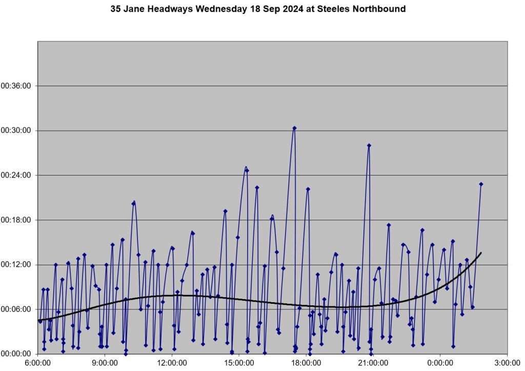
Another way to look at headway data is to plot the headways as numerical values rather than as physical spacing as on the chart above. Here are charts of 35 Jane headways northbound on September 18.
The lines dip down to the x-axis frequently indicating a very short headway and buses travelling together from the terminus. Moving from chart to chart up the line, it becomes spikier with taller peaks showing the evolution of gaps. However, throughout the charts, the trend line plotted through the values does not move much. This is an example of how stats can hide the actual behaviour of data and the service riders experience.


Southbound
Southbound service on 35 Jane behaves similarly to northbound. Even when departures from Pioneer Village Station are regularly spaced, bunching develops as buses move along the line (read top to bottom).


Full chart sets
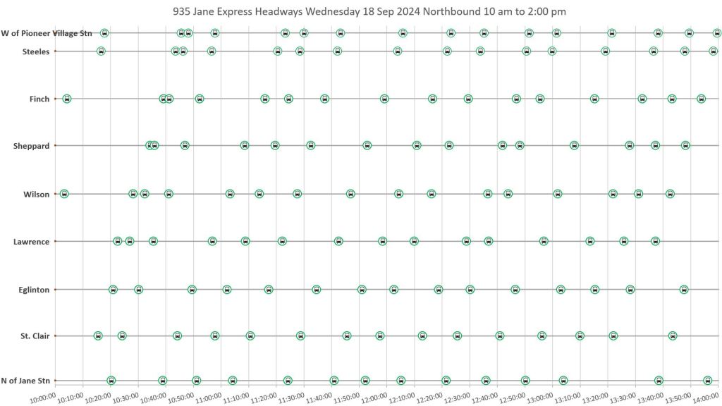
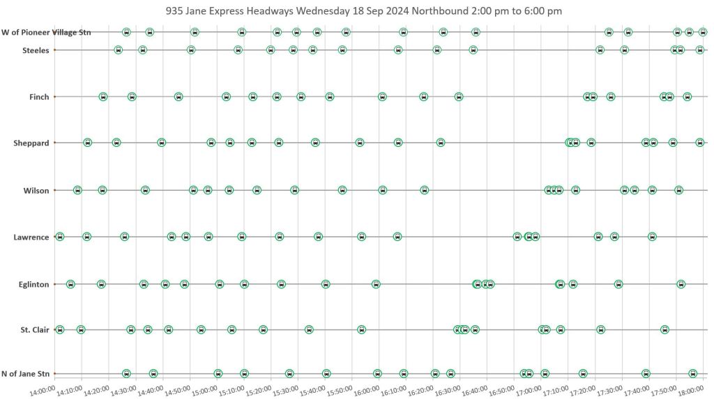
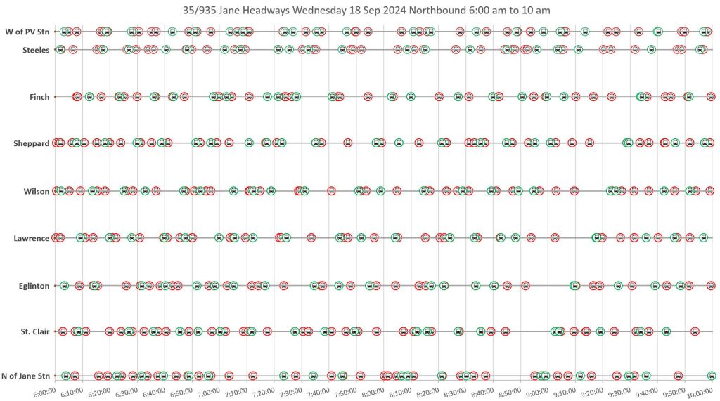
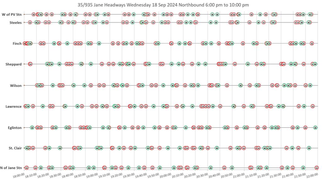
935 Jane Express
The service chart for September 18 shows generally better-behaved service on the 935 Express than on the 35 Local. There is some bunching, notably after the PM peak delay, but this is resolved by selective short turns restoring buses to their proper place in the southbound stream after 5pm. Some buses report crowded conditions, but not as extensively as for the local service above.
An obvious question this raises is whether express services are inherently less vulnerable to bunching than local services which drop out of the traffic flow to serve stops more frequently. Or was September 18 just a “good day” for the 935 Jane Express? This is a topic for a separate article, and with data from multiple routes where express and local operations are mixed on an all-day basis.


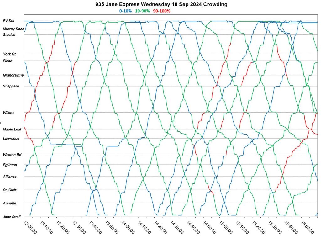


The bus spacing charts for Sept 18 show a service than stays fairly regular all day. There is some bunching, but it usually originates from a terminal rather then developing enroute.
Northbound


Southbound


Full Chart Sets
- Sept 18 Express service/crowding
- Sep 18 Northbound Express spacing
- Sep 18 Southbound Express spacing
Merged Local and Express Vehicle Spacing
The charts presented earlier show only the local or the express service. Both of them operate on the same street, but for riders whose trips begin or end at a local stop, the express buses don’t exist beyond being an annoyance that they cannot use.
One issue for express operation is the layout of local stops and whether express buses have opportunities to pass locals. This is important for reserved lane designs that could be counterproductive if express buses become trapped behind local runs.
The following charts show the combined spacing of express and local services on September 18. Red bus icons on the chart are local trips, and green icons are expresses.
Northbound

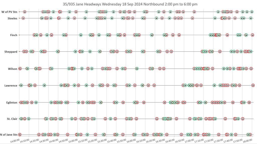

Southbound


Full Chart Sets
TTC Service Standards
The TTC Service Standards set out the goals for service quality and, by implication, reporting metrics.
Crowding standards vary with vehicle type, but in summary aim for a seated load on average during off-peak periods, and allow standing loads during peaks. Note that these numbers are hourly averages, and a mixture of very full and very empty buses can achieve the target even though most riders are on the full buses.
The off-peak standard was suspended by management in the 2023 Budget process, and interim standards for off-peak crowding are only slightly below the peak standards. Restoration of the “average seated load” standard is one possible goal listed in the preliminary 2025 budget report, but it is by no means guaranteed as it will have a cost in service improvements on busy routes,

On-time departures from terminals are the only reliability metric in the monthly CEO’s Report, and even that is rolled up to a system wide average.
To be considered on-time, a vehicle must leave its origin timepoint between 1 minute early and 5 minutes late. TTC’s goal is to have 90% of all trips depart on-time.
There is an arrival time standard at the destination of a trip, but it is very lax and has never appeared in reports of service quality.
To be considered on-time, a vehicle must arrive at its terminal timepoint between 1 minute early and 5 minutes late. TTC’s goal is to have 60% of all trips arrive on-time.
Headway performance standards vary with the frequency of service recognizing that when buses are scheduled close together, riders do not care about a timetable.
| Scheduled Frequency | On-Time Standard |
|---|---|
| Over 10 minutes | From 1 minute early to 5 minutes late, on 60% of all trips. |
| 5 to 10 minutes | Headway deviation no more than 50% of scheduled value, on 60% of all trips. |
| Under 5 minutes | Headway deviation no more than 75% of scheduled value, on 60% of all trips. |
The 60% target gives a huge margin for operating service outside of the standards. This is an all-day average, and it allows 40% of trips to exceed the standard with no distinction of whether they are peak or off-peak trips, nor any specification of where the headways are measured.
There is a standard for “missed trips” defined as any vehicle leaving a terminal more than 20 minutes late (or not at all). This metric has never been reported. It is related to …
Short turns are a bane for riders who suffer from wide gaps on outer parts of routes, and who may be turfed off a vehicle at a poorly sheltered location hoping that a through bus or streetcar will show up soon and with ample room to board. For some years there was an unwritten edict that there shall be no short turns, and this produced as many problems as it allegedly solved. The stats went down, but as I have shown in previous articles, the actual number of short turns has been under-reported versus what can be gleaned from vehicle tracking data.
The CEO’s report lists a monthly count of short turns by mode, but with no breakdown by route or time of day, and the counts are of dubious accuracy.
This is a classic case of TTC Board members complaining about an issue. Management makes it disappear in part by proscribing a valid line management technique, and in part simply by mis-reporting what actually happens.
The Service Standards claim:
While some short turns are necessary, TTC’s goal is to minimize short turns due to schedule and operator issues.
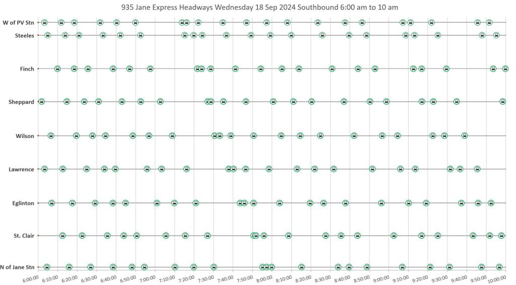
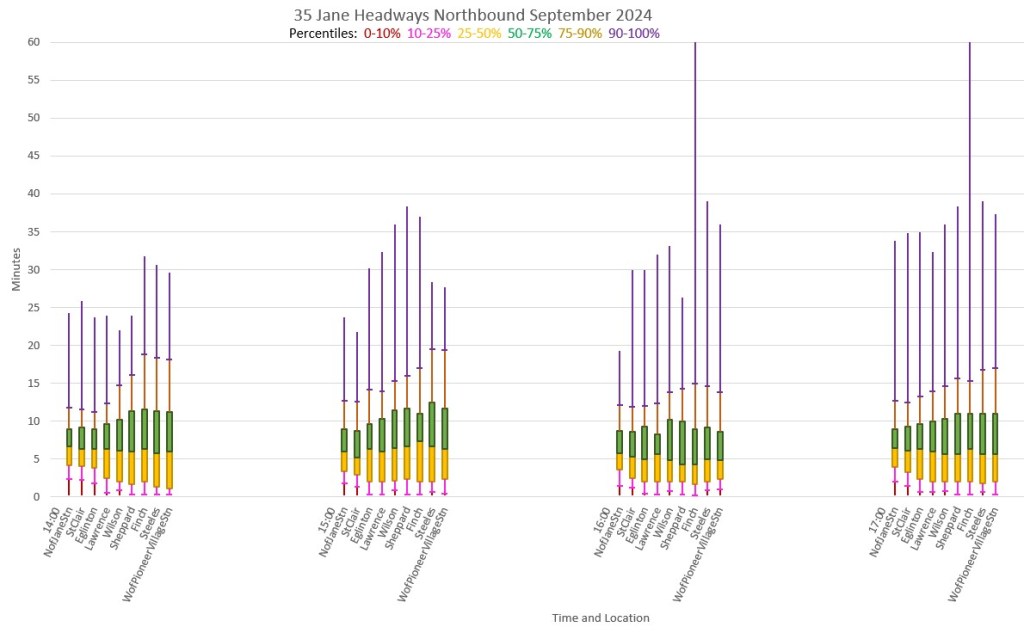
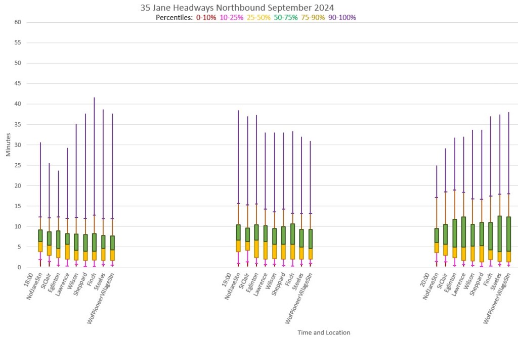
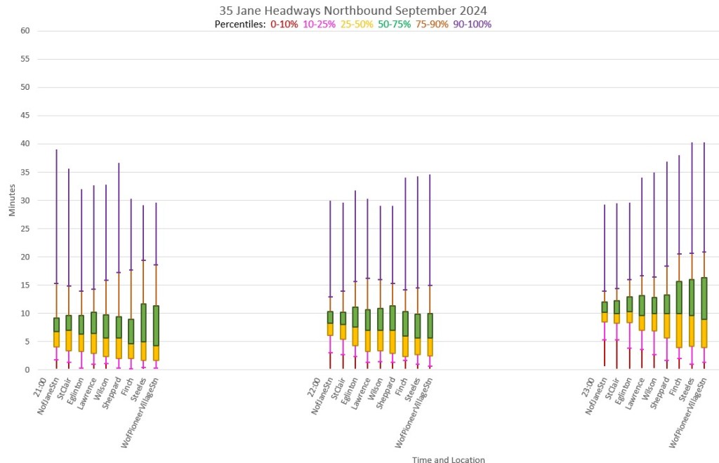
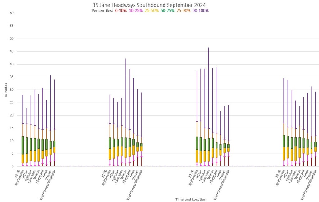
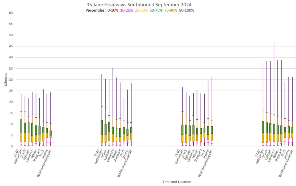
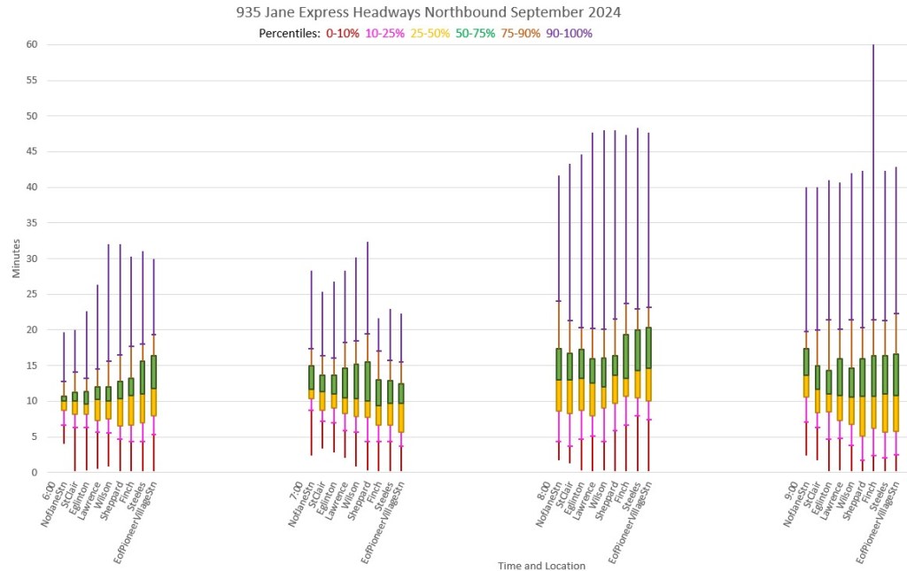
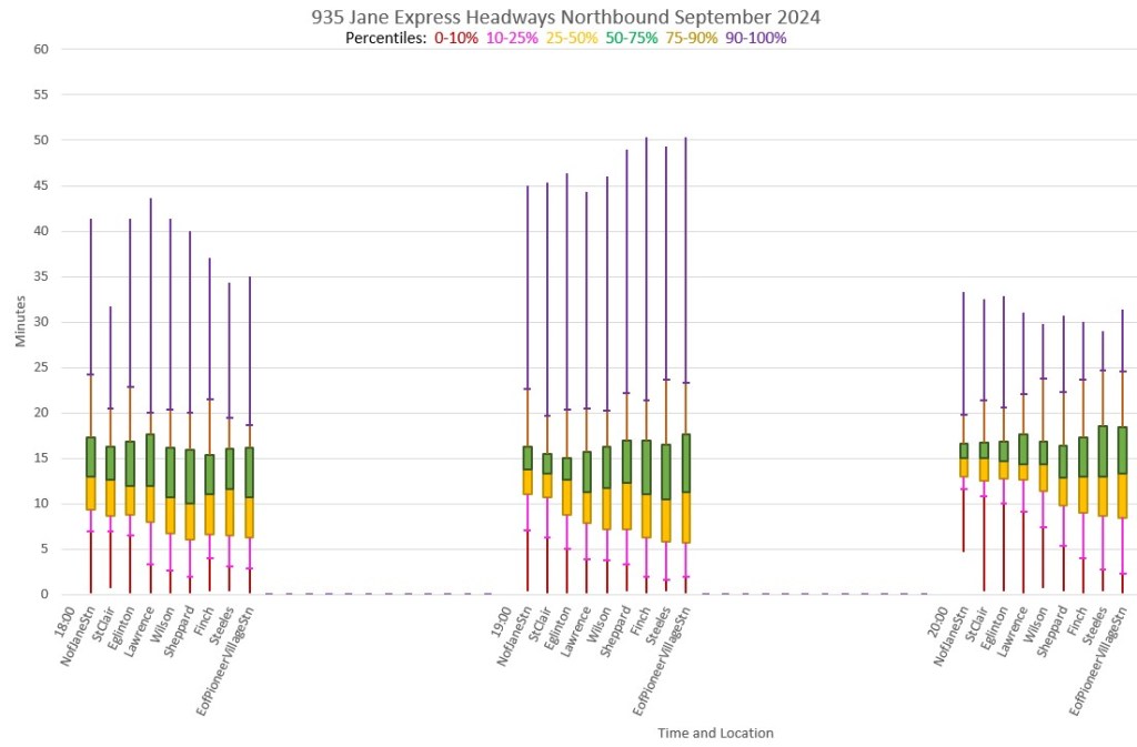
Headway Distribution Charts
The charts in this section illustrate the distribution of weekday headways on the 35 Jane local service.
Each group of columns gives the stats for one hour starting at 6am and running to 11pm. Each column shows the data from one location along the route. The direction of travel is left-to-right for northbound, right-to-left for southbound.
The segments of each column correspond to a range of percentiles showing the data distribution broken into ranges:
- The central yellow and green boxes contain the range from 25th to 75th percentile.
- The lower tails (red and pink) below cover 0-10th and 10th-25th percentiles respectively.
- The upper tails (brown and purple) cover 75th-90th and 90th to 100th percentiles.
The yellow and green boxes represent half of all trips and show the range of headways that riders will encounter half of the time at each hour and location. The tails show the outlying values that will be seen the other half of the time with the lower quartile representing very closely spaced service (bunching) and the upper quartile representing longer headways (gaps).
Depending on the route and time of day, the columns will stretch out as buses move along the route as bunching gets tighter and gaps get wider. Although very wide gaps are not the norm, those purple tails represent 10 per cent of trips indicating that a rider has a 1-in-10 chance of encountering a big gap in their travels.
Note that the charts are scaled with a maximum value of one hour just to fit in the worst case data points.
Northbound


Southbound


935 Jane Express
Northbound


Southbound


Chart Sets

As an operator who works out of McNicoll, I find that management replacing 40 footers with artics does nothing but cause more crowding and more gaps. I’m assuming this was a ploy to save money & to not actually improve service. The 60 footers put the buses behind more and leaves more people at the stops.
LikeLiked by 1 person
Dick: As an operator who works out of McNicoll, I find that management replacing 40 footers with artics does nothing but cause more crowding and more gaps. I’m assuming this was a ploy to save money & to not actually improve service. The 60 footers put the buses behind more and leaves more people at the stops.
The TTC needs to buy more articulated buses and then convert the most crowded routes for exclusive operation by articulated buses. How many articulated buses are currently in service and how many of these are the new ones and which routes are they running on?
Steve: Routes with articulated buses as of the October 2024 schedules: 7 Bathurst, 29/929 Dufferin, 36 Finch West, 939 Finch Express, 941 Keele Express, 953 Steeles East Express, 985 Sheppard East Express, 129 McCowan North (Steeles service), 903 Kennedy/STC Express. 904 Sheppard Kennedy Express, 905 Eglinton East Express, and some all-night services. Peak scheduled vehicles is 159 artics. The current fleet is 152 diesels and 68 hybrids.
This information is available in the Scheduled Service Summary.
LikeLike
I was on a bus this morning that went from “Empty” to “Few Seat Available” when there was about 20 passengers on board. If that is 10% load that would give a total bus load of 200 which doesn’t sound right.
I would be good to get more observational data on what these thresholds actually are.
Steve: I have always wondered just how accurate the automatic passenger counts really are, and whether issues with data quality lie behind the TTC’s reluctance to release detailed numbers rather than broad categorizations of loads.
LikeLike
I do not have experience with the Jane Express, but rather the Keele one. That experience is that at least in the morning and evening the Express buses intentionally shadow behind local buses to a point, Sheppard for South, St Clair for North, then usually skip past the locals to get nearer the next local bus, taking a minimum of passengers with them as they do.
Express were easily half as occupied as locals, if that, and seemed intentionally by many of the drivers to be intentionally quieter runs. The ideal of course would be fuller, moving faster, leaving locals to take less people, stop less frequently and everyone move faster.
I would be curious to see what an investigation into several express routes vs their local routes would show for usage. It would seem if the express were far less used than locals number wise, maybe an adjustment to their plan would be in order.
Steve: Although it is a route-by-route issue, I have often felt that the express buses on some routes would be better used to improve the local service because their headway (assuming it could be trusted, which is another matter) is infrequent enough that waiting for an express will burn up more than the travel time saved.
41/941 Keele is another route that I have looked at and the charts will appear in an article soon. Yes, the express buses do tend to “shadow” the locals.
LikeLike
I see this on the 36 Finch West both ways. Whether it’s the morning (to work) or afternoon (back home). I take screenshots of the clustered times on the Transit Now app so my colleagues don’t think I’m a jerk for being late. I’ll wait at Finch station for up to 20 minutes. 2 of the 3 scheduled buses show up at the same time while the other one must have been taken off route. It’s infuriating to get on a bus full of riders (lots of stops, slows the trip down) while the empty bus flys by.
LikeLike
I’ve belonged to unions my whole adult life, so I have a great deal of sympathy for them. But, in this case, it appears, from the outside, that this problem could be solved by some serious, honest backroom discussion between management and union leadership. It’s a very fundamental problem for a transit company, and it’s shocking to me that no one inside seems to want to even allow that it exists.
LikeLike
Since you’re working on new ways to present the data, I might suggest plotting the numerical headways as a histogram rather than a connected scatter plot. Then you wouldn’t need a separate chart for each stop, you could combine all stops for the route into a single chart.
Steve: I did this some years ago and the results were uneven. Also, the scatter plot moves in time along the x-axis while a histogram is constrained to showing data for one period for each stop. There’s a limit on how many dimensions can be displayed on one image. I may take another run at this if only as part of a post on comparisons in ways to chart the data. I think the histogram would be good for summarizing, say, a whole week’s or month’s data.
LikeLike
The new stringline/Marey charts are nice. Regardless of the information carried by the colors, I find reducing the the number of colors to three makes them much more digestible than the previous versions with an attempt at different color per run.
My suggestion is to avoid red/green distinction for your colorblind viewers. I would suggest one of the sequential, multi-hue color schemes from ColorBrewer, for example.
The directionality of a sequential scheme also makes it easier to remember which color is which.
Steve: Thanks for the suggestion. I will try recolouring the charts to see how they look and will probably publish the next route analysis with the alternate colour scheme. And, yes, I agree that fewer colours do make the charts more readable.
Updated: I have tried using a range of colours in the same family (e.g. taupe as in your linked example), but the difference does not stand out as clearly as fine lines on a white background as opposed to solid areas in your sample. I don’t want to change the background from white so that anyone printing these charts does not chew up ink/toner. I also tried making the lines thicker, but that runs into problems with overlaps (the reason I made them thin in the first place).
LikeLike
The stringline/Marey charts are nice, but so detailed that only three hours are visible at once.
The headway plot makes it easier to see full-day performance. To deal with the issue with the trend line hiding the problems that you point out, I would suggest quantile regression. The R `quantreg` package can do this, and ggplot2 has a `geom_quantile()` geom that will use it.
If you don’t feel like using R, you could roughly approximate this by dividing the data into, say, 20 min bins and plotting the worst headway in the 20 min. Or second-worst if you’re feeling generous.
Probably slightly smoother but more work would be to calculate for every minute of the day how long someone will wait for a vehicle, and then plot the 90th percentile of that for each bin.
Thanks again for these useful analyses!
Steve: You’re welcome! The problem with the granularity you suggest is that there are few data points per “bin” and so the results tend to be “noisy”. Previous attempts I have made at likely waiting time calculations used hourly intervals. Estimated wait time calculations actually go up as the square of the gap because, assuming a uniform arrival rate of would-be riders, more people wait longer as the gap widens. Assuming one arrival per minute:
This can be calculated for the scheduled headways as well as actual, and then the ratio of the two shows the degradation caused by uneven service. The arrival rate really does not matter as it falls out of the calculation in a ratio.
For uniform service of, say, 6 minutes, there are 10 vehicles per hour with a passenger wait time of (6*6/2)*10 = 180 minutes. That’s 3 minutes each for the 60 passengers who accumulate in an hour. (Note that it is possible that the scheduled service itself is uneven over the hour, and so the formula for this base value would be adjusted accordingly.)
For an uneven service of, say 4 and 8 minutes alternating, there are 5 vehicles with a passenger wait time of (4*4/2)*5 = 40 minutes and 5 vehicles with a passenger wait time of (8*8/2)*5 = 160 minutes. Total wait time is 200 minutes, or 11% more than for uniform service.
The ratio gets bigger the wider the swing in headways is. For example, if we go to alternating 3 and 9 minute headways, there are 5 vehicles with a wait time of (3*3/2)*5 = 22.5 minutes, and 5 with a wait time of (9*9/2)*5 = 202.5 minutes, for a total of 225 minutes, or 25% higher than for uniform headways.
In particular, buses on a 1 minute headway contribute almost nothing at all, and buses on wide headways contribute a lot. For example, a single bus in a 20 minute gap contributes 200 wait minutes (20 passengers waiting 10 minutes each on average) all by itself.
There will always be some variation in headways, and so one cannot use the “perfect service” number as a base. The question for service measurement is how wide the allowable swing should be.
A further wrinkle in the calculation is that actual scheduled headways do not necessarily evenly divide into 60 minutes and the numbers can go askew when a bus from hour “1” actually is recorded as part of hour “2”‘s data. Yet another is that buses in wider headways will be more crowded and will suffer greater loading delays, and this will add total trip time for the majority of riders who are on those vehicles.
I’ve been wrestling with the problem of expressing/calculating excess wait time for a while.
LikeLike
Sorry for three comments in a row but keep thinking of new things.
If you can decrease the ink density by having a single trendline for 90th percentile headway performance, you will be able to stack these on top of each other so a single plot will be able to show either multiple stops on a route, or one stop across multiple days.
Steve: There are also schemes using a three dimensional presentation to stack information for successive days/stops behind each other, although there can be problems with the front rows obscuring the back ones.
LikeLike
Re: the TTC’s loading definitions:
The colour coding by passenger load is nice on the surface but the dividing points seem unusual. The middle level is so broad that it almost seems to make the exercise meaningless. Is there something behind 10% (5 riders on a bus) that is internally meaningful? (e.g., maybe they’ll only short turn a bus if it’s less than 10% full?)
At the other end, though, presumably “90-100%” actually means “90% or more”. It *would* be meaningful for them to show buses that exceed the policy capacity and have turned into a rolling sardine can where it takes 30 seconds to try and squeeze in just one more.
To me, a division of loading that matches customer experience might be
– Up to 33% of capactiy — you can generally choose your seat (and have at least a seat buffer space)
– 33% to 67% of capacity — you can generally *get* a seat, even if it’s a less coveted one
– 67% to 100% of capacity — there will be standees but not an unacceptable level
– More than 100% of capacity — the bus is absolutely packed to uncomfortable levels, and to the point where it affects stop times and operators may be leaving passengers behind
Re: the new chart formats:
Although nothing can beat those Marey charts for instantly displaying quality of service, I do like the new headway diagrams, and I like them more than the scatter plots. My initial reaction was that the symbol was too large, that it obscured other buses near the same time. Then it dawned on me that that’s a perfect representation of how you experience a pair (or more) of buses — in terms of waiting times, when they’re that close together, the trailing bus might as well not exist. The only place it doesn’t work is where there’s a conflict between an express and local bus, where that would be a meaningful distinction.
The 10-minute interval vertical gridlines are very helpful especially in cases of longer gaps, and they’d be a nice addition to the Marey charts. The combination of express and local branches on one chart is also a nice addition and is in line with rider experience (is it worthwhile waiting for the express or are you better off just getting on the local).
Steve: Thanks for the feedback. I agree that a more granular definition of load would be preferable, but what I have from TTC is simply that the load falls into one of three ranges defined by the percentages shown. I really would like to see more. One particular division point is at a full seated load as this relates to off-peak crowding standards. That said, we don’t want too many divisions as the chart will become a riot of differently coloured trip segments. My main intent was to flag crowded trips and show, to the degree this occurs, how they are often in the wake of a gap. By extension, if the service ran more reliably, there would be less crowding assuming that the overall frequency was sufficient to the demand.
On the subject of the icon used in the headway diagrams, this is in part to make them friendlier to a general audience rather than just a dot.
Re vertical reference lines on the Marey charts, I will have a look at this, but suspect every ten minutes might be a bit much on what is already a busier chart than the headways.
LikeLike
Hi Steve, it has been almost 3 years since your great E-buses usage analysis articles and things have changed a lot. Some flyers migrated to the east, more proterra languished, and BYDs being dispatched on longer runs and even overnight OT (one was on 329 last Friday). Just wondering if you have info/data and would like to review how the trial series perform nowadays as well as how divisions utilize their e-fleet after years of operation, since we are about to see more and more E-buses in the coming future. Thanks!
Steve: I reviewed bus fleet usage in January 2024 here. You can see there that the high end of the trial fleet was at or below most of the diesel/hybrid fleet. Also some buses rarely left the garage. Until there is a substantial number of new “production” (as opposed to test) vehicles in use, I am not planning an update. There is, however, a need for the TTC to be much more transparent about the reliability of the various subfleets of buses. “Stats” in the CEO’s report hide a lot.
LikeLike
It would be interesting to see what conditions the lead bus is facing in those situations when bunching gets severe.
I assume the TTC buses all have forward-facing cameras these days—I assume they don’t actually analyze the recordings, but do you know if that’s something that could be released under FOI?
Steve: Forward facing cameras? Not yet, and there is some question of the use they will be able to make of the images captured. In any event, many of the gaps shown originate at terminals where conditions in front of the bus are not an issue, or at times with little traffic effect. This is visible in the absence of a change in the slope of many of the lines on the chart which show chronic congestion in specific areas.
The recordings made on transit vehicles are released only for law enforcement purposes, and an FOI would likely fail. In any event it would be a vast amount of data to review, and it is much simpler to look at the tracking data to see how the route behaves.
LikeLike