
The Toronto Region Board of Trade recently published a review of municipal transit systems against an overall set of targets. Intriguingly, this document goes by two names:
- Needs Improvement: Toronto Region Transit Report Cards is the title cited on the main announcement page for this report.
- Needs Improvement: Getting to World-Class Transit is the actual title on page 1 of the report itself.
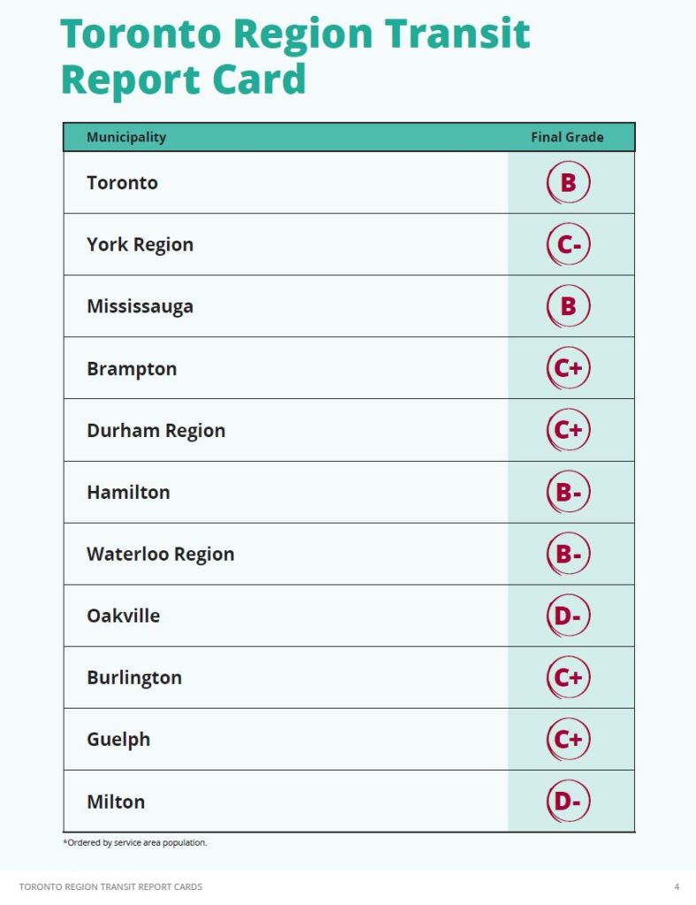
To little surprise, the most mature among the municipal systems received the highest grades: Toronto, Mississauga, Hamilton and Waterloo Region. The challenge with any grading system, assuming that it is uniformly applied, is the structure and goals used in any evaluation.
Updated July 12 at 11:10pm: Comments by Darwin O’Connor of TransSee.ca regarding reliability metrics are now reflected in the text of this article.
Updated July 10, 2023 at 3:00 pm: The City of Guelph had their grade upped from a D+ in the original rankings to a C+ based on service reliability which is quite high on that system. This raises a few key questions:
- Was the “reliability” metric cited by Guelph the same as the one used by the Board of Trade for other systems? Just what does Guelph’s claimed reliability score of 88% mean?
- (Updated) Darwin O’Connor, who calculated the reliability metrics for the Board of Trade Report, advises that he also provided the Guelph score and used the same methodology as for other cities where tracking data were available.
- Reliability counts for 35% of the total mark. Was Guelph scored zero on this simply because the Board of Trade didn’t have service tracking data for them?
- Reliability data are also listed as “Not Available” for Oakville and Milton. Considering that neither of them has a 15 minute service area, awarding them substantial marks for being “on time” with what they do run would be boost that might not be fairly earned.
- (Updated) O’Connor replies: “TransSee is unable to provide reliability data for Oakville because their API doesn’t have a method to get all vehicle locations at once. I also didn’t have tracking data for Milton because my data source is unofficial. I expect if it was included they would get a better mark like Guelph did.”
If anything, this gaffe reveals sloppiness in the Board’s methodology and the typical problem of looking only at the high level summary without poking “under the covers” to verify the results. The Board of Trade should try harder for accuracy and completeness on their next transit outing.
See also Global News coverage of this change.
The Board regards the ability to move workers, students and residents as an important economic goal, and the absence of good transit as a drag on the region’s economy.
“Improving transit is critical to addressing our reputation as North America’s third-most congested city – a key barrier to the economic competitiveness of our region,” said Jan De Silva, President & CEO of the Toronto Region Board of Trade. “These report cards highlight where we’re falling short and, as a result, what we can look to as we seek to provide a world class transit network that will better-connect workers to jobs, students to school, and residents to their lives.”
TRBOT Media Release, July 5, 2023
There is a fundamental difference between a mere evaluation of our transit systems versus each other, and one that would qualify systems as “world class”. That term sets a much higher threshold, and there is no sense that the Board of Trade took this into account when constructing its grading system.
Updated July 10, 2023 at 3pm: The chart below is the revised version showing Guelph with a C+ grade.
“Getting to an A” is the premise behind the review, but much less clear is whether that “A” will actually bring the type of transit network and service to be truly competitive, to be “world class”.
The Board acknowledges the limitations of its review and notes that some conditions “are the result of a historical lack of investment and operational resources”. That is a delicate way of saying that transit has not been a priority at the political and social level. As population and travel growth shift the emphasis toward transit, “… suburban cities now find themselves pressured to stand up an urban-quality transit system that helps residents move within and throughout the region …”.
Key findings include:
- The combination of network coverage (where there are routes close to people and destinations) and service is poor in most of the region.
- Service reliability is particularly bad in Toronto with only 58% of trips meeting an “on time” standard.
Another important factor is that a line on a map does not guarantee good service, or service at the time and to the destination a rider might require. GO Transit, a system notably absent from the Board’s analysis, looks good on a map, but not quite so good on the timetable.
For an organization like the Board of Trade, this is a rare recognition that transit is more than a handful of high profile construction projects. A dominant car-oriented culture led directly to the congestion that bedevils the region. Cars enable travel throughout the region, but a corresponding web of transit service never developed. Our collective focus on big ticket projects to support commuting traffic primarily to Toronto’s core left other travel to lower-quality bus service, if that.
In all the hoopla about billions in “transit investment” we forget that over a decade ago the Metrolinx regional plan clearly showed that their proposed network would at best keep congestion from worsening, but would not relieve the underlying problem.
In this article, I will review the scoring system and the goals it seeks to achieve, what the Board considers worthy of an “A” grade. Are we aiming high, or is our definition of “world class” merely good enough to remove some of the more embarrassing gaps in our region’s transit network?
For those wanting the answer up front, no, I believe that the Board, and by extension the political voices they represent, are aiming low. Either they would give everyone an “A” grade for middling improvements, or they would be forced to admit that “world class” is out of reach.
The target for “frequent” transit service is not exactly high. If we were evaluating a road network on a similar basis, we would be happy with two lane roads on a roughly 1.6km grid. That would be a square from roughly Bloor to Dundas, and from Yonge to a bit west of Spadina. The roads would only require capacity for 200 people/hour each way equivalent to four full buses on a 15 minute headway. Some roads would close every evening and all weekend.
That is hardly a “World Class” transit service. The target coverage and service level befit a rural area with cows and sheep grazing by the roadside, not an urban transit system. This target understates the true shortfall in transit as a viable travel alternative.
How To Score A Transit System
For their analysis, the Board of Trade assigned weights to various factors just as one might find in any study (environmental assessments and “business cases” are notorious for this sort of thing). These weights and factors tell us what the Board values in a transit system.
Coverage and Frequency
Fully 40% is devoted to route coverage and frequency of service. The physical metric is an 800m walk from jobs and residents to transit. Notably absent are other major groups of riders and destinations such as students, academic institutions, hospitals and community centres.
The span of service is only 7am to 7pm weekdays. Base coverage is every 30 minutes or better, and “frequent” is 15 minutes or better. The assumption is that these are a surrogate for something more, but there is no penalty for a system with only the bare minimum. The shift in transit demand in recent years has shown the importance of off-peak travel, but the Board’s scoring system ignores this.
This is a key blind spot in the evaluation, and by extension the goals for transit systems. The report often cites the need for “24 hour service” to support the shift economy, but does not acknowledge that transit and travel demand exist for far more than getting people to and from work. A common observation among transit systems is that off peak travel has recovered post-pandemic to a higher level than peak travel because it is not affected as much by work-from-home travel changes. This speaks to demand that supports economic activity, a key Board focus, beyond getting workers to and from their jobs.
The table below summarizes the coverage and frequency data for systems around the region. These figures show the huge gap between the mere presence of lines on a map (“walking distance to a transit route”) and service levels at a 15 or 30 minute level. Again, note that “all day” service only applies to the 7am to 7pm window, and these values would be considerably worse if the span of service were extended into evenings and weekends.
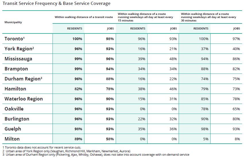
Coverage gets 20% of the total score and is proportionate to the population and jobs in walking distance of a base service level (the rightmost pair of columns above). The next 20% is for the proportion who get frequent service (the middle pair of columns).
As an example of the importance of “frequent” service, the Board cites the Union-Pearson Express train, but with selective memory ignoring the effect of a substantial reduction in fares.
When UP Express was introduced, it increased service to Weston and Bloor stations from limited peak period trips to 15-minute trains all day in both directions. Ridership increased from 653 per day at Weston and 353 per day at Bloor in 2014 to 1,827 and 2,231, respectively, in 2019—at Bloor, that’s a 532% increase!
The Board summarizes the challenge of regional travel and the mismatch between service on offer and travel needs:
Many trips in the region are only served by local bus routes, which can mean very long travel times when typical suburban commute distances—in excess of 10 km—are taken into account. This can result in one-way commutes of well over an hour, and many potential commutes, like from Scarborough to industrial areas in Brampton and Mississauga, are next-to-impossible. Express routes—notably GO Transit service—tend to be geared to commutes to downtown Toronto, making them difficult to use for people with other destinations.
[…]
Very infrequent service also makes connections challenging, limiting accessible destinations to the ones that happen to be on a passenger’s local route. Nobody wants to stand on a suburban street corner for 45 minutes waiting for a connection, particularly in harsh weather.
These distinctions are important because despite encouraging progress, many residents of the region still can’t count on transit for their daily travel needs. This limits access to jobs, services, and other amenities. It also limits employers’ access to talent. All told, this means reduced economic productivity. Longer-term rebalancing of the system away from peak period commuting toward all-day, bidirectional journeys has significant potential to increase overall utilization and efficiency.
Reliability
The next 35% goes to reliability, and the Board of Trade strikes a blow against the received wisdom of Toronto’s transit.
For service every 10 minutes or less, their metric is that the gap between vehicles should be within 40% of the scheduled value. In other words, for a bus due to arrive every 10 minutes, the gap can be no greater than 14 minutes. The leeway drops with the scheduled headway, and so a bus scheduled every 5 minutes should show up in no more than 7. Where the headway is over ten minutes, there is a hard limit of four minutes relative to the scheduled headway.
This is a very different view of acceptable transit compared with the TTC on a few points:
- The metric is relative to scheduled intervals between buses, not to “on time performance” (see below).
- The metric is tighter for very frequent service, and there is a smaller upper bound on headway deviation for less frequent service.
- The metric applies to all trips without an escape clause allowing up to 40% of trips to be outside the target. The proportion of trips outside the bounds affects how many of the 35 points a system gets.
There is an extensive table of route-level performance compiled by Darwin O’Connor of transsee.ca. It is summarized by system below. The column headings are potentially misleading.
- “On Time Percentage” is actually the proportion of trips meeting the Board’s metric. This is not the same as being “on time”. Indeed for transit service better than every 15 minutes, riders tend to just show up rather than timing their arrival at stops to a schedule. It is the gap, and the reliability of that gap, that riders perceive as being “on time”.
- “Frequent Service Percentage”. It is not clear whether the cutoff point for this is the under-over 10 minute dividing line in the Board’s metrics, or the 0-15 and 15-30 minute bands they apply to their coverage and frequent service calculation.
- “Arrivals”. It is not clear where the measurement is taken for each route, and headway reliability can vary a lot between terminal departures (where it might be regulated by formal dispatching) and points along a route.
- (Updated) Darwin O’Connor advises that “The “Arrivals” column is the number of vehicle stops measured.” This creates a weighting problem in that, roughly speaking, the number of stops, and hence the number of arrivals measured will be greater for longer routes with frequent service. O’Connor also confirmed that his screenline for “Frequent Service” is at the 10 minute mark, not the 15 minute value used by the Board for service coverage.
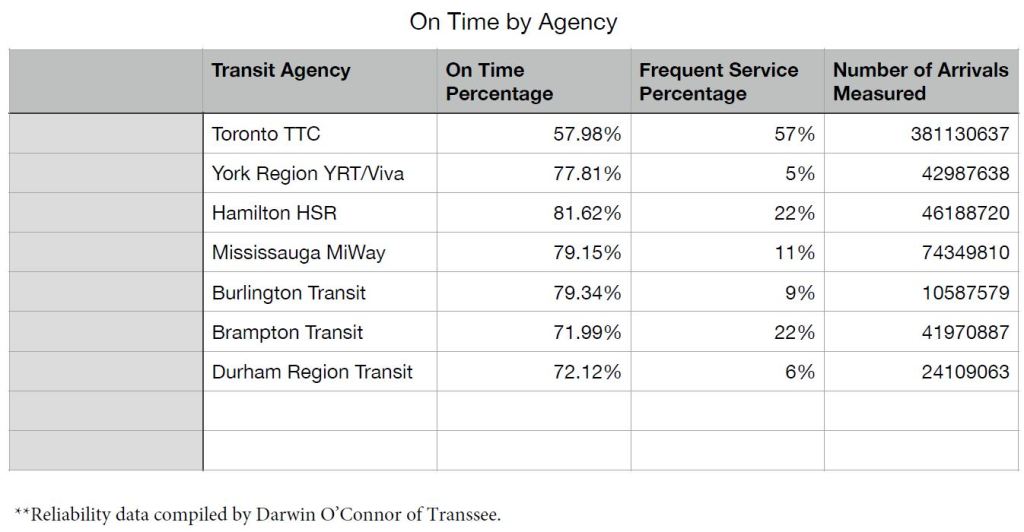
The TTC has vastly more service (counted as “arrivals”) than all other systems shown here. Of those trips, 57% qualify as “frequent” service, but only 58% of trips were “on time”. Other local transit systems have much less frequent service, but achieve better reliability for what they do operate. Even so, “better” is only a matter of degree, and the best of the lot (Hamilton) manages just over 4 trips out of 5 within the Board’s metric.
As a matter of interest, the table includes the TTC’s all-night 300 series routes, and the reliability metrics for these are appallingly low even though almost all of them operate on half-hourly headways. This is an example of lines on a map that offer a lot less service than the map implies.
An important question with these metrics is the degree to which it is physically possible to achieve them. There will always be some transit service disruptions. The question is how many of these are beyond a system’s control, how does each system respond to external problems, and how many of them are “own goals” including poor scheduling and lax headway discipline.
Counting “on time performance”, however one defines the metric, does not address service that simply isn’t there, only the service that is actually scheduled. Nothing in the metrics relates to crowding, passed-up riders, or the latent demand if only there were transit service for all travel needs.
The Board observes:
Businesses have made clear that one of their most important challenges is getting their workforce to and from the workplace. In a region ranked third in North America for congestion, it’s critical that we strive for an accessible, well-connected, high-frequency transit network that helps to move cars off our roads. Limited transit service is one of the largest impediments to our economic growth and our region’s transit system is only as strong as its weakest link. It doesn’t matter that the transit near home provides excellent service if the transit near work is infrequent and unreliable.
Other Factors
Three additional topics get 5 points each: does the municipality provide transit priority up to and including full grade separation, 24-hour service, and integration with neighbouring networks. Strangely there is no credit for operating beyond the core weekday periods except for overnight service.
Fare integration is really all about revenue sharing, not to mention the absence of provincial support. Queen’s Park is happy to support co-fares between systems outside of Toronto and GO Transit as this saves them the cost of local “last mile” service or parking capacity. Funding to reduce fares overall and to increase GO’s presence is quite another matter.
Finally 10 points are reserved for the growth in transit vehicle hours per capita from 2010 to 2019. For the most part, this metric is skewed to systems which have rapid growth in service as opposed to mature systems like the TTC that already have good coverage. There is also a methodology problem when a significant change in the fleet makeup alters the proportion of trips taken on high capacity vehicles like articulated buses or rail systems. Vehicle hours might go down even when population and ridership rise.
Regional Statistics
The report includes a summary of statistics that shows the huge difference between the role of transit in Toronto and other municipalities. If we accept the premise that Toronto is not “world class” and needs improvement, then the municipalities beyond lie even further from that goal. Whether they would agree or not is another matter.
An obvious question that the Board of Trade does not address is how much travel could actually be achieved depending on various levels of improvement. The coverage and service level goals are far below the level within Toronto, and the scope of change needed to reach Toronto levels (as opposed to the far less ambitious Board goals) would be very large and long term.

Scoring the Systems / Getting to an “A”
My comments here address the Board’s suggestions for improving scores on various systems. Readers can explore the detailed evaluations on their own.
A common factor for several local evaluations is the concept that GO Transit has a role to play as a major part of local transit service and access. However, GO routes provide limited connectivity between local nodes based on service levels and the structure of the local transit and development patterns.
Getting to an “A” is not simply an issue within municipalities, but for the network as a whole.
Toronto (TTC)
The Board advocates an increase in express services to reduce the time for long distance journeys and cites the Highway 27 express as a sample of what can be achieved. This is not the “solution” it might seem for several reasons:
- Only part of this route operates on a limited access highway as opposed to local streets, and “Highway 27” is a relic of the era before the 400-series expressways dominated travel in the region. Roads like this are extremely rare in the overall network. Like the rail corridors, they can be used for routes that happen to lie along them, but most transit service lies elsewhere.
- There is a tradeoff between access and speed for express routes in that residences and jobs do not lie conveniently in clumps at express stops, but along a route. Moreover, there can be severe impediments to transit riders for last mile access designed around inward facing development parks, car access and parking.
- Express services on local streets saves some travel time, but not a huge percentage of a trip, and this saving can be offset by poor service frequency and reliability.
They advocate the expansion of the RapidTO “red lane” program although, for reasons I have explored elsewhere, the benefits of this are probably overstated.
The fundamental problem with many trips is that they are simply very, very long, scattered over a wide geographic area, and hard to serve with transit. They are also hard to serve on congested roads.
The Board cites the lack of transit service to Toronto’s eastern waterfront as a major growth area with an urgent need for the planned LRT line. This illustrates a problem with overall coverage and frequency scores and the effect at a local level. The contribution of a fully built-out waterfront to Toronto’s total population and jobs would make only a small shift in the Board’s metrics. All of this area already has bus service at least half-hourly and some much better, but it is hardly well-served by transit.
The gap and challenge in the waterfront shows right at home in the Board’s “front yard” the problems of transit in many parts of the region. The Board’s offices are on Queens Quay East and access on foot from Union Station can be faster than waiting for a bus to appear.
The Board cites problems of service reliability and wayfinding, especially for temporary diversions. Readers of this blog will be familiar with my extensive coverage of these problems.
On the subject of fare integration, the Board presses for links with GO and other local operators, but does not delve into the implications for funding and for service levels on the connecting routes. They cite a one-way 40 minute time saving for travel from northern Scarborough to downtown, but do not address the wait times implicit in a transfer to GO, nor the fact that most riders in Scarborough actually want to go somewhere else in the GTHA.
There is an assumption that there would be efficiencies in a bus network refocused on GO stations, but this would distort the network for other types of travel around rail stations that are not transit nodes in their own right. This is a pervasive problem across the GO rail network because their corridors tend to be in old industrial zones, not in areas which are natural origins and destinations for passenger traffic.
The Board notes financial problems both from pandemic ridership losses and from mounting capital maintenance needs. However, financial viability is not part of their scoring.
Similarly, “rider experience” factors including safety and fare pricing are noted, but without reference to potential solutions on both a local and regional level.
York Region
With so much of the overall score going to coverage and frequency, it is no surprise that the overall York Region score is only 49% rating a C- grade.
York Region has appallingly low coverage for a region that touts itself for major growth and has a disproportionate appetite for extensions of Toronto’s subway network. The Board describes the overall region thus:
York Region has very limited transit coverage of frequent routes. Only 16% of residents and 21% of jobs are within walking distance of a route running all day every 15 minutes. Even routes running every 30 minutes—a minimum level of frequency that can be described as “full service”—are within walking distance of only 37% of residents and 40% of jobs. This means that the majority of urban York Region residents have only very limited transit service, reducing their access to jobs and employers’ access to talent. YRT also has to serve a large rural and low-density area, and major destinations and concentrations of development are widely dispersed.
The Board advocates a clear service standard of at least 15 minute headways on major routes, frequent all-day VIVA service and 24-hour service. However, it is not clear just how much this will shift the region’s modal split toward transit and how much latent demand there would be for an improved network. Much of York’s transit future builds on and around the planned subway extension. Opportunities related to GO Transit are more constrained because of corridor locations and planned GO service levels.
Mississauga
Like York Region, Mississauga has a low percentage of residents and jobs near a 15 minute or better service, but it does pick up some points for having comparatively better coverage at the 30 minute level. This and the presence of some express corridors gets them to a “B” grade.
A major employment hub is the airport which is not well served by transit on a regional level.
The area surrounding the Pearson Airport, spreads out over part of Mississauga, Brampton, Toronto (Etobicoke), and Vaughan. The area is home to hundreds of thousands of jobs in many sectors, including manufacturing, logistics, and offices. In a survey conducted by the Board, businesses in this area have highlighted workforce access to jobs as the number one challenge they face. This is due to fragmented transit service between multiple municipal agencies and GO Transit, as well as limited late-night service (when many industrial businesses have shift changes), long travel times, and a challenging pedestrian environment. It has the potential to become a 24-hour transit hub that serves this 24-hour economic zone. Addressing these challenges will go a long way to making this critically important economic concentration globally competitive.
I am old enough to remember when “Malton” airport seemed to be a long way out in the country, and have watched the area around it grow entirely based on automotive access. Yes, there are bus routes, but compared with the network that feeds into downtown Toronto, the transit service is paltry. The UP GO service touches only a fraction of the catchment area for travel to the airport.
Pearson Airport dreams of being a transportation hub, but this is far more about air travelers who all have one destination – an airplane – than the thousands of workers coming to the wider airport district. Unlike Union Station downtown, the airport does not have a built-in network of distributor lines to move riders out from one major node.
Moreover, most travel into downtown does not come through Union especially with the rise of work-from-home as a replacement for GO commuting. Downtown is a district, not a node. An obvious challenge is to balance transit service for air travelers with the very different needs of workers in the wider airport area.
The idea that the airport district can become globally competitive with major improvements in transit access is deeply ironic. An aerial view shows this is one of the most highway-intense areas of the GTHA.
As in other regions, Mississauga will need to improve its frequent service and all-day coverage to make transit more attractive.
Other Cities
Grades for other cities range from B- (Hamilton and Waterloo) down to the lowest rank of D- (Oakville and Milton).
A common factor across these cities is poor coverage at least at the 15 minute level, and for the lowest ranked even at the the 30 minute level. Long trips are a problem for riders everywhere because travel needs span municipal/system boundaries.
Service improvement is an overwhelming recommendation to achieve an “A” across many systems. How this will be achieved in a car-oriented political climate is difficult to understand. This is a not simply a case of running a few more buses, but of expanded fleets, facilities and scale of operations. Transit spending, let alone granting more road space to transit, is hard to defend when transit usage is low.
Even with an “A” grade, much of the GTHA’s transit will fall far below service in Toronto which itself is less than ideal.

Wondering if you saw the news that the Guelph Board of Trade has lobbied successfuly to have its grade raised from D+ to C+. There is a Global News story this morning.
Margaret
Steve: I have added the link to the Global News piece to your comment, and will update my article accordingly.
LikeLike
It is interesting that more space is not devoted to increasing the reliability of the TTC. For example, there is no excuse for poor reliability at night, especially overnight, as traffic levels are stable (and low) and there is less bus congestion at the terminals. Is poor reliability on the owl routes a case of trying to “squish” all the routes into a 30 minute headway instead of providing enough running time/layover to ensure connections are made?
Any mention on who is going to pay for all these transit improvements? The cost of, for example, doubling the amount of transit service York Region Transit provides is astronomical.
Steve: There is not a word on the estimated capital and operating costs of getting to the rather paltry level of service the Board cites for an “A” rating, let along to something even at the TTC’s level, or “World Class”. I have tried very hard not to dismiss this report as an incomplete and flawed analysis, as the exercise is worthwhile. However, the TRBoT are cheerleaders, and it would look bad for them to give everyone a failing grade. Note that their scale bottoms out at D-.
LikeLike
Mobility in Toronto needs to be looked more holistically and strategically, setting clear objectives and targets, including on reliability. This would require managing roads & signals, parking and transit together, with clear accountability for the outcomes of getting around effectively, efficiently and affordably, minimizing impacts. We can hope.
LikeLike
On January 1, 1973, the two-zone fare system within Metropolitan Toronto was abolished, and the zone fares outside of Metropolitan Toronto’s boundaries were combined into one. The TTC had now become wholly dependent on government operating subsidies to balance the books.
Provincial subsidies ended with the (Progressive) Conservative government in 1996. From that point on, the TTC has been underfunded, which affected day-to-day services. The TTC relied only on the city to help. Another stumbling point occurred with Mayor Rob Ford, who was anti-transit and cut city subsidies, resulting in more cut backs in service.
Mayor John Tory (and former [Progressive] Conservative party leader) was of little help, in fact made more service cuts with the recent city budget.
Will Mayor-elect Olivia Chow reverse things? Maybe not, since we have Premier Doug Ford as the “father” of the “child”, Toronto, still not giving much help on the TTC operations budget.
LikeLike
I was surprised that they both called out the TTC for service quality, and GRT for excessively slow speed of ION operations. Good to know that it’s not just transit enthusiasts who have noticed, even if the report overall could have been better.
LikeLike
I provided that original reliability data to the Board of Trade and the added Guelph data. The Guelph data used the same methodology (I just ran the same query for Guelph).
The criteria as described in the report is “The proportion of trips within four minutes of schedule when the scheduled headway is more than ten minutes, and the proportion of trips where the gap between vehicles is within 40% of the scheduled headway where the scheduled headway is less than ten minutes.” This is the average of each scheduled stop recorded by TransSee in 2022.
Steve: The question is moot once we know that the Guelph number came from you, not from a local metric of the transit system.
TransSee is unable to provide reliability data for Oakville because their API doesn’t have a method to get all vehicle locations at once. I also didn’t have tracking data for Milton because my data source is unofficial. I expect if it was included they would get a better mark like Guelph did.
Steve: My complaint is that the Board of Trade defaulted to giving zero marks if reliability data were not available. Considering this was 35% of the total score, that is a substantial penalty.
The “Frequent Service Percentage” is for service that has a 10 minute headway or less. The “Arrivals” column is the number of vehicle stops measured.
Steve: This means that you are reporting reliability at every stop, and long routes will contribute more arrivals for a given service level than short ones. I am not sure I agree with this de facto weighting.
I also ran New York MTA and Los Angeles which got 55.6% and 65.8% reliability respectively. The complete spreadsheet is at this link.
Steve: Thanks for the clarification. I will update the article to reflect the methodology. It is unfortunate that the report uses different definitions of “frequent” with a 15 minute line in the main report, and a 10 minute line in the reliability metric.
LikeLike
It is unfortunate that no attempts were made to provide solutions. It is my opinion that a key part of Toronto’s transit crisis is Toronto’s extreme housing crisis.
For example, I used to work in the employment district near Toronto International Airport. There was very little nearby housing, and that little housing was totally unaffordable. So everyone was forced into a hellish commute.
My concern is that few people are thinking holistically about how transit and housing are inter-related crises. So that a politician’s goal may be to say “I built XXX units of housing.” With no regard for whether or not that created a transit crisis because this housing was not where people work or go to school or their other destinations.
Steve: Dare we talk about major public buildings like hospitals and schools being built where land is cheap (or owned by someone’s friend), not where it is well-served by transit?
LikeLiked by 2 people
Concerning your last comment,
Still waiting for the “third party” that is supposed to build a pedestrian tunnel (allegedly) between Finch West LRT’s Humber College Station and Etobicoke General Hospital (William Osler Health System). Will out-patients, staff, and visitors have to play “frogger” to cross Highway 27 from the station to the hospital?
Etobicoke Hospital does have parking available at $3.25 per 30 minutes, up to a maximum of $16.25. 30 minutes is impossible for out-patients or visitors. People don’t include the cost of the fuel to get there and back home.
LikeLiked by 2 people
It has always been so with politicians. As an Army veteran I have spent far too much of my life on Army bases that were put on the crappiest land imaginable. Exhibit #1 for that is Canadian Forces Base Borden, north of Toronto. Yes, there is somewhere in Ontario with literal sand dunes. And plenty of places such as CFB Petawawa with ravenous hordes of mosquitoes and black flies.
Politicians are like diapers. They need to be changed often, and for the same reason.
LikeLike
Wklis wrote about people playing “Frogger” to get from the LRT station to Etobicoke General Hospital due to failure to provide a pedestrian tunnel.
It has always been so with politicians. Consider the non-existent tunnel between Leslie Stubway Station and North York General Hospital. Which was cut at the very last minute by politicians trying to save a dollar. Fortunately, nobody going to a hospital is ever sick, elderly, pregnant or disabled.
LikeLiked by 2 people
Yeah, this fails the real-world test. I lived in Mississauga for 3 years without a car. There is no way that the experience is in any way comparable to living in Toronto without a car (which, for this latest stretch, has been15 years). I still travel regularly to Mississauga. It’s a nightmare. Transfers are poorly timed on infrequent routes. Hope you like waiting. If that transfer is on a Sunday, you’re F’ed, as Sunday service is the worst. Evenings and nights are terrible as well. If I was out in Toronto and wanted to take GO train, then Mississauga transit buses to my home, I had to be on the 9:43 PM train to Mississauga to be able to do so. Any later and one of the two buses I needed to take wasn’t running. BRT doesn’t change anything. It’s just a backdoor, budget GO-train-lite service for those living along Dundas. No better than a B- and that is just for the extensive weekday coverage. A C at any other time.
On the other hand, a car-free life in Toronto is entirely possible, if not always ideal. B seems fair, given the many shortcomings. In the outer ‘burbs, where one has to cram onto jammed buses, it can be rather unpleasant. My sympathy for those riders, however, is tempered by them having voted for two rounds of Fords. The assorted LRT projects in the works should provide some relief (crosses fingers).
I think Hamilton was done dirty. Probably deserves a B. My experience there has been that HSR is a proper transit system, intended to provide transit to the population, not a begrudged afterthought like Mississauga.
LikeLiked by 3 people