
This post is intended as historical background to debates on ridership, fleet and mileage trends, together with breakdowns of Operating and Capital Subsidies. The data here come from TTC Annual Reports and Financial Statements.
Updated with charts of various factors compared to the Consumer Price Index, and with a chart of surface vehicle average speed.
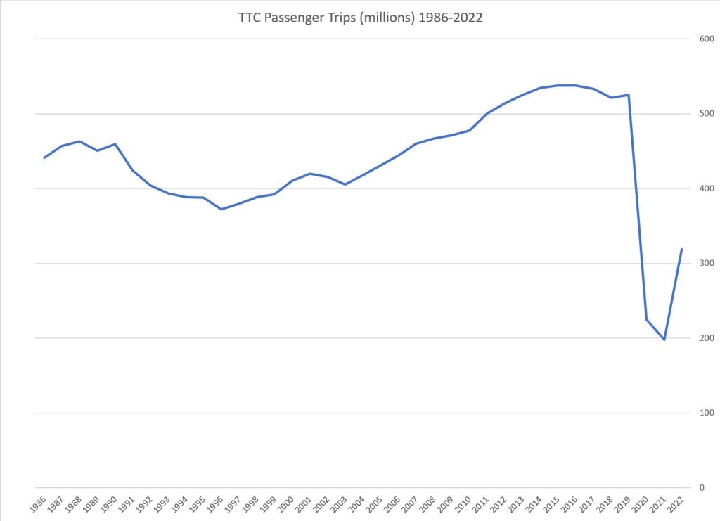
Ridership, Fares and Revenue/Cost Ratio
TTC’s ridership enjoyed a long continuous climb after the recession of the early 1990s until about 2015 when the annual trip count hit a plateau and then declined. After a slight uptick in 2019, the pandemic hit and ridership plummeted bottoming out in 2021.
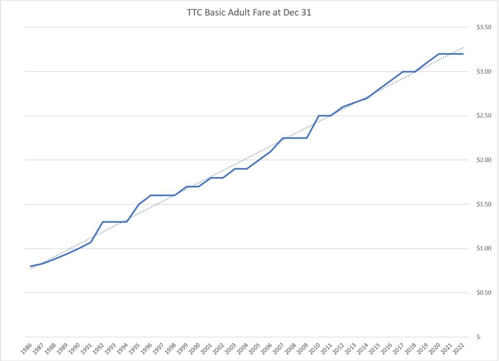
Over the period from 1986 to 2022, the basic adult fare climbed at a steady pace in spite of fare freezes from time to time. The dotted line in the middle chart is a linear trend line which lies quite neatly along the fare values. Note that the basic adult fare is not the same as the average fare, and that discount schemes including passes and time-based transfers can blunt the effect of a fare increase for some riders.
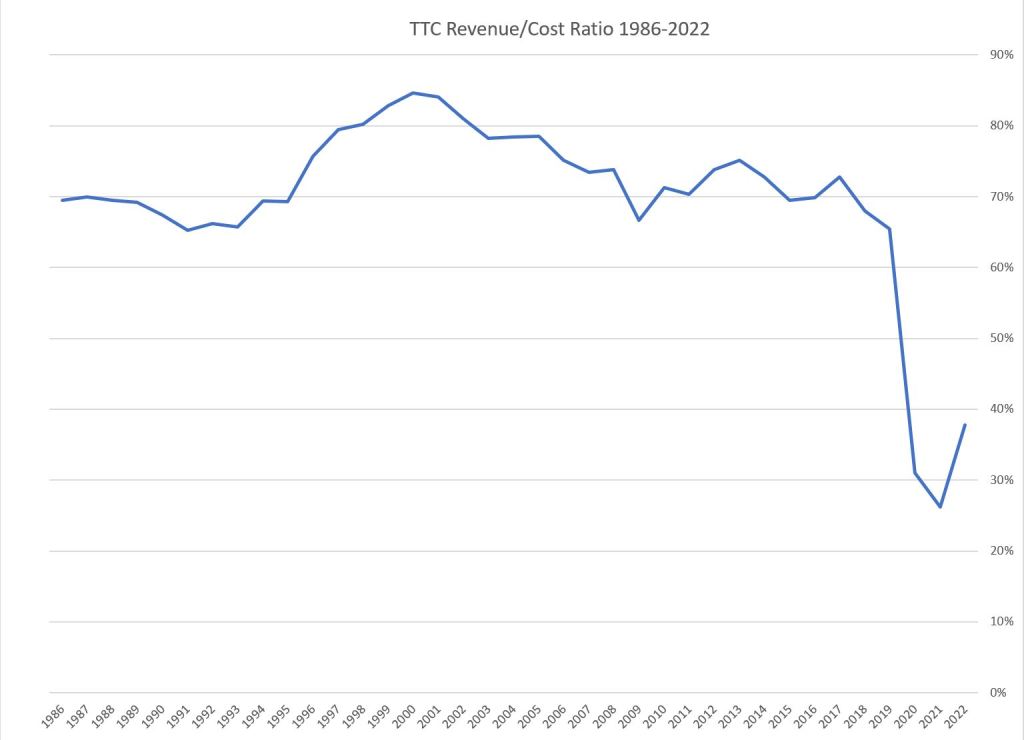
The Revenue/Cost Ratio comes up often in debates, but the value is often misquoted. That is not hard to do as the value has bounced around ever since the initial “Davis formula” of the early 1970s. In that period, the agreement was that TTC’s self-generated revenue (fares and other income such as parking lots and news stand rents) would pay 2/3 of the total, while the remaining 1/3 would be split between the City and the Province. In practice, this never quite worked for a few reasons:
- The Province rarely agreed on what constituted an expense they should subsidize, and in practice their percentage of the total “wobbled” around the 1/6 level from year-to-year.
- Both the Province and City could effectively dictate the total TTC spending by pegging their contributions. If the Province was feeling stingy, the only option the City had to beef up TTC support was to break from the agreed formula.
The early 1990s recession was followed by the arrival of Premier Mike Harris who slashed transit subsidies. This drove up the R/C ratio until the City began investing more money in operating subsidies. The value has bounced around in the 70-75% range for about a decade, but was allowed to fall somewhat in 2018 and 2019. From 2020 onward, the ridership losses drove the R/C ratio below 30% for a time.
Note that “revenue” includes miscellaneous income such as parking fees and subway shop rentals which account for about 5% of the total. Therefore the proportion from fares is about 5% lower than the R/C value shown in the chart.
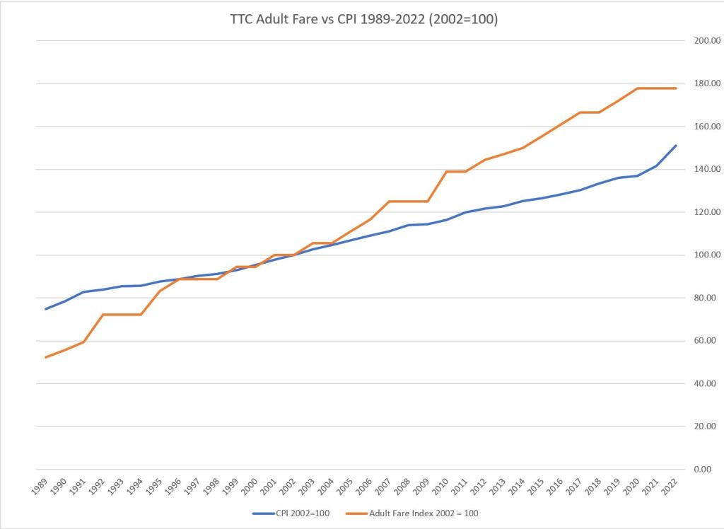
Updated: A chart showing the Adult Fare vs the Consumer Price Index has been added below. It is quite clear that the rate of increase of fares (the slope of the orange line) has been running ahead of the CPI (the slope of the blue line) for several decades.
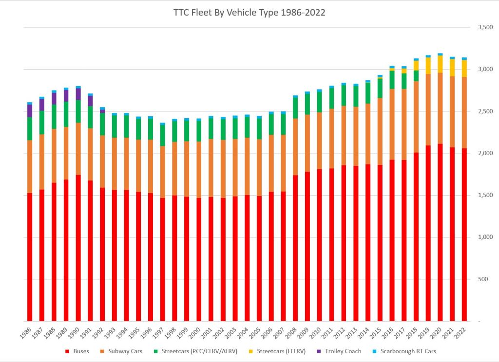
Fleet Size and Mileage
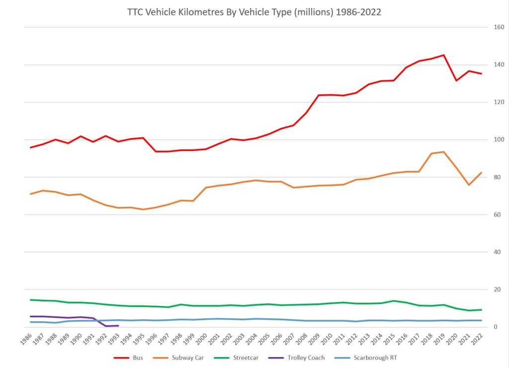
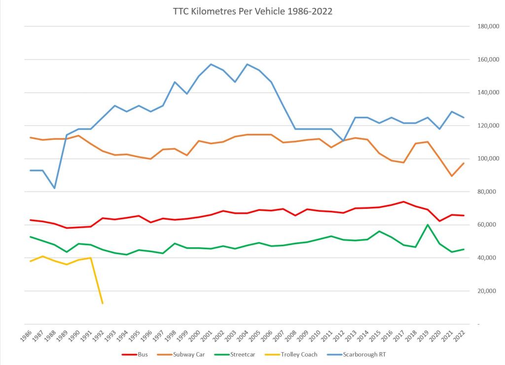
The charts below show the number of vehicles in the TTC’s fleet by type as well as the average annual mileage for each type.
On the left is the count of vehicles. Buses (red) dominate the fleet followed by subway cars (orange) and streetcars (green, then yellow). There is a small complement of trolley buses up to 1993 (purple) and SRT cars (turquoise).
The middle chart is the number of vehicle kilometres operated by each portion of the fleet, and on the right is the average annual mileage per vehicle for each type. Note that the fleet mileage has not dropped as precipitously as the ridership because the TTC maintained much of its service through the pandemic era.
Modes that run in more congested parts of the city (streetcars and trolley buses) accumulate lower annual mileages compared with the bus fleet which runs on comparatively free-flowing suburban roads. Rapid transit modes top out the chart with the SRT particularly high because of its widely spaced stations.
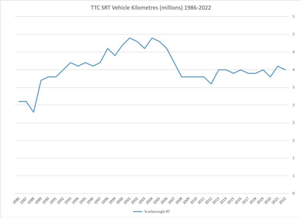
The SRT mileage dropped substantially almost two decades ago because of reliability problems with the fleet. The upper right chart shows annual fleet mileage, and because the SRT is such a small part of the total, the blue line on that chart does not show much change. However, when only that mode is plotted (lower right), the drop is much more obvious. It exactly mirrors the per vehicle values on the lower left because there was no change in the fleet size.
Replacement of 8-car “G” trains with new 6-car trains in the late 1980s reduced the car mileage without reducing the train mileage. After 1990, the mileage per car went down due to reduced service in the recession and an increase in the subway spare ratio. The fleet grew in anticipation of a new line opening in late 2017, but the service level still reflected the smaller system causing a dip in the per-car mileage.
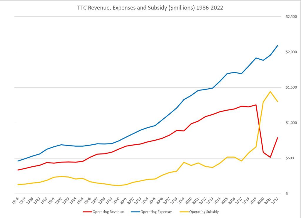
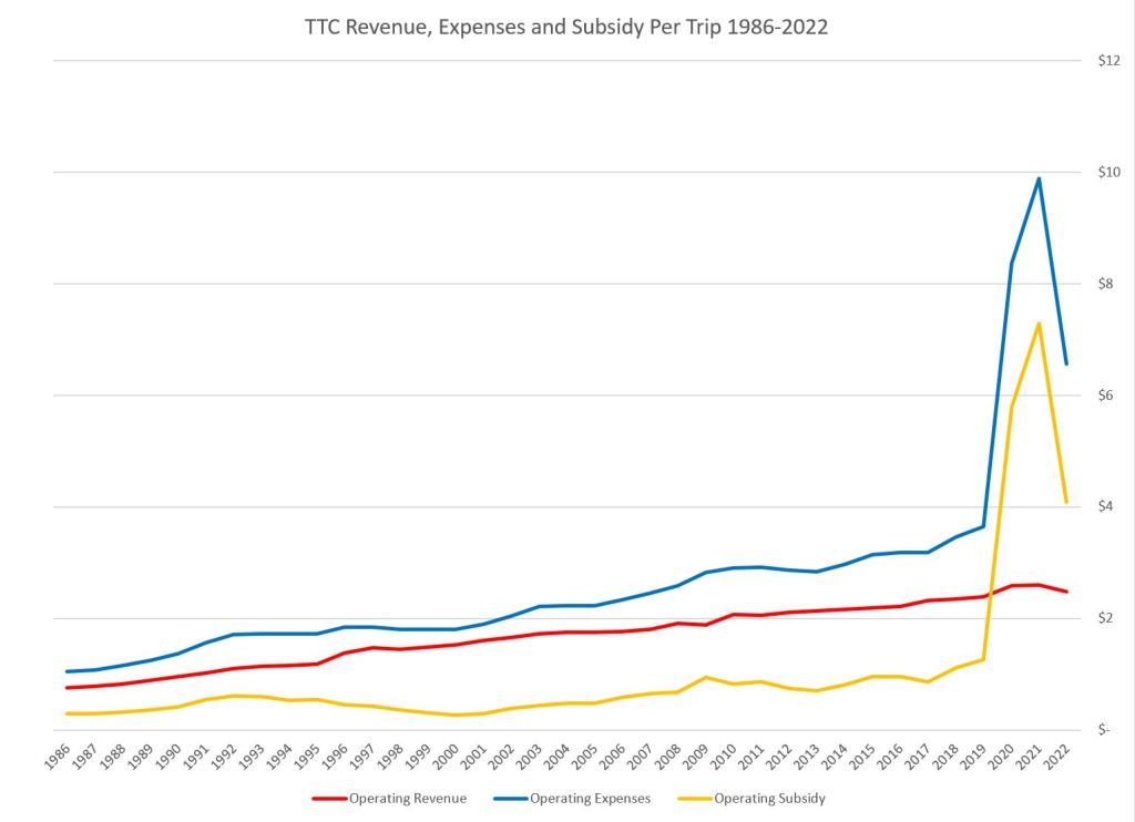
Revenue, Expenditure and Subsidy
The cost of running the TTC has grown each year, and the revenue does not keep up because the average fare does not cover the cost of carrying most trips. In the charts below, the cost of running the system (blue) climbs both as an absolute number and as a cost per vehicle kilometre. Revenues (red) do not grow as quickly and are hit hard by the pandemic years.
The subsidy level falls in the 1990s recession and in the following Harris era, but then climbs strongly for a time. The effect of changes in political attitudes to transit funding are evident in these numbers. On the right, the values are shown per trip. Cost and subsidy have a big jump in the pandemic era while revenue per trip, driven by the average adult fare, not by the number of trips, levels off. Some concession fares, notably the timed transfer, reduced the average fare per trip slightly.

Tracking Stats Against Inflation
Update: This section was added on June 19 in response to a reader’s comment.
The chart below plots several values against the Canadian CPI (Consumer Price Index) with year 2002 as “100”. There are several caveats about the limitations of this presentation, but the numbers show differing rates of growth in some areas.
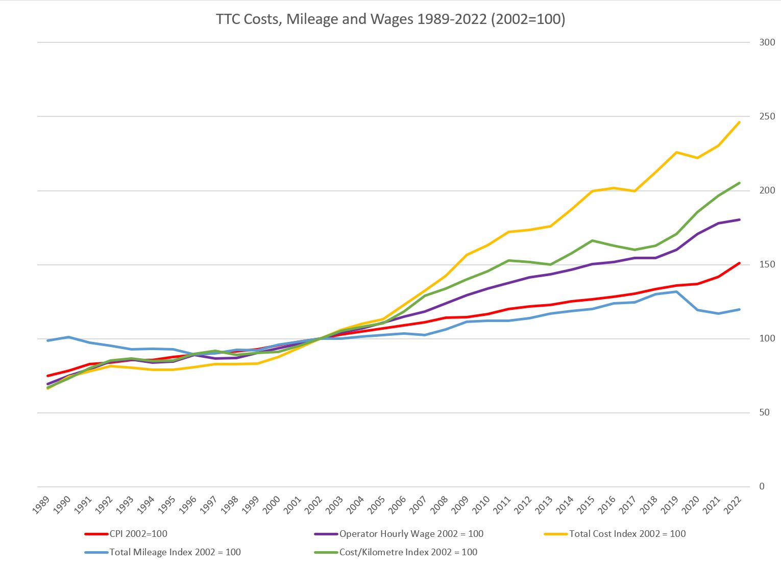
The red line tracks the CPI. There are versions of this index that include different weighted factors, but they all behave similarly.
The total vehicle mileage in blue shows relatively little growth in the amount of service provided and in particular the fallback during the pandemic era. Also visible is the service decline in the 1990s recession and the long recovery just to get back to the 1989-90 level. Mileage is an imperfect measure for several reasons:
- Traffic congestion slows operations and therefore more hours (driven by operator wages) are needed to provide the same amount of service (see chart below).
- The total mileage is dominated by subway and bus operations (see the charts above), and only the bus component has risen substantially. The only subway extensions, and hence service increases, in this period were Wilson to Downsview (now Sheppard West) in 1996, Sheppard from Yonge to Don Mills in 2002, and the Vaughan extension in 2017. There was little capacity to improve the pre-1989 subway network because the signal system limited service increase.
- Increase in the average size of streetcars (almost doubled with the new Flexity fleet) allows more capacity to be provided with fewer vehicle miles. This affects service quality, but it reduces the mileage and hours from that component of the network.
- There are large fixed components in TTC costs for infrastructure (especially on the subway) and administration that are not affected by the mileage operated except for major changes in system scope.
The operator hourly wage in purple tracked the CPI until the early 2000s, but then pulled away in the next two decades. However, the cost per vehicle kilometre in green went up even faster than the wage level indication that wages alone did not drive this factor.
Total spending grew fastest of all through the combination of increased service and the higher cost of operating that service.
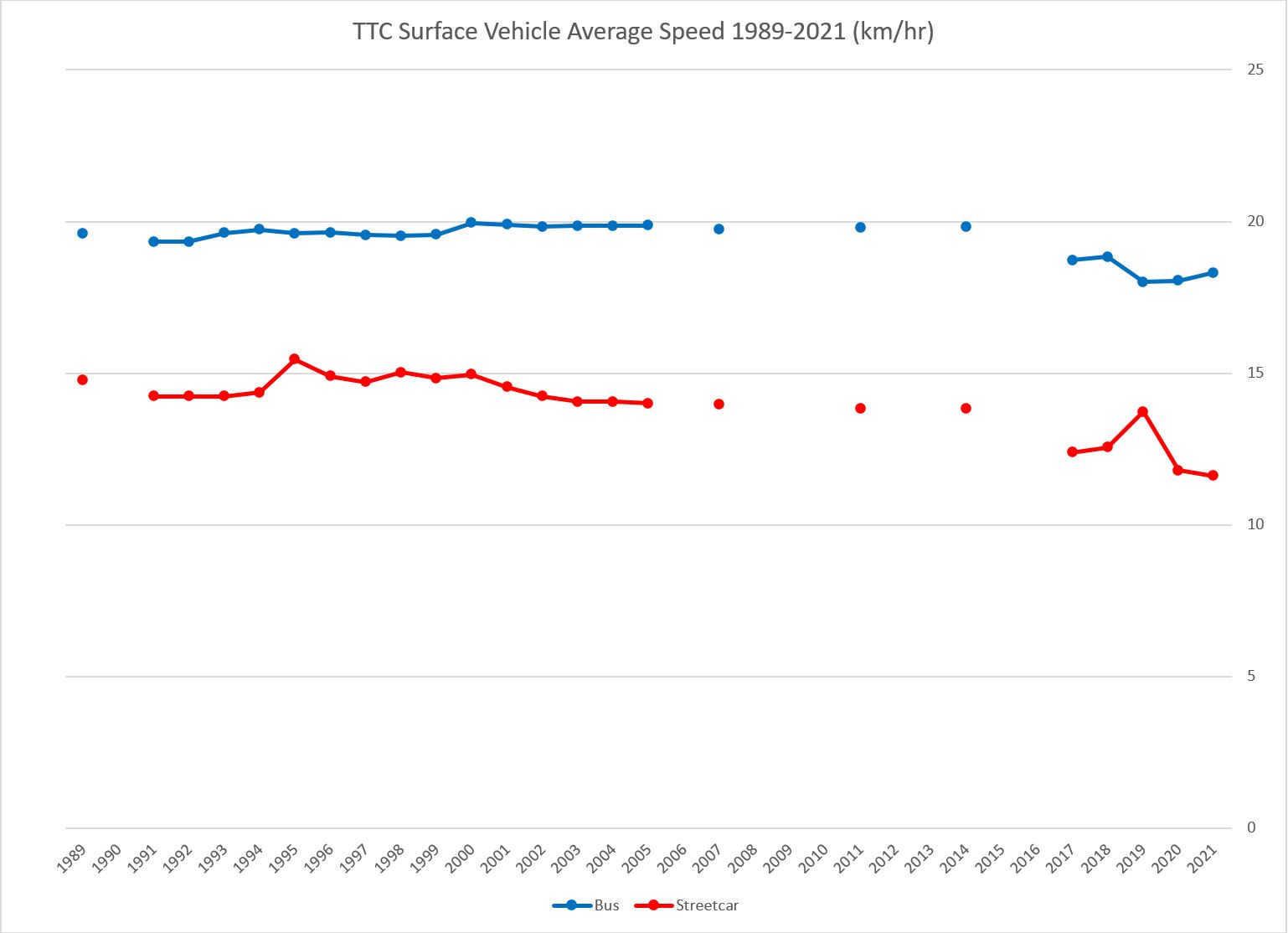
The average speed of surface vehicles can be calculated from the reports published (irregularly in some years) giving route level stats including vehicle hours and mileage. From these the totals across all routes yield the average speed. The chart below shows the difference between bus and streetcar routes. Empty years are those when the TTC did not publish any data.
The speed of a mode, taken as a system average, reflects the conditions under which it operates. Buses overall run on faster suburban routes. Even though some routes see severe peak period congestion, they rack up a lot of mileage in uncongested off-peak hours. Streetcars by contrast operate in congested conditions during more of the day.
Scheduling practices in recent years have added more recovery time to many routes and this adds vehicle hours but without mileage and so the average speed has dropped. On the bus system, the temporary suspension of some express services during the pandemic contributed to the lower average speed. On the streetcar system there is the combined effect of slower operation of the new cars and a raft of slow orders, notably at intersections. (The stats for 2022 have not yet been published.)
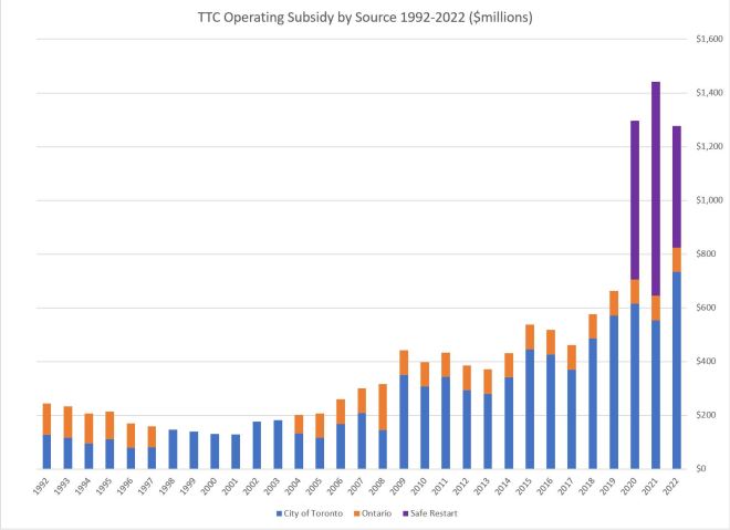
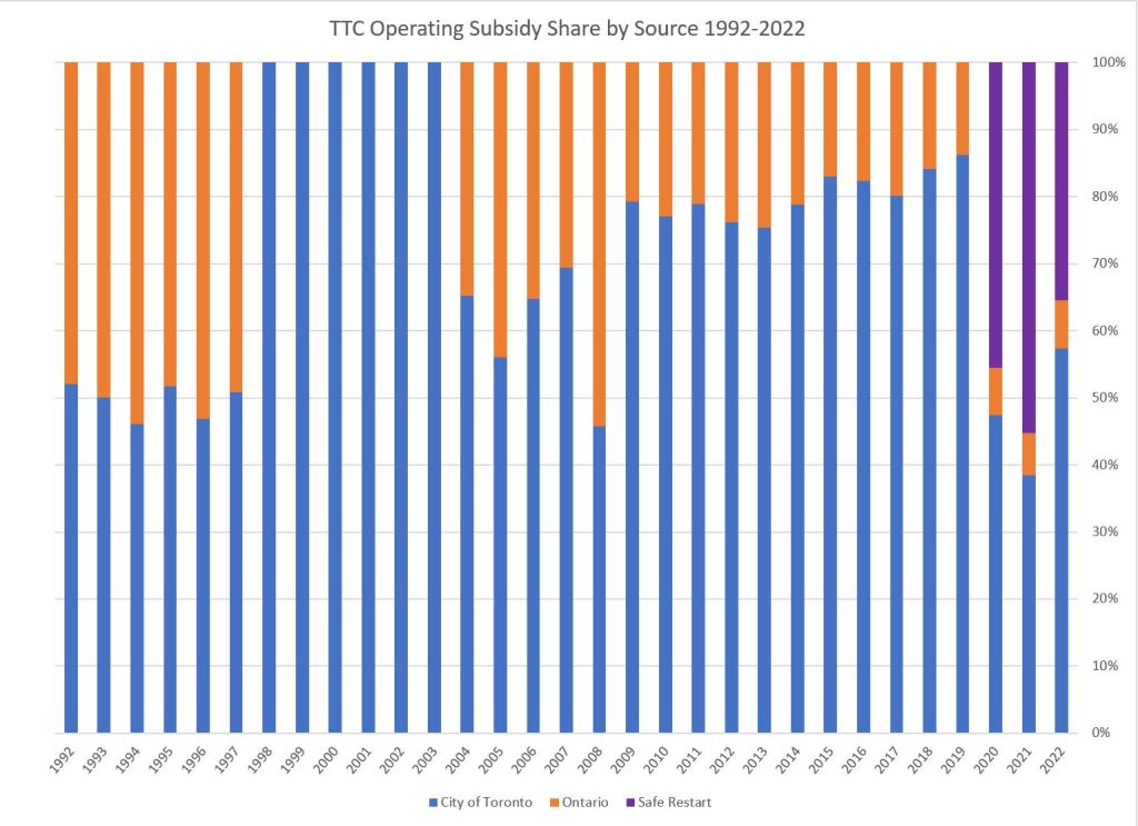
Operating Subsidy: Who Pays How Much?
The chart on the left shows the TTC’s operating subsidy broken down by source. The extra pandemic era funding greatly increases the total in recent years (purple), and the trend in “normal” subsidy is clear following the top of the orange section of the chart.
The middle chart shows the same data by percentage. Notable in this series is the six-year period without provincial subsidy thanks to Mike Harris, and the gradually declining provincial share in more recent times. This decline, as a percentage, arises from the fixed allocation of $91.6 million of provincial gas tax to the Operating Budget by the City with the rest going to Capital. As the total subsidy rises, that fixed amount becomes a smaller share.
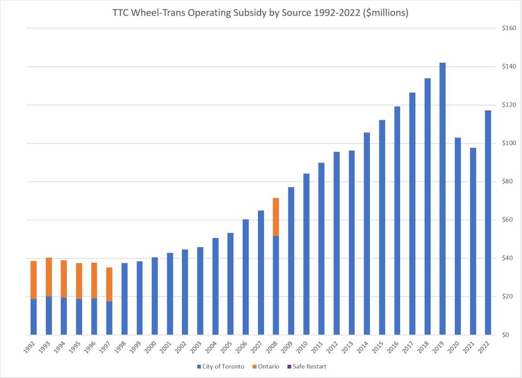
On the right is the Wheel-Trans subsidy which has been almost entirely on the City’s account since 1998 and the Harris cuts.
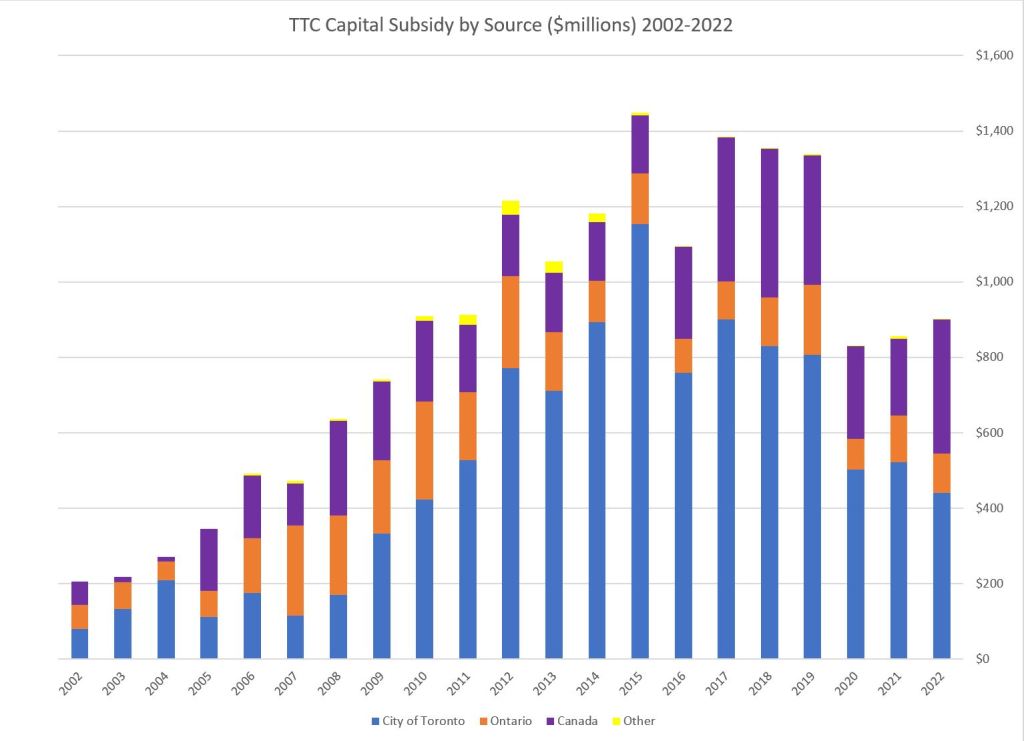
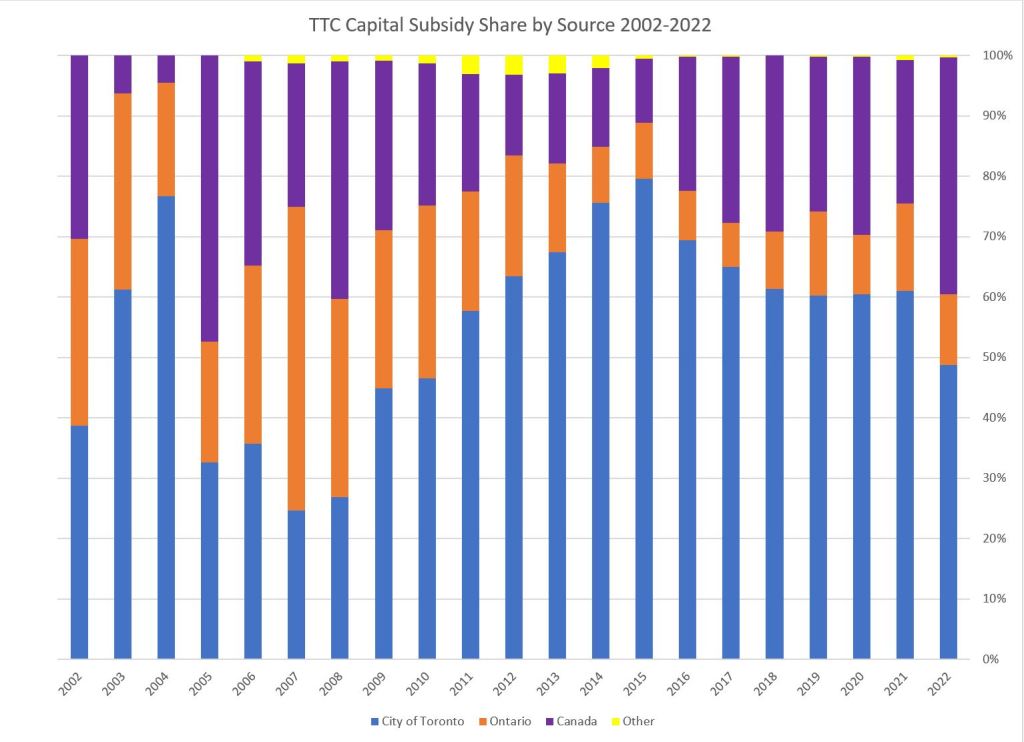
Capital Subsidy: Who Pays How Much?
Capital costs have been treated in different ways over the years (rapid transit vs other costs, new construction vs maintenance) by various governments, and the City has been left with the lion’s share. This is especially critical with the large backlog of state of good repair projects and the focus of provincial and federal funding on major expansions.
Provincial spending on projects that Metrolinx has taken over is not included in these charts. The high point in 2015 corresponds both to the peak in Spadina subway extension spending and a large rise in City spending on SOGR.
The chart begins in 2002 because of the lower granularity of reporting of capital subsidies in TTC financial statements before that time. Also, there was a period starting with the Harris era at Queen’s Park but continuing into the McGuinty era where capital grants were announced and paid in blocks, but actually spent from reserves over several years. This complicates tracking the shares over that period, and I chose to begin after the funding process stabilized.
Toronto’s challenge is that the known provincial and federal funding streams are far below the level needed for SOGR needs, and even with increased participation from other governments, the City itself faces a growth in transit capital spending.

Fascinating charts Steve, thanks. They certainly show that “Big Daddy Ontario” is none too generous!
LikeLike
Meanwhile, the population of the greater Toronto area (since TTC riders do come in from the 905 to use) in 1990 was 3,807,000. In 2023, it is estimated to be 6,372,000.
I’m sure the ridership for public transit in the 905 has increased big time, during that span. That is also why GO Transit use has also increased.
That also means the elderly population has also increased, who tend to use public transit more during the non-rush hours. While a 15-minute neighbourhood, where most facilities and venues are within a 15 minute walk (average), would be of benefit, that would require a change in zoning to allow that. Currently, most of the sprawling suburbs neighbourhoods assume that people will drive or be chauffeured around. We need a better public transit that would cater to people who do not drive or don’t need to commute anymore.
LikeLike
Is it possible to get statistics that cover the percentage of total revenue from pass sales? As has been pointed out here, it’s impossible to tell either ridership or per-rider cost per trip for users with the old Metropass, which wasn’t monitored or tracked anywhere but in subway automatic turnstiles.
And even in subways, I often found it quicker to pass through the collector’s turnstile, waving my Metropass, rather than going through the swipe at the automatic turnstiles.
WIth Presto, there should be more definite information about price per ride.
I would assume, though, that any time your Presto tap says “FREE TRANSFER”, that isn’t counted as a separate trip–although, in the old days, it would could have been two or more separate fares, or multiple trips on a Metropass.
Steve: We know how many Metropasses were sold either in hard copy form back in the day, and now via Presto. From that it’s easy to calculate the revenue. Pass sales are down, of course, because the price multiple is too high for many people to break even.
There is a conversion from unlinked trips (e.g. taps) to the conventional number of linked trips (“rides” in the classic sense), but I am not sure how the conversion factor is derived. I will ask.
LikeLike
It would be interesting to see the fare graphed against inflation. Feels to me that in the last few years, that it hasn’t been keeping up.
I’d sooner see a bit higher TTC fares than the recent cut in service standards.
Steve: I have added update that chart.
LikeLike
Can you please analyze why costs have gone up so significantly? Should the TTC focus on automation and autonomous vehicles? Would it decrease cost per ride and increase transit capacity significantly if we converted our subway lines to autonomous lines and started deploying and piloting autonomous buses or streetcars?
Steve: The article has been updated with more charts showing the relative change in factors over time. As for automation, this really only applies to the subway because that technology is nowhere near ready for commercial use on surface vehicles. An important issue with autonomous vehicles is also their size. Transit caries large passenger volumes, and what would in effect be a fleet of automated Ubers is not going to provide that level of capacity, but it would add to vehicle capital and maintenance costs, not to mention road congestion. Even on the subway, automation only gets rid of the driver, but not the army of people needed to maintain and manage the system, including the automation technology.
LikeLike
Fascinating stuff as always Steve. Any way you could get total trips and total service on the same graph? It would be interesting to see if you could approximate total service as a multiplication between vehicle kms and the average passengers a vehicle could carry. Not sure how feasible it would be to get such a stat with enough accuracy for the results to be meaningful, but it would be interesting to see any leading/lagging impact between service levels and system usage over such a long time frame.
Steve: I will have to think about this. Average vehicle capacity isn’t the only factor, however, because of riding characteristics on routes. For example, some routes have a lot of turnover, and so the total trip count is higher because the capacity is used over and over. Similarly, some routes have strong bidirectional demand, whereas others have light loads in the counterpeak direction. This makes the overall trips/km stats vary wildly, and you need to understand the route characteristics, not simply compare the numbers.
A good example of this in past years was that the pols wanted a “profit and loss” value for each route. Very short routes (e.g. the Main bus running 2km between Danforth and Queen) by definition cannot have long trips, and so the cost per trip is low. If one allocates revenue based on trip count (the then-methodology was to assign about half a fare to each ride because on average riders transferred once per trip), the route is wildly profitable. The fact that a rider might then get on the subway or the Queen car and ride across town consuming vastly more resources wasn’t taken into account. Oddly enough, that profitability never translated to better service.
Similarly, express buses, particularly the 14x downtown routes, can have a high cost/rider because of strongly directional demand and long trips.
And so to your question, it is difficult to simply take vehicle kilometres, riding counts and vehicle capacity to produce a system wide index because the process will average out a lot of the route-by-route detailed effects.
For route by route stats for 2019-2021, please see The Varying Strength of Ridership Recovery and this table containing the details.
LikeLike
It’s not a mention about TTC’s increase of forepersons and managers with no need now 2 workers 2 forepersons 3 supervisors, and no one as a clue about anything.
LikeLike