
This post continues a series of articles reviewing travel times for streetcar and bus operations on 510 Spadina. Recent events include winter storms, temporary bus substitution for one week in February 2026 due to power supply issues, and implementation of better transit priority at three intersections.
This article includes data from January 2024 through March 2026 showing travel times on Spadina. Also included are comparisons of speeds and dwell times along the route from October 2025 and March 2026.
For an extended period in 2024-25, the 510 route operated with buses and was, for a time, diverted to St. George Station. Comparisons between streetcar and bus travel times varied through this period depending on the location, time of day, traffic conditions and the degree of priority given to buses, if any.
In February 2026, signals at College, Queen Dundas and King were modified to give streetcars a clear signal before allowing left turns. In the data to March 31, the effect of this change is small. At the level of an individual intersection, this is hard to measure because the change in wait time for a signal is comparable to the frequency with which streetcars report their location. This problem is discussed in more detail at the end of the article. [Corrected at 5:45pm, April 6]
Although signals may clear for streetcars more quickly, there is no change in TTC operating practices that force vehicles to crawl through intersections. The results were not as good as I had hoped, and there are areas on 510 Spadina that need priority far more than the three intersections modified so far.
At this point, confirmation of the benefit of signal changes awaits more data as well as possible expansion of the program.
More generally, the three modified intersections are only part of a larger route, and not necessarily the primary source of delay. Any attempt to improve 510 Spadina travel times must look at the whole route, and at the many locations where streetcars can be delayed.
One point of interest is that streetcar travel times rose slightly after the period of bus operation compared to before (Spring 2025 vs Spring 2024). The change is small but noticeable. What made the difference?
The City and TTC must address why it is possible for buses in mixed traffic to outrun streetcars on reserved lanes during periods when traffic is not congested. A mixture of signalling, stop location and TTC operating practices make this possible.
My apologies to readers who say “oh no, not more charts” and move on to something else. I have deliberately included a lot of them here so that those who are interested can see how the data behave. Any suggestions for changes in presentation or analysis are welcome.
Travel Times on Spadina
This section reviews travel times in two segments of 510 Spadina: between Front and Richmond, and between Richmond and Harbord. The first segment captures changes at King, while the second captures the combined effect at the Dundas and College intersections.
Screenlines for time measurements are located in the middle of each intersection. The locations are chosen so that locations where signal timings have been modified are not split on either side of a screenline. An important factor is that travel times vary even without signal changes, and the benefit of an individual change can be lost in the “noise” of other sources of delay.
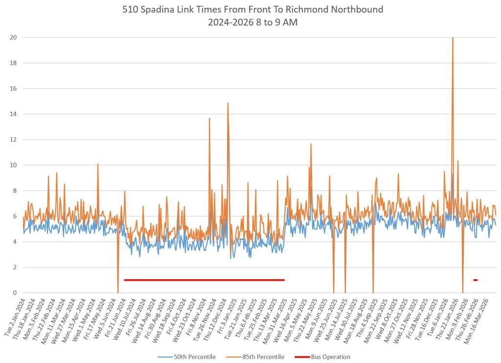
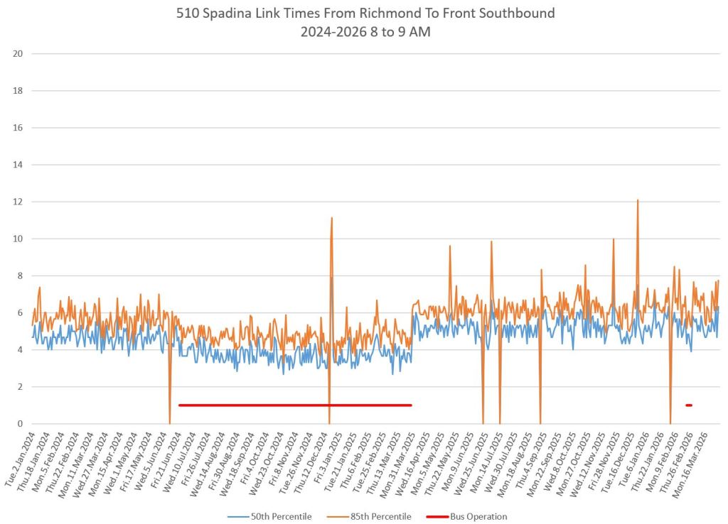
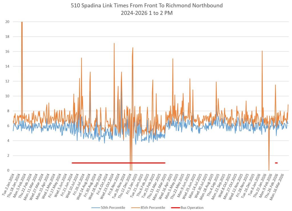
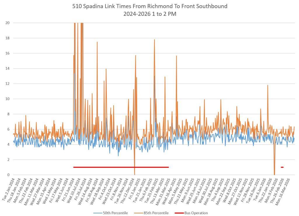
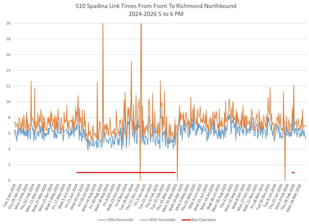
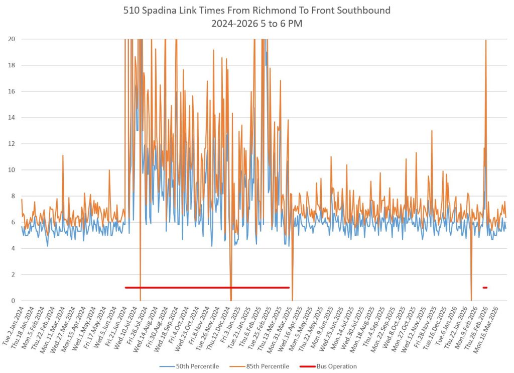
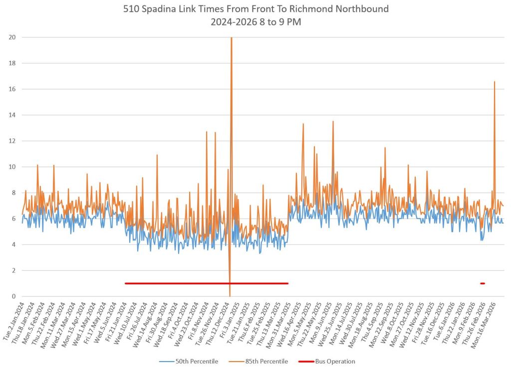
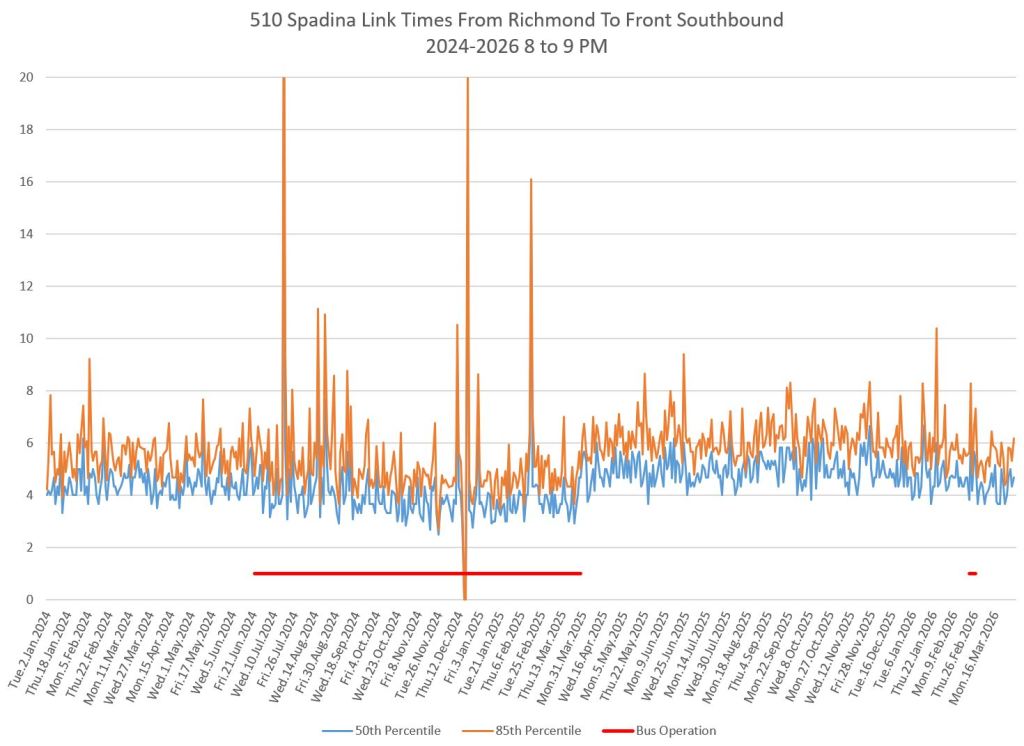
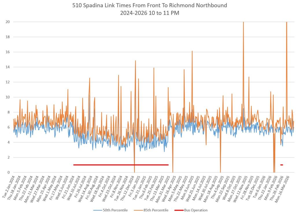
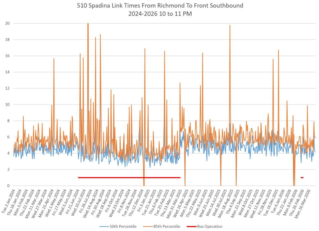
Between Front and Richmond
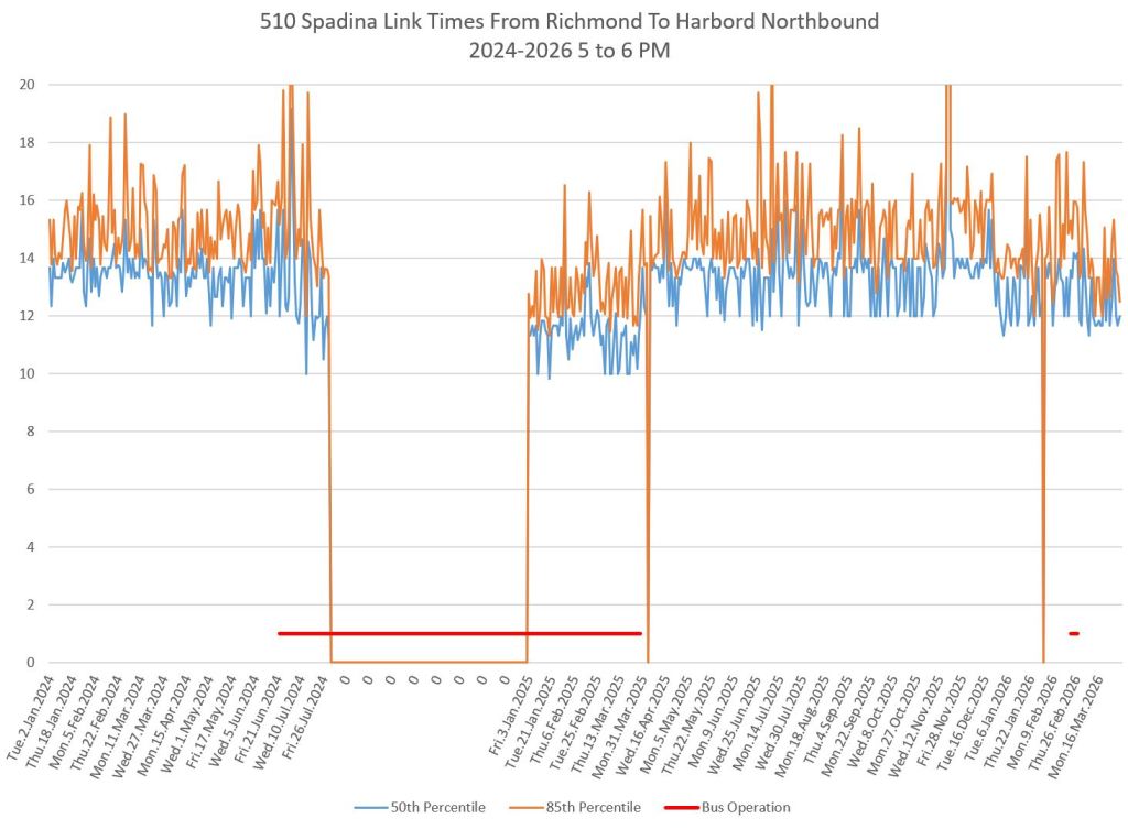
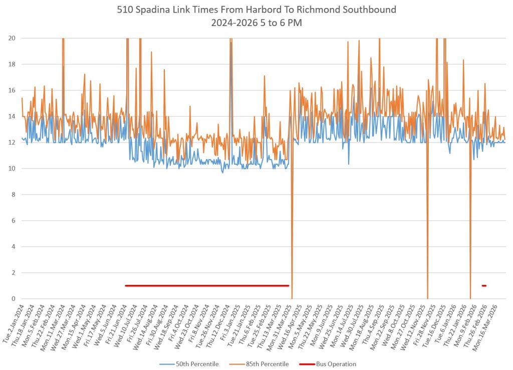
This segment includes the intersection at King which has the new signal timing pattern. Charts below show the median and 85th percentiles of travel times by time of day northbound (left) and southbound (right) from January 2024 to March 2026.
The horizontal red bars show periods when the route was operated with buses.
Southbound buses had great difficulty approaching the backlogged area near the Gardiner Expressway. Even the installation of red lanes at the south end of this segment did not completely relieve the problem.
Northbound bus travel times in 2024 show evidence of a “heartbeat” pattern. This is due to traffic congestion in the Entertainment District and the peaks occur almost always on Fridays.
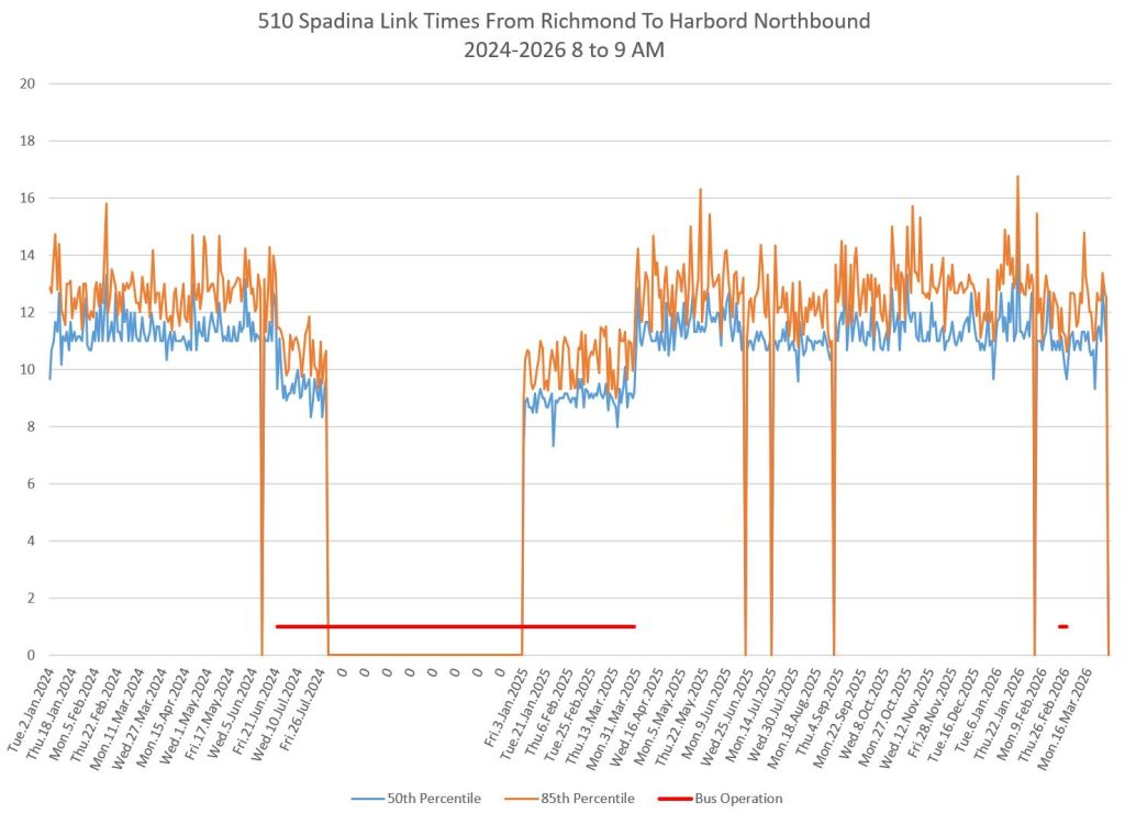
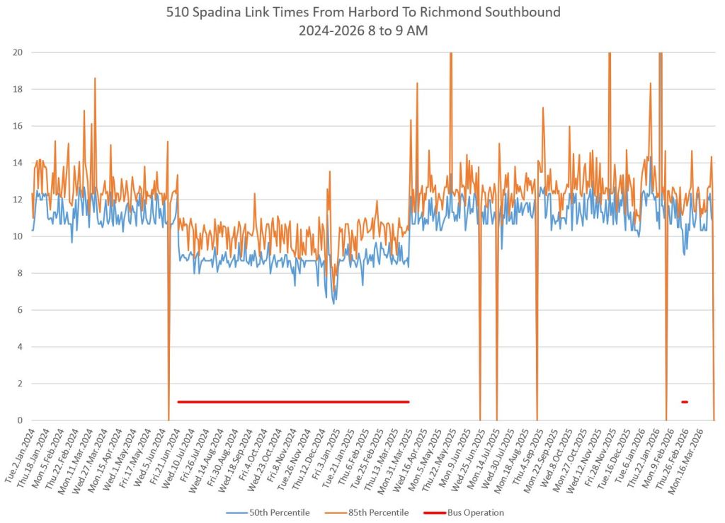
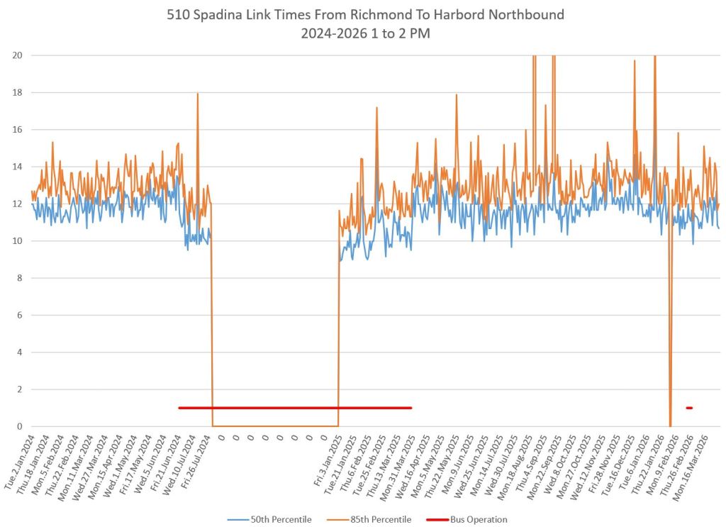
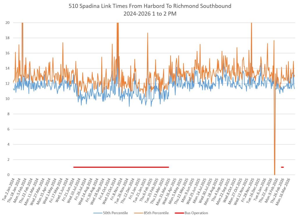
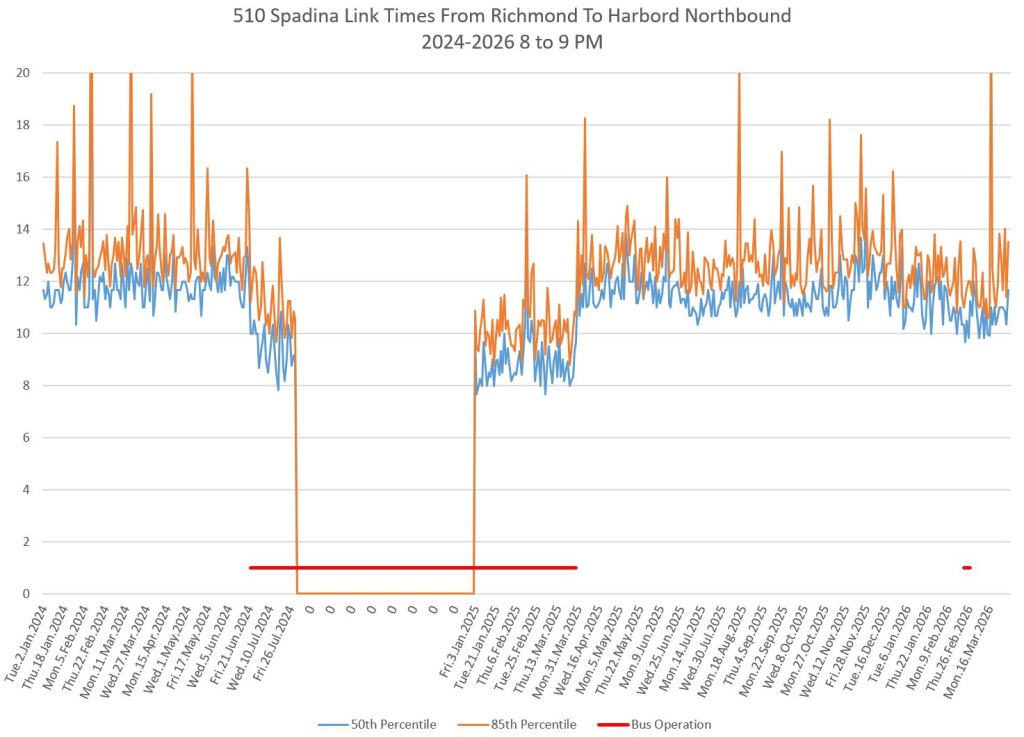
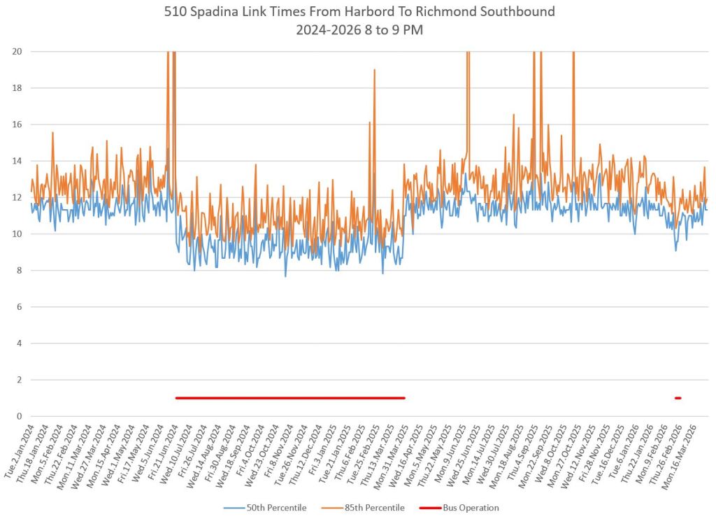
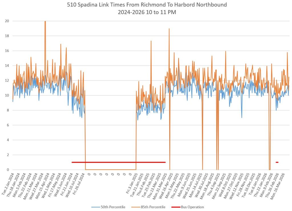
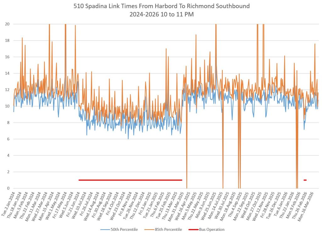
Between Richmond and Harbord
This segment includes the intersections at Dundas and at College which have the new signal timing pattern. Northbound data are on the left, and southbound on the right.
There is a small change in southbound travel times in some periods in 2026. Both the median values (blue) and the 85th percentile (orange) dropped. This implies both a reduction in travel time and in variability. Northbound travel times were either unchanged or rose slightly. How large and permanent the changes will be remains to be seen.
From July 2024 onward, buses diverted to St. George Station due to construction on Bloor Street. Because the Harbord screenline is in the middle of the intersection, buses turning north to east there did not cross that line and therefore there are no travel time data. Southbound buses, on the other hand, did cross the screenline and so there is no gap.
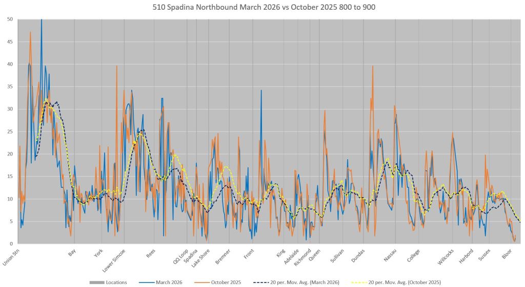
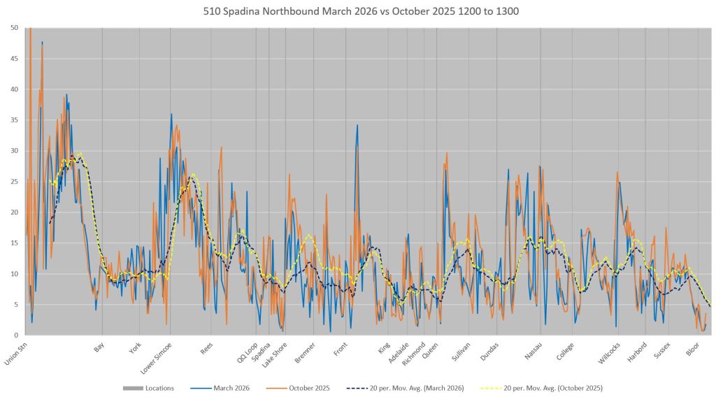
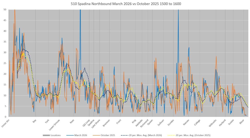
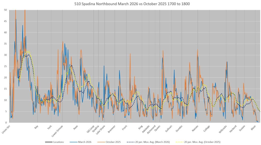
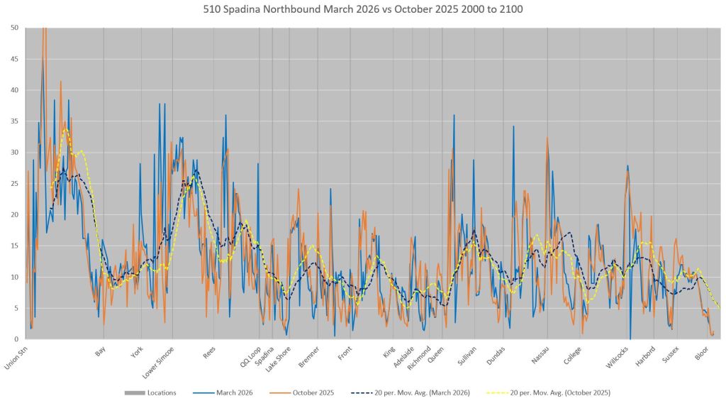
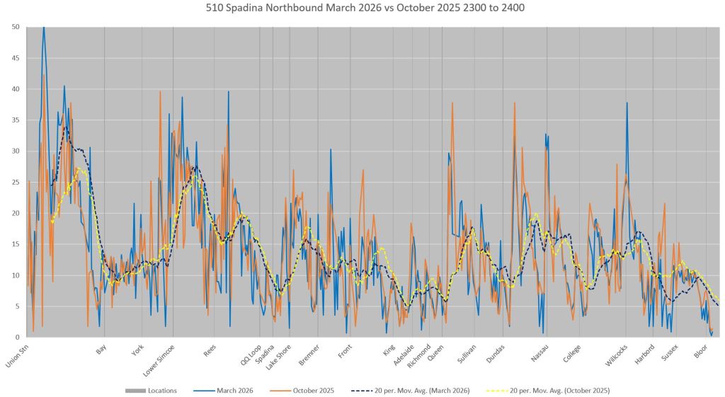
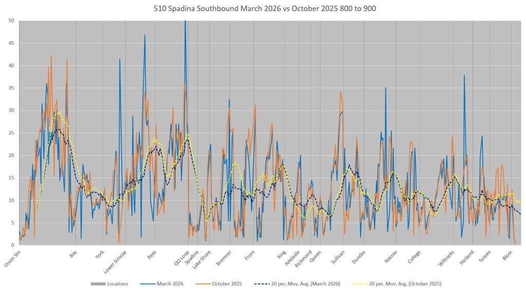
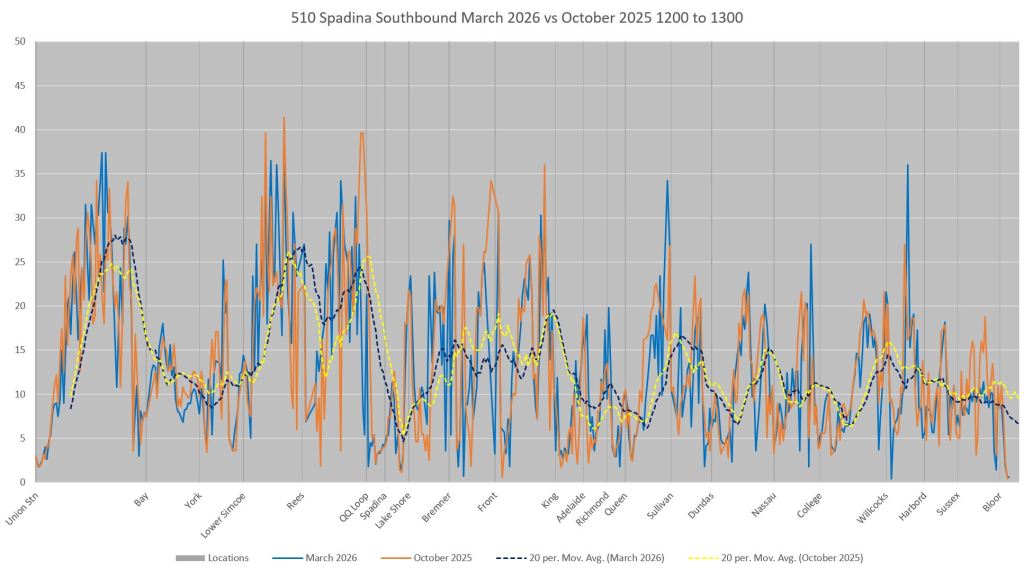
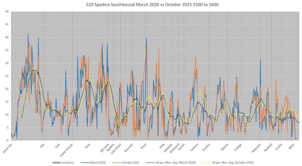
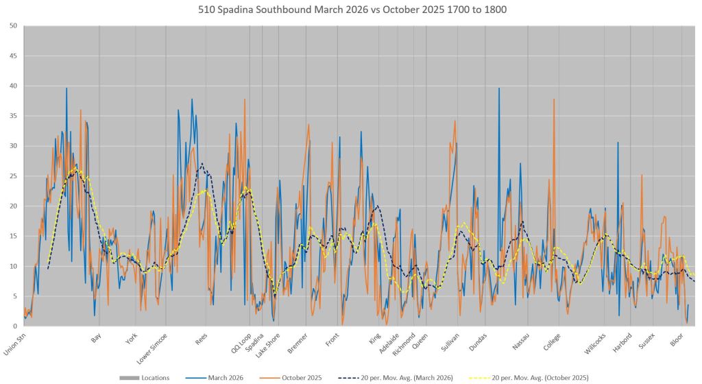
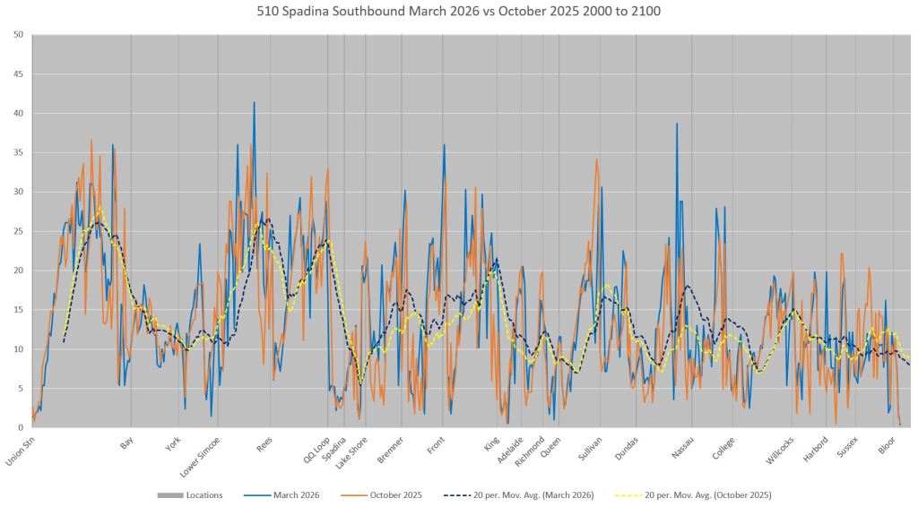
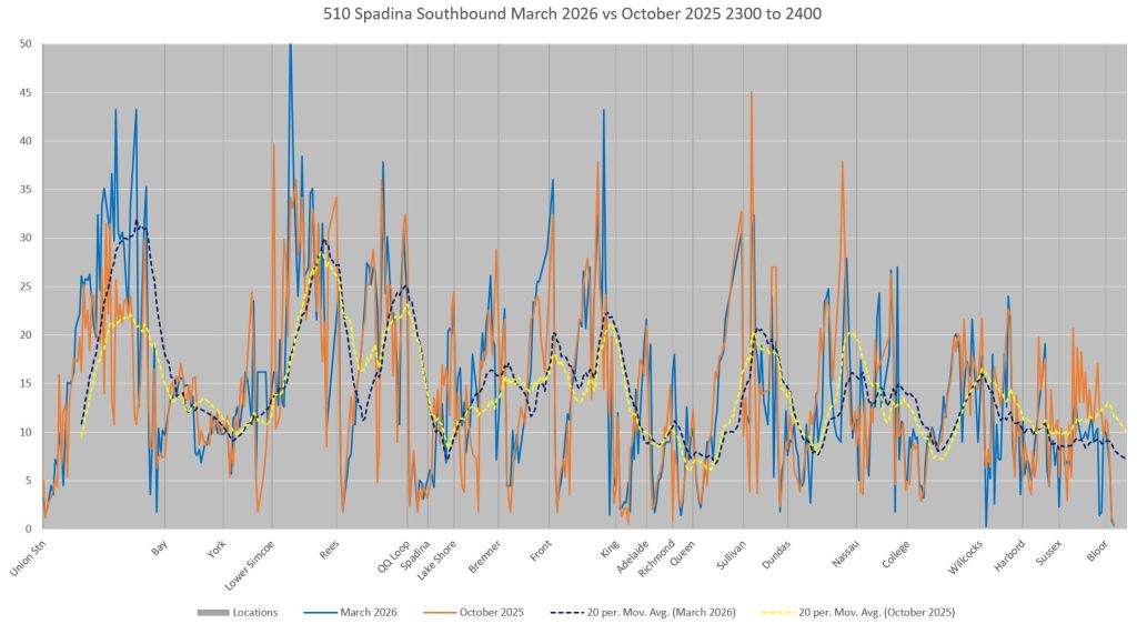
Speed Profiles October 2025 vs March 2026
In an attempt to get a better view of what is happening at intersections, I compared speed profiles over the route in each direction using weekday data from October 14-24, 2025 (nine days after Thanksgiving weekend) to March 16-27 (ten days after Spring Break week).
In the charts below the horizontal axis covers the entire route from Union to Spadina Station. The vertical axis shows the average speeds in km/hr. There are four line on each chart:
- Solid blue: March 2026 data
- Dashed blue: March 2026 moving averages
- Solid orange: October 2025 data
- Dashed yellow: October 2025 moving averages
Each chart covers one hour’s data to show the difference, if any, by time of day.
For the purpose of analysis, the route is divided into 10m segments. The moving averages include 20 segments, hence 200m. This eliminates the steep peaks and valleys, but shows the overall movement of data values more clearly for comparison.
Individual data points are spread out due to the polling cycle for retrieving location information from cars (see a more detailed explanation later in the article). For the purpose of assigning a speed to each segment, the time and distance between tracking observation are converted to a speed which is assigned equally to each 10m segment between the each observation. The values shown in the chart are the average of the calculated speed for all vehicles.
Union Station is at the left side, and Spadina Station at the right. Southbound service is headed right-to-left and so dips in speed tend to be to the right of locations where there are stops. Northbound they are to the left. Locations with farside stops show the double-dip pattern common because cars are often help nearside awaiting traffic signals.
Northbound (read left to right, click on images to open a full size gallery view)
In some cases, the yellow dashed line (October) is above the blue dashed line (March), but this varies over the route. Generally speaking there is not much difference between them. The locations where we would hope to see changes are northbound at King, Dundas and College, but in fact there is little change, and the amount is similar to the small differences elsewhere.
For those unfamiliar with the route, some stops are nearside, but most are farside.
- Farside stops: Harbourfront, Rees, Spadina/Queens Quay, Bremner, Front, King, Queen, Sullivan, Dundas, College, Harbord
- Nearside stops: Baldwin, Willcocks, Sussex
In some cases, traffic signals are very close together and not all stops have signals. This makes the definition of near or farside tricky in some cases such as on Queens Quay between York and Lower Simcoe with three sets of signals, but one stop located at the middle one. The lower part of Spadina similarly has more signals than stops.
Southbound (read right to left)
Southbound data show a similar pattern to northbound with small changes usually better for 2026 data, but not consistently.
- Farside stops: Sussex, Harbord, College, Baldwin, Dundas, Queen, Spadina/Queens Quay.
- Nearside stops: Willcocks, Sullivan, King, Front, Bremner, Rees, Harbourfront.
Discussion
Although the three intersections where the timing of left turns have been altered show a dip in travel times, there are many other slow segments of the route notably with the closely spaced cross-streets between King and Queen, and along Queens Quay between Lower Simcoe and Bay. There is also the traffic knot south of Bremner through the Gardiner Expressway/Lake Shore interchange.
The challenge for such segments is whether it is practical to provide a “green wave” to get streetcars past locations where they would not otherwise stop, and what effect this would have on east-west traffic at locations such as Front, Adelaide and Richmond. A related technical issue is the need to detect a streetcar entering a series of intersections where a wave would be provided, rather than detecting on the approach to each one, if at all. Major intersections tend to have no streetcar detection except to activate transit-only turning signals.
As I mentioned earlier, the granularity of tracking data is such that it is not generally possible to distinguish the time stopped at a traffic light because this could be bracketed by two observations. Also, it is impossible to know whether a delay waiting for a green for the streetcar from the extra time waiting for a left turn phase. A further problem is that because streetcars much approach intersections at a walking pace due to the slow order at junctions, an operator might hold back from crossing on the tail end of one green and have to wait an entire cycle for the next one.
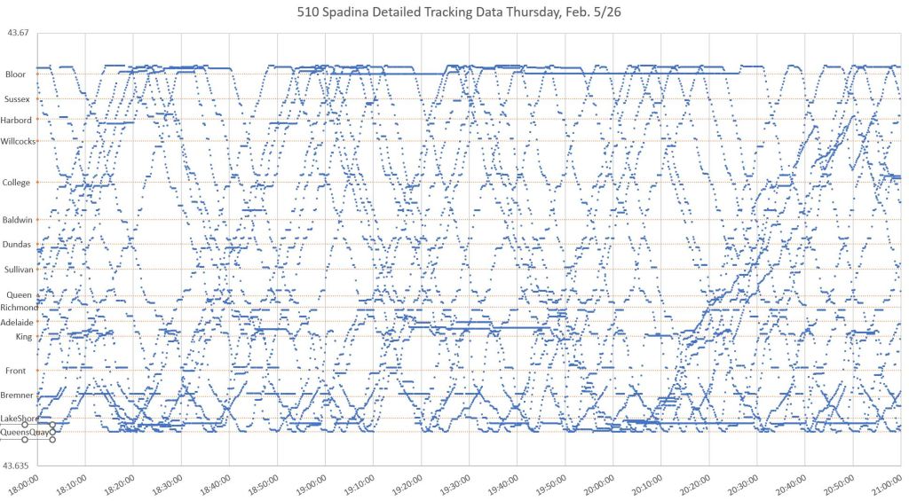
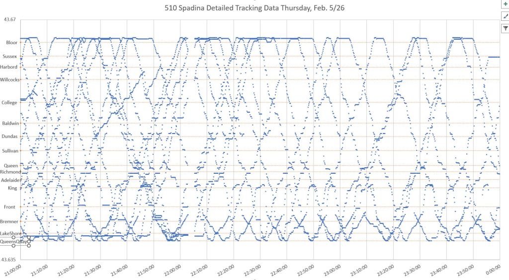
The Problem of Data Granularity
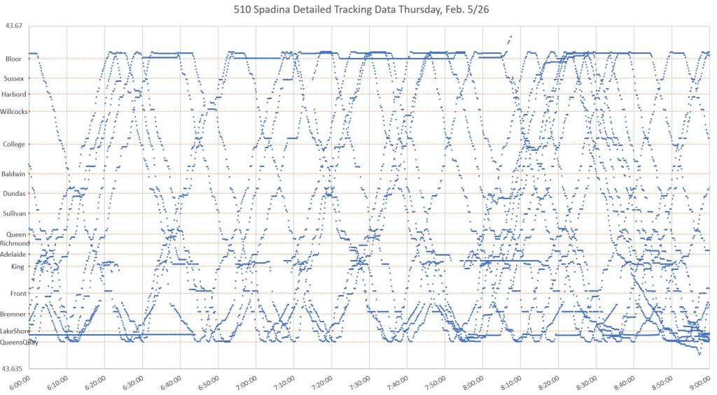
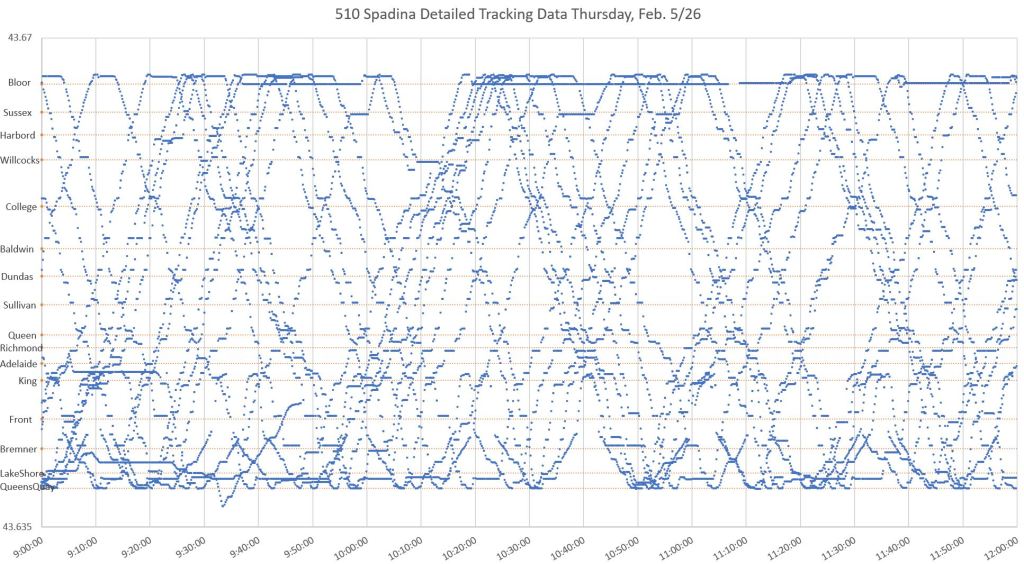
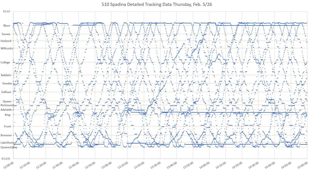
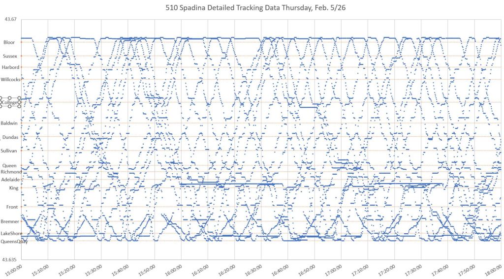
The charts below show all of the data points for February 5, 2026, plotted with latitude on the Y-axis and time on the X-axis. The result is similar to the charts published here in many previous articles, and this plot “works” because the segment of the line included is straight. Latitude can be used as an indication of vehicle position along the route between Queens Quay and Bloor.
In the entire dataset for this day, there are almost 90,000 observations, and each of them is one dot in the charts. Many dots are clustered around intersections because cars are more likely to be there stopped or moving slowly than elsewhere. Clusters of dots horizontally show a car holding either because it is serving passengers or waiting for a green signal. Places where this happens commonly are quite evident in the charts.
Where a car is stationary long enough, there is a horizontal line of dots. This shows clearly where cars encountered delays. Longer delays and layovers are obvious at Spadina Station (at the top) and on the approach to the station where cars often queue. Other locations include just north of King (cars laying over on Charlotte Street after short-turning at Adelaide), at Bremner and south of Lake Shore (Queens Quay Loop).
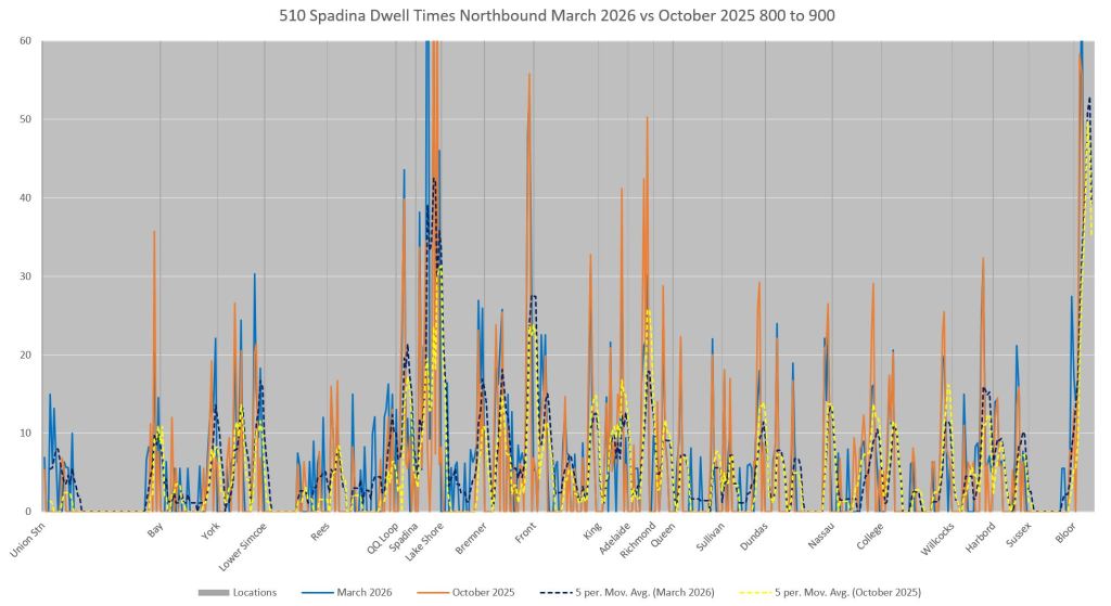
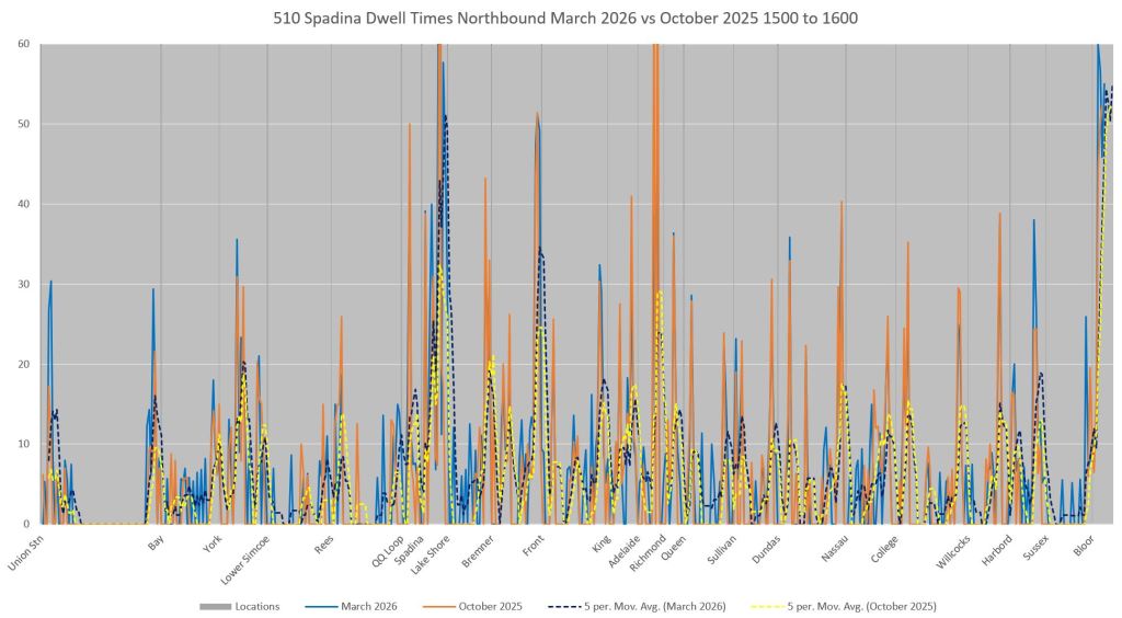
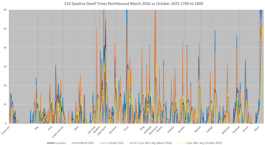
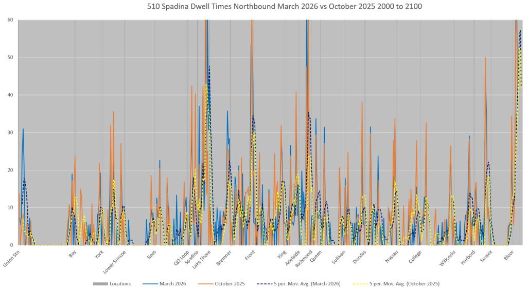
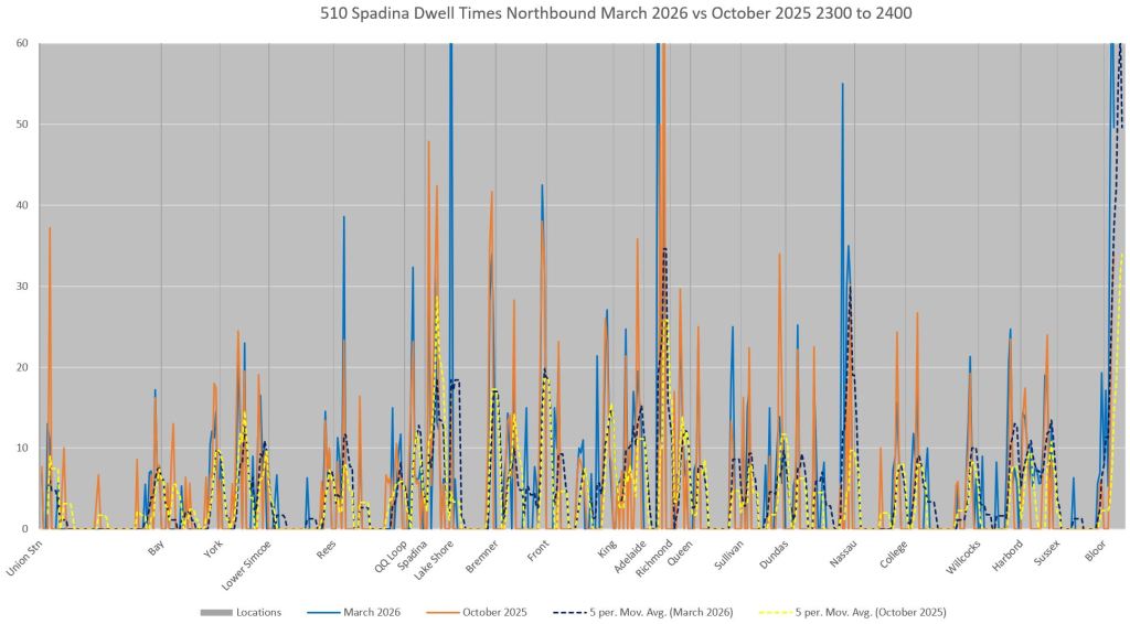
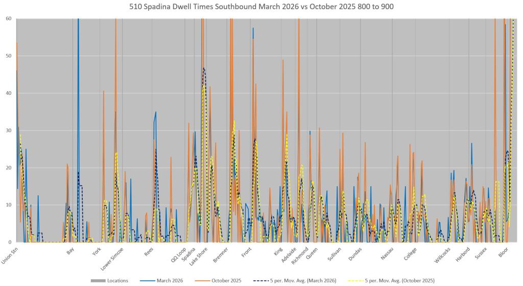
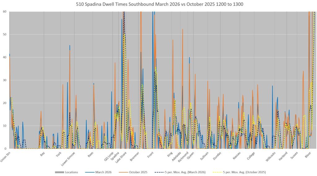
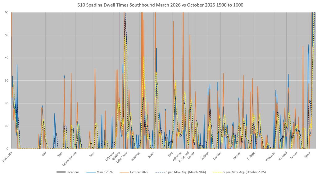
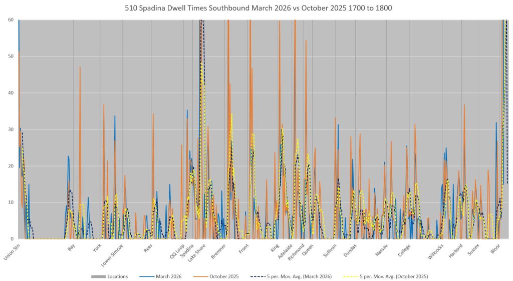
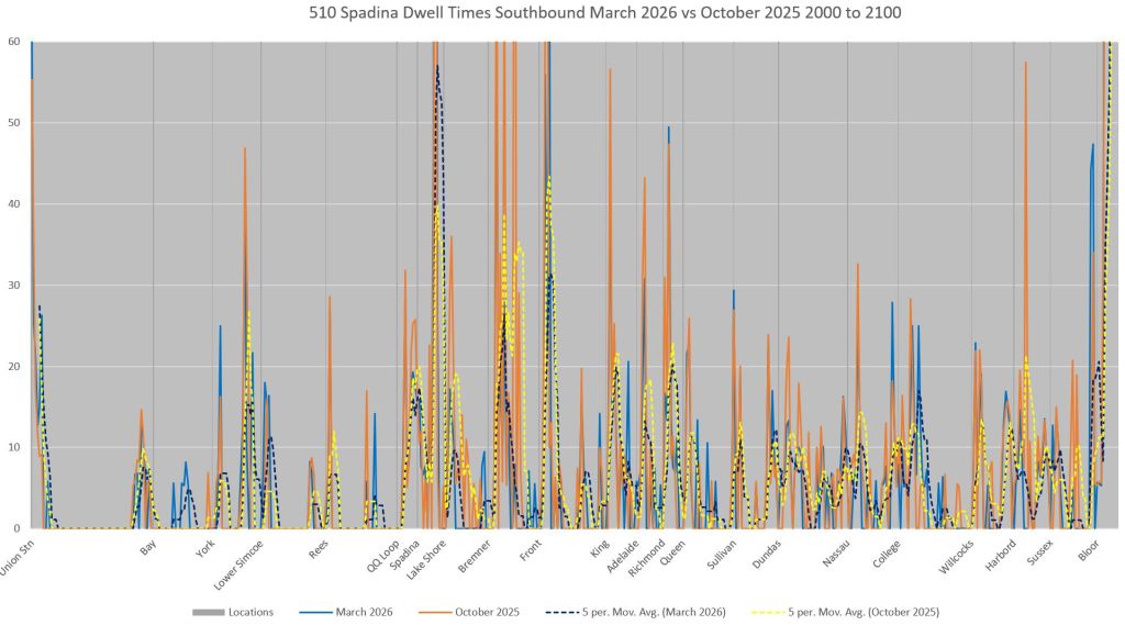
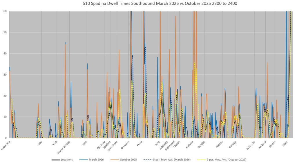
Dwell Times on 510 Spadina
Although the locations where streetcars tend to sit are visible in the chart of all observations (above), what is not immediately obvious are the key, problem locations nor time-of-day variations. The charts in this section attempt to show dwell times where streetcars are stationary long enough for this to show up in the data.
The chart formats are similar to the speed charts shown earlier, but include only information about stationary cars. The two charts differ in that a speed chart shows how fast streetcars travel between dwell points, while the dwell time charts show how long they sat at each point.
In the context of signal priority, the dwell times should go down on average if TSP is a benefit to most streetcars.
Methodology
In the data, where there are two or more observations of the same car at the same point, the car is stationary. Because the polling cycle is about 10 seconds, if there are, say, three such point in a row, then the car was stationary for somewhere between 20 and 30 seconds. For the sake of the calculation, a value of 25 seconds is used. The dwell times for all cars stationary at a point within the same hour are averaged to produce the plotted values.
These are displayed both at the 10m segment level and on a moving average of 50m in the charts with comparisons between late October 2025 and late March 2026. The underlying data are the same as were used in the speed profiles earlier.
Discussion
As with the speed charts, four lines are plotted:
- Solid blue: March 2026 data
- Dashed blue: March 2026 moving averages
- Solid orange: October 2025 data
- Dashed yellow: October 2025 moving averages
The charts show a pattern any rider of the Spadina car will recognize with two separate dwell time spikes on either side of most intersections. This shows that streetcars often “miss” a green signal because serving their preceding stop causes them to fall out of the “wave” of traffic that signal timings serve. There is no aggressive priority in the sense of holding signals green until an approaching streetcar passes. (To be fair this would be challenging with so many major east-west cross-streets and the frequency of 510 Spadina service.)
Note that the offpeak, particularly late evening both farside and nearside dwell times are lower. This suggests that with shorter stop service times, streetcars have a better chance of catching downstream green signals.
Northbound (read left to right, click on an image to expand in a full screen gallery)
Although King, Dundas and College do show some nearside delay, it is small compared to intersections like Lake Shore, Bremner and Front.
Richmond also has long nearside times but this is both a transit stop and a traffic signal. Turns from Spadina are prohibited onto this one-way westbound street.
Similarly Nassau is both a stop and transit signal. Left turns are prohibited, but there is a U-turn signal.
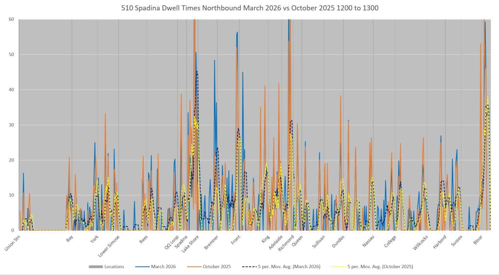
Southbound (read right to left)
Southbound charts show similar patterns to northbound, but there are more nearside stops. The combined effect of stop service and signal delay, if any, cannot be directly take from the data. Every stop from Richmond south to Bremner show longer dwells than elsewhere on the route. Adelaide is a regular point for delays where left turn traffic takes precedence over streetcars. There is a transit priority signal only for streetcars turning east on Adelaide. Delays at Lake Shore are particularly bad because most green time is devoted to east-west traffic.
One might argue that farside stop locations give a sense of the dwell time inherent to stop service when streetcars can leave immediately after the doors close. That of course is relative to passenger volume, but also gives a sense of what the extra nearside dwell time waiting for a green signal might be.
Previous Articles
- TTC Plans Buses on 510 Spadina June-October 2024
- TTC Updates and Extends Spadina 510 Bus Replacement
- 510 Streetcars vs Buses: June 2024
- 510 Spadina Bus Modified Diversion Tracking
- Reserved Bus Lanes for Spadina?
- Spadina Replacement Bus Shifts to St. George Station
- Analysis of 510 Spadina Bus: July 2024
- 510 Spadina: Buses vs Streetcars Jan-July 2024
- Harbourfront Overhead Reconstruction
- Travel Times and Speeds on Streetcars: 2025 vs 2019

Bathurst 511 streetcar just a week or two back was running substitute buses on the norther section of the route due to track repairs.
I’d raced up the stairs at Bathurst station to catch a streetcar only to find four substitute buses waiting (ostensibly bunch-ups) and I was damning the thought of being late to my appointment, only to find the bus got me there (Dundas and Bathurst) in record time.
I used to prefer streetcars…’nuff said.
LikeLike
I think it would be useful to take the locations where there are a lot of vehicles dwelling and do the following.
1. Isolate them (no need to show the locations where there is very low amount of dwell)
2. Identify the spread of dwell for each vehicle and chart it as a weighted candle (ie a vertical line where top and bottom are shortest and longest dwells, and there are horizontal ticks on the candle for each time period)…with enough data this could show the range and distribution of dwells for lights, stops etc.
3. For lights – use the open data for lights to determine minimum and max cycle length, and add those markers at each light location…this would help identify lights where priority would be helpful, or where retiming could be helpful.
Steve: I will look at filtering out and displaying data for your point 2. As for point 3, the Open Data files do not contain all intersections, notably those with adaptive systems, and those that are shown do not inlcude timing details.
4. Do you know which lights have sensors, and where the sensor is located? Would be helpful to identify these as there is obvious benefits of earlier recognition of the vehicles…
LikeLike