
In a recent article, I detailed the headway reliability of night buses on several routes. In a comment, a reader asked if I could relate that data to “on time” performance.
There are a few problems with that concept, not least that the TTC’s own standard is so lax. The charts presented here are an attempt to show the degree to which departure times on two routes are scattered (307 Bathurst) or more closely bunched in a more-or-less reliable group (335 Jane).
Depending on reader feedback, I will include these charts, or possibly a modified version of them, in future articles about night services.
Updated June 20, 2025: The charts for 307 Bathurst Night Bus have been modified to show the advertised times of buses to show the degree to which service is “on time” or not.
A separate set of charts has been added to show the evolution of departure times northbound over the route from Front to Steeles.
Reading The Charts
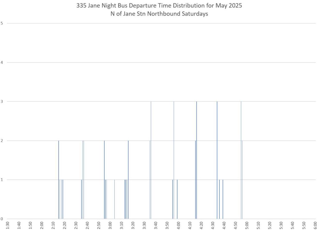
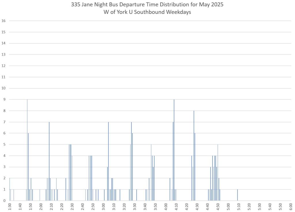
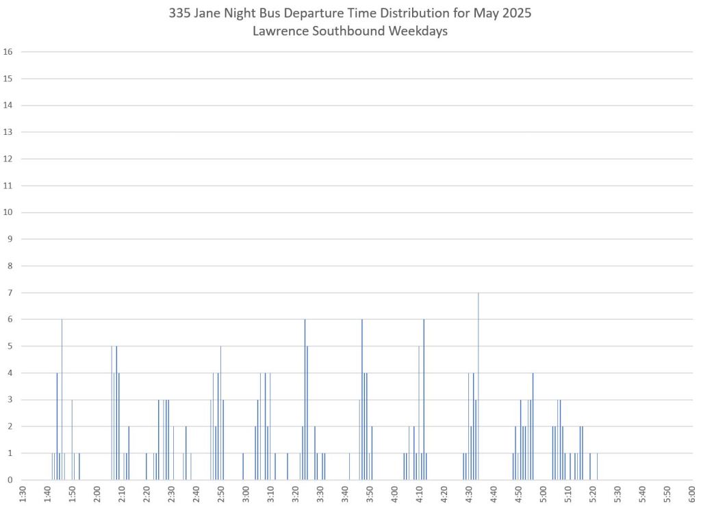
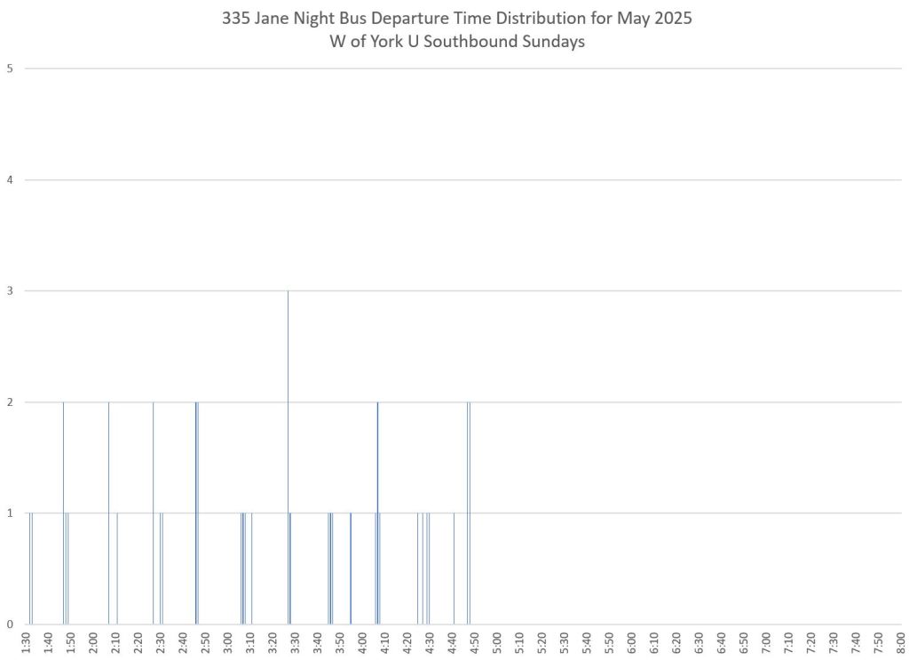
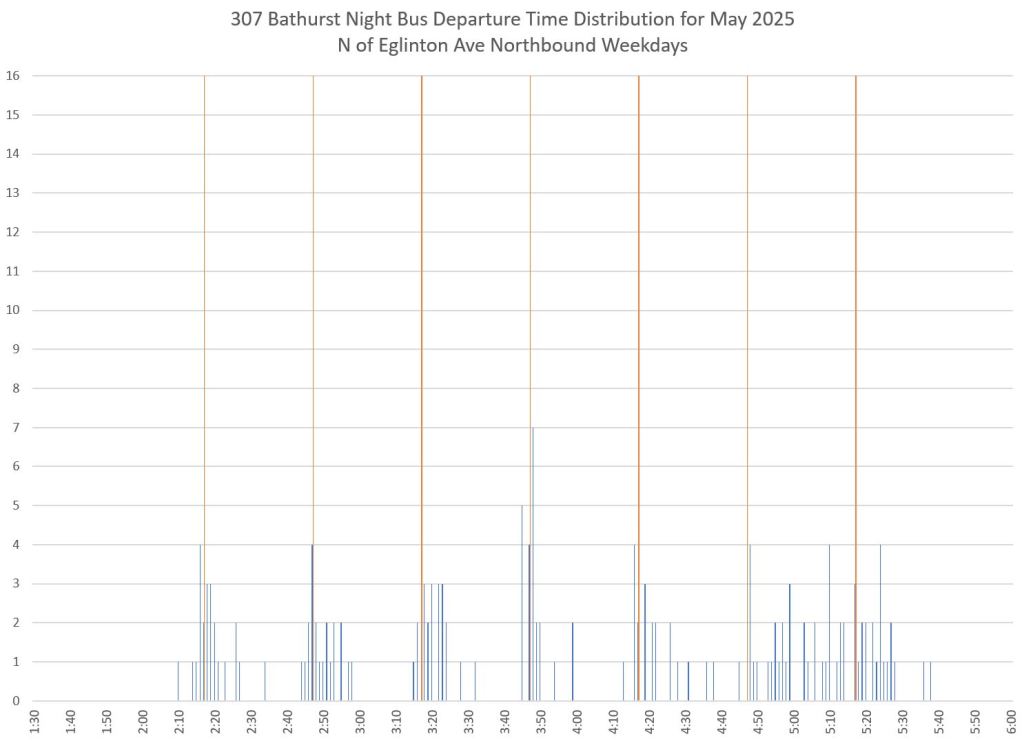
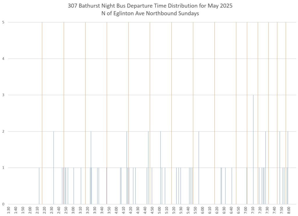
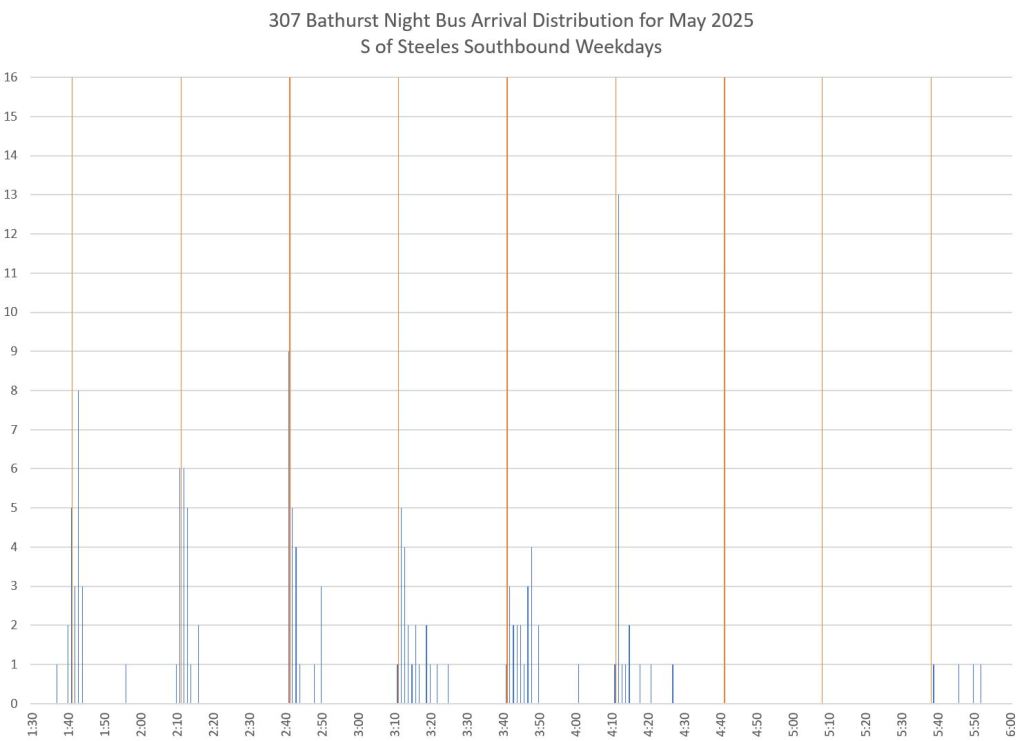
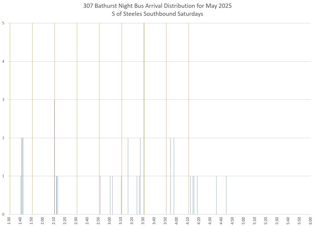
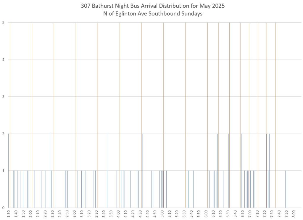
Each chart shows the number of buses crossing a screenline for each minute starting at 1:30am. The lines are the same as used for the charts in the main article.
The height of each bar shows the count of buses within a specific minute. For weekdays, there were 21 days in the month of May 2025, and so in theory the maximum number of buses for any minute should be 21. In practice, these buses appear spread out in time over a few minutes for 335 Jane, and over a wider band for the less disciplined service on 307 Bathurst.
The narrower the column, the better the schedule adherence for that trip. Where columns are spread out, the departure time is less predictable.
In each set, the counts for a screenline near the terminal are shown on the left, and for a screenline midway along the route on the right. Note that even with tightly grouped values at terminals, these spread out as buses move along the route, an inevitable factor in transit operations. The challenge is to keep this dispersion to a reasonably low level so that riders can depend on infrequent service with only a small allowance for variation in departure times.
Within each set, the first pair of of charts show weekday counts, the second pair show Saturdays, and the third show Sunday/Holidays. There were 5 Saturdays, and 5 Sunday/Holidays in May 2025, and so the maximum possible bus count should be 5. With only five buses for each departure, the “spikes” in the chart are not as tall as for weekdays, but the spread of departure times is still evident.
335 Jane Night Bus
For 335 Jane, the departure times are fairly closely grouped northbound from Jane Station, less so southbound from York University
Northbound


Southbound


307 Bathurst Night Bus
Service on the Bathurst Night bus does not run reliably even though it is infrequent. Departures northbound from Front and southbound from Steeles are erratic as the detailed data in the previous article showed.
Updated June 20, 2025: Vertical red lines have been added to these charts at the advertised times for stops at or near the screenlines to show when a bus was expected to appear, as opposed to the actual distribution of times in tracking data.
Northbound


Southbound


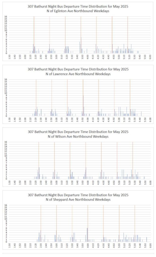
Route Overview: The Evolution of Departure Time Distributions
The charts below show the actual vs advertised departure times at 10 points along the 307 Bathurst route from Front to Steeles.


Steve: The following comments were left on Blue Sky by George Bell. I have copied them here to be with the article.
Steve: I can add the scheduled time as a coloured bar, but with the caveat that my time points do not exactly correspond to stop locations. For example, the TTC gives a scheduled time for the stop in Jane Station, but my screenline is on Jane north of the station. As for stacking multiple locations, I though of that but it would squash the vertical scale for individual stops. I will think about it and maybe compromise with a few key stops on one chart. Probably better in portrait rather than landscape page orientation. As for looking at overall line management, you can do that on the time-distance charts showing the movement of all vehicles including layovers and short turns.
LikeLike
Excellent work. Are you able to do an analysis for the 341 Keele night bus route? Does the TTC read your analysis and do they take any steps to improve their performance based on your analysis?
Steve: See the previous article about night routes which includes 341 Keele. Yes the TTC reads my analyses. What action they take is another matter.
LikeLike