
Revised at 6:30 pm on February 23, 2025: Additional RSZ charts posted to the Urban Toronto site over the past year were passed on to me by a reader. I have incorporated info from them into the charts below to fill in several blanks in my own data.
For roughly one year, the TTC has published a list of reduced speed zones (RSZ) on the subway system. Many of these are long-lasting and span multiple stations.
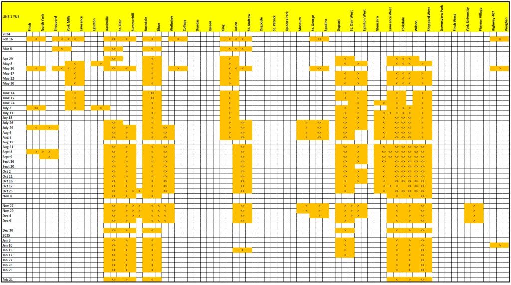
In recent discussions of service quality, TTC management speaks of twelve zones as a reasonable number to exist at any time. Things will go out of whack, or otherwise need repair, to be sure, but the number and longevity of RSZs is extremely frustrating for riders.
As with some other performance indices, the one chosen by the TTC only tells part of the story, even if we agree (which I do not) that having 12 RSZs is perfectly acceptable. What this number does not tell is the extent of each slow order (mileage or proportion of the line affected) or duration (days, weeks, months). Indeed, TTC could get the number down to two simply by making all of Lines 1 and 2 an RSZ. That is obviously nonsense, but shows the problem inherent in just counting items in a list.
The charts below show the areas with RSZs for the two major subway lines over the past year. I was not assiduously collecting this information every week, and used the Internet Archive to fill in a few gaps. Where there is a break of more than a week in my snapshots, I have left a blank line in the chart, although the similarity of data before and after the break suggests that the RSZs persisted.
Most striking about these charts is the proportion of Line 1 that has been under an RSZ for the past year. Some problem areas appear and disappear implying that the problem was minor and fixed quickly, but others are permanent.
A common factor among many of the affected areas is that they are in open areas where track sits on ties and ballast. These are subject to shifting and deterioration far more so than track in tunnels that is bolted to the concrete floor, or sitting on concrete ties (except for switches and crossings). This makes repairs more complex compounded by the problems of working in winter. However, these areas have been on the chart since long before the snow, and a real problem for the TTC is whether repairs can even be achieved in weekend shutdowns.
There are many problems with how the TTC reports is own performance, notably that problems are understated or masked by the choice of metric and presentation. A further concern from these charts is whether the TTC will ever dig itself out of the backlog of work they represent.
Reading the charts:
- The colour bands extend from the limits of a slow order as shown on TTC maps or text descriptions.
- The symbols “>” and “<” indicate the affected direction of travel, and “<>” means “both ways”.

I will update these charts from time to time to show the TTC’s progress, or not, in resolution of chronic subway slow zone problems.
