
Updated Oct. 29 at 2:35pm: The service chart showing crowding levels has been revised with adjusted colouring, and to give emphasis to lines so that they stand out better. See the end of the article for a sample.
Updated Oct. 27 at 8:45pm: Sample charts have been added at the end incorporating some suggested changes.
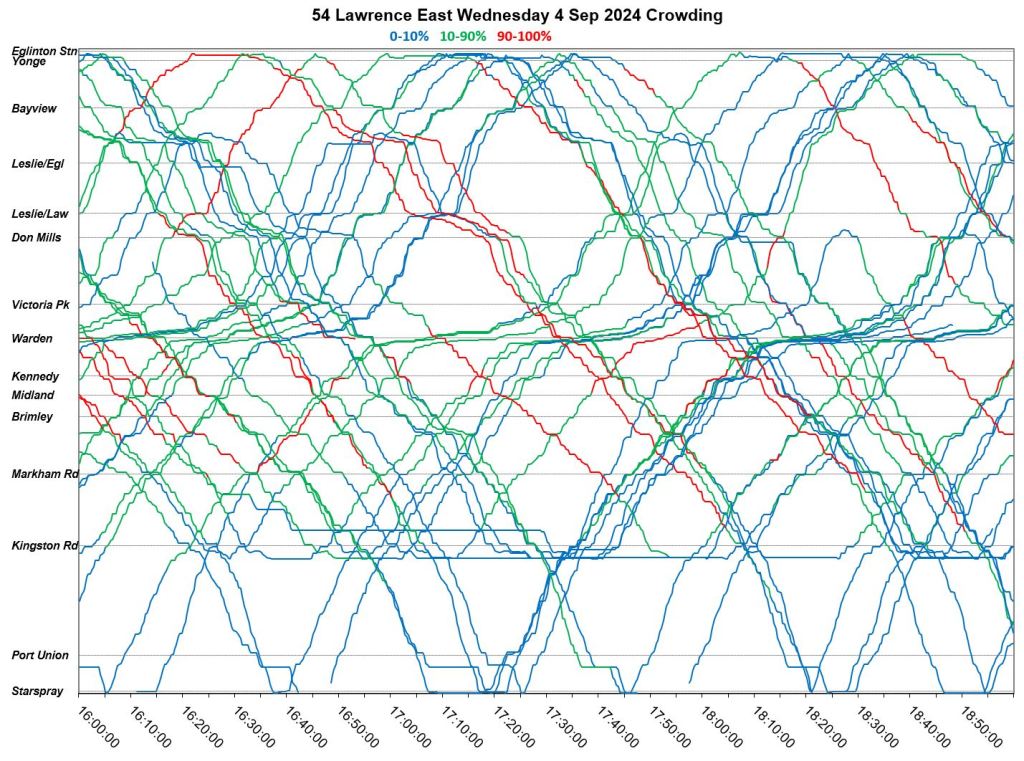
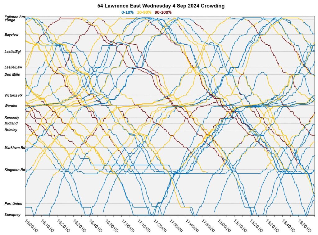
This article continues my search for clear ways to display vehicle crowding data that I now receive as part of my data feed from TTC. In previous articles, I have shown vehicle tracking charts colour coded for the crowding index.
These charts show the regularity (or not) of service, locations of delays, bunches and gaps, and the resulting crowding pattern. This is useful for fine-grained analysis, but one must look at many charts to see the overall patterns.
In an attempt to “zoom out”, I developed a new chart format that shows the proportion of service at each crowding level seen at screenlines along a route by time of day. This article presents the results for the routes already published, but I wanted to nail down the format before publishing more. (I have many more in the wings including 25/925 Don Mills, 29/929 Dufferin, 36 Finch West, 39/939 Finch East, 41/941 Keele, 52/952 Lawrence, 53/953 Steeles East, 60/960 Steeles West, 85/985 Sheppard East, 86/986 Scarborough, 89/989 Weston, 116 Morningside, 129 McCowan North, 903 STC Express, and 905 Eglinton East Express).
Regular readers will know that I abhor the TTC’s practice of reporting service stats on monthly averages with every trip combined to give an overall picture. This hides a lot of things, notably the variations by hour and location, not to mention variations between routes. The chart format proposed here attempts to strike a balance between a hyper-detailed view and one where readers can see how routes behave at a level they can relate to their own journeys.
Does the new format shown here work for readers? Please let me know in the comments. I can do a lot of preparatory work on the other routes, and then drop their stats into whatever the final chart template looks like.
Many thanks to those who have sent suggestions regarding other charts I have published.
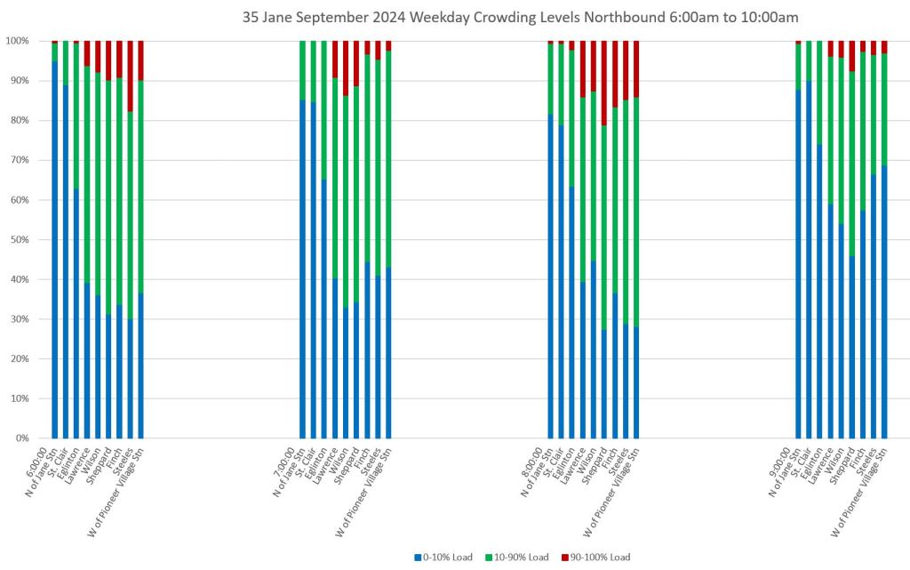
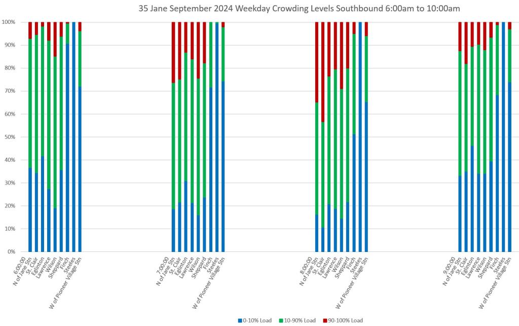
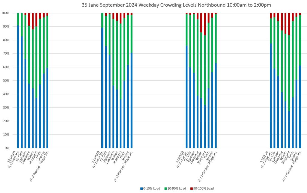
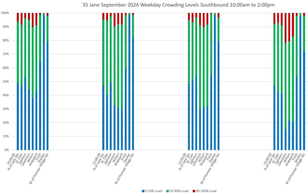
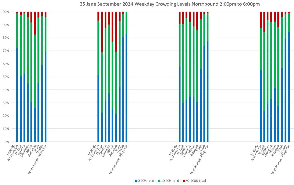
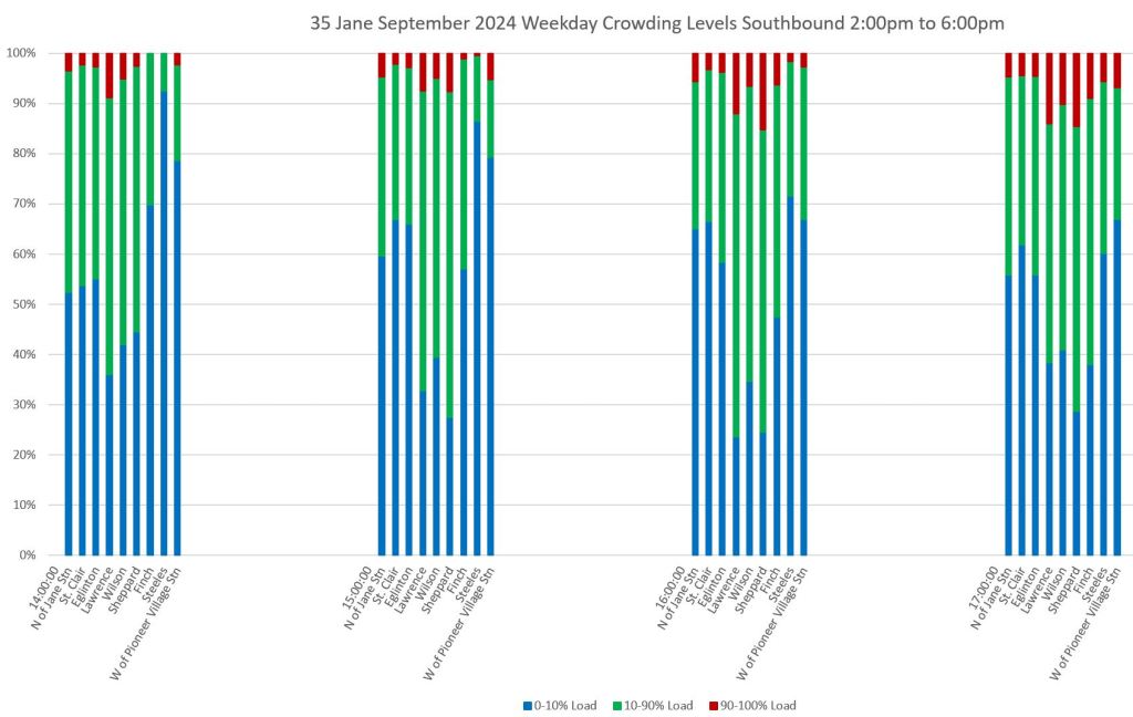
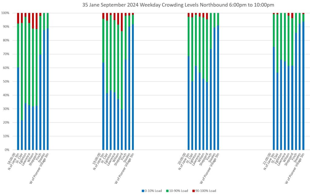
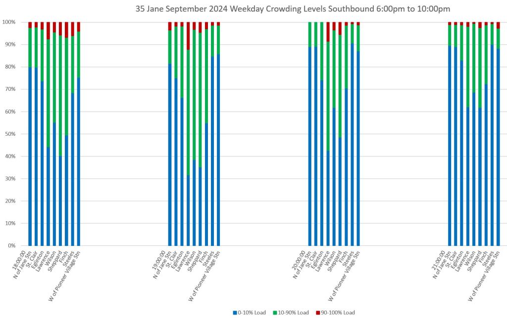
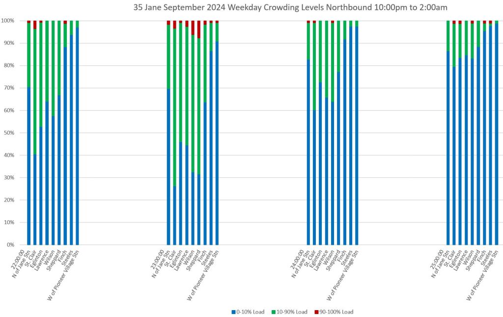
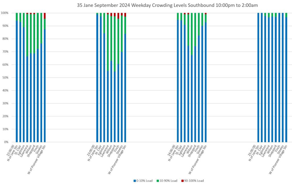
35 Jane Local
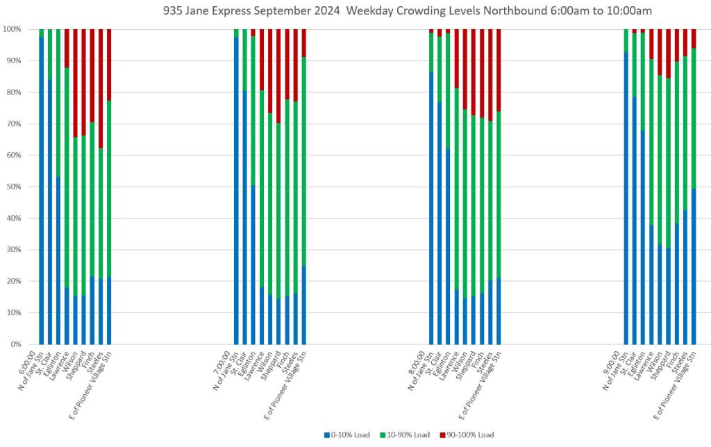
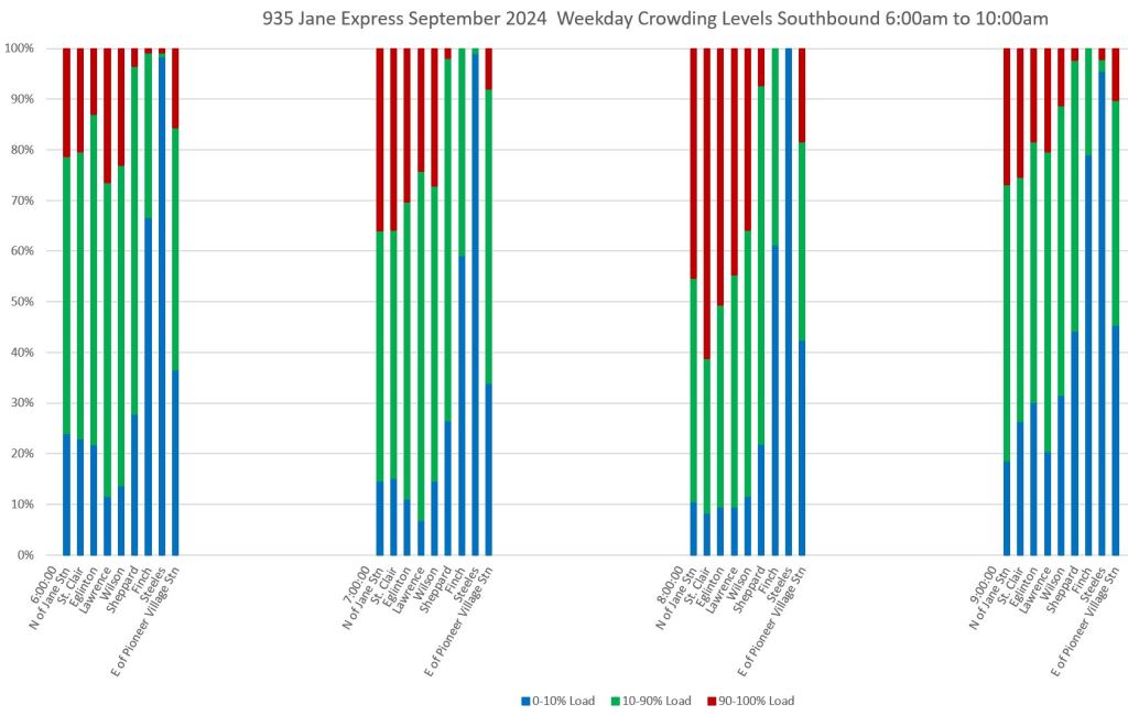
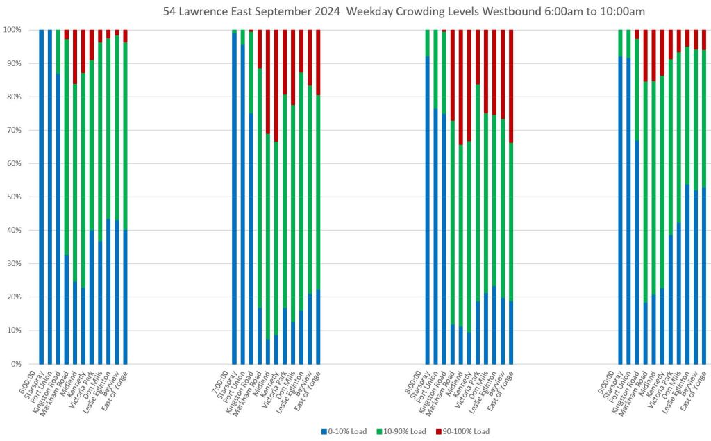
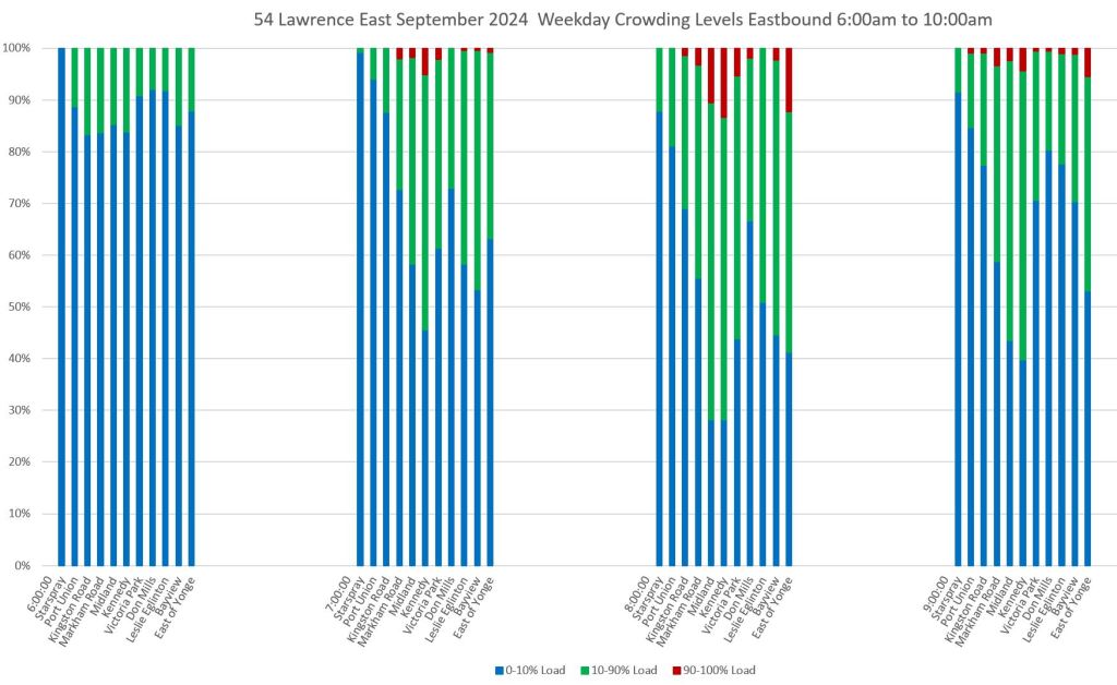
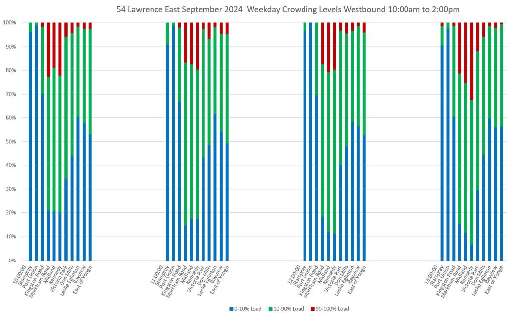
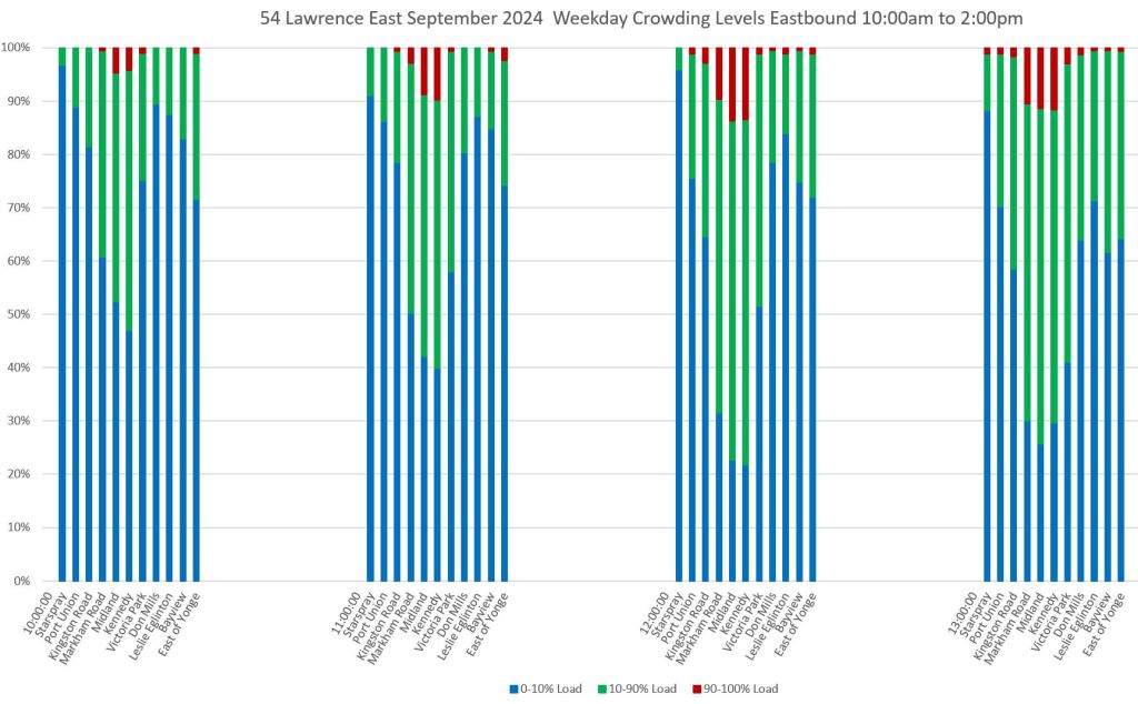
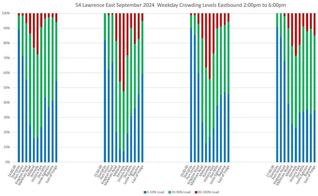
These charts show the proportion of trips on weekdays in September 2024 by location, direction and time reporting the TTC’s three crowding levels:
- 0-10% load: Blue
- 10-90% load: Green
- 90-100% load: Dark Red
A few important notes about the data:
- The choice of load factors is the TTC’s, not mine, and it corresponds to the loading breakdown shown on TTC’s online schedules and by transit apps that make use of this factor.
- It is quite obvious that a range of 10-90% is too broad to show what is going on, and a useful break would be between a seated load and standing.
- This relates to the off-peak Service Standards if the TTC ever gets back to respecting them in service design. There is no point in having a “seated load” or “seated load + 10%” offpeak standard if the stats are not broken down on the same basis.
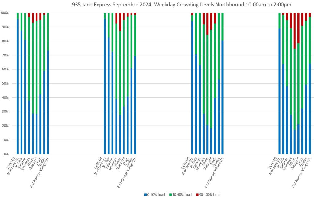
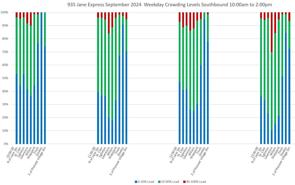
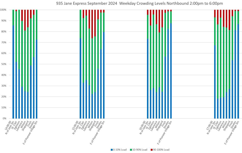
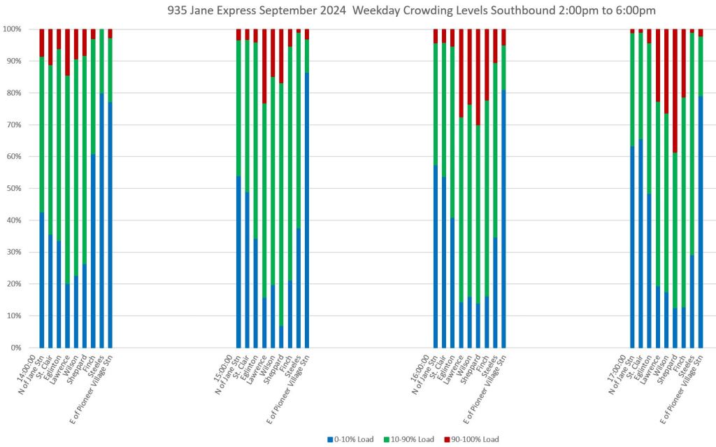
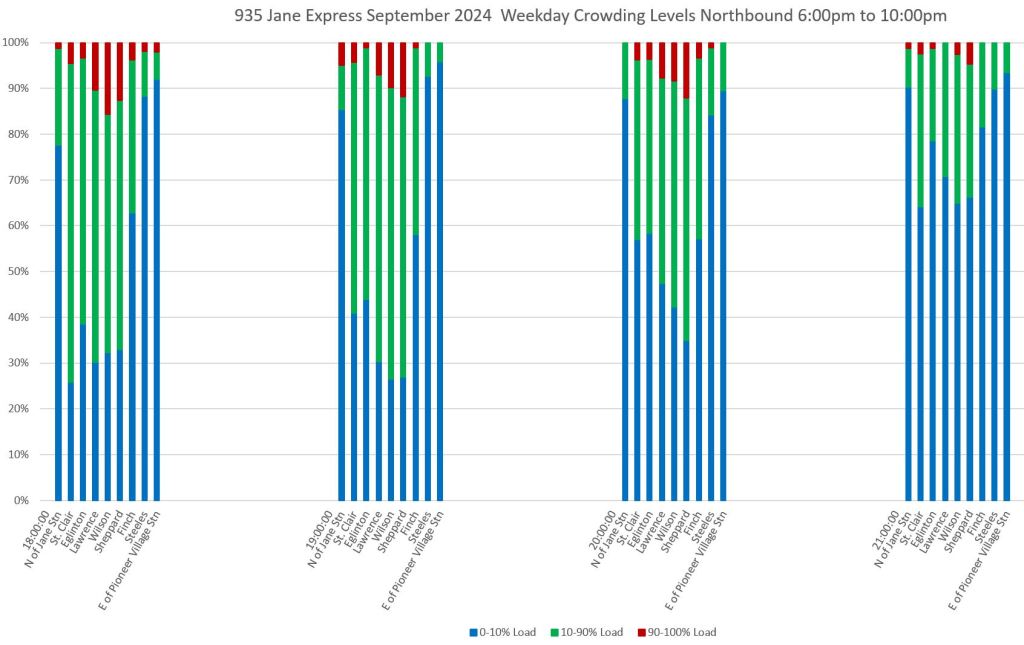
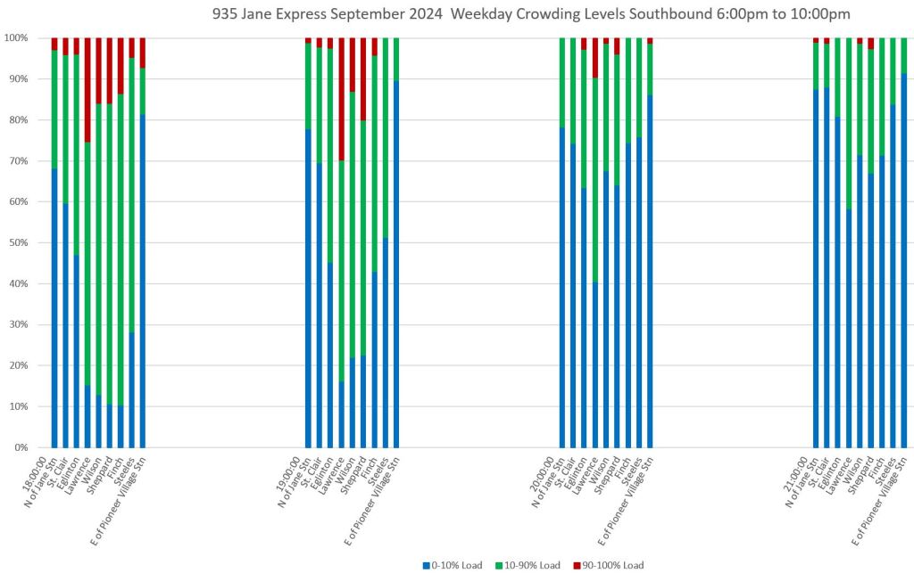
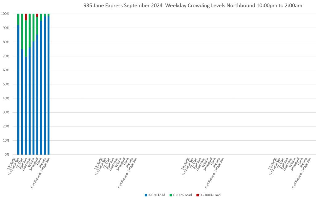
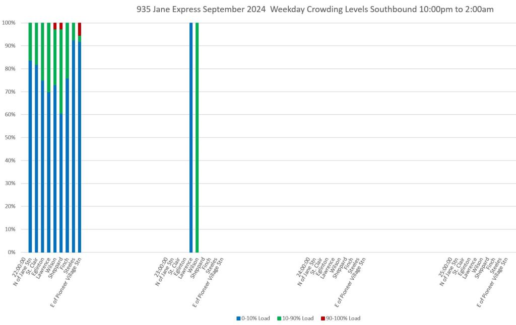
The charts below are arranged in four hour groups through the day with each group of columns containing one hour’s data. Northbound service is on the left, southbound on the right.
Sceenlines are arranged from south-to-north within the columns so that the leftmost bar is for data just north of Jane Station, and the rightmost bar is just west of Pioneer Village Station.
The charts are arranged in four-hour period because these correspond to major service periods through the day, and because this leaves enough room in the template for routes where more screenlines are used.
The greatest southbound crowding occurs between 8-9am and it builds up toward Jane Station, but is not confined to the very south end of the route (top right chart below).
Note that the greatest proportion of crowded trips is not necessarily near the terminus, but can occur in the middle of the route. Every rider is not going to the subway, and crowding near the terminal does not necessarily reflect conditions elsewhere on the route. This is a fallacy in the how some politicians see bus routes.
Note that the crowding levels are measured by the TTC’s automatic passenger counters (APCs) on the bus fleet, and whatever limitations it may have. One factor this cannot measure is the number of riders who were unable to board because a bus was full.
There is a lot of blue (under 10% load) throughout these charts. At some times this represents the light loads one might expect, but it is also related to bunching problems. This can be seen on the detailed service tracking charts in previous articles where a bunch of vehicles shows the first (or maybe first two) in a group with full loads, and a drop-off in following buses. This is an indication of wasted service resources thanks to uneven headways.
Although there might be many lightly-loaded trips, most riders are not on these buses, and the perceived level of crowding is dominated by the riders who are on full ones, just as average wait times are dominated by the large gaps with many riders waiting for a bus to appear.
An important consideration for TTC service quality is the need to actually manage vehicle spacing. Red paint may chase motorists out of the way of buses, but if they continue to travel in packs, the full benefit of service is not achieved.
I am contemplating a chart to combine headway and crowding information, but have not yet settled on a format. Another RFC article will appear when I have a proposal.
I experimented with a few other layouts, but settled on the version here.
- If the data are displayed as raw trip counts, the variation in service levels through the day makes it harder to compare the proportion of crowded trips during each hour.
- I also looked at a day-of-the-week breakdown to see if the values changed on midweek days versus “lighter” days like Monday and Friday. There was some, but not much, difference. I might bring out a version of this if I can easily and clearly compact the extra variable (day) into the dimensions already shown on the charts.
935 Jane Express
The express service on Jane shows similar patterns to the local service, but with a slightly higher proportion of crowded buses and fewer lightly-loaded vehicles.
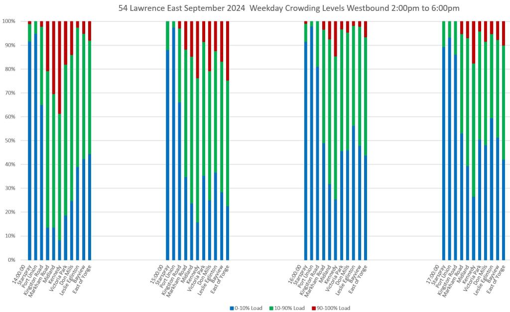
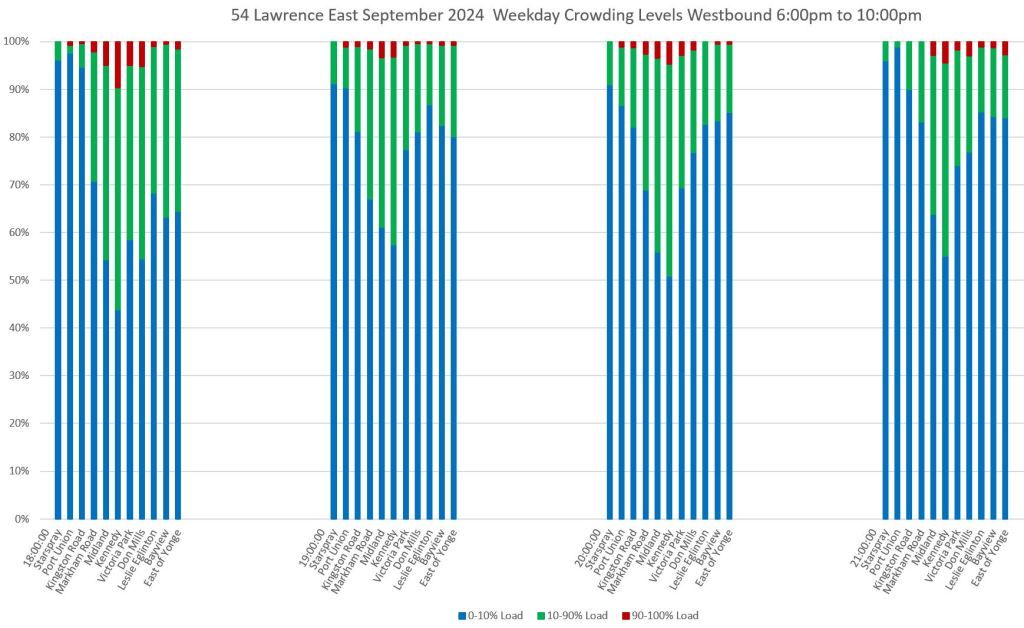
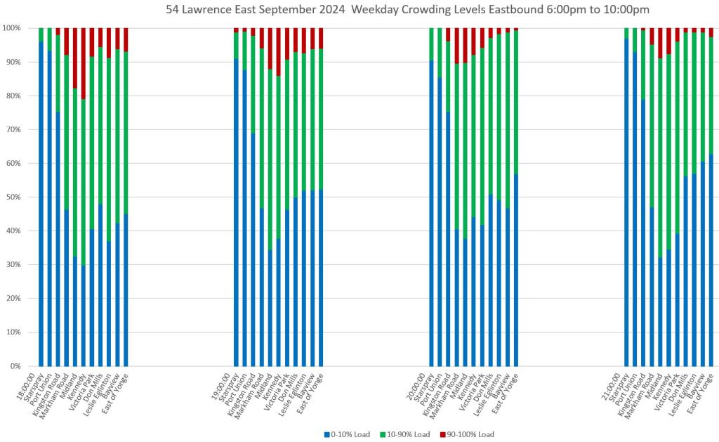
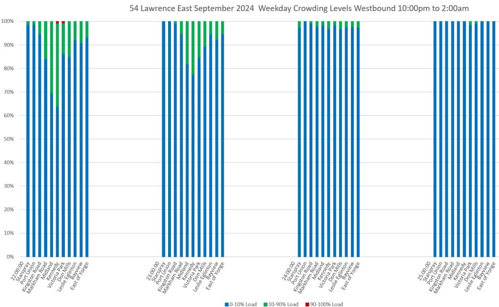
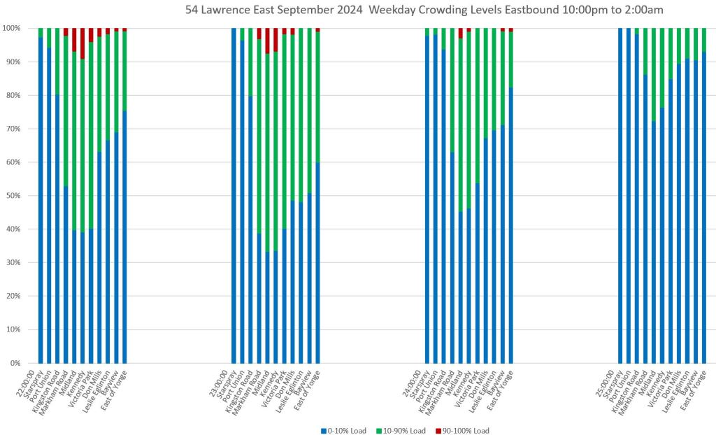
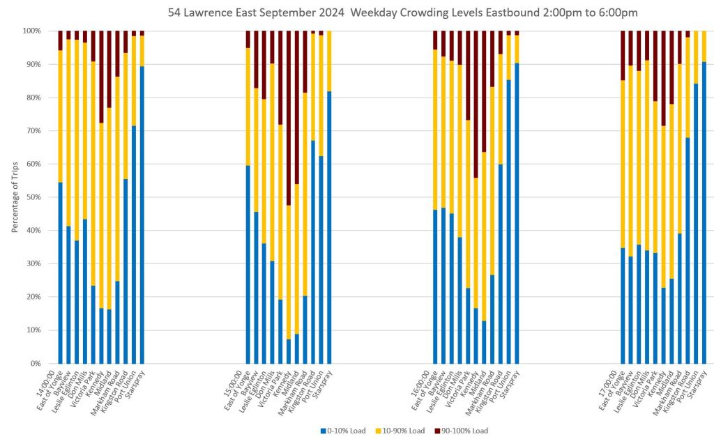
54 Lawrence East
Screenlines for Lawrence East are arrange from east-to-west with Starspray Loop on the left and Eglinton Station on the right. Note that the greatest crowding occurs in the middle of the route.

954 Lawrence East Express
This service operates only in peak periods, and runs between Starspray Loop and Kennedy Station.
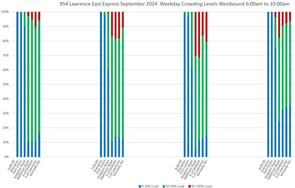
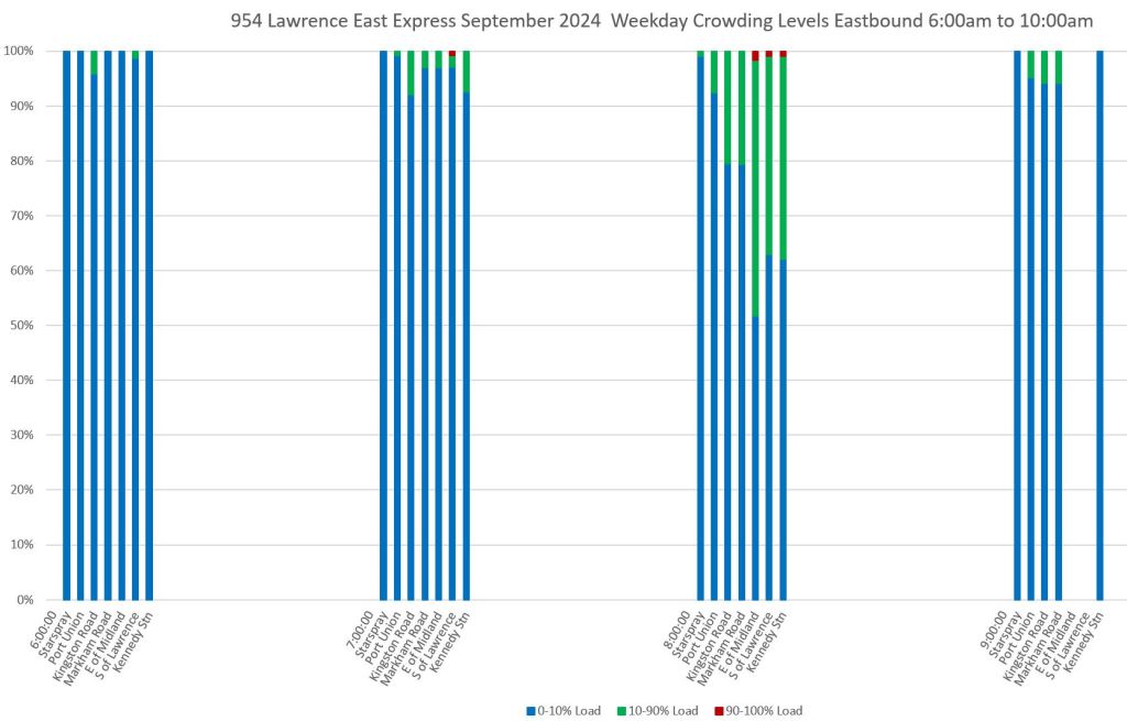
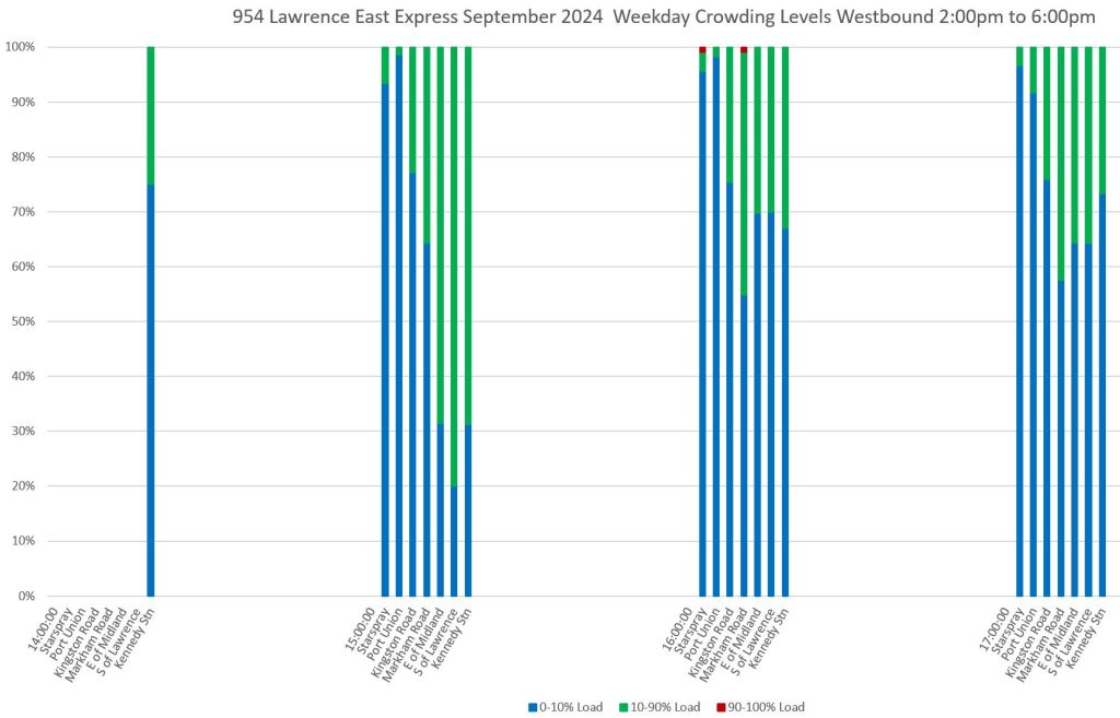
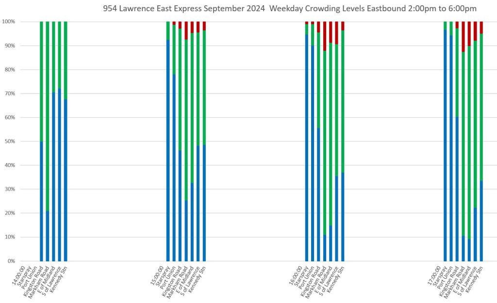
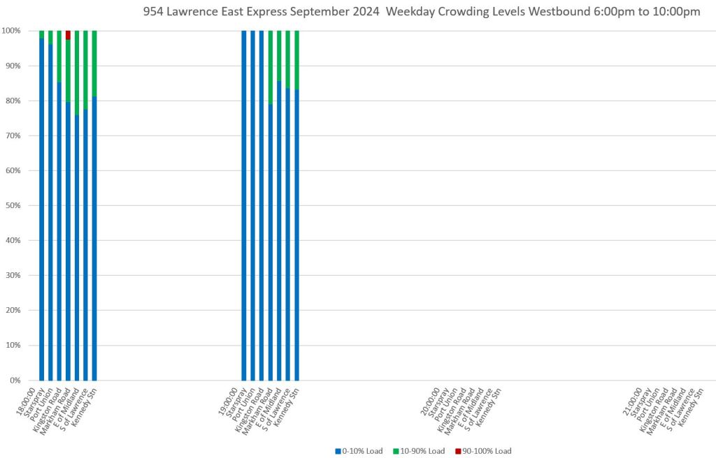
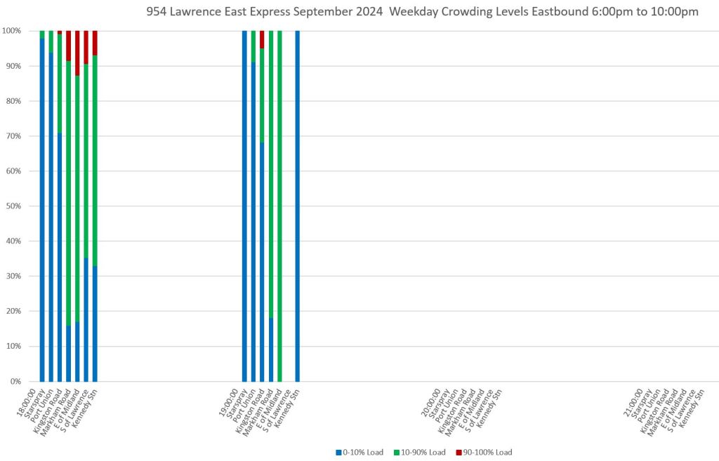
Chart Sets
- 35 Jane
- 935 Jane Express
- 54 Lawrence East
- 954 Lawrence East Express
Revised Charts
In response to some comments I have received, here are two new charts with the following changes:
- The crowding summary chart has been recoloured for accessibility, and a legend has been added to the y-axis. For eastbound and southbound charts, the time points have been reordered so that progress along the route reads left-to-right as it does on westbound and northbound charts.
- A similar time point reordering has been done on the headway distribution chart (not shown here) for consistency in future articles.
- The operating chart showing crowding levels has been recoloured on the same scheme, and the background has been changed from white to a pale grey so that the colours will stand out better.
Crowding Summary Sample
The original version is on the left, and the revised version is on the right.
Operating Chart With Crowding Levels Sample
The original version is on the left, and the revised version is on the right. I deliberately chose a “busy” chart to see how well the colours worked with a lot of overlapping lines. One obvious possible change would be to darken the yellow. Even though it is the same shade as in the charts above, it does not work as well for fine lines as for areas.
Updated Oct. 29, 2024 at 2:35pm: A further revision has been added with:
- A darker yellow/gold colour for loads between 10-90%, but with a heavier line weight.
- The same dark red for loads between 90-100%, but with a heavier line weight.
- A return to a plain white background for the chart.

The 34 Eglinton East route is packed to the brim during the weekday rush hour because it’s scheduled every 15 minutes, yet on weekends, several buses pass every 5 minutes.
Does having a job mean less service for a route?
Steve: The 34A branch to Kennedy Station is supposed to run every 10 minutes at worst. From Don Mills westward there is also the 34C Flemingdon branch although its buses are not coordinated with the 34As. Where and when are you waiting?
LikeLike
Great work, Steve. Very useful to help understand problems with service, if only the politicians and managers would look at it
A couple of comments: Colours alone can be difficult for many people to distinguish, especially for those with any form of colour vision deficiency. Blue/green can be especially problematic, and the colour-rendering capability of different devices can exacerbate the problem. Black, white, orange, and blue are considered the best choices when colour alone is the distinguishing factor. Usability guidelines recommend a secondary means of differentiation where possible. If your software can do it, I’d suggest sparse dots, slanted lines, and dense cross-hatching in addition to the colours mentioned above for the different degrees of crowding.
Is it possible to match the order of screenlines to the direction of travel, so that all charts can be read from left to right? As it is, northbound Jane charts are read left to right, but southbound charts must be read right to left. If there are reasons not to do that, then perhaps an arrow pointing left or right could be added below the screenline names. Otherwise, one has to search for the travel direction in the chart title, and might miss it when switching quickly among numerous charts.
Hope this is useful. Many thanks for all the work you do!
Steve: Thanks for the suggestions. Colours come up regularly as do other schemes like hatching. One thing I have to watch out for is that I use the same colour scheme on the service charts where the lines are narrower and hatching won’t work. However, I will look at combinations that might be possible for both narrow and wide lines on different charts.
Regarding the right-to-left ordering, I will look at it. It’s actually just me being a tad lazy and using the same template for both directions, although one could argue that it’s useful to preserve the same east-west, north-south orientation for both charts. This would also affect the headway distribution charts used in some articles which have the same orientation of screenlines for both directions. If I am going to change one, I need to change both.
LikeLike
Thanx very much for these. They look lovely, as well as conveying elegantly much good information.
Would it be worth labelling or at least describing the y axis? Do I understand it to be reporting the proportion of services with the coloured load? So do I understand the first bar of the first chart showing for 35 Jane September 2024 weekday that the from the hour starting at 6:00 north of Jane about 95% of services were 0-10% of load, about 4% were 10-90% of load, and about 1% were 90-100% of load?
Steve: The axis already has percentages on it, but I will add descriptive text.
LikeLike
These are nice.
In my opinion, the crowding summary charts take too much space, making it harder to display many stops or time intervals. If the loading data were more granular, something like this would be more useful, but as it is, there are really only two pieces of useful data per bar: fraction of buses that are >90% load, and fraction of buses that are 90% load on the y-axis. With the higher data to ink ratio, you could easily show 24 of these next to each other for a whole day for a stop. Or use line plot for even higher density. If you want to display multiple stops per time interval, you can do that too. And you can now do various kinds of overplotting for easy comparisons also.
Steve: The intent of the plots is to show the change in crowding along a route. The density of lines is chosen because some routes have more screenlines in my model, and need elbow room. I have other charts that show headway data for single locations either for one day, or summarized by week and month. There are many possible dimensions to choose for the charts, and I have to decide based on what I am trying to illustrate.
I agree that more granular data would be useful, and the underlying machinery is designed to easily add more granularity.
LikeLike
IMO these charts work well. At a glance, the proportion of trips above a given crowding standard tells me if there’s an aberration or a perennial issue. The narrower the timeframe the better, four hours is probably fine for most surface routes, for the subway and 10-minute network a narrower window may be suitable, especially to spot the peak within the peak which may affect a half dozen or more vehicles.
LikeLike