
This post reviews operation of TTC service on the 54 Lawrence East bus and its express equivalent, 954, for September 2024. It continues on the work of building new charts including crowding data that began in the previous article on 35/935 Jane.
In response to suggestions, there are a few changes in the charts here.
- The shade of red used for crowded buses has been darkened.
- A reader suggested using a colour palette with a common base such as a light, medium and dark taupe. I experimented with it, but found the contrast for fine lines against a white background did not work well, especially on small displays.
- New charts showing the distribution of headways along the route and over time have been added.
- The scheme used is intended to give comparable information to a histogram, but on a more compact basis that makes changes along routes easy to see.
Summary of the 54/954 Lawrence East bus review:
- Service on 54 Lawrence is unreliable with much bunching and gapping during many periods, especially toward the eastern end of the line.
- Bunching caused by unregulated “blending” of the two branches (54A to Starspray and 54B to Morningside) is chronic. (This is a common problem on branching routes.)
- Crowding during off-peak periods generally occurs on buses that are running in a gap.
- Groups of buses commonly stay together for extended periods, including terminal departures, rather than being spaced apart to minimize gaps.
- Late evening service on the eastern end of the route is quite erratic, and there was a repeated wide gap on most days in the period reviewed here.
- The 954 express service has relative little crowding and much more reliable headways than the local service.
- This route is a textbook example of abdication of route management. The tracking data shows little sign of congestion compared to some other routes, and bunching is a common operating practice.
This article uses the same week as my analysis of 35/935 Jane. It was chosen in the middle of the month after resumption of school-based travel patterns.
There are two visible breaks in data on some charts:
- On Wednesday, September 18, there is a roughly 10-minute patch of missing data just after 10am.
- Construction on Lawrence between Victoria Park and Pharmacy required diversion of service.
Scheduled Service

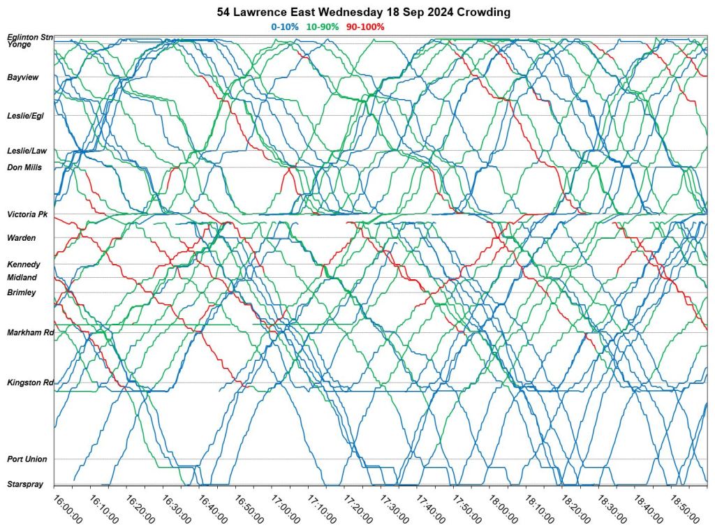
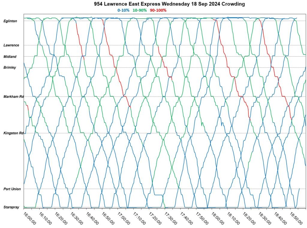
Service on Wednesday, September 18
Service on September 18 is typical of this route with buses running in pairs or worse throughout the day. Many of the trips segments shown as crowded (red) are buses operating in gaps. Particularly noticeable are 54B buses that turn back at Kingston Road & Morningside, but do not evenly split the gaps between 54A buses from Starspray. Although headway management at Eglinton Station should be straightforward, buses often leave there in pairs.
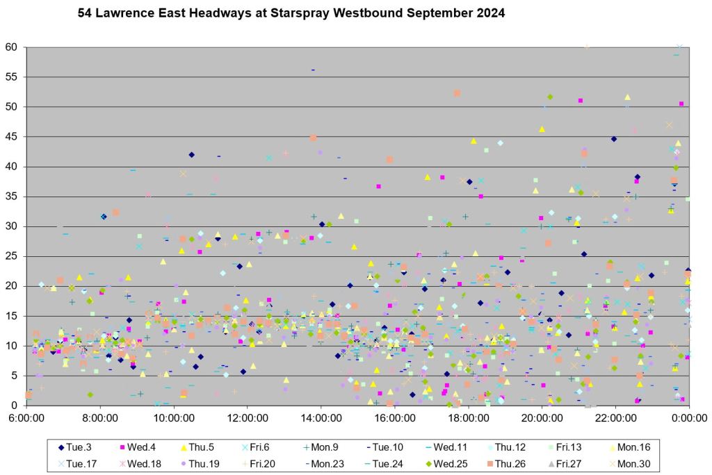
There is a wide gap in service at Starspray after 11pm. This is not a “one of” event as shown later in the article.


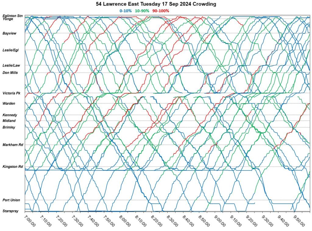
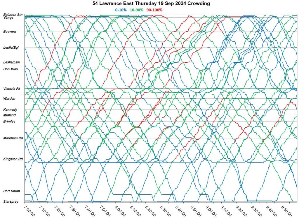
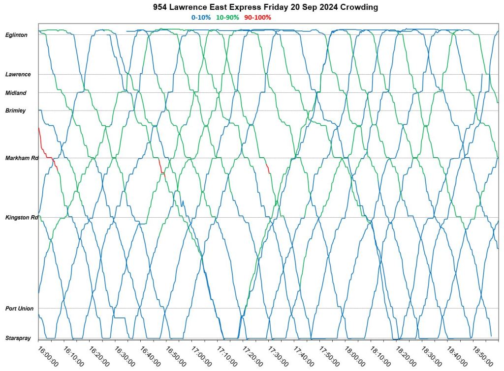
Peak Periods for September 16-20
AM Peak
This group of charts collects the 7-10am periods for Monday-Friday the times and locations of crowded buses are consistent from day to day, as is the general pattern of bunching and gaps. This is typical service, not a cherry-picked example.


PM Peak
Like the AM peak, the PM peak has consistent times and locations of crowding, and these are almost all associated with gaps. The bunching problem is visibly worse with platoons of four to six buses.


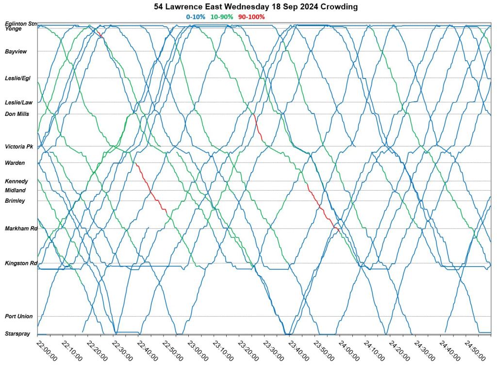
Late Evening
Service is more reliable late evening, although some bunching remains. There is a consistent pattern where a bus that should operate through to Starspray after 11pm is missing. This shows up in the detailed headway stats later in the article with very long late evening headways east of Kingston/Morningside.


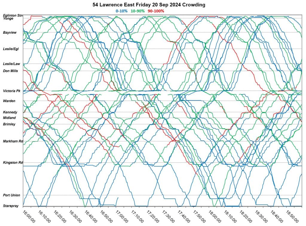
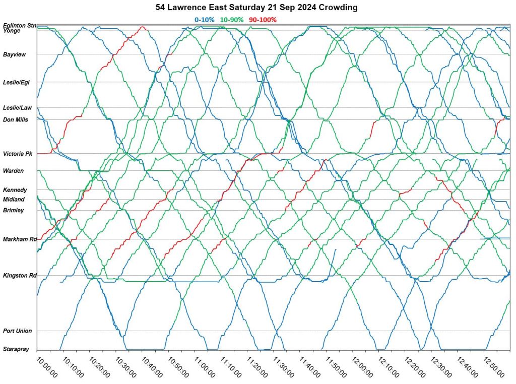
Saturday, September 21
Saturday service is only slightly less fouled up than on weekdays. Buses regularly run in pairs (or worse) and make entire trips between Eglinton Station and Morningside as if they were coupled in a train. The result is wide gaps throughout the day.
Note that there is a gap at Starspray after 11pm similar to the one seen on most weekdays.


Sunday, September 22
Bunches and gaps occur on Sunday just as on Saturday with 54A and 54B running as pairs both east and westbound. The size of platoons grows later in the day.


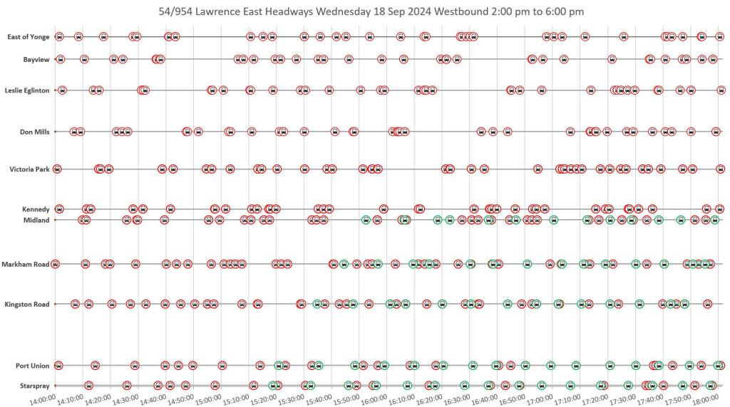
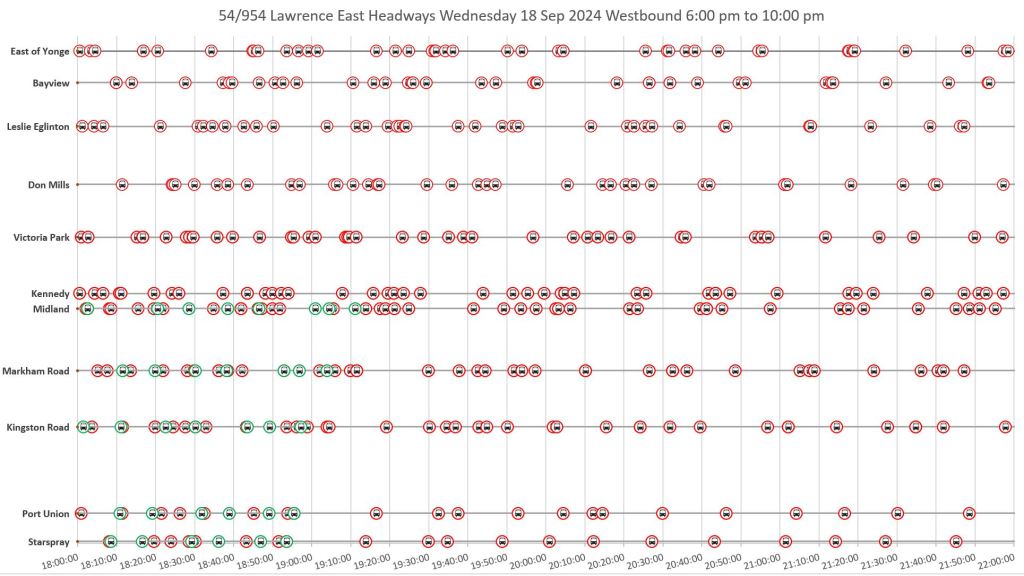
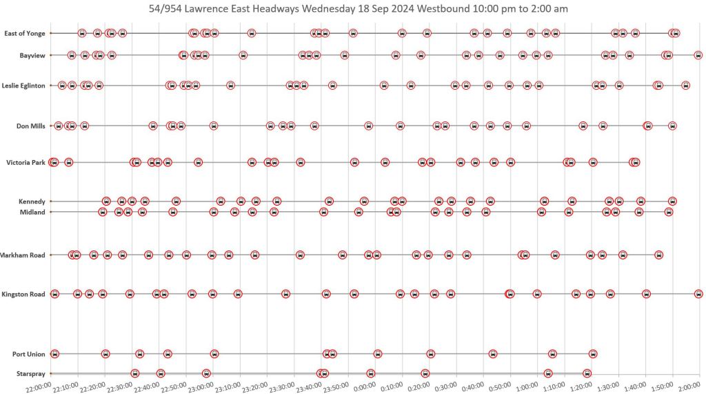
Headway Charts for September 18
These charts show bus spacing at various key points along the line. During peak periods, the 954 express trips are included with green icons while the local 54 service is shown in red.
Westbound
Starspray is at the bottom of these charts which should be read upwards as the direction of travel.
There are more buses from Kingston Road/Morningside onward because the 54B service has joined in with the 54A from Starspray. The service runs in packs across much of the line for most of the day.


Eastbound
With Eglinton/Yonge at the top of these chart, they should be read downward as the direction of travel.
Much of the service leaving Eglinton Station is already bunched, and these groups of buses close up as they proceed east.


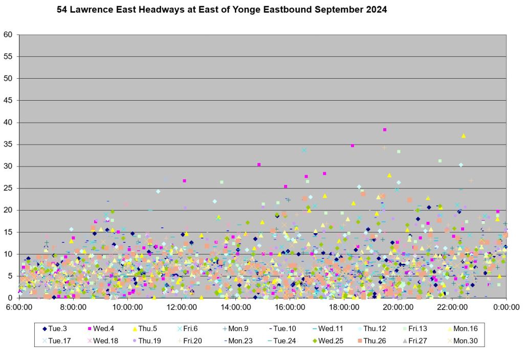
Monthly Headway Summaries
Readers familiar with earlier articles will recall scatter charts showing the distribution of headways on routes. In a few cases, these are “well behaved” with data points clustered around the scheduled headway, and fairly small standard deviation values indicating a narrow range of values.
That is not the case for Lawrence East. The charts below show the values of all headways at three points on the line for weekdays in September. A few important notes:
- The vertical axis on these charts goes up to 60 minutes (one hour). No respectable transit service should require this much headroom to fit in all of its data. (There actually a few points over 60 in one chart.)
- The range of values greatly exceeds the TTC’s nominal target of a six-minute window, however it might be calculated, for a bus to be “on time”.
- There are many points in the range from 0-5 minutes on a route where the scheduled headway is never in this range. This shows how common bunching is.
- The chart on the left shows headways leaving Starspray Loop at the east end of the route. Only half of the service is scheduled to run there, and the advertised service ranges from every 10 to 20 minutes depending on the time of day.
- The middle chart shows headways westbound at Markham Road where the full service of 54A and 54B operates.
- The chart on the right shows service leaving Eglinton Station. Bunching is common even though this is a terminus, and on some occasions headways are much wider than advertised.

(In the interest of space, I have not published the full monthly details inline here, but they are available at the end for those who are interested.)
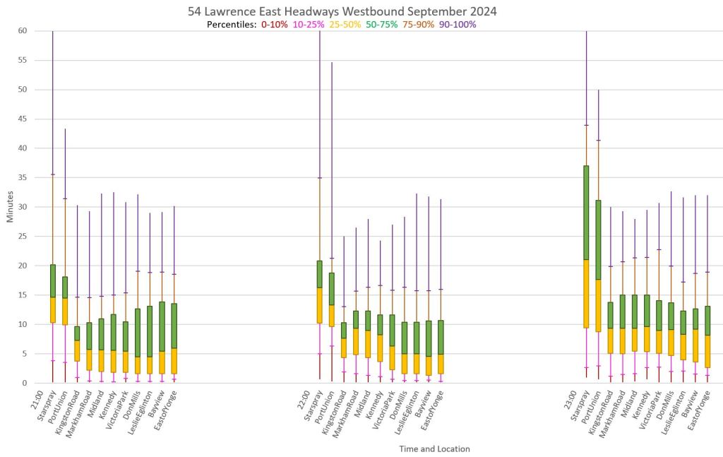
Making sense of this requires a different presentation of the data. The charts below show the distribution of headways at various points along the route from Starspray to Eglinton Station.
Initially, I ran these plots with 20 minutes as the maximum, but this proved impractical because of the number of points above that level. Here is a chart with a 20 maximum. Many of the lines run off the top of the page even though this does give the main part of the chart more elbow room.

On the chart, each group of lines represents data for one hour, and each line one location from east to west. The charts consolidate the data for each of the screenlines I set up on the route as points to measure headways.
The yellow and green bars in the middle of the lines contain half of the data points (the second and third quartiles). Ideally, their combined height should be within a range of acceptable headways, and the tails (the first and fourth quartiles, subdivided to show the lowest and highest decile) should be short. They are not.
An important point here is that consolidating data from a period of several weeks can hide as much as it shows, and yet nobody (not even me) has the time to look at every day and location in detail. Those central yellow-green bars don’t look “too bad” in many cases until one remembers that they represent only half of the service. The other half lies in the tails either in the bottom quartile of bunched service or the top quartile with substantial gaps.
Within a month’s data, there will always be a few outliers caused by unusual conditions, but they should not be so pervasive nor so numerous.
The next group of charts is scaled at 60 minutes. They track the headway behaviour over the course of the day from 6am to midnight.
There is some evidence of gaps spreading wider here, but so many trips are closely spaced from the terminal (or from the point where 54A and 54B services merge) that the effect of runs catching up to form pairs is not seen as much.


Here are the corresponding charts for eastbound service. The locations are in the same order as for westbound, and each group should be scanned right-to-left to track progress along the route.


954 Lawrence East Express
Service on the 954 Lawrence East Express operates between Starspray Loop and Kennedy Station during peak periods only. There are some crowded trip segments, but these are not generally due to gaps. Service on the 954 is fairly reliable, at least by comparison to the 54 local service.
In these charts, Starspray loop is at the bottom and Kennedy Station is at the top. Here are charts for the week of September 16-18.
AM Peak


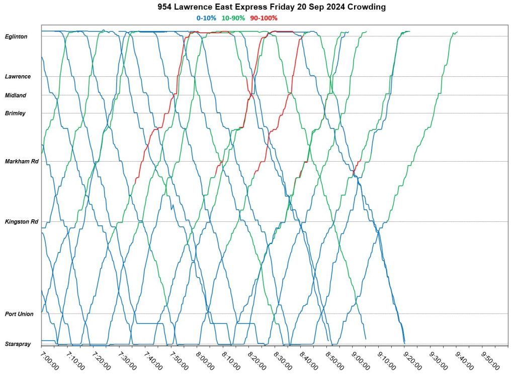
PM Peak


Full Series Charts
- Monday, September 16
- Tuesday, September 17
- Wednesday, September 18
- Crowding (54 Lawrence)
- Crowding (954 Lawrence Express)
- Headway Spacing WB
- Headway Spacing EB
- Thursday, September 19
- Friday, September 20
- Saturday, September 21
- Sunday, September 22
- Weekday Headway Distributions
- Headway Statistics and Scatter Charts

That’s some pretty atrocious service… Curious if there’s a way to indicate in the charts if particular buses are considered on-time by TTC “standards” or not, particularly in the bunching charts.
Steve: It’s rather messy trying to associate specific lines with the schedule, and part of the standard is headway based, not schedule based.
LikeLike
To elaborate on the road closure between Vic Park and Pharmacy. A watermain broke near Pharmacy on the Friday preceding your data set, and Lawrence was closed for at least 2 or 3 weeks.
Lawrence buses were diverted to other side streets south of Lawrence (certainly Surrey in at least one direction, maybe another street in the other direction). Westbound buses then turned onto northbound Vic Park where they immediately got stuck in a looooonnnng queue of traffic waiting to turn back onto westbound Lawrence. That left turn is bad in rush hour even on a normal day, and it was common to see several 54s in that queue while the diversion was in place. I’m not surprised to see so many long, nearly horizontal “westbound” lines at Vic Park on your graphs.
Steve: Thanks for the link to the article!
Astute readers may notice that the charts show some lines as continuous between the two screenlines, and some are broken. This is a side effect of my routine to map the TTC tracking data that I chose not to clean up for this article. Basically, there are gaps in time between reported data points, and I have to fill these in to make a continuous plot rather than a series of dots. If the gap is short, I assume that the bus stayed in service and on route, but if it is longer, I make a break in the line. This is further complicated by the fact that the tracking system “corrects” GPS readings that are close to the expected route, and a bus making a short detour will appear to stay on Lawrence for a short distance east of Vic Park and west of Pharmacy even if it’s not really there. This makes the “break” appear shorter than it really was, and some of them are short enough to trigger the “fill in the gap” logic.
Notwithstanding the diversion, most trips had considerable layover time at terminals (a definite requirement on such a long route), and so the erratic headways cannot be blamed on the diversion. If I look a week earlier at September 11, before the watermain break, problems of gaps and bunching look roughly the same.
LikeLike
Hi Steve,
Just curious whether you’re going to publish an article in relation to the Highway 401 tunnel proposal and whether you think this concept could morph into an expansion of the Sheppard Subway on both ends?
Steve: No. First off, the tunnel proposal is absurd as a piece of engineering. The access ramps and interchanges would consume substantial space that would either come from the existing highway right-of-way or from neighbouring built-up districts. Yonge Street with the Don Valley should be particularly intersting. Second, I do not think that a subway under Hwy 401 makes sense because there are no origins and destinations on the highway. Riders have to get to and from stations somehow.
Frankly this is a totally bullshit proposal whose only “value” is to convince me how little Ford and his advisors actually know about transportation systems.
As for the Sheppard Subway, that should stand or fall on its merits, such as they are. If proponents of the Sheppard line hitch their wagons to the “401 line”, their project never see the light of day.
LikeLike