
Updated April 23, 2018 at 9:30 am: A section has been added following the original article to discuss travel times over the full route from Main Station to High Park including weekend data.
With the temporary conversion of the 505 Dundas and 506 Carlton routes to bus operation for much of 2018, there is a chance to compare how these routes operate with each vehicle type. In this and future articles, I will review travel times across the routes as well as headway reliability.
Data for 506 Carlton that I have collected runs from June to October 2017, and from January to March 2018. For the purpose of speed comparisons, weekdays from January 8-19 (streetcar) and March 19-28 (bus) 2018 are used. This avoids major storms as well as periods when schools were closed and traffic was lighter than normal.
There are seasonal variations in travel times due to the nature of streets and neighbourhoods transit services run through. As the year progresses, it will be possible to compare data for warmer months when the streets are busy between 2017 and 2018 data, although this must be tempered with the effect of diversions that were in effect during 2017.
There is a slight improvement in travel time at certain periods of the day and certain locations/directions for buses, but this is not large or widespread even in off-peak periods. Buses tend to reach higher peak speeds between stops where conditions permit, but in many cases the speed profiles are comparable for the two modes.
Bus headway reliability has been a topic of some discussion on Twitter along with the capacity of the replacement service, but I will turn to those issues in the second part of this analysis.
Route History
The 506 Carlton route changed from time to time over the past year, and this affects the travel times reported here.
- June 18, 2017: Service diverted via Dundas and Bathurst both ways for streetscape work on College. This increases travel times on the west end of the route starting in mid-June.
- June 19 to July 9, 2017: Service diverted via Queen between Parliament and Coxwell for construction on Gerrard.
- July 10 to 25, 2017: Service diverted to Coxwell-Queen Loop for construction on Upper Gerrard. Bus shuttles provided service east of Coxwell.
- July 26, 2017: Service returned to Main Station. West end diversion via Dundas continues.
- October 14, 2017: Service resumes standard routing.
- February 18, 2018: Conversion to bus operation. Western terminus extended to High Park Station.
Chart Formats
The charts presented here are similar to those I have used in previous articles with some minor changes.
In the chart sets containing percentiles of travel time values, there are three groups of charts.
- The first three pages show the 85th percentile values by hour through the day. Most trips fall within this range, and using the 85th percentile shaves off the worst of the peaks.
- The next three pages show the 50th percentile values by hour. The format is the same as in the first group, but the values are the medians – half of the trips take longer, and half take shorter.
- The last four pages show four percentiles from 25th (only 1/4 of trip take this time or less), 50th (median), 85th (most trips) and 100th (maximum values) for four one-hour periods through the day representing the am peak, midday, pm peak and early evening.
For the collection of 85th percentiles, the travel times rise and fall through the day. Detailed comments appear later in the article, but a few points are worth noting here:
- Travel times in the summer (until Thanksgiving weekend) were longer than in the fall and winter.
- Some of the highest values fall not in the AM peak but in the late morning.
- Where there is a spike up, this indicates a delay severe enough to push the 85th percentile to a high value. Where there is a spike down to zero, there was no service over thr route section and direction during the hour in question (for example below, on September 22 between 11 am and noon).
Data are grouped based on the hour when a vehicle enters the section being measured, in this case crossing Yonge Street westbound.

Sample 85th percentile values for 6 am to noon
The charts with the four percentile bands give a sense of the range of values. At the low end, the 25th percentile (purple) gives a sense of the best case times as only one quarter of the trips achieve this time or better. At the high end, the 100th percentile (red) shows the maximum that can occur. This might only be one vehicle or it could be several. The space between the lines gives a sense of how spread out the values are.

Sample percentile values for the AM peak hour
The charts showing average speeds are organized differently to show vehicle behaviour over the length of the route.
- There are 20 pages to each set of charts, one for each hour from 6-7 am to 1-2 am.
- To allow the charts room to “breathe”, the data are split into the east and west half of the route divided at Yonge Street, and there are separate chart sets for westbound and eastbound travel.
- Westbound charts should be read left to right. Eastbound charts should be read right to left.
- To the degree that the blue (streetcar) line hangs below the green (bus) line, this shows areas where streetcars travel, on average, more slowly than buses during the hour in question, averaged over the period. Where the blue line rises above the green line, the streetcars are faster.
- One can get a sense of the evolution of travel times for both modes over the course of the day by stepping through the pages to view the rise and fall of values.
- Late at night, the number of vehicles in service falls, and with that the number of data points. Charts for the period from 1-2 am have less granularity as a result.
Methodology: From the tracking data, we know where each vehicle is every 20 seconds, and from this can derive the speed at that location and time. The route is subdivided into 10m segments, and the calculated speeds are allocated to wherever the vehicle is observed at a given time. The total is then divided by the number of observations to produce average speeds. The downward notches in the charts correspond to places where vehicles stop, or at least slow, typically on the approach to a transit stop or signal. Not all trips stop at all locations, and so a non-zero average can result. Where the downward “notch” approaching a stop is wide, this indicates vehicles queueing on the approach due to congestion.

Eastern Half of 506 Carlton Westbound
Travel times on this section of the route show the effect of the Parliament/Queen/Coxwell diversion in June-July 2017, and the absence of through service from Main Station to Yonge Street in July. At other times, the data represent travel via the standard route.
- 85th percentiles
- During the 8-9 am period, there is a drop in travel times in mid-March that is not matched in other data between 6 am and noon.
- During the afternoon, notably during the 5-6 pm period, travel times in March are a bit shorter than in January.
- During the evening, there is only a slight decline in March relative to January.
- 50th percentiles show similar results
506_201706_201803_WB_DanforthYonge_MonthLinkStats
In the speed comparisons, the streetcar and bus data stay close together for much of the eastern half of the route with a few notable exceptions where buses outpace streetcars:
- Over the Main Street bridge southbound
- On Gerrard west of Main
- Between Jarvis and Church westbound
506_201801_201803_SpeedStats_WB_MainStnYonge_Comparison
Eastern Half of 506 Carlton Eastbound
Travel times are slightly shorter during the peak hours for buses in March versus streetcars in January. The effect is smaller during the off peak hours.
506_201706_201803_EB_YongeDanforth_MonthLinkStats
The eastbound speeds for buses tend to be better in areas where they get a fairly free run. It is worth noting that the average speeds for buses (and occasionally streetcars) exceed the 40 km/h speed limit fairly regularly.
506_201801_201803_SpeedStats_EB_YongeMainStn_Comparison
Western Half of 506 Carlton Westbound
On the western half of the route, travel times are affected by diversions between June and October 2017. There are some differences between the January and March values, but not to the same degree as for the eastern half.
506_201706_201803_WB_YongeParkside_MonthLinkStats
As on the eastern half of the route, the points where buses show higher average speeds than streetcars are for the intervals where they reach top speed between stops. Comparative speeds west of Lansdowne were affected by construction that affected the bus running times.
The speed chart for buses extends to High Park Station via Parkside (a particularly brisk part of the route where the speed limit is 50 km/h) and there are no corresponding streetcar data.
506_201801_201803_SpeedStats_WB_YongeHighPark_Comparison
Western Half of 506 Carlton Eastbound
As with the westbound trips, there are slightly shorter time for buses, but the effect is smaller than on the east end of the route.
506_201706_201803_EB_ParksideYonge_MonthLinkStats
506_201801_201803_SpeedStats_EB_HighParkYonge_Comparison
Updated April 23, 2018 at 9:30 am:
Full Route Travel Time Data
The charts above show a lot of the fine grained detail of travel time behaviour, but miss one obvious point of comparison: how long does it take for a vehicle to travel across the entire route?
This section presents data from January through March 2018 where the first month is all streetcar, the third is all bus, and the middle is a transition between them. There are a few important caveats here:
- The “full trip” time is measured between the intersection of Main & Danforth and Parkside & Howard Park. This omits terminal times which can be highly variable given the tendency of vehicles to take long layovers due to schedule padding, and it clips off the extended route of the 506 bus to High Park Station so that the same distances are measured for both modes.
- None of the data have been filtered to omit the effects of storm days or service delays.
- Both January and March include weeks with school breaks (first week of January, middle of March) during which traffic is lighter than normal.
- Statutory holidays (New Year’s Day, Family Day, Good Friday) are included with Sunday data.
- Data have not been broken out by days of the week as I did for some of the King Street Pilot charts, except for weekends.
The sample page below is for westbound trips on weekdays, and it compares the data for January (streetcars) with March (buses). The linked PDF contains six charts for weekdays, Saturdays and Sunday/Holidays; eastbound and westbound.
- The solid lines in the middle of the bands at the top of the chart are the average travel times for each mode. The data are averages of all trips taken during each hour of the day (assigned to the hour when they began) for all weekdays in their respective months.
- The solid lines at the bottom are the standard deviation values (SD) for the data.
- The dashed and dotted lines show the range of one SD plus or minus from the averages.
For westbound trips, the average lines lie almost on top of each other for all days including weekends. Travel times are shorter on Saturdays, and shorter again on Sundays. Weekdays show the familiar double-humped curve for the AM and PM peaks with the PM peak being higher as there is more competing traffic on the roads in the afternoon. The standard deviation values are almost flat through the day showing that there is only a small difference in the range of observed values between peak and off peak.
For eastbound trips, the bus averages are a few minutes shorter than the streetcar values during many periods, but the standard deviations are quite similar. The differences, such as they are, are not uniform across the route as the detailed speed comparison charts above show. Also, the irregularity in headways can contribute more to the length of a trip by either mode than the actual in-vehicle travel time differences, where any exist.

506_201801_201803_ComparativeTravelTimes
For an even more detailed look, the following charts show all of the travel times for each month and direction. Here is a sample page showing westbound trips in the second week of January.
- Each dot represents one trip, colour coded by day.
- The trend lines are a polynomial interpolations (6th order) to show the overall shape of the data.
- There are five charts, one for each week of the month, and separate charts for Saturdays and Sundays.
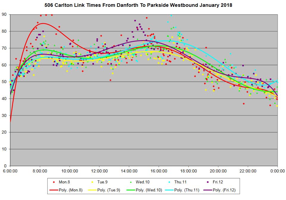
One page consolidates all of the data for weekdays. The purpose of this is to show the shape and distribution of the data. Average values will thread their way through this cloud of points, while standard deviations will reflect the scatter of values around the averages.

The chart sets also include average and standard deviation values for each type of day. These are the same values as used in the Bus to Streetcar comparison chart above.
The lines for each day are always slightly different depending on conditions (weather, congestion, delays, special events). For example, Tuesday, January 2 was a lighter than normal day for traffic and this is reflected in the travel time values and trend line. Similarly Saturday, January 6 and Monday, January 1 have lower travel times than other weekend days.
506_201801_Danforth_Parkside_MonthLinks
506_201801_Parkside_Danforth_MonthLinks
February data are included here to show the change, or lack of it, between the streetcar weeks (up to Saturday, February 17) and the bus weeks (after Sunday, February 18). Average and SD values are not included in these charts to avoid mixing data from the two modes together.
506_201802_Danforth_Parkside_MonthLinks
506_201802_Parkside_Danforth_MonthLinks
In the March data, Thursday the 29th was a storm day, and this is reflected in longer travel times through much of the day.

A couple of weeks ago the stops along College were moved from the safety islands over to the curb lanes. This is asinine, of course; especially on a street with a bike lane. Now it seems like the stops have been moved back to the safety islands. The TTC seems to go back and forth on this issue a lot. Is there a good reference, or do you have a comment, on the thinking behind either choice?
Steve: The TTC’s usual standard is for buses to load at the curb, but I don’t think they took into account that there are still some safety islands left on College that are beside bike lanes. I suspect it’s either an oversight, or a case where the decision was made by someone who does not know the route in detail.
LikeLiked by 1 person
One rather fears that this is the same person who actually ‘manages’ the route as many route management problems seem to be caused by a lack of local knowledge.
LikeLike
What was the median and standard deviation of travel time for bus and streetcar?
Steve: The median is the 50% line in any of the charts. As for the SD values, I have used them on other charts, but many don’t understand what they mean, and they’re an abstraction. Also, there is the question of SDs bouncing around a lot at the level of data where I am reporting for only one hour on one day at each data point. “N” is comparatively small.
LikeLike
On Bathurst and Lake Shore, I found that buses usually use the stops at the safety islands, but it depends on traffic and where people are waiting. Sometimes when travelling in pairs both will be used at the same time.
LikeLike
With respect to headway monitoring and on street supervision, I noticed today (Sunday) there was a supervisor out on King Street at Church on the westbound side Church stop. He poked his head in the rear door and tapped the Presto reader with a card then went back to the sidewalk. What specifically was the purpose of this? Is it somekind of vehicle tracking record keeping with Presto?
Steve: I believe this is a regular test to see which readers are working. I don’t think that the TTC believes some of the availability numbers they get from Presto. Of course, checking only one reader on a car is hardly a full test. When a line is busy and people cannot move between readers, having one working at the back door is useless if you’re not nearby. Similar problems happen with the fare vending machines on the new cars.
LikeLike
What about median cycle time between bus and streetcar? Its very difficult to get any sense of comparison between the two from any of the graphs above. The speed graphs seem to imply the buses are running faster but how much time over the entire route cycle does this add up to?
Steve: If you look at the charts of travel times over each half of the route, and match this against the dates, you can see periods when buses were faster, or not. You can read medians directly off of the charts (50th percentile). I can generate charts showing end-to-end times for January, February and March, and add them to the post, but you will have to wait as I am working on something else.
The cycle time is meaningless as a comparison for two reasons. First, the bus route is longer than the streetcar route (buses go to High Park Station). Second, all vehicles have layovers of varying lengths at the terminals. If this is included as part of “cycle time”, it does not reflect actual driving conditions.
Updated April 23 at 9:30 am: Charts of full trip times have been added. Westbound it’s a draw, eastbound the buses are slightly faster. Note that the new charts use averages (arithmetic means), not medians, because standard deviations are relative to the average values.
LikeLike
The other day, westbound at College and Spadina, there was a sign at the curb saying the stop is not in use, and that it had been moved to the transit island. However, I saw a driver stop at the curb lane, which required people waiting at the island to scurry across a lane of traffic back to the bus stop. So it seems that drivers are either receiving inconsistent or incorrect instructions, or just do what they like!
Perhaps this has been addressed before, but are there any ways of preventing gapping and bunching from rising as one moves across the route?
Steve: There must be an operational culture of keeping vehicles spaced apart, sitting at terminals and enroute if necessary to do so. This requires central management that can “see” the behaviour of gaps, but it also requires an acknowledgement at the highest level of how commonplace the problem is. It is the rule, not the exception, a part of “TTC culture”.
I often arrive at High Park station to find the electronic board saying that the next two 506 buses eastbound are leaving in “9 min and 9 min” or “11 min and 11 min.” Is there some reason that they are intentionally having two buses leave from the terminus together, when they could be more spaced out?
Steve: This is probably because there is a pair of buses somewhere near Roncesvalles running together, and so NextBus shows their predicted departures together too.
One advantage of the bus service for those living near High Park station which is a high-density area (and which the planners want to become more so), is that the 506 route has been extended to go there rather than end in High Park. The streetcar route does not have the flexibility of being extended in this way (or at least I have never heard it be considered).
Steve: And it is rather unlikely given the amount of new track this would involve. If anything, Keele Station would be a more likely connection point were it not already full of bus routes (which is why the 506 bus goes to High Park).
LikeLike
Thanks for adding the graphs on end to end times, I think it’s much easier to get an ‘overall’ (but admittedly limited) picture with these. The poly interpolation graphs are also really nice so I think you should keep using them!
Steve: I have charts coming out of my ears in various formats, and there are advocates/aficionados of each type. Also I get complaints about there being so many, but in an analysis like this there are many ways to look at the same data to bring out various aspects of the situation.
I should probably mention that because I have been doing this sort of thing for years, I have a repertoire of chart formats, and add to this from time to time when requests come up. I used to publish the scatter diagrams with the trend lines, but then many readers wanted percentiles. Each one tells its own tale!
LikeLike