
Updated February 5, 2018 at 2:30 pm: Charts showing comparative travel times between Jarvis and Bathurst for the period from March 2016 to January 2018 have been added to give a longer context to the effects of the King Street Pilot. Scroll down to the end of the article for the charts and commentary.
This article updates previous posts about the effect of the King Street Transit Pilot on TTC vehicle movements.
Please refer to previous articles for commentary on the transition from the pre-pilot to pilot results and for the period up to the end of 2017.
- Analysis of Route 504 King: November 2017 (Part 1: Preliminary King Street Pilot Review)
- Analysis of Routes 501 Queen and 6 Bay: November 2017 (Part 2: Preliminary King Street Pilot Review)
- The King Street Pilot: Sorting Fact from Fiction (Torontoist)
- The King Street Pilot: Sorting Fact From Fiction (Part II: Travel Times)
- The King Street Pilot: Sorting Fact From Fiction (Part III: Service Capacity)
- The King Street Pilot: Sorting Fact From Fiction (Part IV: Headway Reliability)
Weather
Toronto’s weather has been much harsher this winter than in previous years, and this affected some aspects of service quality through late December and early January, notably headway reliability. Low temperatures were not kind to the older streetcar fleet, and snow affected traffic conditions over the full route, not just in the pilot area. [Source, Environment Canada historical data for “Toronto City”]

WeatherStats_201709201801 [PDF]
Travel Times
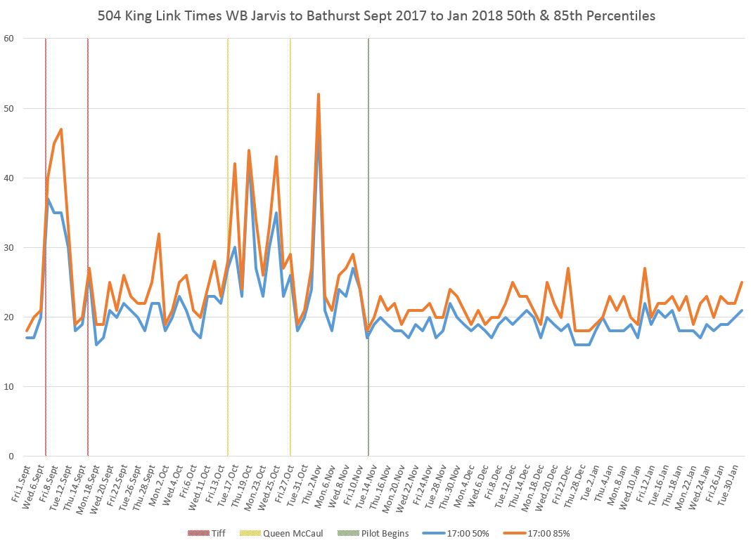
Data for January 2018 show that the travel times through the pilot area between Jarvis and Bathurst Streets continue to be both below the pre-pilot values, and generally without the day-to-day “spikiness” in the range of typical travel times.
The sample below shows the travel times for westbound vehicles crossing Jarvis Street between 5:00 and 6:00 pm from September 2017 through January 2018. Horizontal lines give the daily values, while vertical lines bound periods where conditions changed.
- The orange line is the 85th percentile below which most times fell, but it must be remembered that 15% of trips lie above this.
- The blue line is the 50th percentile where half of the trips are above and half below.These two lines are close together because the data values are clustered over a short range in most cases, and so one gets from the 50th to the 85th percentile with a small increase in travel times.
- The vertical red lines show the bounds of TIFF. For September 7-8, the travel times are tracked over the planned diversion via Queen Street and so they are much longer than trips via King.
- The vertical yellow lines bound the period when Queen was closed at McCaul.
- The green vertical line shows the beginning of the King Street Pilot. (Although it is green, this band may show up as black depending on your display.)
- Where there is a gap or the value drops to zero (no examples on this chart), there were no vehicles making the trip on the day and hour in question due to a long delay or diversion.
The two sets of charts linked here contain data for five representative hours of operation starting at 8:00 am, 1:00 pm, 5:00 pm, 8:00 pm and 10:00 pm. These are in the same format as previous charts except for the addition of one month’s data.
Within the January data, there are two peaks showing that a delay of some kind occurred.
On January 3 in the mid-evening, service was blocked west of Yonge Street for over half an hour. Most of the service diverted via Church and Spadina (visible in the chart below as lines that disappear between Jarvis and Yonge, then reappear at or west of Spadina). The cause of this delay is unknown as no service eAlert was issued for the delay or diversion

On January 30, a stalled bus (according to the eAlert) held service eastbound at Church from about 5:45 to 6:10 pm. A few cars diverted via Spadina, Queen and Church. The reason for congestion eastbound between Yonge and Jarvis beginning at about 5:10 pm is unknown.
Also worth noting here are:
- The large gap in westbound service originating from Broadview Station at 17:30 that developed completely independently of the delay at Church Street.
- The congestion westbound at The Queensway and associated short turns at Roncesvalles, a typical problem during the PM peak.

Line Capacity
The additional data for January 2018 show a slight growth in the total route capacity at key points through the gradual replacement of CLRVs (standard length, old streetcars) by the double-length Flexitys. Mid-February will bring changes in the timing of 504 King Trippers, conversion to streetcar and extension of the 503 Kingston Road car (not included in these charts), and improved shoulder peak service on 514 Cherry.
However, the primary contribution to improved capacity will come with the substitution of Flexitys for CLRVs as each changeover doubles the capacity of the affected trips. This is visible in the growing yellow (Flexity) band in the sample chart below.

Please refer to the previous article about capacity for detailed comments on the evolution of the values shown here.
- Jameson_AM_Peak_EB_201801
- Bathurst_AM_Peak_EB_201801
- Yonge_PM_Peak_WB_201801
- Bathurst_PM_Peak_WB_201801
- Jameson_PM_Peak_WB_201801
Headway Reliability
Irregular headways continue to be the TTC’s weak point and bunching is a chronic problem. The King Street Pilot reduces the wide, pre-pilot swings in travel times and this, in turn, reduces the need for short turns. That is a benefit to riders on the outer end of the route, especially during periods of less frequent scheduled service. However, bunching from terminals remains a problem.
In a previous article, the distribution of headway values was presented with daily data to show just how variable the riding experience (or more accurately, the waiting experience) can be. Here is the data for Yonge Street westbound in the hour from 5 to 6 pm. Each colour represents a two minute band of headways, and the height of each colour shows the percentage of trips from the total. For example, on the right side of the chart, Wednesday, January 31, half of the trips passing Yonge westbound between 5 and 6 pm were on a headway of 2 minutes or less, at a time when the scheduled service is 4’20”. This is not uncommon as data for earlier dates show.

A more dramatic version of the same chart presents the same data as bands rather than columns. This version makes it more difficult to pick up individual values, but demonstrates the degree to which very short headways (red) and longer headways (dark green bands and above) are prevalent.

Although I am not generally in favour of averaging because it can hide details, I opted to shift to weekly rather than daily consolidations to concentrate on the longer term pattern for this month’s review of data. The target headway for this period is just over four minutes, and so the orange and yellow bands are the area where service would be expected to fall. The bands from turquoise onward (10 minute or greater headways) are the least desirable, and they were notably wider during December. The prevalence of long headways was reduced in January, but it will take more months’ experience to determine what the typical numbers are. In reading the full sets of charts, the target headway for each period should be kept in mind, and therefore the colours where one would hope to see most of the service.

Please refer to the previous article on headways for detailed comments on sections of the route.
- 504_201712201801_Danforth_SB_MonthHeadwayStats_Weekly
- 504_201712201801_Yonge_WB_MonthHeadwayStats_Weekly
- 504_201712201801_Bathurst_WB_MonthHeadwayStats_Weekly
- 504_201712201801_Jameson_WB_MonthHeadwayStats_Weekly
- 504_201712201801_BloorWest_SB_MonthHeadwayStats_Weekly
- 504_201712201801_Jameson_EB_MonthHeadwayStats_Weekly
- 504_201712201801_Bathurst_EB_MonthHeadwayStats_Weekly
- 504_201712201801_Yonge_EB_MonthHeadwayStats_Weekly
The charts for service inbound from the terminals (Danforth SB and Bloor West SB) show some reduction in the prevalence of very wide headways in the pilot period, but this is far from uniform. Shorter headways at terminals indicates that fewer trips are short-turned before they reach the end of the line, a result of shorter and more reliable travel times through the pilot area.
At Yonge Street in both directions, the range of headways is considerable especially outside of peak periods.

Similar patterns are evident at other locations and directions.
Updated February 6, 2018 at 2:30 pm:
A Longer View: March 2016 to January 2018
To give more context for the effects of the King Street Pilot, I expanded the travel time percentile charts to cover the past two years. [This runs from March 2016 as I do not have the February 2016 tracking data for 504 King.]
The chart below is the same format as the sample earlier in the article, but with a wider date range. This also picks up two events that affected travel times:
- The reconstruction of King & Charlotte in March-April 2016.
- The TIFF diversion in September 2016.
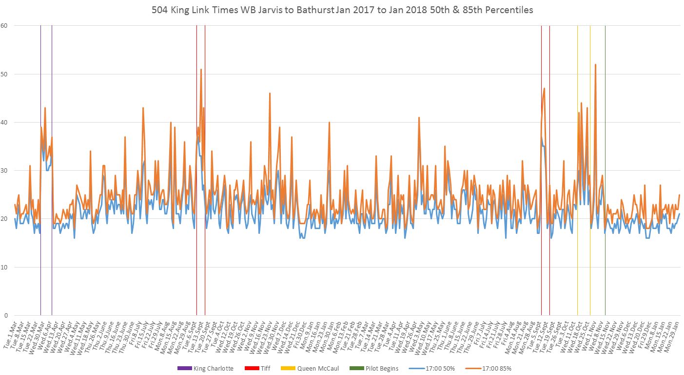
Westbound
504_201603201801_Jarvis_Bathurst_MonthLinkStats
During the 8-9 am hour, travel times are slightly higher once the pilot begins. This happens because there was no AM peak congestion pre-pilot, but the change in stop locations added a westbound stop at Jarvis that was did not exist before. There was no offsetting change at the west end of the pilot because the stop at Bathurst remained nearside.
This should be remembered as a general issue for all time periods where demand would be sufficient to occasion regular stops at Jarvis westbound as the savings in travel across the pilot area are slightly offset by the extra stop within the pilot area.
During the evening periods, and especially in the 10-11 pm hour, a regular pattern of longer travel times on busy club district nights is quite evident. This effect is shaved off by the pilot’s reduction of conflicting auto traffic.
Eastbound
504_201603201801_Bathurst_Jarvis_MonthLinkStats
Eastbound travel times do not see as large an effect as westbound as has been noted in previous articles. For the 8-9 am hour, one new farside stop eastbound at Bathurst is traded off for the loss of a nearside stop eastbound at Jarvis. Note also the dip at Christmas in 2016 when the weather was mild.
Midday travel times, 1-2 pm, are slightly lower with the pilot than before.
PM Peak times, 5-6 pm, are also improved slightly, although not as much as for westbound travel. The primary benefit is the substantial elimination of the spikes in values.
Evening travel shows a similar effect as well as the appearance, as in westbound data, of regular club district effects in the pre-pilot data.
Shifting the Stop to Farside at Jarvis Westbound
The effect of the relocated stop can be seen in travel times for the route segment from Parliament to Jarvis. Here are the data for November 2017.
The stop was actually moved in the week preceding the pilot, and so the travel times changed on Wednesday, November 8 for the am peak. The stop service time was no longer charged to this segment and is actually added to the Jarvis to Bathurst times as shown above.

Tuesday, November 7, shows no data for the PM peak and early evening because all service was diverting via Queen and Parliament. Due to the way the route is mapped in my software, cars did not actually “cross” Parliament during this period and therefore there were no trips between this point and Jarvis Street to measure.
The time saving, as measured by the 85% percentile line, is about 2 minutes varying by time of day. This is an additional saving for westbound travel in the pilot area. In turn, this begs the question of whether times should be measured from somewhere west of Bathurst to east of Jarvis to pick up the full effect, including any delays eastbound at Bathurst due to the extra left turning traffic. A topic for another day.

Great analysis, Steve.
It seems like there is still a lot of bunching happening (headways below or above the scheduled goal)…but fewer situations where headways are really bad.
What can TTC do to manage this? I imagine that with transit priority and higher vehicle speeds we may see even more bunching (though there is an obvious limit of short headways).
Anecdotally, demand and pass-bys seem to be higher as well. If TTC can manage the bunching that would certainly help smooth out service gaps and reduce pass-bys…though I expect that the capacity increase from additional LFLRVs will help most.
I’m interested to see what the upcoming service changes and streetcar substitions will lead to, on King and other corridors.
Cheers, Moaz
Steve: I already have my request in for February data on many routes, and have historical data so that the review will not just be for the month of the changeover.
LikeLike
Steve, might not coupling the flexities in pairs allow for increased capacity with less bunching? Can the existing fleet of flexities be retrofitted for mu operation.
Steve: Probably, but that would make for a 60m long streetcar and some very wide headways. Oh yes. It would have to stop at Broadview Station (and a few other places) in stages as one Flexity barely fits there now.
LikeLike
I noted your tweet with the four years of year-over-year data. The travel time decreases at the end of 2017 are visible at a glance. Can’t wait to see what happens this spring.
Steve: For King, I have data going further back, although with some gaps, but I thought that a four-year retrospective established what was happening.
LikeLike
It is very, very easy and common for transit to bunch hard when operating five minute or better headway in mixed traffic, unless you’re running a fixed or moving block system designed for mixed traffic with both anti-bunching technology and absolute control of the TSP system (in our world, that’s bleeding edge stuff). Just like bus service, every little delay from an accessible boarding to someone holding a door open for a friend to catching a red light due to a large crowd at a stop will eat at your headway, and they’ll happen in an uneven fashion across the line. Accidents and incidents happen. In other words, bunching will never truly go away, even with a lack of traffic and bunch of brand new streetcars that have high reliability. Over time, the delays might actually go *up* as the line’s popularity continues to soar, even with all door boarding on the Flexity cars. Dispatchers and supervisors need to get creative with their solutions. For example, you can have the car in front of a gap stop and stay to fill a gap in reverse, as it’s better to run a 10/10 headway than a 5/20…cuts down on the snowball of ridership that builds up during a gap, plus a 5 minute delay on two cars is much easier to stomach than a 15 minute delay on one. The biggest thing is that schedules more or less have to go out the window once you start bunching… priority is on keeping vehicles spread out to maintain even headways, plus avoid overcrowding and passengers left behind as much as possible. You can rotate blocks around to restore schedules to normal once you head into off-peak.
I don’t think the TTC has the *right* tech in place to truly take advantage of the King pilot, even with the new cars. Without some serious anti-bunching solutions in place, dispatchers have to be in near constant communication with every car on the route, which is extremely intensive for a route like King. If you want the perfect headway every day, which is what riders clamor for in the age of Uber and Lyft, you almost have to run King like the legacy subway fixed block system with forced distance between cars. The previous transit system I worked for didn’t have schedules at all… only an average advertised headway and an operator heads up display on each vehicle that would show you how far away your leader and follower are. This was done using longer/shorter arrows to represent distance. If you got close to the vehicle in front (short arrow for leader), you slowed your pace. If you got too far away (long arrow for leader) with another vehicle close behind (short arrow for follower), you’d get on the phone and request to service onboard stop requests only (drop-off only), which forces your follower to slow down by virtue of picking up those left behind. Something like that is needed, but up until recently that tech has been the domain of university circulator shuttles and smaller agencies that don’t have huge upfront costs to install it.
LikeLike
In my opinion, the key graph is of the 85% reliability. The dramatic elimination of the “spikiness” is why so many passengers are so happy about the pilot.
My boss is not happy if I arrive at work late 15% of the time. If the service is unreliable, I have to leave home extra-early to provide enough time so I will not be late for work if there is a delay.
Which is why the TTC’s averaging is so profoundly misleading. I can just imagine my boss’s reaction if I were to try to excuse arriving late to work by saying, “On average, I get to work on time.”
LikeLike
I am equally concerned that the new tech will not be really serve either. I think that there is a need to create technology to push responsibility to the operator, and then a system of accountability. The tech in his discussion – short and long arrow, where in essence you know you are too close to one or the other, is important, and should be something we are working to, and then we should be also rewarding the drivers who work to improve performance.
LikeLike
Did anyone get a see how things looked at the terminals on Family day? I noted at least 17 Flexity cars operating on 504 that day.
Steve: I will receive the tracking data for February in a week or so, and will then be able to see whether there were severe backlogs at either terminal.
LikeLike