
Updated December 5, 2017 at 8:15 am: Charts showing travel speed profiles in the pilot area have been added at the end of this article.
Updated December 3, 2017 at 10:50 am: Charts showing hourly average travel times by day have been added in a section at the end of this article.
The pilot operation of King Street as a transit thoroughfare began on Sunday, November 12 and will continue for the next year.
This post is the first in a series of articles reviewing the effect of the new configuration on the operation of 504 King and related routes.
The methodology behind the processing and presentation of TTC vehicle tracking data is explained in Methodology For Analysis of TTC’s Vehicle Tracking Data on this site.
The first sets of charts show the running time for 504 King streetcars westbound and eastbound between Jarvis and Bathurst Streets.
- Westbound: 504_201711_Jarvis_Bathurst_MonthLinks
- Eastbound: 504_201711_Bathurst_Jarvis_MonthLink
Within each set, there are five pages corresponding to weeks (or partial weeks) of the month with Monday-Friday data, and separate pages for all Saturdays and all Sundays.
Worth noting:
- The break between “before” and “after” data occurs at Week 3, Monday, November 13. There is a clear difference in running times over the pilot segment after the implementation.
- Sunday, November 5 was a home game at BMO field for the Toronto FC, and its effect on King Street traffic is clear.
- Sunday, November 19 was the Santa Claus parade.
The change in running time also had an effect on the quality of service provided on the route. This showed up in more reliable headways (less scatter in the actual values around the average) which, as with the link time charts, is visible starting in week 3. The benefit is visible both at the terminals and at Yonge Street. I have also included a chart for Dufferin eastbound to show service coming into Liberty Village.
The charts are in the same format as for the link times above, but show headways between cars at various locations on the route, not travel times between them. Note that 514 Cherry cars are not included here.
Westbound:
Eastbound:
- 504_201711_BloorWest_MonthHeadways
- 504_201711_DufferinEB_MonthHeadways
- 504_201711_YongeEB_MonthHeadways
The improvements in travel time are not uniform across the study area, but are concentrated in certain segments of the route.
(Note that for these calculations the screenlines are in the middle of the cross street. This means that dwell time at stops will shift to a different segment if a stop at a screenline was nearside before the change, but farside after the change.)
The afternoon of November 2 saw severe congestion across the west end of the route, and this appears consistently for all segments.
Westbound:
- From Jarvis to Yonge there was never much congestion except when triggered by construction or a similar event that blocked the curb lane. There is little change here in running times.
- From Yonge to University running times are very slightly reduced, but again this is a segment that was not severely congested before the pilot.
- From University to John there is almost no change.
- From John to Spadina there is a quite noticeable change in both the length and the consistency of travel times. A considerable amount of this is due to the elimination of delays from turning traffic at Spadina.
- From Spadina to Bathurst there is also a change in running times, but mainly in the evenings when the club district is active. This change also varies by day of the week.
- 504_201711_Jarvis_Yonge_MonthLinks
- 504_201711_Yonge_University_MonthLinks
- 504_201711_University_John_MonthLinks
- 504_201711_John_Spadina_MonthLinks
- 504_201711_Spadina_Bathurst_MonthLinks
Eastbound:
- From Bathurst to Spadina there is a change in running times which, like the eastbound data, is mainly in the evening.
- From Spadina to John, there is little change.
- From John to University, there is an improvement, although on Wednesday and Thursday, November 29-30, there are extended running times during the pm peak period. This backlog was west from University Avenue implying that something was preventing streetcars from crossing quickly to the east. (Some readers here and on social media have commented that there are days when north-south traffic crossing King prevents service from clearing intersections.)
- From University to Yonge, the running times are more consistent after the pilot began, but the averages stay roughly the same.
- From Yonge to Jarvis, running times are slightly higher. This reflects the shift of the busy Yonge Street stop east of the screenline at Yonge.
- 504_201711_Bathurst_Spadina_MonthLinks
- 504_201711_Spadina_John_MonthLinks
- 504_201711_John_University_MonthLinks
- 504_201711_University_Yonge_MonthLinks
- 504_201711_Yonge_Jarvis_MonthLinks
In future articles, I will review:
- Details of specific days when the line was disrupted.
- Detailed speed profiles in the pilot area.
- Operation of 501 Queen and 6 Bay before and after the pilot.
- Operation of 514 Cherry.
- Capacity of service provided on King Street.
- The effect of TIFF on the King, Cherry and Queen cars.
My thanks to TTC staff for pushing the November data out the door on December 1 to permit early publication of these results.
Updated December 3, 2017
Average Travel Times
The charts above show data for the individual trips across portions of the route together with trend lines showing the overall pattern through each day.
The following charts are organized to present hourly averages for each day of the month to illustrate the contrast between the “before” and “after” conditions. The times on the charts refer to the hourly periods when vehicles entered the segment westbound at Jarvis or eastbound at Bathurst.
Each set contains four pages corresponding to the AM peak, midday, PM peak and evening periods, followed by all Saturdays and all Sundays.
- In the AM peak, there is not much change in average travel times before and after the pilot.
- During the midday, travel times are lower on average by 2-3 minutes.
- During the PM peak, average travel times are lower, and dramatically so compared to some days early in the month. Note that November 6 is a Monday, and these are typically the least congested weekdays on King.
- During the evenings, average travel times are lower and more consistent after the pilot begins.
- Results on weekends are less dramatic than for weekdays. The effect of the Santa Claus parade is visible on the 19th and this is particularly striking for eastbound service.
- In some cases there were no cars for specific days and times due to a major blockage or diversion. These show up as “zero” values for the averages in the charts.
I have created but did not include charts of Standard Deviation values. Although they do show some improvement after the pilot begins (lower SD values indicate less scatter in the individual travel times), the values are rather “noisy” because the number of data points for each day and hour is small.
Another issue for service capacity is that the number of vehicles crossing the pilot area varies quite a bit on a day-to-day basis for each hour of the day. If the service were “on schedule”, these values should not change much (±1 vehicle), but this is not the case. I will review this as part of the service capacity analysis in a later article.
Updated December 5, 2017
The charts in this section compare the travel speed through the pilot area in detail for the week of October 23-27 (pre-pilot) to November 13-17 (first week of pilot). Early November was not used for “before” data because the route was diverting around bridge repairs on Queen at the Don River, and travel speeds downtown could have been influenced by operators driving faster than usual to make up time.
As a guide to reading these charts, here are two sample pages showing travel speeds in each direction for the hour beginning at 4:00 pm. The blue lines show the “before” data and the green lines show “after” data. The charts should be read in the direction of travel with westbound going left to right, and eastbound going right to left.
Where the pilot speeds are faster than before the changes, the green line is higher than the blue one. One immediately obvious change is that the dips in average speeds at stops shift from the nearside to the farside of interesections. However, delays caused by traffic signals at some locations are common to both sets of data.
A common problem on King before the pilot was a backlog of traffic from certain intersections, notable Spadina westbound. This shows up in much lower speeds not just at Spadina but for a considerable distance east of it. These dips are wider in periods when congestion backed up from problem intersections is the worst.
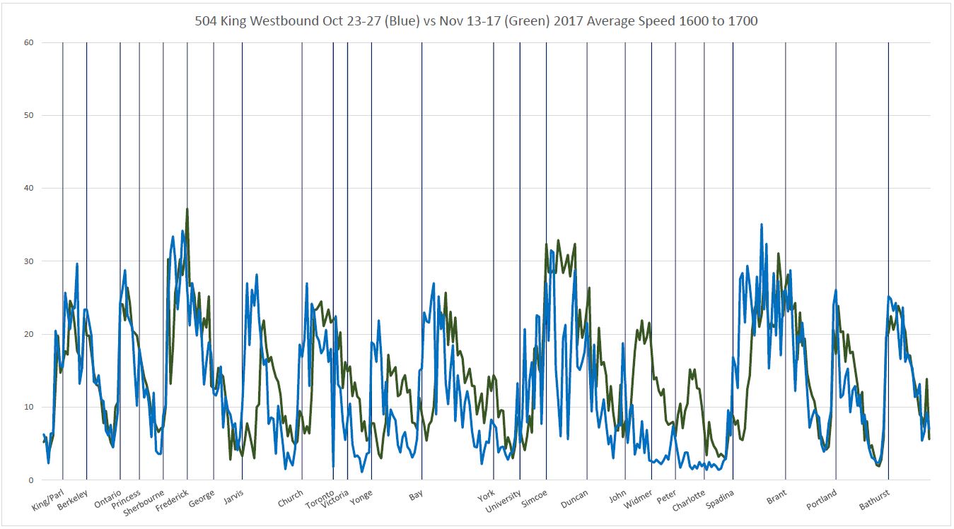
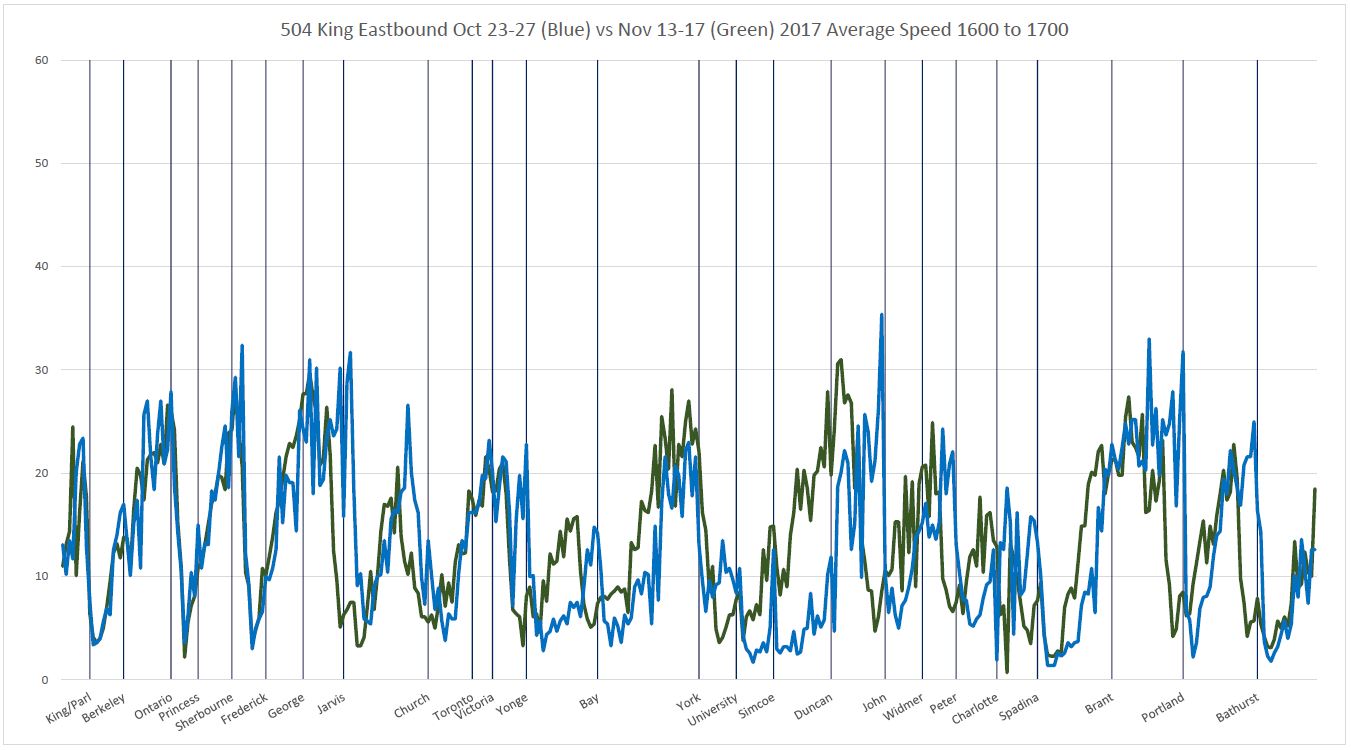
By paging through the full sets of charts linked above, one can see the evolution of travel time patterns over the day rather like a flip chart animation. Areas and times that were not congested before the trial generally show the same travel speeds for before and after except to the degree that stop placement affects behaviour at intersections. Where speeds are improved by the pilot, the green line rises above the blue one, and the separation changes through the day.
There is a marked difference between the patterns in the AM peak, midday, PM peak and evening hours.
As other charts have shown, the average travel times through the pilot area are not affected as much in the AM peak when competing traffic is less of a problem, but later in the day, problem areas show up in the “before” data. There is a peak at midday when travel times have now been considerably improved and another, of course, in the afternoon rush. During the evening, the benefit in the financial district drops off, but it remains west of University Avenue.
At the beginning of the pilot, all transit signal priority was turned off to see how the street would operate without it, although this mainly affected crossings with less important streets. This shows up as “double stops” at locations where there is now a farside stop and approaching streetcars can be caught without extended green time to clear an intersection.
As the pilot continues, this type of chart will provide a base for comparison of the effect of various changes and of seasonal effects.

Well when you do not really actually to honestly look at an issue, it is hard to say whether it could be a strength.
LikeLike
I think that some City Councillors (the usual ones?), the TTC Board and TTC Management are all, collectively, lacking a LOT of VISION with regards to how a transit system of the 21st Century in a city the size of Toronto needs to be funded, managed and operated. There was a time when a computer was seen as a “black box” and if you gave it input, “Ta-Dahhhh!” the “correct” output was produced – like magic! – without all the slide rule figuring-out. Seems that people still believe that technology will solve all issues – see the recent Twitter spat between Elon Musk and transit planner Jarrett Walker and follow-up article – without having to think what the actual issue is first, before setting up the computer programming.
I’m trying to think of another business model where NOT serving your customers is somehow a good thing that is promoted by upper management and within the corporate culture. I realize that this is public money, so it’s very easy for Councillors to pay lip service to their constituents so that it looks like they are “actively doing something” but, really – how much griping and angry phone calls to councillor offices are needed to get them to actually *move* on an issue when the streetcars are not moving as they should or are crammed to the rafters?
Actually, it makes me think of a Tim Horton’s store near me where they never EVER have enough staff on duty to handle both the very high drive-through and walk-in customer traffic (the drive-throughs are deemed priority, by corporate policy, I guess, because they are more impatient about wasting gas in the line). As a result, the walk-in customers can spend much longer waiting to be served – just so the store owner can save the $11+ per hour++ s/he’d have to pay for the additional staff person to come to work and maybe stand around for some of the hours after the rush period dies down. I mean, people keep coming to Timmie’s like an addict seeks out his dealer, so it’s not like they’re going to go out of business anytime soon.
Likewise – before I digress too much – the TTC can say (and seems to have said, as part of their corporate mantra): “Well, where else are you going to go?” If there are fewer riders, well that could justify running fewer buses or streetcars (yes, Bombardier, you are lucky about this) and putting off building that wonderful DRL and Hey! – those crammed-up buses that come irregularly will just be slightly less crammed-up! Oh, and don’t you worry about that “Induced Demand” garbage….
Here’s the deal (my Christmas Wish List for 2075!):
It is NOT rocket science. But don’t get stuck trying to justify using science or technology to fix problems that can quite easily get the Red Rocket actually moving more like a rocket than a rock.
LikeLike