Correction: The original version of this article stated that the “Income and Transit Use” paper was the work of Steere Davies Gleave (SDG). This was an assumption on my part – that it was a continuation of their previous work. I have been advised by SDG that this paper is not their work, but that of Metrolinx staff. All references to SDG in connection with this paper have been modified appropriately. My apologies to SDG for mis-attributing work to them.
Updated: This article was updated on February 19 at 6:45 pm to include comments on the things Metrolinx should also be studying, but omitted in their review of incomes and transit use. Scroll down to the end to see the update.
In two previous articles, I have examined the February 2017 update to the Metrolinx Board by staff on Regional Fare Integration, and a June 2016 background study by Steere Davies Gleave [SDG] on fare integration concepts.
This article reviews another June 2016 study by Metrolinx Staff on income equity: GTHA Fare Integration: Income and Transit Use
The context for this study, nominally, is to determine whether a new fare scheme will affect low-income households.
In reviewing potential modifications to the transit fare system across the Greater Toronto and Hamilton Area (GTHA), the social equity implications of transit fare policy must be considered. Lower-income households rely more on transit for their mobility, are more sensitive to the fare they pay for their transit trips than higher-income households, and, as a result, fare policy choices may impact them more. [p. 1]
However, the selective examination of effects by Metrolinx staff focuses on the benefits of a lower fare for “short” trips while playing down the effect on “long” ones.
For the purpose of the analysis, Metrolinx looked at a fine-grained version of census data, “dissemination areas”, where each element contains less than 1,000 people.
[these …] typically exhibit greater homogeneity in the household incomes of their residents than larger geographic units. [p. 2]
Each of these areas would lie within one geographic section of travel surveys (the Transportation Tomorrow Survey which, at the time of writing would have been based on 2011 data), and the transit usage for each dissemination area was taken from the corresponding TTS area’s results. Census data on income was used to assign each census area to one of ten income ranges, and through this to map transportation patterns to incomes.
Note that there was no adjustment to reflect the availability of transit in any of the census areas, and the results merge data across the region. The income groupings are based on dividing a population of 6.5 million into roughly equal groups of 650,000. “Equivalent income” is a value derived from a combination of household income and household size.

The actual distribution of income shows a familiar pattern with higher incomes along the Yonge Street corridor and in some parts of the 905, notably those well-served by GO Transit.

It is also no surprise that the higher income groups travel more by automobile for the simple reason that they can afford to do so.
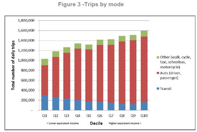
Moreover, given their geographic distribution, lower income riders tend more so to use surface transit modes rather than the subway or GO. This reflects the type of service available both where they live and where they are travelling (work, school, etc.).
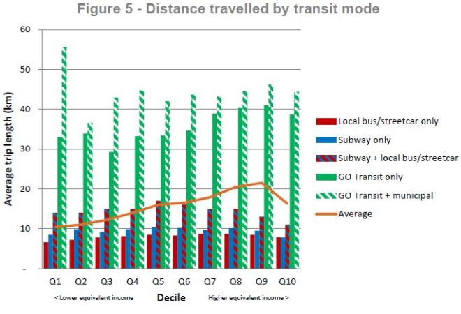
The distance travelled by mode shows the effect of location, available transit service, speed of mode and type of trip. Except for the highest income group, there is a gradual increase in average length of trip beginning at 10km and peaking at just over 20km. What this chart does not show is the number of trips included in each mode’s total. For example, the lowest income riders also go the furthest on “GO Transit + municipal”, but this does not mean that low income riders are taking a huge number of long GO trips.
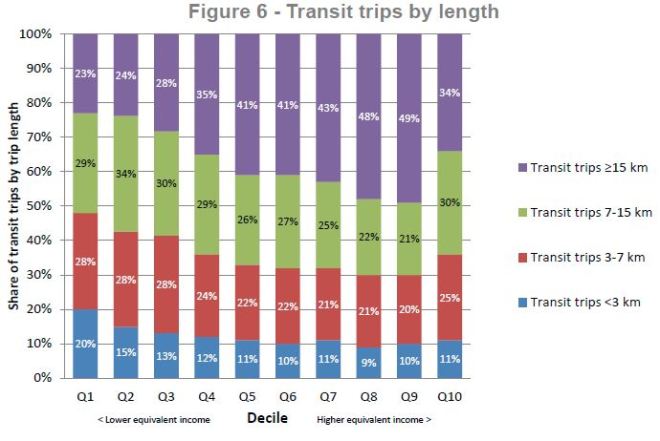
The next chart shows the distribution of trips by length. Trips under 7km (the screenline used by Metrolinx for a local trip or a zone size) are highest for the lowest income group at 45%, but they are also substantial (36%) for the highest income group. This could be due to the availability of subway service in areas where incomes are higher, and therefore short transit convenience trips are attractive. Where incomes are lower, a short trip, especially one off peak, incurs a substantial penalty compared to auto travel is this is an option.
There is no subdivision of data to indicate geographic variations in origin such as those who live in central Toronto, those who are in the “outer suburbs” (former suburbs of “Metro”) and those who are somewhere outside of the “416” completely. Variations in the availability and type of transit are important considerations.
The next part of the analysis is very revealing about the outlook of the study’s authors. In the first chart, we see the proportion of trips involving “Planning District 1”, or downtown Toronto.
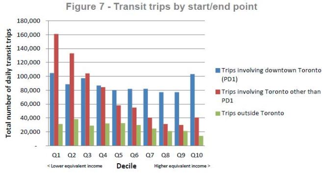
Again it is no surprise that lower income group tend to be travelling outside of PD1.

Increasingly, this is an area where low income residents are few in number, and jobs they might have are greatly outnumbered by higher-paying professions. This area is served by the heart of the subway system.
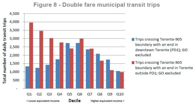
Meanwhile, the group driving all discussions of fare integration are the poor souls who must pay double fares to cross a boundary. Note the huge difference in scale between this chart and the one above. The numbers below do not include GO riders who are, for the most part, bound to and from Union Station, and so this reflects mainly those who pay double fares at the 905/416 boundary. Relatively few riders come all the way into PD1 from the 905, and few attempt the crossing for areas outside the core where at least part of the trip is likely to be by subway.
Although GO customers have been omitted, any fare integration policy will include some sort of discount for a GO+TTC trip, and this will benefit all GO riders. It is also central to the implementation of SmartTrack within the integrated fare scheme. There is no estimation of the number of riders of all income classes who will benefit from this fare reduction.
A few charts reveal how different income groups use transit. These differences are almost certainly a function of availability of transit or auto as alternatives, and of the relative convenience of these modes for each type of trip. Again, there is no breakdown to show whether these patterns differ by major geographic territories.
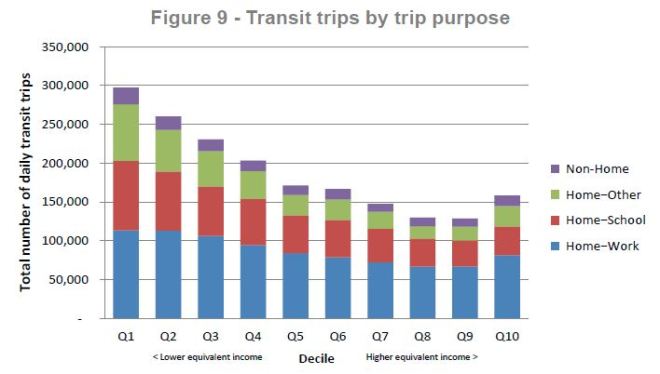
For each type of trip, the number taken by transit drops as incomes rise, going up again slightly for the highest group.
On a time-of-day basis, proportionately more trips are taken during the peak as incomes rise. This shows how transit is less competitive as a mode for those who can afford an alternative. Even so, the overall proportion of off-peak trips shows that transit in the GTHA (taken as a whole) does not exist only to handle peak period commuters.

Although these breakdowns are all interesting, they do not address the fundamental question of how a new transit fare structure would affect riders overall especially in how it might discourage people from taking longer trips by transit due to extra cost.
As I discussed in a previous article, the 7km screen used to distinguish “short” trips by Metrolinx leaves huge parts of the city and GTHA facing trips that will fall into multiple zones, or which will exceed the point at which there is a benefit from a reduced fare. All of this is in the interest of making “short” trips across the 905/416 boundary cheaper for a small portion of the total transit population.
To some extent, inequities for short trips regardless of where they might be can be addressed in other ways including bulk or capped fare costs (passes or maximum charges per time period). These alternatives are completely ignored in this study which concentrates on the single fare model.
Updated February 19, 2017 at 6:45 pm:
In the Metrolinx study, the summation of data across the entire GTHA misses the basic fact that there are differing circumstances in each neighbourhood both within the City of Toronto and among locations beyond. When someone makes a decision to take transit or drive, this is strongly affected by their local circumstances, and in some cases the fare charged may have little to do with the decision.
Here are a few suggestions for additional data Metrolinx might like to consider:
- What is the auto ownership by household in each of the dissemination areas forming the basis for their study?
- What is the average household size and age distribution? Working adults, children, elderly, etc?
- What is the trip destination distribution by length, type (work, school, etc)? For example, are work trips typically longer than school trips? Are they more likely to be taken by transit?
- What is the transit service density available in each area for peak or off peak travel, and for regional versus local travel? In other words, how much of an option or hindrance would transit be to making journeys? Where are the “transit deserts”?
- What do the isochrones look like for major nodes, especially those not on the rapid transit network, depending on which services are available? Peak vs offpeak? Premium vs local fare? (An isochrone is a map showing how far one can travel from a point in a given amount of time.) These can be used to show the benefit, if any, of changes in a network in a manner that is more inherently understandable than abstract values such as vehicle kilometres travelled and imputed savings averaged over all trips.
Metrolinx needs to understand and to publish information showing how their simulated population of transit riders would be affected by new fare structures both for the existing network, and as it grows, particularly in the conversion of transit corridors and trips from “local” to “rapid transit” or “regional” fare premiums. This needs to consider all types of trips in the network, not just the handful affected by cross-boundary fare premiums.
Of particular importance, Metrolinx needs to distinguish between co-relation and causality. The behaviour of riders in various parts of the GTHA is a function of the services and fares available to them, not necessarily a choice that they made to favour one type of travel over another.

Metrolinx is also not examining the effect fare by distance would have on labour mobility. If it becomes too expensive to get to a job the job-employee connection weakens.
LikeLike
In hindsight, I think it was a mistake to let Metrolinx drive the fare integration initiative. All the other transit agencies except Metrolinx have similar cost structures and similar fare structures: they all serve a certain municipal boundary (i.e. a zone) and they charge a flat fare in that zone. Metrolinx and GO Transit have a much higher cost structure and they serve a huge area that is so complicated that only fare by distance works for it. All the transit agencies can probably work out some sort of bilateral deals with zones without changing too much or losing too much money. The odd man out is always Metrolinx, which can’t lower fares without bankrupting itself and whose crazy collection of routes going all over the place don’t fit any sort of zone system.
I think if Metrolinx were removed from fare integration, then a deal could be easily reached and gradually rolled out. Something like Toronto splitting itself into two zones (center and suburbs), but with the minimum Toronto fares being for two zones (so things would be exactly the same as it is now for TTC users). Then the TTC could gradually roll out half-fare stickers for bus pass users of other cities that would entitle the user to ride in one TTC zone + subways. Then they could deploy some sort of Presto thing for single trips plus one zone add-on. And then maybe later offer some sort of PRESTO add-on that GO Transit users for the downtown zone. (All of this assumes that other cities figure out a way to offer equivalent good deals for TTC users too, but the other cities are much less dependent on fares than the TTC, so they have more leeway to offer weird subsidies.)
GO Transit will probably never fully fit into a fare integration with local transit systems. At best, they can maybe work out a deal where one of their fares includes the cost of one zone of the local transit agency or parking or something.
LikeLiked by 1 person
If Metrolinx really wanted to address public transit accessiblity, equitable fares, they wld 86 fare-by-distance, throw it overboard and implement a GTA local public transit 2-hr time-based transfer (most 905 already offers—as TTC & 905 PT ~90% GTHA trips) not tie it to GOtransit (~9% GTHA trips). The province won’t do the obvious, however, as it would mean losing votes in LPO-rich 905, as GOtransit users would still have to walk the last km or so… to avoid paying a 2nd TTC fare.
It is shameful to me that Metrolinx has ignored a simpler, fairer, more equitable integration fare in favour of demonstrably inferior fare-by-distance. It is particularly biased, as Metrolinx/SDG haven’t even paid lip service to establishing the ride goal of GTA Fare Integration (eg. 30% GTA 24hr trips) to serve as the foundation for determining the preferred integration fare strategy!
Steve: Note that this article has been corrected to reflect authorship of the “Income and Transit Use” paper by Metrolinx staff, not SDG.
LikeLike
Exactly, Ming, there is not one example of a major NA local public transit agency that uses true fare-by-distance—it’s the child or heavy, regional rail only! It seems too obvious to keep GOtransit as fare-by-distance and local GTHA public transit as flat fare with integration via 2-hr time-based transfer to give poor, single use riders a similar to Metropass multiple trip value.
LikeLike
Very insightful series that questioned my assumptions about fare by distance.
LikeLike
The statistics used here puzzle me. Maybe I’m supposed to be confused. Most of them do not weight by ridership, or they do it in obscuring ways.
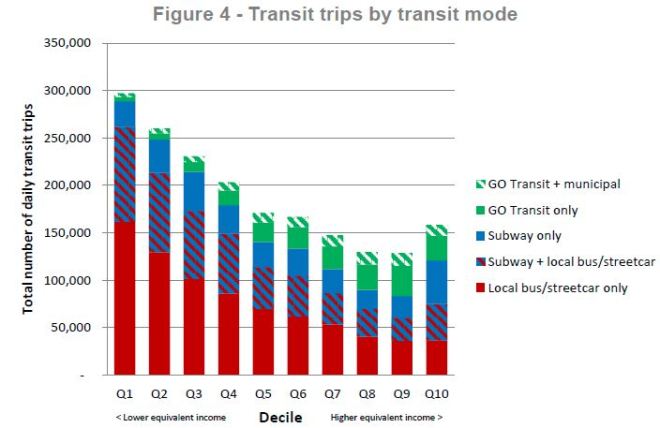
For any consideration of fare equity as it relates to lower income riders, GO transit usage is basically irrelevant, as Figure 4 shows.
The three lowest deciles, (why are the “Q”, which to me sounds like “quartile”??) take about 220,000, 250,000 and 280,000 rides on non-GO transit; call it 750,000 rides total Q1-Q3.
By contrast, the wealthier deciles Q7-Q9 take about 120,000, 80,000, and 75,000 rides; call it 275,000 rides total.
Skipping Figure 5 which shows — well I don’t know what it shows, really — look at Figure 6.
For lowest three income deciles, trips over 7 km make up over 50% of their trips; call it over 375,000 rides (50% of 750,000). We know from Figure 4 that basically none of this is on GO transit.
For the income deciles Q7-Q9, something like 70% of trips are over 7 km. However, we multiply by total rides on non-GO transit, and we see that this is only about 192,000 rides total on non-GO transit (30% of 275,000).
So, if we implement fare-by-distance, with increased fares for trips >7km in length, this will affect over 375,000 rides made by the lowest income riders. Whereas only 192,000 rides by the wealthy Q7-Q9 deciles will be affected.
Conclusion: raising fares for trips longer than 7 km will affect many more lower-income riders/rides than they will upper-income riders/rides: 375,000 rides versus 192,000 rides.
The way things are laid out makes me wonder if all the data is designed to obscure this.
To add: and this is where one has to think carefully: Figure 7 shows average trip distances regardless of mode. For the Q7-Q9 deciles, who do a lot more riding on GO, I would expect that a lot of the trips in the upper lengths is actually on GO, not local transit. (We can dismiss this possibility for the lowest deciles, since they take very few rides on GO in the first place, so the distribution of distances is for rides on buses, streetcars, subways.)
So the number of Q7-Q9 rides that take trips >7 km on non-GO is lower than the obvious breakdown. I would suspect considerably lower. My multiplication of total rides by the distance percentages assumes the distance travelled has the same distribution for GO and non-GO, which is clearly not the case.
While the estimate of 375,000 rides of >7 km on local/municipal transit stands for lowest-income groups, it could well be that for higher-income groups there is very little use of municipal transit for their longer trips.
I would also guess that upper-income people take few transit rides for short distances, as they likely have a car and it’s way more convenient to drive short distances than take transit (walk to the stop, wait for transit to arrive, maybe transfer, then walk to your destination). I would think that upper-income people use local transit where it is more convenient, e.g. going downtown to an event where driving and parking would be a hassle.
I also wonder how the breakdowns of mode and distance differs between the City of Toronto and 905 suburbs. Again, I would suspect that a lot of the upper-income usage of municipal transit is in the City, where there’s good transit service and attractions often don’t have parking, or expensive parking.
Steve: One of my long-standing mottos is “never assume Machiavellian machinations when simple incompetence will produce the same result”. It is entirely possible that Metrolinx has not done the sums as you have, but rather have a mantra (“fare by distance is good for poor people”) that they will repeat and support with whatever charts come to hand.
LikeLike
Well, I don’t agree. GO trains can also use zones – the same “zones” the local agencies use today, i.e. municipal boundaries. Imagine that Toronto, Mississauga, Brampton etc. are all a zone each. How many GO stops per zone? Other than Toronto, that’s usually one or two stops, isn’t it? So fare by zone would work out roughly to fare by distance. Only Toronto (with it’s several stops) would have be to “solved”, but I’m sure it’s not that difficult.
LikeLike
All these fare polices are a waste if children’s Presto cards are going to allow free entry to the subway system. I have two daughters and since they just walk everywhere, I can just borrow their Presto cards.
Steve: Until you are challenged by someone who either checks your fare, or sees the special “not an adult” display on the reader. This would be an issue for any discounted fare even if kiddies didn’t ride free. Also, it will be interesting to see how Metrolinx “integrates” free rides for children into its regional fare proposals.
LikeLike
Children will get to ride the first 3.14159 kilometres for free. Thereafter they will have to pay 25 cents, two candy-canes, or alternatively spin on one foot while reciting their favourite poem from English class for every subsequent kilometre.
LikeLiked by 1 person
Steve, the sums I did took fifteen minutes while sitting at a table in Ikea, and they are very basic statistics and numeracy. I would also say that giving just the average distance is not providing solid information because we don’t know what the distribution of values happens to be. (Saying that the average salary in a business with ten employees is $50,000 could mean that every one of them makes $50,000, or one person makes $410,000 and everyone else makes $10,000. The average doesn’t let you distinguish the two.)
I would not attribute deliberate avoidance of useful statistics to simple incompetence, especially when the avoidance lets you avoid mentioning unpleasant features of policies that you advocate.
Steve: I was being both generous and ironic. There is a delicious Catch-22 where someone’s work is either a deliberate misrepresentation or misinterpretation, or is simply sloppy because a quick evaluation of the “facts” supports a foregone conclusion.
I had planned to work through those numbers in a bit more detail, but have other things to write about and things to do that do not involve this blog, amazing thought it may seem!
LikeLike
There are four major results of a fare unification on the local systems:
Ridership goes up or down
Farebox revenue goes up or down
While they are interrelated there needs to be a solution from the province on all of them.
1) ridership drops – likely on systems that were charging less than average – the riders are shocked by a price increase and stop using the system – or another more attractive route is opened (ie GO) – not much can be done with this other than making the car less attractive in that city – maybe parking tax or improve the value proposition by improving service or adding routes (capital likely required)
2) ridership rises – likely on GO and systems that were overcharging and now forced into a more reasonable price structure – more capital is required to improve service and more operating is required to keep up with service – but it may not come from the farebox (because pricing was lowered) – city likely not able to cover without a raise in property taxes, may not be able to make capital investments quickly enough
3) farebox revenue increases – likely all of this has to be put into service improvements and capital improvements – the city would likely still have to raise their property tax to keep service levels at reasonable rates
4) farebox revenue decreases – this is the one that you have to be worried about because it means cuts to service or higher property taxes
The provincial government despite wanting to have a neutral outcome on this needs to be very aware that because the service levels and pricing are different, and they are going to be fixing the fare, the only other relief valve is property taxes, which can only take so much change per year without large consequences. Without the addition of another relief valve – in the form of transfers from the Ontario government for a number of years until a steady state is achieved, there will be problems with any scheme to unify the systems.
Alternately the province unilaterally lowers property taxes by an appropriate amount and then institutes a southern Ontario wide tax of some sort that they then redistribute to the cities … a situation that basically would provincialize the operating expenses of local transit. Without getting into the actual operation of it.
Steve: And the irony in all of this is that the goal of Metrolinx is supposed to be reduced usage of cars. They are so fixated on the “cross border” problem that they ignore the much larger and truly “regional” transportation problems.
LikeLike
I am a firm believer in the KISS principle. Bureaucrats on the other hand want to drag things out, study, consult, report, study on and on. They have to do something to justify their jobs. Witness PRESTO, UP Express etc. etc.
Wherever you board, you pay the normal fare. Cross from TTC to Miway pay 1/2 the Miway fare. Go the other way back and pay the Miway fare then 1/2 TTC fare. Cross yet another boundary pay another 1/2. KISS
LikeLike
If I understand correctly, Metrolinx’ “equivalent income” has some sort of adjustment for household size. However, since the lowest income decile has more home/school trips than any other group, it seems that either: a) the adjustment is inadequate, or b) the lowest income group contains a disproportionate number of college/university students who may be distorting the usage picture.
The other thing that caught my eye was the large number of non-taxi car trips – around 600 thousand a day – taken by the lowest decile. If the deciles are around 650 thousand people each, that works out to nearly one car ride a day. I guess it’s possible they are all relying on friends, but that seems a pretty steep level of car reliance for someone with an income under $25,000. That’s also roughly double the level of public transit usage.
It also seems weird that all groups have roughly the same number of “other” trips. This left-over category of active transportation, school bus journeys, taxi rides (and for some obscure reason) motorcycle rides, is apparently unrelated to income.
In any event, I think you are right Steve. This data really needs to be pulled out on a much more granular basis, especially by age and geography.
Steve: One point about those car rides. There are likely to rides per day for those using that mode (to and from a destination), and so only half the decile might be using autos (or friends).
LikeLike
Fare by distance may be even more problematic for distant GO riders, far beyond the TTC’s service area.The Barrie line for example is forecast to grow from 4 million rides per annum in 2014 to 22 million in 2029, the biggest percentage increase in the TTC/RER/GO network.
The trouble is that many of these new riders will only take the train if the cost, convenience and reliability of RER/GO are as good if not better than taking a car or a car/TTC hybrid.
Unfortunately today’s numbers provide little room for optimism. With Yorkdale’s parking lot now open, someone driving a 2017 Honda Civic today could reach Union Station from Barrie’s south GO station via the subway for $23.56/day return. An occasional GO/RER rider would pay $27.10 for the same trip, while a daily GO commuter could cut the cost to $21.46.
Of course if a rider placed a value on the extra 34 extra minutes needed to take the train all the way, the modest GO advantage would disappear. Using the minimum wage as a time value pushes the return GO trip costs to $27.92 and $33.56, making the car/subway hybrid option a superior financial choice.
While many of those taking the train today are either not placing a value on the lost travel time or judge the mind numbing drive south as just not worth the effort, there is very little room to play. A steep fee hike through the fare by distance concept, might just push a marginal public transit proposition over the edge.
There are of course other factors: gas prices, auto maintenance, car insurance Highway 400 traffic, potential GO parking fees, 5 new train stations (which might add 30 minutes a day to travel time) and the prospect of Barrie’s GO parking lots getting Miltonized. Each of these items could be just as damaging to train traffic as a big fare hike. Moreover If semi-autonomous cars every become a reality, many more folks may find the driving commute far easier to take. Some may abandon RER/GO all together.
To my mind though, the big missing piece of the whole fare integration project is parking. Much as many urbanites would wish it were otherwise, access to affordable parking is a key requirement for many public transit users, including, it seems, a pretty large share of those with the lowest incomes.
My basic point is this: just as it’s very risky to take downtown TTC riders for granted, it’s perhaps even riskier to assume driver-riders across the network and those of us on the fringe are happy to pay more for less. As painful as it is may be to unwind the single zone fare concept, it’s better to do it now before the growing suburban and exurban hordes force an even tougher solution on downtown dwellers.
Steve: The thing that bothers me about claims for fare by distance is that it is somehow “more equitable”. “Equity” these days is code for “you cannot challenge my position because I’m helping the poor” in certain circles. I agree that proper FBD will really hurt the long haul travellers who now get a relatively low per km fare. The real issue in all of this is the idea that somehow we can avoid higher subsidies to smooth off the rough edges of the fare system without penalizing people. We are spending billions on infrastructure with the goal of shifting trips away from cars, but seem bent on screwing riders and discouraging their use of what we build.
LikeLike
I agree.
The other problem though is that active transportation is a substitute for only the shortest of trips. So a price structure that incents lots of short term trips, via public transit or private cars, isn’t doing much for system capacity management, the environment, or general health. Of course not everyone can walk or cycle, but on the surface it looks like there is a fair bit of potential for many to to shift modes for the shortest journeys.
LikeLike
One problem with running really long commuter services to destinations such as Barrie, Niagara and Kitchener is the question of frequency versus speed on long lines. Do you run all the service to the end of the line making all stops which gives everyone a frequent if slow service or do you run an express service to the outer ends of the line while short turning the inner end service? This has the advantage of reduced travel time to the outer end at the expense of lower frequency service for everyone. The other advantage to it is it reduces the number of trains and crews, and thus costs, required to run the service.
When (if) RER service starts then there will be by default frequent inner service and less frequent express (hopefully) service on the outer ends of the lines. To do this on lines with a 15 minute or better service on the RER section would require 3 tracks to allow the outer end express service to pass the RER local service or very good scheduling with good use of passing tracks or crossovers. A third track allows more flexibility while the use of crossovers and passing tracks might cost less.
Metrolinx’ published proposals for RER service are not totally clear on how they are going to accomplish this.
Transport for London is divided into 6 zones. From a simplified point of view zones 1 and 2 are the old city of London and you cannot buy a fare for just zone 1 unless you use an Oyster or contactless payment card. You can get fares from zone 1 to any other zone that increases the farther out you go or you can get a flat fare from zone 2 to 6. This fare is just slightly more than the zone 1 fare. Check out their website. This is a zone fare system, not fare by distance, and it also goes out to zone 9 for certain rail services.
Transport for London abandoned “fare by distance’ because it was wasting too much time with ticketing and also making fare calculation by passengers too complex. Zone fares were introduced starting in 1981 and have been modified many times since. I am getting this information from various web sites so I cannot guarantee its accuracy but it seems to agree with what I remember from my last time in London.
Steve: Yes, looking at the TfL website, their system is based on zones, not on distance.
LikeLike
Are those income ranges gross or net?
Steve: Gross as far as I know. Net is too difficult to calculate because it requires assumptions about how much someone would have left over.
LikeLike