This article has been split apart from the coverage of the October TTC Board meeting to accommodate updates and to keep the comment thread separate from other issues.
The Board considered a presentation entitled New Wayfinding Standards which, among other things, proposed a change in naming for subway lines to the use of numerals. This has provoked no end of comment, some on this blog, as an ill-advised waste of money.
More to the point, this presentation is neither a “standard” nor a comprehensive review of TTC wayfinding. It is an overview of a few changes, and even these are not set out on a thorough basis. What we have here is a proposed trial, but not a systemic review of wayfinding.
The goals are simple: avoid multiple styles of signs, convey information in a consistent way so that riders know the “language” of the signs across the system, make maps easier to understand, and make all forms of wayfinding more accessible. One style, one letter font, one style of branding should identify a “TTC” message wherever it appears.
Consistency and legibility are not important just for the casual user, but for the regular passenger who may be in an unfamiliar part of the system. They may walk through their “home” station on auto-pilot, but off of their regular territory, they too will be “tourists”.
The TTC has a recognizable “brand”, the flying keystone, but this has been diluted over the years by numerous slogans, different marketing campaigns that have left their marks on the system like shells accumulating on the sea floor.
The original TTC logo from the days of the Toronto Transortation Commission did not have the wings. These were added when “rapid transit” came on the scene. The colours of the logo on left reflect the fleet colours of the time.
In this example, we have the keystone logo in its current red-and-white format and two separate slogans each with its own typeface. Neither of these is the well-known “Subway” font used for station names on much, but not all, of the system.
This is intended to be the simplified, standard logo with simply the organization name and no additional messages.
Passengers wandering through the system need to be able to decide where to go quickly even if they are in an unfamiliar location. This is important at congested points where a single rider stopped because they can’t easily see the appropriate path can block many more.
That’s a nice idea, but we must see whether the TTC actually achieves this goal with proposed new signs.
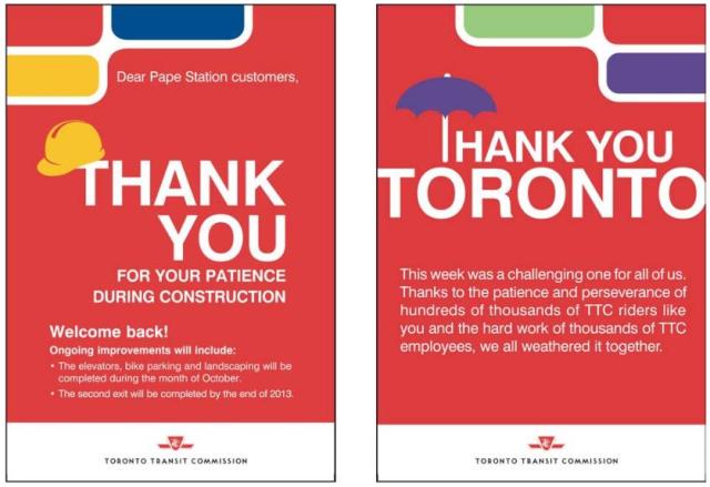
Recently, a new “standard” construction notice began to appear.
This maintains the red-and-white colour scheme, but it is different from other notices that have appeared for station maintenance projects, a standard that is itself fairly new. This style is also poor for use in electronic copies where black ink on white paper with limited use of colour endears organizations to people wishing to produce printed copies as handouts.
It is unclear which of the construction notices is to be the new “standard”, and how long this will last before someone dreams up yet a new way to present this type of information.
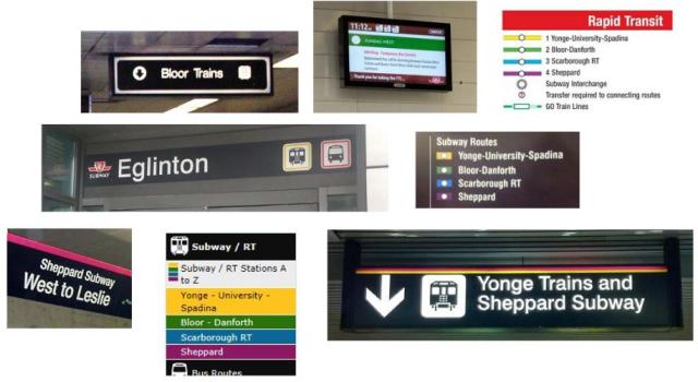
Current signage and other materials (web pages, printed materials) have many formats.
This is only a sample. Notable by its absence is the style found in some older stations such as the original BD line where the “subway” font is used for directional signage, not just for station names. These represent various generations of design each considered valid in its time, but presenting an inconsistent whole.
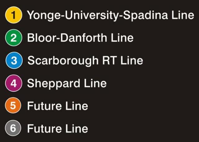
The use of names and colours is inconsistent and, in some cases, it is rather subtle. The TTC would like to move to line numbers, but would keep line names.
The intent here is not simply to use numbers but also to establish the circle as indicating “rapid transit”. However, no proposals has been made for surface routes, let alone how locations with other providers services (e.g. GO Transit, Mississauga, VIVA, etc) would handle consolidated signage.
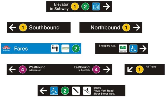
When these are combined into other sign forms, however, consistency takes a beating.
Why, for example, is some information in such small type (compare “All Trains” with “Northbound”)? Why is the “Fares” sign unique in having a blue background? Why does line 4 run westbound “to Sheppard” rather than to “Sheppard-Yonge”, the actual name of the terminal station?
In these signs, the subway pictogram has become a numeral, but the mode-specific pictograms would remain as generic references to buses and streetcars.
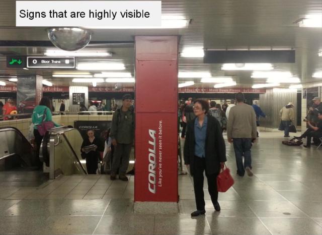
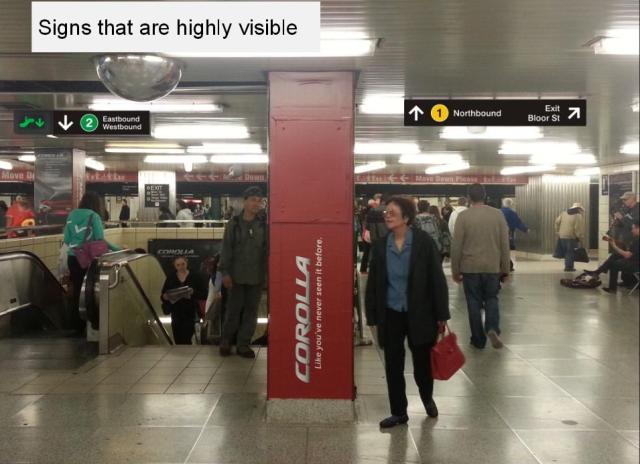
One of the worst problems at major stations is visual clutter. The presentation gives a before-and-after view of the east concourse at Bloor-Yonge intended to show how signs could be more prominent, but actually demonstrating a much more severe problem.
Although there is somewhat improved information about the location of trains for lines 1 and 2, the dominant message here is that this is the “Corolla” station. Leaving aside the fact that this is a competing technology, the basic problem is that “station domination” advertising can totally swamp the viewer in images that have nothing to do with wayfinding. On particularly memorable Amex campaign even managed to cover up the station names and was so visually busy that one could have a hard time finding the directional signs.
This is a basic policy issue about wayfinding: yes, the TTC needs advertising revenue, but it should not allow campaigns that make the stations illegible even to the point of being unrecognizable.
In the sample above, note that the sign over the escalator lists “Eastbound” and “Westbound” rather than using the “All Trains” designation introduced in the samples above.
St. George Station fares a bit better, but shows how much more is to be done.
Notable in the new sign is the disappearance of the red-and-white “Exit” designation. This brings up the question of cases where certain signs may require standard formats under the Building Code. Both the St. George and Bedford concourses lead to exits from the station, but it is unclear whether the term “Exit” here is intended to say “this is the shortest way out”.
A sample street entrance is shown for Osgoode, here at the northeast corner of Queen and University.
Leaving aside the less-than-ideal letterspacing in “Osgoode”, this sign begs the question of whether so much real estate should be devoted to directing would-be riders to another entrance in a way that requires both fluency in English and a knowledge of local geography. It is quite conceivable that some entrances will require space for more information, and there must be a policy about the hierarchy of messages. All entrances do not have a large wall space over a stairway and the space available for supplementary information may be limited.
There are other samples in the presentation, but I think that I have made the point that the samples are not fully thought out and don’t represent a comprehensive “standard” for new signage. (I am avoiding the term “wayfinding” as that implies somewhat more than updating the look of signs to the current administration’s preferred flavour.) Also, beyond the issue of composite identification of routes with a symbol, colour, number and name, there is no discussion of accessibility.
Maps
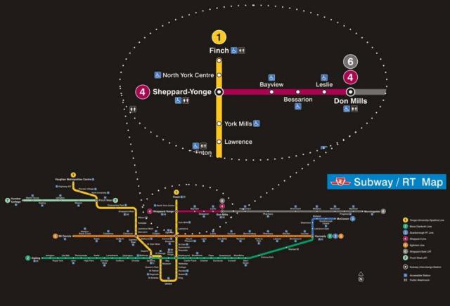
A sample of an expanded Rapid Transit map is worth including here, if only for amusement.
First off, note that the exploded section focused on Sheppard-Yonge station would not appear on the regular map. It is intended to show more detail as part of the presentation.
In this case, we have the “future” lines 5-Eglinton (not “Crosstown”), 6-Sheppard East LRT and 7-Finch West LRT co-existing with 3-Scarborough RT in a configuration that will never exist (unless the RT leads an unusually charmed life and Toronto gets a serious penchant for building LRT).
This map shows the ongoing problem with trying to preserve a map format that is out of scale (vertical vs horizontal) to reality so that it will fit in the space over a doorway on a subway car.
TTC staff, who earlier this year appeared to have the system route map targeted for oblivion, have reconsidered and now recognize that there is a need for such a map. The problem is how to convey a mass of information in this format.
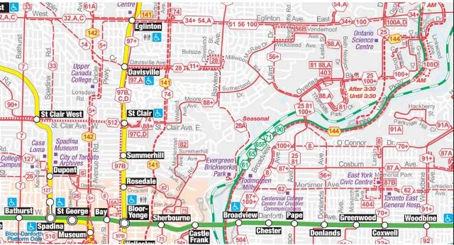
Here are three versions of a segment of the system map. First is the current Ride Guide which uses a street map as an underlying grid.
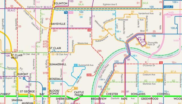
Next is a guide with routes given different colours for clarity where many of them run close together (I will skate past the issue of colour blindness already raised with respect to subway colours). None of the colours, other than those of the subway lines, has any meaning.
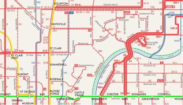
Finally, we have a map where the lines indicate the frequency of service. In particular, routes with frequent service get a thicker line. There are many, many errors on this map including the omission of the Eglinton services 32/34 as “frequent” routes, the indication that the 97 Yonge bus provides service south of Davisville all of the time, and coding the 140 series of routes as if they were all-day services when they are peak-only. I will be generous and hope that this is just a sample, and that if a real map appears using this scheme, better proof-reading is applied to it.
During his presentation, the TTC’s Chris Upfold quoted Jarrett Walker’s line “frequency equals freedom”, but did not really put this in the proper context. If anything, the map above shows just how much of the central area of Toronto does not have “frequent” service much of the time.
All of this is very much in early stages, and yet we may see some of the ideas rolled out early in 2014 when print media come up for their regular refresh. There is a chance that we would see a new “standard” evolve without enough time to discuss what the real goals may be.
Overall, my feeling about the presentation is that as a wayfinding system it is far from “ready for prime time”. These are a scattered set of ideas, but not an overall style guide, and the interaction of various proposals has not been thought through.
The TTC plans to implement a trial of new signage at Bloor-Yonge and St. George this winter. In most cases, existing signs will be covered with vinyl wraps (just like advertising campaigns) using the new layouts. Only illuminated signs require new inserts, and these will be sized to existing fixtures.
The whole matter will come back to the Board for discussion sometime in 2014 complete with a cost estimate. That may be premature because without a overall style manual or a sense of how far the TTC would go in retrofitting existing signage, it is difficult to know what the scope of cost would be.





Isn’t that what TTC font is? A Futura lookalike? It’s certainly not exactly Futura … the R for example (and the Q). But it’s certainly highly influenced and looks a lot like Futura.
Knowing TTC it was supposed to be Futura, but like everything else, they didn’t quite get it right … 🙂
LikeLike
I believe this has already happened. Years ago there used to be buses numbered 1, 2, 3, 4 but they were re-numbered to allow the rapid transit routes to be renumbered down from the 600s. They should renumber routes 5, 6, and maybe 7 now so that by the time those numbers are needed for rapid transit they are forgotten as bus route numbers.
I should point out too that the current discussion is not about somebody wanting to number routes, as they are already numbered. Rather, it is about using the route numbers more prominently in the signage, as is already done when advertising service disruptions and changes. Of course all the comments about it not really being an integrated and well-designed proposal still apply.
Steve: And for the trivia contests: The old routes were 1 Armour Heights, 2 Anglesey, 3 Ashbridge and 4 Annette.
LikeLike
Congratulations on a great posting! Comprehensive and beautifully illustrated.
Steve: Thanks. All of the illustrations are excerpted from the TTC’s presentation, but with my own comments and comparisons.
May I add two comments.
First, I have a longtime gripe with the TTC’s almost universal use of white lettering on black or coloured background. This has a particularly negative impact for much of the backlit signage with large black facing, whereby the entire purpose of back-lighting is severely minimized simply by default. The hanging backlit bus platform location signs, for example, at St. Clair West Station and many others, could just as well be UN-LIT for all the internal lighting accomplishes. Additionally, the station name signs over the main entrance at street-level continue this practice, especially at the more recently constructed stations, eg. Sheppard. At night, these backlit signs are almost indecipherable against intensely lit buildings and streetscape.
Second, I have a newer gripe with the much vaunted electronic readout signs on the ceilings of the newest subway cars, in essence a component of the wayfinding system. Why use such tiny, little lettering and why scroll the entire annoyingly long and convoluted blurb repeatedly at every station – “The next station is Dupont, Dupont Station” – with Dupont in the same tiny, little lettering occupying a tiny, little fraction of the large electronic sign.
It’s painfully obvious to me that whoever cooked this up has spent minimal, if any, time riding rapid transit elsewhere. Throughout Germany, in almost universal practice, the next stop is announced on-board by a distinctive chime and the name, ONLY. No extra verbiage so one only hears the name itself, nothing more, thus improving the impact of this important information. This format is replicated on the on-board electronic signage with the stop name ONLY, filling the entire sign with big, legible lettering. In most instances when the vehicle has stopped at the particular location, the large lettering FLASHES. We are here!
But, unfortunately, we are stuck in Toronto in a self-imposed and rigid “transit timewarp”! Should I continue to pray for “transit salvation” in Toronto in my lifetime?
LikeLike
The number makes the system more confusing. Any tourist or commuter knows the difference between Yonge and University-Spadina line. This will troublesome at Union were sign will say: 1 Northbound to Vaughan or 1 Northbound to Finch.
Also consider the bus network. I will say take the Eglinton East bus, Bayview bus or King car. I never remember the number.
I disagree with the TTC rebranding.
LikeLike
Realistically, could the B-D line not be 2, and (even though it’s not sequential) have the eastern leg of it into Scarborough be 3?
I can’t imagine that if/when this line is built, that all trains would be going to McCowan & Sheppard … so if they were to interline, 2 and 3 would be running from Kipling east …
then again.
LikeLike
Queen and University. A different style of subway sign on each of the four corners.
All lead to the same space-time station, unfortunately. Can’t take the entrance by the ’60s sign and ride a Gloucester to the end of the line at St. George.
Steve: That installation is a trial, but we have yet to hear which version of the sign they have decided on.
LikeLike
It doesn’t look like that at all from the pictures you posted as well as those on other news sites. Andy Byford is simply trying to cheat people by saying that he is keeping the line names yet everywhere he is putting numbers in place of the line names and wasting OUR money to do so just so that he can get his Downtown Relief Line approved by avoiding calling it by name and calling it by number instead. You can call the Downtown Relief Line whatever you want but people will still recognise it as the Downtown Relief Line (DRL) simply because it has been called the Downtown Relief Line for more than 50 years and so calling the Downtown Relief Line (DRL) Line 5 or Line 6 will NOT increase support for it and will only leave less money for it as money would have been wasted on this unnecessary line numbering project.
Steve: This is only one of many inconsistencies in the entire proposal.
LikeLike
I don’t know if splitting Y and US would be a good idea, as then you’d have to explain that you don’t actually need to change trains at Union. What would be very simple and clear is that you would have FInch via Union and Downsview via Union. So if you were at Eglinton, you would see “1 To Finch” and “1 To Downsview via Union” and know where to go to go downtown (since Union is pretty prominant to both locals and tourists).
The other issue is why the TTC doesn’t use the flexible tools like the changeable display signs. Is there a reason why late nights on Yonge the maps in the TR trains still shows the route lit up all the way to Finch? That seems like it should be a very simple change since they have the St. Clair short turn.
LikeLike
It is undeniable that a good wayfinding strategy is an integral part of an accessible transit system, but I would question the number of riders this would benefit on a regular basis. I don’t have the statistics to back up my supposition, but I believe that the majority of people who take transit do know where they are going (and likely travel the same route frequently). For these people, most wayfinding signage is merely background noise. They know which train, bus or streetcar to take, and well enough with existing signage, which stairwell to take to get there.
Developing a wayfinding strategy for work moving forward is a good idea, but it must be a vision that is adopted and adhered to for the long term for it to become consistent and complete. Like other commenters on this thread, however, I don’t feel that this subject deserves priority over capacity improvements, but that the two can coexist with the long term vision in mind.
LikeLike
And since I have access to the “fact[s]” and know what they actually say, here it is: The Paul Arthur system fared generally better than the existing system in actual user tests. Afterward it was never brought before the Commission. It was buried.
That is what happened.
Steve notes:
That issue was addressed at length in the process, which did not reach fruition. Pictograms can be arbitrary or can have a historical or geographic reference but in practice later become arbitrary. This is another way of saying it does not matter if one person can give you the backstory to the pictogram while someone else cannot.
The real issues involved are actually similar to those brought up by colour-coding: Is there one obvious name for the colour or icon that everyone automatically uses without thinking? Hence use red/blue/black but never pink/teal/anthracite. The real practical usage problem with pictograms is how to describe them to other people (verbally or by trying to draw them yourself).
All that was going to be tested out the ass, if you will forgive the vulgate, in the actual implementation stage, which never happened. But it has given lots of armchair critics a decade’s worth of opportunities to state that it would never work. Well, Paul was gonna test that to make sure it did.
LikeLike
In British English, sure. Not here.
LikeLike
Actually, the international standard is to use the “running man” pictograph with or without the word exit in the local language regardless if it’s an emergency exit or not. Simply put, in an emergency, all exits are emergency exits and the last thing you want is for people who don’t speak the local language to wonder what’s the difference between “way out” and “exit”.
And yes, it is strange that with all this talk about numbering lines for “simplicity”, the TTC is not updating the exit signs to the ISO standard.
LikeLike
I don’t know, I found the big signs at Yonge that said “Northbound trains use “N” stairways, Southbound trains use “S” stairways” and things like “Sherbourne St. and Buses next exit” and “Glen Rd. Exit East End of Platform” to be pretty easy to figure out. It’s where the mish-mash of later signs being added and some of those taken down and replaced by a yet again different style with different information is where things get inconsistent and confusing, such as at Bloor where some signs direct you to “Bloor Trains” and others direct you to “Bloor/Danforth Trains” and some say “Bloor-Danforth Trains”. Then there are cases where signs of various eras were taken down and never replaced such as at Queen, where the platform signage was removed when the vitrolite tiles were taken off and most of it was never replaced. Never mind new styles of signage, how about just putting up some signage? On the other hand, King has up to date signs so someone has made sure that this station has proper signage.
All the original Yonge line stations had hanging signs indicating whether one was on the northbound or southbound platform. Very few of these remain (Queen actually still has the originals), but some were replaced in renovations such as at Wellesley. However, back to Bloor, where these signs would be the most useful, there are almost none to be found. Just ensuring each station has signs that are consistent should be the first objective, especially at the transfer stations and high volume stations. That would go a long way to reducing confusion before reinventing the signage.
Steve: Bloor is a particularly good example of visual clutter. Those “N” and “S” signs were designed to be easy (relatively) to spot among the other stuff hanging from the ceiling and walls.
LikeLike
With regard to the test signage at St. George Station – isn’t the word “buses” redundant as it is next to a pictogram of a bus? Its also inconsistent as the other pictograms aren’t accompanied by a corresponding label.
Also the blue ‘fares’ sign features a Presto badge. When the TTC (at long last) transitions to Presto will we not be rid of attended collector booths?
Steve: The transition to Presto starts next year, probably in the fall with the launch of new streetcars on Spadina. I do not believe for one moment that it will be ready for the Pan Am Games.
LikeLike
. . . and the example from Royal York Station has the word ‘buses’ absent a pictogram.
LikeLike
I’d assume the one that they, and you, included in the presentation at the entrance to Osgoode Station.
Steve: Don’t bet on it.
As for the “Running Man” pictograph. It might be in use internationally … but given that in an emergency one is told NOT to run, but to walk quickly … then I’ve always thought it was rather an odd symbol. The EXIT sign is essentially a symbol here … to the point that none are confused if it actually says SORTIE instead of EXIT. Might as well use this and reduce confusion. Sadly though they seem to be moving away from that.
LikeLike
It’s a copy. The old Mary Tyler Moore Show font was unique, not the TTC subway font. Good grief I’m showing my age again.
WAY OUT was used when the Yonge line opened. It was considered too groovy in the 60s I suppose. They should just put up a pictogram of Snagglepuss with EXIT … STAGE LEFT instead.
Subway pylons … that logo by itself means nothing to tourists. Put up the word SUBWAY – METRO and a pictogram of a train on the crest along with it. So simple.
As for the original 1960s BD signage, anyone who was there remembers the massive confusion when that line opened. No routing information whatsoever on the platforms or on the cars themselves. Can’t they use a compass icon for directions to denote eastbound, westbound, etc.? That’s way more intuitive than the word “eastbound”.
LikeLike
Another inconsistency is using the word “Buses” and then having a Bus symbol. Same applies to “Elevator to Subway” and then having a blue elevator symbol. If the point is to simplify the ‘message’ then the symbol should suffice.
With the Osgoode sign, the round yellow 1 should be on the left side, not the TTC Subway logo. The TTC logo sign on the pole should have SUBWAY underneath it.
And if you are going to use line numbers, dump the line names.
Steve: As I said before, this is a slapdash collection of ideas, not a consistent system of signage that has been carefully thought out.
LikeLike
Well, unique to you, and to A.M. Cassandre who drew Peignot in 1937. Clearly unique is in the eye of the beholder and let’s let it rest at that.
LikeLike
Why would the TTC get rid of attendants at collector booths? Not everyone is going to use a PRESTO card after all.
Also, Steve, I don’t about you but with regards to the two signs about construction work, I prefer the one on the left which specifically states who it is referring to (passengers at Pape station), it thanks them specifically, has the words “WELCOME BACK” on it, and isn’t one long paragraph.
LikeLike
That’s correct. There will be those using Presto and those who will purchase single ride or multiple ride tickets from vending machines with cash or credit/debit cards. As the system will be Proof-of-payment, (hopefully) no collectors will be required. Perhaps they may be redeployed in a customer service/information point capacity?
The redundancy of collectors is one of the advantages of Presto implementation.
I wonder if TTC will lose the turnstiles/gates as has happened in other cities with POP systems?
LikeLike
One thing to remember with the “international running man” as an emergency exit sign is that they are green because this is supposed to be a good colour whereas red indicates danger and should be avoided. The problem with this is that in emergencies that produce smoke red is much easier to see than green. The distance that light travels in smoke, haze or fog varies with the fourth power of the wavelength. Red has a much longer wavelength than green. Just think about driving in a fog and how the red lights show up before the green.
LikeLike
There is a very good chance that Mayor Rob Ford will be re-elected next year and also a very good chance that Tim Hudak will be Premier next spring. Mayor Ford has already said that Prime Minister Harper suggested connecting the Sheppard subway to the Bloor Danforth subway via McCowan and Sheppard and will soon provide funding as well. So, we might be looking at a super line from Kipling to Kennedy to McCowan and Sheppard to Yonge and Sheppard and so all this numbering business will be a waste as Line 2, Line 3, and Line 4 might merge and regardless of that Line 2 and Line 3 are still merging as Prime minister Harper has already announced funding for the Scarborough subway extension replacement of the SRT and the city will be a fool to not accept it (besides Council has already repeatedly voted for a Scarborough subway and the polls also heavily support a Scarborough subway and so there is no reason to waste massive amounts of our tax and fare dollars on this useless numbering which will no longer be correct in a few years). Also Steve, the only picture you posted of the line names is NOT something that is shown on a train or a subway station but just an image that will NOT appear anywhere in the system and is just used to downplay the criticism that this is not about dropping the line names in order to get approval for the Downtown Relief Line (DRL) by dropping the word Downtown from it’s name and calling it by a number instead. In order to get the Downtown Relief Line / DRL built, the political landscape has to change at the municipal and federal level and status quo maintained at Queen’s Park none of which is very likely. Everyone talks about relief of the Yonge Line but what about relief of the Bloor Danforth line as it is often very crowded even outside of rush hours and burying the Eglinton Line completely is the only way to provide relief to the Bloor Danforth Line which will neither have the additional capacity of the new signal system being installed on the Yonge University Spadina Line nor have the additional capacity of the much larger newer trains all of which are for the Yonge University Spadina Line only.
Steve: This message brought to you by the fanclub for Ford and Hudak. You keep posting under different names, but the argument for the “super line” gives you away.
LikeLike
In France the practice seems to number tram lines as L1, L2, L3 etc.; metro lines as M1, M2, M3, etc and bus lines are B1, B2, or C1, C2 etc. I don’t know why the C but at least you know what you are looking for. Perhaps we could use L for Light Rail.
The problem is that every time a new sign is used they drag up a new style. A standard has to be set up and enforced. I wonder how many remember the original green and [?] style on the original highway style buses that was suddenly changed on a subsequent order a few years later. One rumour had it that one person decided to change style and colour without any permission.
LikeLike
…Peignot.
I agree with David Vereschagin. As he and I actually have done the research, you should believe us.
LikeLike
Or as Hudak’s latest LRT vs. subway comments might be indicating, we might be looking at no subways beyond Kennedy after he gets elected.
LikeLike
@ HW re: flexible signs not being accurate at late-night, that’s laziness on the operator’s part.
My hunch is this:
* The LED route maps are tied to the destination signs at the front & back of the train.
* Operators never really updated the signs on T1s and older (because they thought no passengers looked at them), and they carried those bad habits into the Rockets
* Now that the link between the two is present, passengers do notice and appropriately are getting confused.
I’ve tweeted TTChelps a few times during closures about which trains weren’t showing the right terminii – this is going to take some time to retrain habits.
Steve: Never mind situations where the TTC wants to display the end terminal station even though no service goes there because of a bus replacement. See “501 Long Branch” and “502 Victoria Park” on common view these days. The problem is conflicting goals and bad system design.
LikeLike
Many systems in Europe have no one in the stations, just machines that will sell you a single ticket, a group of tickets, a pass or recharge you card. It is hard to believe that Presto is having so much problem adapting its system. They could have bought an existing system but then they could not have justified the high expense for developing an “Ontario Technology.” I think we have been down this road before. The GO bi-levels where a success but that was because there was a need for them.
Steve: A big problem for Presto was that technical constraints of its early implementation on buses roaming the countryside beyond wireless access and limited capabilities of the onboard and on-card systems became a “baked in” part of the system. Presto tried to hang on to the value of its investment in the Mark I version far too long, and was eventually forced into a redesign (Presto Next Generation) to support Ottawa and Toronto. That could have been a point where Ontario could have quietly adopted an internationally proven system, but the idea that we have to build our own dies hard here. We won’t get another shot at this for about a decade after (a) we see what problems arise in truly regional fare integration in the GTHA and (b) credit/debit cards and equivalent smartphone-based payment systems become commonplace.
LikeLike
I love reading this site, but the ongoing negativity is a concern to me. So I try to look at the glass half full approach.
We should be happy that everything the TTC does is under review, and I see a lot of positives in what they are proposing in terms of standardization. They are getting better and better every board meeting so they are listening (bit by bit). Don’t forget that there are also unions, politics, limited budgets and the grumpy public to satisfy so everything is tactical and measured.
It’s good to be a critic, but I want to see some positivity too mes amis! Things are looking up in general if you ask me.
I realize funding is an issue and is limited, but do all of you really think the TTC people are stupid and don’t want what’s best for the system and public? Andy Byford ran the London & Sydney transit agencies, so I doubt he’s as incompetent as people think he is. It’s just you have to be quite tactical and maybe a bit more patient than some of you who have been waiting for pride in our system and city for a long time.
Steve: Correction. Byford did not “run” the London agency, and his role in Sydney was not on the local transit system, but a commuter train operation.
In terms of the way finding article:
We all have our opinions on what is best, but I think being clear about directions is a good thing, making things consistent, adding numbers etc. Right now our system is simple, but crossing my fingers that within 20 years we’ll have 5-10 more lines (including LRT).
Finally, as someone who is colourblind, I should let you all know that it’s not that you can’t see colour entirely (though there is a range), it’s about the limited detection range of pigments. Think of it like RGB codes for your computer. You can make almost any colour with the numbers 0 to 255 on each. In my case I only have a green deficiency, so my range on that one pigment is like 0 to 100. Just means that a lot of colours that are defined by the amount of green saturation “grey or dull out”.
LikeLike
The 3 was more recently ANCASTER PARK before being absorbed by the 120 CALVINGTON. If they’re going to continue displacing the bus routes they’re going to run into problems with the next block as Avenue Rd., Bay and Bathurst are major streets with few alternatives for renaming to go along with the renumbering (the next closest being 13, 18 and 19).
For the Scarborough RT and Sheppard East LRT wouldn’t treating it as an offshoot branch be simpler thereby reducing the number of colours you used up? 2A and 4A with perhaps a lighter shade of green and purple. The practice is seen in places like Paris and Santiago. We could go the Boston route and simply continue with the same colour despite the mode change with their Red Line to Mattapan.
The need for consistent wayfinding implemented system-wide is there, just much lower in the list of priorities that the TTC has to deal with. The outcry from the public that their fares are going to the equivalent of window dressing should get them to quickly reconsider going much further. By all means do the research now if you must, but don’t implement it until the more pressing matters are dealt with. In the mean time, make sure you don’t lose your findings amongst all the other reports!
LikeLike
You would love the system in Nice. They have plain sans serif font on poles at the start and end of the tram platforms, cursive right on the shelter itself. Both are black letters on a white background but they add a cute saying, also cursive, in white on black next to the station name. Some of the station announcements use a male voice, some a female, some a child and some a combination. They also have different music for each station.
The one line carries almost 100 000 passengers per day. They had 5 section 35 m LFLRV but are expanding them to 7 section 45 m. Headways appear to be 3 – 4 minutes in rush hour. Sitting at the back of a 45 m long train the front is a long way away. Great city.
LikeLike
Or maybe 2 announcements, one at King and one at Union.
Cheers, Moaz
Steve: All I can say is that if we are worrying about the contents of announcements for an unlikely restructuring of the subway, rather than talking about the benefits and implications of various lines, we have solved most of the problems in the known universe.
LikeLike
And in between, the 3 was Kingsway . Though it just ran on Bloor and Dundas (with a short-lived branch to Sherway) but served the Kingsway neighbourhood before being replaced by an extended Bloor West route.
LikeLike
No, just ignorant, defensive, and prone to grudges and blacklists.
They definitely do not “want” the latter.
Steve: While Joe and I disagree on issues from time to time, I must underscore his point about TTC’s defensiveness. Deep in the corporate culture is a long history of always being “the best” which bred an attitude that any problems must be due to external circumstances, not to internal actions (or inaction). Compound this with two decades of spending constraint where the good people were trying to just keep the lights on. I’m not excusing the result, just trying to understand the context.
It is sadly amusing that among the initiatives for 2014 is the idea that the TTC would clean its tunnels and vent shafts as a way to improve service reliability. For several years, riders have been told that all those “smoke at track level” incidents were their fault thanks to newspapers and other junk. This was even used as one of the justifications for a billion-dollar platform door project.
TTC exhorts riders not to misuse the passenger assistance alarm even though it is common to see delays for such events during the peak period when trains are packed full.
Service is ragged because it runs in mixed traffic and cannot possible be operated reliably. Even at 2 am. Even on Sunday morning. Even when the prime directive for line management is keeping operators on time (assuming a line is managed at all, not just left to its own devices).
LikeLike